
Recomendados
Más contenido relacionado
La actualidad más candente
La actualidad más candente (20)
Similar a Lana del ray
Similar a Lana del ray (20)
Más de laurenamyharriman
Más de laurenamyharriman (16)
Último
Último (20)
Lana del ray
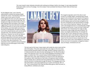
- 1. The image/iconography used in this album cover consists of a vintage design, something which would appeal to the conventions and audience of this genre. The way Lana is styled in a plain, white, collared shirt, and the makeup used such as brown and gold on the eye and a red lipstick are all representative of vintage era’s, such as that of wartime. However, the colours used in the background aren’t as stereotypically vintage as people would assume. It does not have a black and white theme, but instead keeps the image visually attractive by using a bright and natural setting. The colours are largely complimentary, for example the blue text ‘Born to die’ matches the colour of the sky and the artists name ‘Lana del Ray’ compliments the white shirt and the clouds in the clear, blue sky. The reason for this choice of colours may be due to the genre of the artist as she is also labelled as a pop artist, so here she tries to incorporate a vintage but modern style and design, intertwined into one. The text used on this cover is kept simple, with simply the artists name and the title of the album. The artists name takes the main stage on this front cover, being stretched along the width of the page, therefore making it stand out in it’s bold and white text above the blue sky background. The title of the album takes a less dominant role on the cover, being displayed at the bottom of the page in a smaller font. This is present above a white background, which is taken from Lana’s shirt, again allowing it to stand out and to be capturing to the audience. Both these pieces of text take on the general colour scheme, which could be seen as patriotic from the predominant use of white and blue and the red that is incorporated through the lipstick. The language used in the title of the album is also quite significant as it is quite controversial: ‘Born to die’. This is conventional of the Indie and Alternative genre, which focusses on being different, individual and unique. On this digipack cover, Lana is directly addressing the audience by looking straight towards the camera. This therefore draws the viewers eye to Lana, which is further encouraged by her stern yet sultry expressions making the image enticing and capturing. The background image and overall mise en scene is kept relatively plain and simple in this image suggesting this may have been done to keep the audiences attention on Lana as the centre piece of the display. Lana looks stylish and classy in this piece of photography, through her styling such as the natural, bouncy curls, and the white and plain shirt. This represents elements of Indie music. However we can still see features of pop in this image, such as the artificially perfected appearance of the skin and the image in general, that may have been photo shopped to create a false idea of perfection. This represents a more superficial and cosmopolitan look than one we would expect of the Indie/ Indie Folk genre. This cover overall is kept relatively minimalist with nothing too striking or bold on the image. It is eye capturing whilst being kept subtle in terms of its design. From the analysis I have concluded that features of both Indie and Pop music can be found.
- 2. This back cover of the arctic monkeys digipack is kept very plain and minimalist. The most visually capturing feature of the back cover is the large red font, which is displayed in a unique and quirky font, typical of the styles and conventions of the Indie and Alternative genre. The colour of this font is also displayed in red, which may symbolise the idea of danger, which can be supported by the semantics of the language used in the album titles such as ‘lightning’, ‘dangerous’ ‘fire and the thud’ and ‘crying’. However this may also be done to add some interest to the page and to stand out above the otherwise plain and boring background. Furthermore. This is also the largest piece of text on the page, suggesting that this is the main thing they want the audience to focus on. The artist is the biggest influence on whether someone will buy an album and therefore it is essential that the title of the artist is capturing, visually attractive, bold and stands out on the page. The barcode is presented on the left hand side of the back corner and takes up the first third of the back cover. This allows for a lot of empty space to be left at the top third of the cover, the second third has some writing but the final third of the picture is given the most attention with lots of text including the song titles and the artists name. All legal information is conventionally displayed at the bottom of the back cover, in a small text so that it does not defer attention from the more important information of the page. The company/corporate logo is also presented at the bottom of the page for legal reasons. The colour scheme used on this back cover are beige, red and black. This keeps the page minimalistic, as even the red which may be considered the brightest colour, is a dull and relatively uninteresting shade of red. This colour is used only on the name of the artist which signifies to the audience that this is the most important piece of text on the page and that this is the centre piece of the back cover/ the centre of visual interest. The song titles are displayed in a practical black, still in a relatively bold font. Furthermore, the beige backing of the page creates a simple, vintage style to the design. This back cover has clearly been created for practical purposes as a pose to artistic ones and the main attention has been aimed at getting across the essential information that they have to provide.
- 3. This represents the name of the production company, therefore advertising them through the use of the digipack and representing the other artists that record with them. Here the title of the band and name of the album is displayed. It is essential that this is displayed on this part of the digipack as in stores where it may be sold it is likely to be stored and stacked with the sides showing, therefore this will be the only way to show the audience who’s album this is. As a result it is vital that this is displayed here for sales and the success of the album. This is a source code that allows easy access to find the album within stores and online which again is important for sales and the success of the digipack/album.