
Recomendados
Más contenido relacionado
La actualidad más candente
La actualidad más candente (20)
Similar a Analysing contents pages prep for blog ppt
Similar a Analysing contents pages prep for blog ppt (20)
Más de lborland95
Último
Último (20)
Analysing contents pages prep for blog ppt
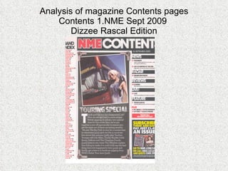
- 1. Analysis of magazine Contents pages Contents 1.NME Sept 2009 Dizzee Rascal Edition
- 2. Contents page NME (SEPT 2009) ANALYSIS Banner- the banner shows that this is the contents page by being written in bold white text to stand out from the background Sub Heading (contents)- breaks down the contents into sections, follows a colour scheme of the title in white, page numbers in red and the main text in black. Masthead- follows the same colour scheme and style as the masthead on the front cover. Main image- image of a woman and a tour bus, this relates to the article beneath about touring. Band Index- list of the bands/artist featured in this issue, band name in red and page numbers in black to standout. They all follow this colour scheme. Main Image Edit- the main image has been edited to look like a old style photograph, this is stylish and would appeal to the target audience. Editors introduction to contents of magazine- gives a brief introduction to this article and the magazine. Also puts the page numbers by band/artist names to show were they are featured in this issue. Subscription advert- shows the reader how much they’ll be saving if they subscribe and how to do so. Date- this is vital as it is used for reference.
- 3. ANALYSIS OF LAYOUR/DESIGN FEATURES OF CONTENTS PAGE MASTHEAD AND WORD CONTENTS –BOLD AT TOP WITH DATE/ISSUE NUMBER Introduction from the editor- about a paragraph in length and use drop capitals at the start. Main image for article +page numbers Contents header Subscription advert A list of the artist which appear in this issue.
- 4. Analysis of magazine Contents pages Contents 2.MOJOJan 2006
- 5. Contents page MOJO (JAN 2006) ANALYSIS Issue Number- need for reference, not that important to the read so that’s way it’s small and in a corner. Date- need for reference, not that important to the read so that’s way it’s small and in a corner. Masthead- looks the same as the masthead on the cover, bold capitals but in white but not black like on the cover. Pull Quote- used to show what will be in an article, also to encourage people to buy it if they open the magazine and look at the content. Text- follows a red and white colour scheme. Background- the background is filled with an image of an artist who appears in this issue.
- 6. Analysis of magazine Contents pages Contents 3. Kerrang Mar 2007
- 7. Contents page Kerrang (Mar 07) Analysis Issue Number/Date- need for reference, not that important to the read so that’s way it’s small and in a corner. Editors introduction to contents of magazine- gives a brief introduction to this article and the magazine. Also puts the page numbers by band/artist names to show were they are featured in this issue. Subscription advert- shows the reader how much they’ll be saving if they subscribe and how to do so. Banner- show that this is the contents page but also follows the same text as the Kerrang masthead. Image- images of artists featured in the issue and the page numbers they feature on. Main Image- shows someone in the air probably at a gig to show off the attitude of the music Text- follows a yellow and white colour scheme, there are headers and page numbers with relevant information beneath.