
Recomendados
Más contenido relacionado
La actualidad más candente
La actualidad más candente (15)
Destacado
Destacado (20)
Similar a Research into ancillary task liam lorraine
Similar a Research into ancillary task liam lorraine (20)
Más de Liam Lorraine
Más de Liam Lorraine (12)
Research into ancillary task liam lorraine
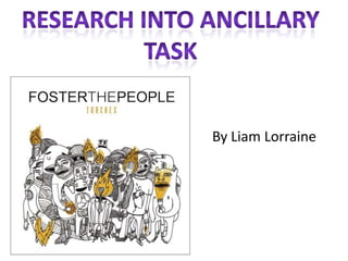
- 2. The font style is san Name of the band is serif with makes the always at the top of the album cover have a album casual feel and isn’t nothing to fancy The layout of the album cover is very conventional as most albums have the name of band at the This image links in top and the with the name of image the album as its underneath. called “Torches” and the characters are all got The colours of the something to do album are very with torches plain and simple contrasting with the bands music