1. Lucas Yates – Andersen
Media Studies
Design principals used?This contents page doesn’t
use the Gutenberg in a traditional way as other
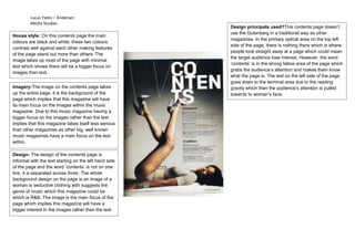
House style: On this contents page the main
magazines. In the primary optical area on the top left
colours are black and white, these two colours
side of the page, there is nothing there which is where
contrast well against each other making features
people look straight away at a page which could mean
of the page stand out more than others. The
the target audience lose interest. However, the word
image takes up most of the page with minimal
‘contents’ is in the strong fallow area of the page which
text which shows there will be a bigger focus on
grabs the audience’s attention and makes them know
images than text.
what the page is. The text on the left side of the page
goes down to the terminal area due to the reading
Imagery:The image on the contents page takes gravity which then the audience’s attention is pulled
up the entire page; it is the background of the towards to woman’s face.
page which implies that this magazine will have
its main focus on the images within the music
magazine. Due to this music magazine having a
bigger focus on the images rather than the text
implies that this magazine takes itself less serious
than other magazines as other big, well known
music magazines have a main focus on the text
within.
Design: The design of the contents page is
informal with the text starting on the left hand side
of the page and the word ‘contents’ is not on one
line, it is separated across three. The whole
background design on the page is an image of a
woman is seductive clothing with suggests the
genre of music which this magazine could be
which is R&B. The image is the main focus of the
page which implies this magazine will have a
bigger interest in the images rather than the text.