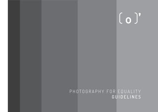
Photography for Equality Visual Identity Guidelines
•
0 recomendaciones•833 vistas

This brand and its manual were built to the discipline of Design Practice 1 at Anglia Ruskin University,2013/2, taught by Will Hill, with the goal of generating an understanding of what is a Visual Identity, which composes and how to build it and other elements that it involves. Project developed by Marina Alves Teixeira, design student at University of Brasília.

Recomendados
Más contenido relacionado
Similar a Photography for Equality Visual Identity Guidelines
Similar a Photography for Equality Visual Identity Guidelines (20)
Último
Último (20)
Photography for Equality Visual Identity Guidelines
- 1. P H O T O G R A P H Y F O R E Q U A L I T Y G U I D E L I N E S
- 2. This brand and its manual and were built to the discipline of Design Practice 1 at Anglia Ruskin University, taught by Will Hill, with the goal of generating an understanding of what is a Visual Identity, which composes and how to build it and other elements that it involves. Project developed by Marina Alves Teixeira.
- 3. C O N T E N T [ introduction basic concepts photograpy for equality the logo versions chromatic scheme proportions exclusion zone minimum size typography incorrect usage applications 4 5 6 7 8 9 10 11 13 14 15 18]
- 4. ( 4 ) I N T R O D U C T I O N The visual identity system is the vehicle for visual transmission of values for an Instituion. An integrated and well-structured graphic identity has the potential to strengthen and consolidate the presence of an service or product in the market. It is, therefore, one of its main assets and should be used in a uniform and consistent manner. This manual comes in order to standardize and manage the use of the visual identity of the brand Photography for Equality by presenting the technical specifications and demonstration of proper applications. It is essential that the standards presented here are followed so that your goal of contributing to the consolidation of the project image is achieved.
- 5. ( 5 ) B A S I C C O N C E P T S Visual Identity A unified and coherent visual system of elements and graphic applications that follows normative standards and represents an Institution, service or product. This set basically consists in a graphic sign and its possibilities of reproduction in visual media. Logotype Nominal representation of the brand, based in a existing typeface or a lettering. Simbol Graphic sign that synthesizes the brand concepts in a way that facilitates its assimilation and recognition. Brand Simbolic representation of a product, service or Institution, that embraces its name, conduct and provided experiences as well as all the concepts and look that make it distinctive.
- 6. ( 6 ) P H O T O G R A P H Y F O R E Q U A L I T Y Social project that through the use of photographic images will highlight the role of women as agents of change in developing nations. Our vision is to allow for an open and direct visual dialogue that advocates for gender equality within these communities. With a focus on visual media, university students and young profession - all are given the opportunity to document and bring to light the barriers that women in these societies face daily.
- 7. ( 7 ) T H E L O G O Simple and friendly approach The project is approached in a simple and friendly way through the typography chosen Dosis. As a sans serif typeface, its round corners and soft edges graphically represents concepts such as reliability and receptivity. This approach is also observed in the use of dark grey and the “emoticon” camera. Importance of the camera Drawn with emoticon style, the camera is synthesized in a playful way. Written in the same typeface as the logotype – Dosis, this graphical sing reinforces th role of the photography in the project: the camera as a tool that work in favour of gender equality.
- 8. ( 8 ) V E R S I O N S The logo vertical version consists in the main version. It best represents the concepts of the project and therefore is the most recommended. However, for situations where you can not use it should be aware of the rules that direct its application in other versions. The logo, in all its versions and signatures, must be applied in the context of highest contrast. Horizontal version This version must be used when the composition demands a horizontal orientation. Examples are given in pages 19/20/22. Short version This version is applied in case of space restriction. Examples are given in pages 18/19/20/34. Simbol This version is applied in case of space restriction or there is the necessity of emphasize the symbol (using it as a signature). Examples are given in pages 22/25. This manual does not cover all circumstances for the application of the logo. Each situation must be analysed so that the appropriate version is applied. m a i n v e r s i o n ( v e r t i c a l v e r s i o n ) h o r i z o n t a l v e r s i o n s h o r t v e r s i o n s i m b o l
- 9. ( 9 ) C H R O M AT I C S C H E M E Colours play an important role in the proper functioning of a visual identity system. The unit of the original colour code must be maintained in case that, for example, changes are caused by different printing processes. Chromatic scheme of branding is based in percentage variations of pure black in C M Y K code ranging from 0% (white) to 100% (black). Follow the colour codes of the original colours in CMYK standards used for printed materials; RGB used for digital viewing, and hexadecimal code used for placement on the web. RGB 60 60 59 CMYK 0 0 0 90 #3C3C3B RGB 255 255 255 CMYK 0 0 0 0 #FFFFFF RGB 60 60 59 CMYK 0 0 0 90 #3C3C3B RGB 255 255 255 CMYK 0 0 0 0 #FFFFFF RGB 28 28 27 CMYK 0 0 0 100 #1C1C1B RGB 255 255 255 CMYK 0 0 0 0 #FFFFFF RGB 135 135 134 CMYK 0 0 0 60 #3C3C3B RGB 157 156 156 CMYK 0 0 0 50 #9D9C9C
- 10. ( 10 ) P R O P O R T I O N S The symbol and the logotype (also in all the versions) were built with the typeface Dosis - using its proportions and spacing - with slight modifications such as the ‘li’ alignment with ‘ap’.
- 11. ( 11 ) E X C L U S I O N Z O N E The exclusion zone aims to ensure readability, recognition and brand integrity, protecting it from interference from external elements. This is a minimal margin between the brand and other visual elements positioned nearby.
- 12. ( 12 ) E X C L U S I O N Z O N E
- 13. ( 13 ) M I N I M U M S I Z E Minimum size is set in order to preserve the formal coherence and legibility of the brand in situations of space restriction. The smaller reproduction of the versions for brand Photography for Equality are defined below. As the resolution of the equipment, you should consider printing them slightly larger. 1,8 cm 1,0 cm 1,0 cm 0,6 cm
- 14. ( 14 ) T Y P O G R A P H Y In order to preserve the recognition and exclusivity of the logotype, a Typographic family was chosen to be used within different purposes. Dosis Ligth Title is the only situation where the typeface used in the logo is applied, always in uppercase. Gandhi Sans This typeface is used for writing texts in virtual platforms ,such as virtual banners or website, or short printed texts used in posters, for examples. Gandhi Serif This typeface is used for writing texts long texts in material platforms such as stationery or invatations. Dosis abcdefghijkl mnopqrstuvwxyz ABCDEFGHI JKLMNOPQRSTUVWXYZ 1 234567890 £&@?!/+(.,:;) Gandhi Sans regular///abcdefghijkl mnopqrstuvwxyz ABCDEFGHI JKLMNOPQRSTUVWXYZ 1 234567890 £&@?!/+(.,:;) italic///abcdefghijkl mnopqrstuvwxyz ABCDEFGHI JKLMNOPQRSTUVWXYZ 1 234567890 £&@?!/+(.,:;) Gandhi Serif regular///abcdefghijkl mnopqrstuvwxyz ABCDEFGHI JKLMNOPQRSTUVWXYZ 1 234567890 £&@?!/+(.,:;) italic///abcdefghijkl mnopqrstuvwxyz ABCDEFGHI JKLMNOPQRSTUVWXYZ 1 234567890 £&@?!/+(.,:;) bold///abcdefghijkl mnopqrstuvwxyz ABCDEFGHI JKLMNOPQRSTUVWXYZ 1 234567890 £&@?!/+(.,:;) italic and blod///abcdefghijkl mnopqrs tuvwxyz ABCDEFGHI JKLMNOPQRST UVWXYZ 1 234567890 £&@?!/+(.,:;) bold///abcdefghijkl mnopqrstuvwxyz ABCDEFGHI JKLMNOPQRSTUVWXYZ 1 234567890 £&@?!/+(.,:;) italic and blod///abcdefghijkl mnopqrs tuvwxyz ABCDEFGHI JKLMNOPQRSTU VWXYZ 1 234567890 £&@?!/+(.,:;)
- 15. ( 15 ) It is important to preserve the integrity and faithful transmission of the identity of the company through the correct application of your brand. Here are some errors in applying the brand that should be avoided. I N C O R R E C T U S A G E Do not change the font Do not stretch or compress the brand, changing the original proportions Not change the position of the symbol in relation with the logotype photography for equality photography for equality
- 16. ( 16 ) I N C O R R E C T U S A G E Do not change the aspect ratio between the symbol and logotype Do not flip or rotate the logo or its elements Do not position elements within the limits of the exclusion zone photography( o )’
- 17. ( 17 ) I N C O R R E C T U S A G E Do not change the original colors photography( o )’ Do not apply in backgrounds that don’t have contrast photography( o )’
- 18. ( 18 ) A P P L I C AT I O N S Applications of visual identity to make clear its use. Elements derived from the logo may be used in the visual composition as shown in the following examples. v e r t i c a l p o s t e r
- 19. ( 19 )
- 20. h o r i z o n t a l p o s t e r ( 20 )
- 21. ( 21 )
- 22. s t a t i o n e r y : l e t t e r h e a d a n d e n v e l o p e ( 22 )
- 23. ( 23 )
- 24. ( 24 ) w e b s i t e
- 25. ( 25 ) w e b s i t e
- 26. ( 26 ) w e b s i t e
- 27. ( 27 ) w e b s i t e
- 28. ( 28 ) w e b s i t e
- 29. ( 29 ) w e b s i t e
- 30. ( 30 ) w e b s i t e
- 31. ( 31 ) w e b s i t e
- 32. ( 32 ) w e b s i t e
- 33. ( 33 ) w e b s i t e
- 34. ( 34 ) w e b s i t e