Kanban Metrics in practice at Sky Network Services

Why should I bother collecting metrics? How can they help me? My CFD is pretty and colourful, but what is it actually trying to tell me? CFD, control chart, lead time distribution, percentiles...Metrics can be daunting to start with but if you know how to interpret them they can really take your Kanban system to the next level - drive continuous improvement and forecast the future! It’s much easier than you think, no need for complex maths or expensive software. At Sky Network Services a few teams are using Kanban and metrics. In this talk I’ll share our experience: what metrics we use, how we use each one of them, what little data we collect to get a whole lot of value, what pitfalls we encountered. Downloads Powerpoint: https://goo.gl/19wOjU PDF: https://goo.gl/AM69MF

Recomendados
Más contenido relacionado
La actualidad más candente
La actualidad más candente (20)
Destacado
Similar a Kanban Metrics in practice at Sky Network Services
Similar a Kanban Metrics in practice at Sky Network Services (20)
Más de Mattia Battiston
Más de Mattia Battiston (8)
Último
Último (20)
Kanban Metrics in practice at Sky Network Services
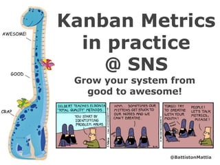
- 1. Grow your system from good to awesome! Kanban Metrics in practice @ SNSGOOD CRAP AWESOME! @BattistonMattia
- 2. About me ● from Verona, Italy ● software dev & continuous improvement ● Kanban “helper” ● ~1.5 year Sky Network Services Mattia Battiston @BattistonMattia mattia.battiston@gmail.com Ciao!
- 3. Why are we here? OUR EXPERIENCE WHY HOW IMPROVING LESSONS LEARNT FORECASTING
- 4. Kan...what? a little knowledge of Kanban helps (limiting WIP, lead time, value vs waste, queues, batches, etc.)
- 5. Why do we need metrics? #1: drive continuous improvement #2: forecast the future
- 6. But I thought metrics were bad.... Typical problems: gaming dysfunctions
- 7. Good vs Bad metrics ● look at improving the whole system ● reward/punish individuals “95% performance is attributable to the system, 5% to the people” W. Edwards Deming ● actionable -> help take decisions ● vanity -> make you feel better ● gaming leads to good ● gaming leads to bad ● in team’s influence ● can’t do anything about it ● feedback about state of reality ● used as target ● usually expressed as trends ● usually expressed as single numbers ● leading (let you change behaviour) ● lagging (tell you about the past)
- 8. Keep a systemic approach Avoid local optimizations - all metrics need to improve for the system to improve
- 10. How do we collect the data?
- 11. The Spreadsheet Inputs: story details; start time and duration of each state; # stories per state;
- 12. Metrics Characteristics ● Purpose: which fitness criteria does it help me with? delivery time, predictability, quality, continuous improvement ● Objective: what do we use this metric for? leading, retrospect, forecast ● Frequency/time frame: how often do we refresh and look at this metric? what time frame does it look at? daily (short term), iteration (long term)
- 13. All the maths you need ● Min, Max Normal: data is distributed around a central value e.g. height of UK population Skewed: data has a long tail on one side (positive or negative) e.g. income of UK population (positive skew) Lead time of stories follows skewed distribution ● Average (mean) avg(1,2,2,2,3,14) = (1+2+2+2+3+14)/6 = 4 ● Median: separates the high half from the low half. Less impacted by outliers median(1,2,2,2,3,14) = 2 ● Mode: value that occurs more frequently mode(1,2,2,2,3,14) = 2 ● Standard Deviation: measures the amount of dispersion from the average. When high, values are spread over a large range. stdev(1,2,2,2,3,14) = 4.5; stdev(1,2,2,2,3,5) =1.2; ● Percentile: percentage of elements that fall within a range 50% perc(1,2,2,3,7,8,14) = 3; 80% perc(1,2,2,3,7,8,14) = 7.8; ● Normal Distribution vs Skewed Distribution:
- 14. Cumulative Flow Diagram Description: Each day shows how many stories are in each state no.stories days
- 15. Cumulative Flow Diagram ● Objective: retrospect (but needs a good facilitator) CFD used for Retrospective ● Objective: demonstrate effectiveness of changes changed WIP limit in DEV to 2
- 16. Cumulative Flow Diagram ● Objective: decide what you should work on today ● Objective: forecasting: rough info about lead time, wip, delivery date (although they’re easier to use when tracked separately) WIP LEAD TIME
- 17. CFD Patterns (taken from CFD article by Pawel Brodzinski) growing lines: indicate large WIP + context switching. action: use WIP limits stairs: indicates large batches and timeboxes action: move towards flow (lower WIP, more releases, cross-functional people) flat lines: nothing’s moving on the board action: investigate blockers, focus on finishing, split in smaller stories single flat line: testing bottleneck action: investigate blockers, pair with testers, automate more typical timeboxed iterationdropping lines: items going back action: improve policies
- 19. Control Chart Description: For each story it shows how long it took. Displays Upper and Lower control limits; when a story falls out of limits something went wrong and you should talk about it. stories cycletime(days)
- 20. Cycle/Lead Time stats + History Description: Stats to get to know your cycle time and lead time. They let you predict “how long is the next story likely to take?”. Visualize trends of improvement
- 21. Lead Time distribution 50% 85% cycle time (days) no.storiesthattookthatlong Description: For each lead time bucket (#days), how many stories have taken that long. Useful to show as a percentage to know probability.
- 22. Story Health 50-80% >90%80-90%0-50% Description: Indicates if the story is in good health or if we should worry about it. Based on lead time distribution 0-6d 6-10d 10-14d 14+d
- 23. Cycle Time vs Release Prep. Time stories days Description: For each story shows how long it spent in the iteration and in release preparation (Context specific). Used to discuss cost vs value of release testing.
- 25. Iteration Throughput iteration no.storiescompleted Description: Number of stories that get done for each iteration
- 26. Daily Throughput day no.storiescompleted Description: Number of stories that get done daily. Should worry when nothing gets done for a while.
- 27. WIP iteration avgdailyWIP Description: For each iteration, the average daily WIP.
- 28. Little’s Law more visible here Description: Lead Time = WIP / Throughput Should demonstrate that when WIP decreases then Lead Time goes down and Throughput goes up.
- 29. Points vs Cycle Time cycletime(days) story points Description: Shows low correlation between estimated points and actual cycle time
- 30. Disney Stations Description: Like queueing at Disneyland. “How long in here? How long from here?”
- 31. Task Time Description: Shows how long tasks usually take (context specific). Gives you an idea of how long a story will take based on n. of tasks
- 33. Bugs percentage Description: Percentage of bugs over stories. Also expressed as “1 bug every X stories”
- 34. Bugs per iteration iteration no.bugs Description: Shows how many bugs were in a particular iteration
- 35. Bugs analysis Description: For each bug it shows at which stage it was found and what caused it. Used to demonstrate how seldom we find important problems in release testing (high cost, low value)
- 37. Flow Efficiency Description: Shows how long stories have spent in queues - nobody was working on them. Shows how much you could improve if you removed waiting time.
- 38. Time in status timespentinstate(days) story Description: for each story visualise how long it spent in each status (absolute and percentage). Shows trends of where stories spend more time
- 39. Stats per Status Description: control chart, cycle time distribution and stats for each status. Helps forecast how long stories are going to take; gives indications on where you should improve.
- 40. Retrospective
- 41. Resources Presentations ● Troy Magennis LKUK13 LKCE13 Agile 2014 ● David Anderson Kanban's 3 Agendas LKUK13 ● Hakan Forss The Red Brick Cancer Articles ● Cycle-time Analysis and Monte Carlo Simulation Results (Troy Magennis) ● The Seven Deadly Sins of Agile Measurement (Larry Maccherone) ● A Tool for tracking Kanban projects (Emily Webber) ● FocusedObjective@Github ● Lean Forecasting Tutorial by Troy Magennis ● Cumulative Flow Diagram (Pawel Brodzinski) Case Studies Siemens Health Services Sandvik IT Ericsson SAP Lean Kanban Case Studies series ● Dan Brown Flow Like Ketchup (LLKD14) ● Dimitar Bakardzhiev LKUK14 webinar ● Larry Maccherone LKUK14 ● Analyzing Lead Time Distribution Chart (Alexei Zheglov) ● Inside a Lead Time Distribution (Alexei Zheglov) ● Forecasting Your Oranges (Dan Brown) ● worldofchris@github (Chris Young) Books
- 42. Thank you! @BattistonMattia mattia.battiston@gmail.com really, really appreciated! Help me improve
Notas del editor
- thank you everyone for coming. I know thursday is a hard day, it’s almost the end of the week, you’d rather be at the pub...so I really appreciate that you’re here Can I ask: who here has an idea of what Kanban is? who here already knows what a CFD is? Great, you are in the right place!
- My name is Mattia, I’m from a small lovely town in Italy called Verona. You might know it as the city of Romeo and Juliet I’m a software developer and I’ve always been interested in continuous improvement and helping my team and company improve I work at Sky Network Services, we’re the department in Sky that deals with the Voice and Broadband. The way I explain it to my wife is “we make the internet work”. Oh btw we’re hiring I joined about 1 year ago and I soon started to help my team improve our process using Kanban and metrics. This then inspired other teams to follow us, so more recently I’ve been “helping” them (wouldn’t say coaching). There are 8 dev teams, about half of them are using or starting to using Kanban
- this presentation is a slightly modified version of one that I do internally for teams that want to learn about Kanban metrics I use it to share our experience about why we like using metrics, what metrics we use and how, and how we collect the data
- not mandatory, but it helps if you have an idea of what kanban is and its values (e.g. limiting WIP) if you need help on this consider going to the London Lean Kanban Day, last year it was great and I’m sure this year it’s going to be even better!
- Why do I even need metrics? what problem are we trying to solve? #1 - improve (hints on where you should improve, validate experiments); Kanban is all about continuous improvement -> start with what you do, and use data to improve basically you are constantly running experiments and validating them with your data #2 - forecast future, move away from estimates and use historical data to predict the future Forecasting is a big topic that deserves to be discussed on its own, for this presentation I’m focusing on #1 (but if you want to know more we can have a chat later, or look up Troy Magennis, Kanbandan, Dimitar Bakardzhiev
- the typical reaction when you start talking about metrics is “how about no, thanks” The argument is usually that metrics can be gamed and they will cause dysfunctions (you’ll destroy the system but the metrics will say you’re doing great) example: velocity; we have to complete 10 points in each iteration -> double the points for each story! So yes, we are stepping in a high risk area when we talk about metrics
- That’s why we distinguish between good and bad metrics: good metrics are about improving the system as a whole, rather than rewarding/punishing individuals. We recognize Deming’s rule about the performance of a system (95/5). They always work with a systemic approach, team metrics good metrics help you take decisions; they are not just vanity metrics that make you feel better (Eric Ries in “Lean Startup” talks about this) gaming leads to better behaviour can be influenced by the team behaviour (e.g. number of releases, when releasing it’s not your choice; you might still track it to use it as an argument, but you can’t do anything about it) absolutely not used as target! they are a feedback mechanism. Only for internal use, no exposure to management, PMs, etc. they are usually expressed as trends rather than single numbers; single numbers tends to become targets, trends instead can tell you a more generic “you are improving” they are leading to let you act on them, rather than lagging when you can’t do anything about it
- always look at all metrics, avoid optimizing just one; only when the system is improving as a whole then you’re improving when you optimise for just one you’re probably doing more harm to the system
- we use Jira but that has been setup with a very generic process to fit all teams; we’re pretty much a physical shop; we have physical boards to represent the real workflow and we either print cards or use post its this is the main board of my team, representing the main part of our process we represent our WIP limits with placeholders -> next = 3, dev = 2, test = 3; an empty placeholder is a pull signal we’ve got the next three stories to work on in next, then dev, functional testing (with “waiting” as a buffer), and waiting for a cut we like the term “waiting” to signal that they are queueing states of complete waste (and we represent them in red) our point of commitment is when a story enters Next, so that’s when our Lead Time starts CLICK for “Iteration based” apps, stories have to wait in “waiting for cut” until the end of the the even iteration (2-4 weeks). Then we do a cut of the application and it goes through release testing, then to production. the “on demand” apps we can do the cut as soon as we want, so we try to do it as soon as possible and release as soon as possible “direct” stories are small things that have to be done (emails, reports, etc.) and go straight to done we treat these three as 3 different work item types, based on either different workflow or different speed in the same workflow This is very important because for most metrics you want to differentiate between work item types. They will have different lead time and different demand In particular for “On demand” and “Direct” we calculate the lead time from Next to Done But for “Iteration-based” we only count the time from Next to Cut and call it “Iteration Cycle time”, as the rest of the time is fixed time
- collecting the data is really simple. We record transitions; we stamp the card each time it moves from one state to the next this piece of information is enough to get most of the metrics we use then we regularly put this information in a spreadsheet, where we record the work item type and the transitions. You might decide to track some extra pieces of information, e.g. for bugs we want to record the environment it was found in. It’s up to you btw there are formulas to only count working days you’re probably wondering why we don’t use a tool. for collecting the data: make sure you are recording reality (real workflow) and you can change the data (e.g. if you forget to update it) Jira is quite bad, can’t update the dates for displaying and analysing the data: Jira is rubbish. Other tools do something, but in my experience you still want access to the raw data and go crazy with a spreadsheet. You will want to reorganise data, rearrange, split it differently, play with it...tools don’t have enough flexibility to do data mining. If you use a tool, make sure you have access to the raw data
- Our spreadsheet: the only input is some details about the story, what state it’s in, and then for each state when it enters that state and how long it stayed in there Collect CFD data every day - it’s inferrable but it makes it easier All the rest is calculated or inferred (organized in various sheets) Our spreadsheet has grown in complexity over time because of many experiments, eventually I will redo it and publish it
- We categorize metrics by some characteristics that help us know how to use a particular metrics: purpose, which fitness criteria does it help me with? objective, what do I use this metric for? Leading: to take decisions on what I should do today; Retrospect: to use in retrospectives, look at the past and decide what we should change to improve; Forecast: to predict the future frequency + time frame: how often should I refresh and look at this metric? If it’s daily, it’s probably about the short term past (e.g. the current iteration or the last 2); if it’s every iteration it probably is about long term past, so looks at the past 6 months
- I left this slide in but I’ll skip it, you can read it later if you want; the math involved is really easy, and all the formulas are already in excel
- Probably the most famous Kanban chart for each day it shows how many stories are in each state
- can be used in retrospectives and root cause analysis to look at history (but needs good facilitator)
- can be used as leading, but it might be just easier to look at the board keep queueing states as thin as possible don’t let any state grow too much alert when you don’t see flow (when chart is not going steadily up)
- one of the most famous (with CFD); usually done with dots, but it was easier to use columns (because of non-numeric data) Objective: retrospect: talk about stories that took longer or shorter than expected, and improve your process or policies; as you improve you should see trends of improvement leading: see stories approaching the limit and decide if you want to act on it Tips & Traps: use percentiles instead of std. deviation for the limits (std. dev only if you have a normal distribution) hard to talk about problems all the time (too busy to improve)
- we calculate some stats about our cycle time (or lead time). Objective: forecasting. Lets you answer questions like “how long do stories usually take? what are the chances that the next story is going to take longer than 10 days?” Tips and traps: distinguish between “all time” and “last X months”. I usually look at the last 5 or 6 months (the process is constantly improving, older data is not representative aymore) shows trends of improvements, but doesn’t really tell you why
- on x-axis you’ve got days, on y the number of stories that took that long. You should find a skewed distribution. You can draw the curve that interpolates the data - it’s called Weibull distribution Get the probability of each bucket, and if you sum them you can find that 50% of stories take 6 days or less, 85% of stories take 10 days or less So next time you ask “how long will the next story take?” you can decide how certain you want to be and pick a number. “how long will the next story take with a 80% confidence?” If I want a story to be done by a particular date, I know it needs to be in Next at least 10 days before the fixed date to have 83% confidence Objective: forecasting (on a story level, but this is the data you’d use to do a montecarlo simulation) Tips & Traps: long tail is symptom of high standard deviation (high variability) multiple peaks are often hiding multiple work item types from the shape of the weibull you can draw some conclusions
- concept of Health of a story, based on how long the story has been in progress for based on the lead time distribution I know that 50% stories take up to 6 days, so I consider that green. After 6 days it becomes yellow, we start worrying about it. And then red and black. Objective: leading. what should I work on today? It’s a way to escalate problems and raise alarms Tips and traps: remember to do it per work item type (can’t expect different work items to take the same amount of time)
- this is quite specific to our context for those stories that are iteration-based we show how long they wait in “release preparation” You can see that release testing takes up most of the time. That’s the effect of having a big batch, with all the dysfunctions that come from it. We put this together with the low value that we get from it, which is number of bugs found, to decide that it would have been crazy for new projects to follow the same approach That’s why for new applications we moved to a flow approach context specific, but it’s an example of how you can use data to drive your argument
- throughput: how many stories are done in a particular amount of time? we use the iteration as cadence, so “how many stories are done in two weeks?” Objective: how many stories should I plan in next iteration? are we going faster? Traps: If you split by work item type you might have iterations where you did nothing of that particular work item type; so the average is kind of weird depending on what project we’re working on, if it only involves iteration-based applications I would look at one throughput or another
- purpose: predictability Objective: should worry when nothing gets done for a while Tips & Traps: easier to look at the board to see if anything is reaching done
- average daily WIP Objective: forecasting. how much WIP do we usually have? Ideally to apply Little’s Law Problems: shall I count or not the amount of stories in release testing?
- problems with demonstrating little’s law Traps: because of the strange mix of work item types in our system it’s been very difficult to demonstrate Little’s law (don’t know if it’s meant to work)
- this is a controversial one, people tend to have strong feelings for or against story points for stories of 1 points, they took from 2 to 10 days; stories of 2 points took 2 to 20 days; etc. very low correlation between story points and actual lead time this worked as a shock factor and we decided to stop wasting time with planning poker, or fingers in the air Now we do story breakdown and use historical data (e.g. lead time distribution) to forecast how long they’ll take
- like at disneyland “how long do I wait from here?” we use 50th and 80th percentile to show how long stories will take from here, and how long they’re going to spend in here Tips and Traps: remember, it’s only valid on a “per-work item” basis (can’t mix) useful to take decisions in the middle of the iterations
- another context specific metrics. When stories are in next we create a list of tasks for the story to agree on the scope and the acceptance criterias we monitored how long tasks take for a while, and now we can predict quite accurately how long a story is going to take based on the n. of tasks highly accurate for dev time (+ creating tasks makes scope clearer) Objective: forecast: how long is a story going to take, based on n. of tasks? leading: how much is left to do on this story? should we swarm? or should I rather start another story? Tips & Traps: high correlation between dev and n. tasks very low correlation between test and n. tasks (makes sense) also helps with defining scope of stories
- one simple way of keeping track of quality: count number of bugs; we express it as “n. of bugs per stories” so that we can keep them into account when we plan in future
- show how many bugs are in a particular iteration Tips & Traps: not so useful if you don’t have a quality problem
- example of data mining to drive changes for each bug it shows where we found it and the impact. We used it to check that we very rarely find problems during release testing, therefore we shouldn’t invest so much time in it Objective: use data to validate arguments. Decisions should make economic sense Traps: be careful when you do something like this because people might feel blamed
- one of the best incarnation of lean mindset. Shows how long stories have spent in queue states, therefore no one was actively working on them (pure waste in lean) It’s a demonstration of deming’s rule - just by removing wait time we could improve our performance of 50% How do you reduce wait time? probably reduce WIP, have true cross-functional people, attack sources of variability Tips: represent queue states on your board by using red labels
- shows where stories spend most of the time; interesting to compare it with what the team perceives are the states that take longer. Clearly shows that development is only a small fraction of time; is this our intended process, or are we here just by chance? does this reflect the importance of each state? e.g. if we think development is the main state, are we happy with it being just a small fraction? lots of potential but hard to use for the risk of people feeling blamed
- also analysed each single status; helps to analyse how long stories are going to spend in each status objective: great for simple forecasting on the next story; can be useful for montecarlo simulations but only if you’re using advanced forecasts (split by state rather than by lead time or throughput) retrospective: what are the slowest parts of our process? where do we have waste? Tips & Traps: need to be careful about avoiding local optimisations can use it to annotate your value stream mapping, and generate your Disney stations
- GOOD drive changes to process: tells you what you should improve on and gives you directions for what to change validate experiments and arguments: can see if a change is having the effect you wanted, or find good arguments for your point enable forecasting helps answer “what should I work on today” infinite learning possibilities, only your imagination is the limit google spreadsheet as tool worked very well WATCH OUT resist the temptation to automate everything, or even worse create a custom tool! You will keep changing charts, metrics, reorganize them, etc. Use intelligent automation, just to make manual steps easier. example: you could capture the CFD data automatically, but I still prefer to have a look and copy/past them when I’m happy they’re right don’t obsess over precision, you’re looking for trends rather than precision. Number won’t always 100% precise but it doesn’t matter only use the last period of time, for example the last 6 months. Data older than that might not be accurate anymore, or might not reflect your current process people still know it better: if you have a reason to think that reality is different from what a metric is saying, you’re probably right; it’s worth investigating, you’re probably on to learning something new! PROBLEMS it was hard to get the team on board, and I actually never succeeded. NIM team is particularly difficult, people tend to have strong opinions and you have to find the right moment when they’re willing to listen. This is true in general. Be prepared to do it yourself, don’t expect people to help you until they think it’s helping them. It still works, you can look at the metrics and decide what’s the next change you’ll introduce. Just make sure you’re never forcing anything on the team, that’s an instant fail it’s hard to make these metrics speak: what do they mean? how do I interpret a particular chart? how do I read this? It’s hard to make them user friendly enough. So again, you can still use them as a management tool to drive the changes you introduce, but you need to make then easier to use if you want people to look at them as soon as you have work item types with different process the complexity explodes; I don’t know how to fix this, you need to make your metrics even more user friendly difficult to make it visible; ideally these metrics should be printable as some kind of dashboard, so before standup and after every iteration someone refreshes them and prints them. But I never managed to do it as soon as you open the spreadsheet you get an information overload that often scares people. Again, need to improve the usability. Add instructions, help, etc. should organise the metrics better, probably by their usage (example: daily vs iteration, lead time vs predictability) write down when important changes or important events happen, so that when you’re looking at the past you know “that’s when we changed the WIP limit in dev, have we improved?” it doesn’t matter what the numbers are saying, you’ll never be able to convince people with just numbers. You need to translate that to a feeling, make them feel a problem and then they’ll listen. example: it doesn’t matter that all metrics are telling you that you have too much WIP, people will be scared of WIP limits no matter what