
Recomendados
Más contenido relacionado
La actualidad más candente
La actualidad más candente (17)
Destacado
Similar a Music magazine's (analysis)
Similar a Music magazine's (analysis) (20)
Último
Último (20)
Music magazine's (analysis)
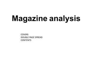
- 1. Magazine analysis COVERS DOUBLE PAGE SPREAD CONTENTS
- 2. The masthead is placed in the top left I-D have used a corner. Which is normally where you stripped back and quite Spin magazine uses the classic black, simple cover. I like the find the masthead, either in the top red and white colour scheme that is well suited colours, corner or across the whole top of the effective for rock/pop music compared to other magazine. However the title of the magazines. magazines that use magazine is only two letters, therefore These cover lines are also no need to stretch it across. contrasting colours. known as ‘lures’ or plugs’ that advertise what is inside the magazine. How many cover lines are used is completely up to the magazine. I like the domineering pose of the model/artist Paramore. The strong and dramatic The pose pose of the model would reflects the really make this cover stand theme of out from the rest. the music. The main cover line acts as the main selling point for the magazin e. Strap lines are normally displayed in a The barcode is placed at the smaller text. They too could be a method of bottom right hand corner of the enticing the reader, with famous bands, free page to simply make it easier to downloads or exclusive information about purchase. what could be inside the magazine.
- 3. ‘The song is mine’ The brightness of Lady gaga’s hair on the cover of this issue matches with the bright colours in the lettering. The stylists have also used a slightly darker lip colour to highlight her suggestive open mouth expression. The main image is Lady Gaga. Takes up the There is a simplicity about the masthead majority of the cover and (being black and not as bold as some her brightly coloured hair other magazines). However the bright contrasts with the grey colours inside the letters give it a slight backdrop but suits the edge. The colours also contrast from the colours in the masthead. black and white scheme. The plus symbol links the cover lines. This plus symbol is not used in every magazine, it’s a One of the cover choice. lines is giving us The barcode is exclusive placed on the information bottom left hand ‘how she writes corner of the her pop hits’. magazine for the This reason that it is exclusiveness easier to purchase. entices the reader and fans of Lady Gaga. Consciously exposing her chest area, playing up to the male gaze and the idea that she is dressed in a dark blazer that has been tweaked to her individual style.
- 4. The masthead is stretched across both The two tone colour pallet highlights pages. I like how the orange fades out to important information e.g names white to break down the title and links to and bands that are going to be the ‘best of both world’ by having two features in the text below. different colours. Alex Turner facing away Minimalisti could have c DSP with been a a short conscious introductio decision to n and the show a article. The slight text isn’t conflict between really the two. broken The down. placement on the page also shows The them at smudged two hand print different on the wall ends. Again gives a this could ghostly show a divide theme . between them or simply to add to the The black and white image gives ides of two the double page spread a vintage Buy lines: introducing the worlds. look and is a nice background for photographer and writer of the the white text. article.
- 5. The image of the band fills the upper half of the page drawing the reader into the image first, and then the text. This double page NME magazine: Artic Monkeys spread is different to those magazines that use the image to fill the Black and white vintage Fans of the band like to see pictures of the whole page and drop the text on top of the image. NME was style image of the band band backstage at gigs and signings. Show originally a newspaper. Here they have stuck to that theme by contrasts to the playful more personality rather than just having the having the text and image separate. photo’s opposite in professional shot for the double page spread. colour. Drop capitals used to show where the text is beginning Quote from one of the band members that NME have claimed 5*. This larger font This banner shows a short Q&A of casual questions. It breaks the stands out and gives the reader a glimpse Text arranged in four columns text down and doesn’t overwhelm the reader. Also the reader of what the text is all about. using a small font. can pick out specific things they want to find out/read.
- 6. DSP Analysis: Taken from Q magazine. (Friendly fires) By having this page without any writing on it Minimalistic page with could be used for multiple reasons, one being a hardly any text. Could The photo seems to be the main focus point of this double page poster for fans. It also shortend’s the amount of continue on to the next spread and the image almost speaks for itself. reading and doesn’t overwhelm the reader. page. Play’s up to the idea of ‘friendly fire’ and criminals. Making the magazine more interesting to look at. The upside-down suspect boards and masks add a humour to the text/image . The lead uses drop capitals to show where Cover line introduces the artist and text. the text is beginning. Grabs the readers attention and draws them Gives the band a Quirky look . in to a specific text/band.
- 7. Contents page taken from NME magazine. Page numbers are clearly bold and visible A bold headline style so reader’s can flick to title is used to simply a certain page/article assure the readers they have reached the that interests them . contents page and can see what is ‘inside’ the The date on the magazine ‘this week’. contents page can be used for readers to keep The layout of the left a record of the hand side of the page is made up of images issue . from live gigs with It’s interesting to note that quotes from the artists . it’s predominantly men on this contents page with ‘Smashing boundaries only one female artist. right now’ using emotive language to draw the reader in and ‘The perfect christmas gift’ will create a sense be subscribing to NME. The ‘breaking news’ small red box filled with celebrity faces with Santa hats on, stands out from the rest of the page but also matches the colours scheme of NME. Being black, white and red. The text layout is broken up into small paragraphs/quote s. This layout doesn’t overwhelm the reader with a block of text.
- 8. Stamp symbol showing the issue number. This Contents page: Taken from Q. issue is number 306 showing readers it has been in business for a long time and well Black, red and recognized. Regular white colour readers can also refer scheme, iconic to back to the magazine . NME and Q It’s a by the issue number. bold statement rock and roll style, however this style is common with many other music magazines, therefore it might The large image of the main not stand out. feature in the issue of the magazine attracts the fans of ‘The best thing I’ve the artist. The red of her hair heard all year’ this fits in nicely with the colour emotive language scheme. draws the reader in and they want to find out more and read on. Smaller images are Features listed to used to break up the the left side of the text and also show page, easy to find who is featuring in and readers can pick the magazine. You’ll out specific pages find Q’s logo in the they’re interested corner of every in. Simplistic layout page. This is a yet effective. The contents of conscious decision a magazine is and adds to Q’s normally found colour scheme and 3 or three pages style. in, after advertisements.
- 9. The top strap line tells readers that the magazine is also available in Mojo is using green tones The ‘mojo’ masthead other countries. in this issue’s contents. is relatively simple The light and dark greens and bold. Mojo has are fairly neutral and set used stylish circular the tone of the magazine. leters, possibly to resemble the shape of a CD. A high angled shot is used to The page number’s are also create the contents image. green. Fitting with the colour This makes the subject look scheme the magazine have small and unimportant. chosen. Mojo’s page number’s However his domineering do not stand out as much as Q’s facial stare straight into the and almost fade into the camera insinuates a danger. background. Cover lines are bold and black to make sure the bands in the magazine can be recognised and the reader can flick The layout is through to their minimalistic favourite. A smaller text with the text is used underneath to commonly explain a little about why down the left the band are in the hand side of magazine and what the the contents article will be about. page fitted The red suit contrasts to the green tones and stands out. The around the model/artist would be lost if he image on the was to wear neutral colours, left. therefor the red works well and again is suggestive of romance or danger.