
Recomendados
Más contenido relacionado
La actualidad más candente
La actualidad más candente (18)
Destacado
Destacado (20)
Similar a Draft 1
Similar a Draft 1 (20)
Último
Último (20)
Draft 1
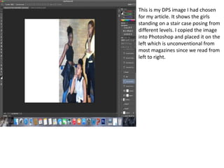
- 1. This is my DPS image I had chosen for my article. It shows the girls standing on a stair case posing from different levels. I copied the image into Photoshop and placed it on the left which is unconventional from most magazines since we read from left to right.
- 2. Effects After inserting my image I decided to start adding effects to it to make it look more edgy. I then clicked on the image and start experimenting with brightness, contrast, saturation and exposure. My first attempt was this, this made the image significantly brighter and more clearer. However I felt that the image still looked a bit plain and needed a dark colour effect to make it look more r&b. I then decided to add some saturation too add this colour I wanted and came up with this dark red which made the picture stand out more and made it look ‘edgy and cool’.
- 3. After many attempts, I was satisfied of how my main image turned out and decided now to focus on the layout of my headline and stand first. The name of the girl group were called ‘DMC’ so I decided to incorporate it in my headline. I chose the font Stencil STD as it really made the name standout and look unique.
- 4. ‘Seconds time’s a charm’ is my headline for the article, the inspiration for this was through the backstory for the girl group, they was famous before and this is their second shot at fame once again so that’s the reason why I chose it. Originally I had placed the headline there under the name of the group but I decided to spread it across the two pages so that I could focus the rest of the space for the stand first and DPS story. I chose the colour burgundy as I wanted it to stand out but still looked sophisticated and this colour best represented that.
- 5. Stand first I was then to add, I kept the font small but bold so it was noticeable. I kept it black so that my DPS story could be a burgundy colour, also I wanted to keep it black as my main colours for the dps was black, white and burgundy
- 6. DPS I had previously written my story before constructing my magazine so all I did was create a text box going downwards and copy and pasted my dps into sections so I could see how it looked overall, I had already changed the font colour prior to pasting it in Photoshop. However as you can see I left blank spaces, this where I would insert my quotes from my the artists themselves.
- 7. After finishing off my dps, I then added the quotes.
- 8. FIRST DRAFT