![Click here to add a title ,[object Object]](data:image/gif;base64,R0lGODlhAQABAIAAAAAAAP///yH5BAEAAAAALAAAAAABAAEAAAIBRAA7)
Recomendados
Más contenido relacionado
Último
Último (20)
Destacado
Destacado (20)
Notas del editor
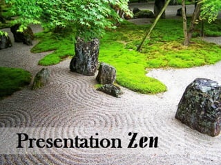
- Written by Garr Reynolds Explains the principals of presentation and design and how they should work together in harmony, but it goes further to expand on the bare bones principals into a little something called creativity. Powerpoint, while often a necessary evil, can choke creativity right out of a person.
- The problem is the convenience of powerpoint often results in such gross limitation of inspiration. Add a title, some text, throw in some clipart and possibly a background, and you’ve got a slide!
- And if you want to get really fancy you can apply a theme. But this is so boring, so bland and we’ve all been tortured by so much of it. A few changes, and you can burst out of the box.
- ...and create something people will remember. The author states that strong images make messages more memorable, and I totally agree. This slide is much more likely to root itself in my brain than the last one. And the next one:
- This is uncreative and just shabby looking. A tacky theme with wretched fonts and a disgusting clipart image... at first I felt a little sick making this slide, but it turned out to be kind of fun to see how horrible it could be and this slide could not get much worse.
- Makes the next one look pretty sleek. And now you are listening to me and not reading my bullet points, and so I can *tell* you that if you don’t plant trees, your children will be born with tails.
- The point is you can tell your audience something without spelling it out And putting a bunch of flashy pictures up doesn’t generally help either.
- White space is not to be feared. It can be very powerful. The author continues the lesson into several other aspects of design and uses of images. This image demonstrates good repetition in the glasses. It doesn’t have to mean your logo and slogan has to be glued to every slide.
- Reynolds also talks about drawing the eye toward the text.
- Making images point the right way is essential.
- That’s not happening here. The alignment is clearly off. The visual flows better when images line up well
- Again, the shoes draw focus directly to the text. This also demonstrates good contrast with such a notable difference between the bright sneakers and text against the grayscale background.
- Reynolds also talks about using images to display quotes. And so of course this...
- easily trumps this.
- One more thing Reynolds mentions is using before and afters to demonstrate change, which I really like.
- When you are making a sale, giving a speech, or doing any kind of presentation, what you are portraying is yourself. So present you with style.