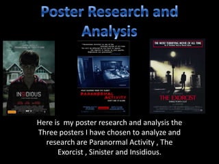
1. Here is my poster research and analysis the
Three posters I have chosen to analyze and
research are Paranormal Activity , The
Exorcist , Sinister and Insidious.
2. Paranormal Activity Poster
Direct Address: Above the title there is another
featured direct address this is because the
personal pro noun on ‘you’ has been used. This
is effective and adds to the fear factor and will
really draw in people that like horror films as if
someone looks at it , it seems like it is directly
talking to them.
Main feature image: I feel that the main image of this
poster is really effective because it is only covers up
the middle block of the poster and is unique because
not many modern posters are represented like this.
The image used is really effective because it gives a
hint of what the films going to be like and what its
about as the image used is a cctv still and it shows the
two characters and from this you can realize that they
may be the main characters . The characters look
distressed and this is effective because it will make
the audience want to know what they are scared of so
will gather the film a larger watching audience.
Text: The font used for the text is a basic sans
they are also called icons. I feel that these icons
have been used and designed in a specific way to
show that the film is a horror. The color of the
title suggests that it could signal danger , blood
and pain. The title also matches the static digital
look which also relates to the films style and story
line. I feel that the font used gives a sharp look
and is very effective because it gives us as the
audience a cold feeling. The title also looks as
though it has been smudged this relates to the
cctv still of the main feature image.
Film Companies: The film companies that are
involved with making the film are featured at the
bottom of the poster. These company logo’s could
draw in a larger audience because if someone see’s
the logo of a film company that they really like
because of previous films they like , this may make
them go see this film.
Review: The review at the top of the
poster adds a fear factor and is effective
because would make horror film lovers
want to go and see it.
Lighting: The use of lighting in this
poster is the very stereotypical
horror genre colors probably so
that it appears to be scarier. The
low key lighting makes the room in
the picture look really dark and
scary. The use of lighting is really
effective because there is also a
shadow of a figure on the door
which the actors are pointing at in
distress, the lighting means that no
one can work out what the
shadow is. The use of this could
suggest that the film is jumpy and
mysterious. The whole lighting of
the poster is dark and sinister
looking which is really effective.
Layout: The poster is created in blocks as the main image does not
cover the whole poster. The use of the quote at the top is also
uncommon to see on modern posters. This layout of the poster
creates mystery for the audience. The layout of the whole poster
overall does look like the poster is unprofessional and hasten been
produced by a professional company and didn't’t take very long to
make because it is not very organized.
Direct Address: On this Poster there is no direct address this is
because the couple who are in the Image are not looking directly at the
camera. This suggests to the audience that they are looking at the
Couple through a cctv still Image because of the angle Of the shot. This
hints to the audience that the film may be about some thing to do with
cctv footage.
Color Scheme: The poster has a simplistic color
scheme which includes the colors black , white,
blue and red. All the colors are all dark and
gloomy and do all represent the horror genre.
The red and black could maybe signalize danger
or death. The use of the black back ground and
because the whole poster and main image is
really dark it could suggest that the film is
mainly set at night. This adds to the fear factor
because you just think you don’t know what
can happen to you when your in the dark.
Layout: The layout at the
bottom of the poster is that
everything has been formatted
in straight lines. This is really
effective because it does stop
the poster from looking too
overcrowded and messy.
3. The Exorcist poster
The color scheme that is used over
the whole poster is very dark and
gloomy. The white and red text on
the black back ground looks really
effective because they are
contrasting colors . This makes you
read it because they stand out to
you.
I feel that the use of the white bright light shining
shows that something is going on in the room where it
is coming from. The light is also shining on the man so
this could highlight how he is a main character and is
important within the film. The setting of the main
image comes across as really creepy and scary and
shows that the setting of the film is scary. It also
makes the audience wonder who the mysterious man
is and what is going to happen to him and what's
happening because of the shining in the house.
The name of the actors on the poster that
are involved in the film . This is effective
because it has been placed at the bottom of
the poster so they see the main image first
also at the bottom of the poster there are
shadows and it could symbolize evil.
This shows that the film is a remake of a original film and if
the viewers have seen the first one they will want to see the
remake. The text that reads ‘version you have never seen’
suggests to the audience that this film has been dramatically
improved and is defiantly worth seeing
The name which features above the main title shows
how the film was once a novel or a original film , so the
audience may already know the story and this will make
them want to go and see it. The title is in a simple and
basic font but is really effective as it is bold and really
stands out to the audience. The use of the color of the
text which is really effective is red , this could represent
a hint of danger or blood so matches and fits in with the
horror genre of the film.
The company logo is situated at the bottom of the
poster. This is effective because it shows the
official information and shows the audience who
sees it which film company owns it and the
audience may of seen a previous film they have
made and really liked it so it may persuade them to
go and see it. This is also good because it does not
distract the audience from the main image.
4. Main Image: The posters main image
features a young boy which a medium shot
who we presume is the main character. In
the background of the image you can see
the house which I believe he lives in or has
something happen to him there. The main
image sets the scene and reveals that the
whole film may be set in that house.
Layout: The poster has a simple
layout as it is just one image with
the text on top of it. The
simplistic layout of the poster
makes it look really professional
because of the way all the
writing is in straight lines so it
doesn't look messy or over
crowded. The basic font and
colors also make the poster seem
really professional.
Text: The posters title is
really effective as it bold and
stands out when you look at
the poster. The font color is
light compared to the dark
background and lighting
within the poster. This is
effective because it creates a
contrast so that the text can
be seen from far away. The
date the film is relapsed is the
boldest piece of writing on
the poster as it is in white on
a black ground and is very
bold.
Insidious poster
Lighting: The lighting used on this poster is
all very dark and gloomy and really helps to
convey the sinister tone. The audience can
tell from the use of color that this film is not
going to be funny or happy, but from the
use of lighting it could be scary. The use of
the dark lighting also makes it harder for the
audience to see every detail of the poster so
it could make them want to go and see it
more to see what actually happens to the
boy and why everything is so dark because
the lighting makes the film seem very
mysterious.
Direct address: The poster uses really direct
address with the main character in the
centered staring straight into the camera. This
use of direct address along with all the other
elements of the poster like all the dark colors
create a much more sinister and I believe that
it can really create I sense of fear for the
person looking at the poster as it looks like
the boy is looking at them.
Color scheme: The color scheme of the overall
poster works really well. The main colors are all
dark and dull and helps to create a very sinister
tone to the poster. The sky can come across as
very dull and grey and the also the costume the
boy is wearing which is pajamas are also very
dark and dull. The boys skin tone has a sense of
death towards it as it is so dark and not the
normal flesh color his face is also expressionless
which could represent that he is lost somewhere
or something has taken over him. The only bright
colors within the poster is the white text and the
red text , this could really highlight to the
audience how sinister this film is.