A2 media evaluation
•Descargar como PPTX, PDF•
0 recomendaciones•109 vistas

evaluation question 1

Recomendados
Más contenido relacionado
La actualidad más candente
La actualidad más candente (20)
Destacado
Destacado (8)
Similar a A2 media evaluation
Similar a A2 media evaluation (20)
Último
Último (20)
A2 media evaluation
- 2. Upon making our short film, we faced numerous forms and conventions of pre-existing media. Our film is a psychological thriller, and I believe that we followed the conventions of a psychological thriller well. We included the themes of death, depression, mental illness and uncertainty to our film and believe that a fan of films such as the Butterfly Effect would also enjoy our short film. From the narrative, we had a firm idea of what we were going to include, for example powerful flashback scenes of when Sue is reminiscing about her daughter, Mazy. By using flashbacks, we were able to convey how happy Sue was whilst her daughter was still alive, and this clashes with how she is struggling without Mazy. The music that we chose to use in our short film for the most part is a background radio, making the film feel more homely, for the flashbacks and end scene we decided to add a dark, depressing piano solo and I believe for these scenes it works well. By using sad music in the parts that need them the most, we made the story more relatable for the audience. We also included a voiceover, the voice of Sue reads out in her head what she is writing in her diary during our flashback scene. We found a voiceover both necessary and effective here, and the audience now becomes more aware of how our main character is coping with her loss and illness.
- 3. We only used props in our film when they were needed, mainly the knife which Sue is seen clutching onto, and eventually finishes herself off with. The motorbike and helmet, iconic of how Mazy died. Sue’s diary, for which she uses to write down her memories and feelings, through this Sue’s character was given a greater depth which was shared with our audience. The diary is also seen being placed on her grave, another iconic scene. We used lighting effectively, admittedly only using natural light and not using any artificial lights, we were able to capture gloomy looking and bright, cheerful scenes when we needed them without much problem, only once were we forced to brighten up a scene via final cut pro. Going from suddenly dark to light scenes are usually represented within psychological thrillers. For locations(décor) we stuck to common, everyday settings, nothing out of the ordinary as this film is intended to be the everyday life of a woman… who just so happens to have issues. And so, we chose to set it in a house, mostly the kitchen area. We also use the outside of the house, a different house to shoot the mental hospital scene, and a real graveyard for the final scene. We were really lucky that the day we filmed the graveyard scene it was both dark and raining. This really added to the effect, you can also hear church bells ringing as main character Sue’s husband Steve walks away.
- 4. We made sure that the story actually sticks to the genre and narrative correctly, we always make sure Semi Detached gives the audience of a psychological thriller what they would be looking for. We ensure our storyline is compelling, we do not keep the camera fixated on the same thing for too long, and the film moves at a fast pace. We include 3 main interesting characters, all of which play a big role and have likeability about them. The audience can connect very well with the roles of Sue and Steve in particular. Our overall narrative leads up to something, and in the final act we are faced with a tragic scene to tie together the film. We also ensured the acting was at a quality standard, as was the music we used. We used a scenario which an audience familiar with this genre could relate to and enjoy. We use good camera work, sticking to using the tripod to ensure the footage is not shaky and always level.
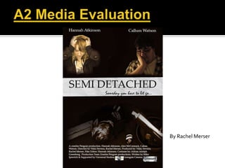
- 5. I stuck to a particular convention while making my movie poster, showing all 3 of the main characters, displaying them how they are portrayed in the film itself. I used a sepia toning, used to represent history (which we also use in our films flashback) and faded, dark areas. The middle of my poster where the main title is I put together a ripped piece of paper to break up the images, which represents the diary in the film. I placed the main actors names at the top, and production and directors names at the bottom, which is the convention for most film posters of this genre as shown below. I had already learned a lot about making an effective front page and double page spread from my first year making a music magazine and feel like I really put these skills into work, and improved upon them.
- 6. For my double page spread, I looked for inspiration from Total film magazine, and from doing research I discovered a common, yet effective convention is to use a large image on one page, and display everything else on the adjacent page. I have 2 columns of text, which isn’t the common convention but I also included an information tab about the film itself. This lists actors names, the rating, release date and more. I also included a small image onto the first page underneath the review. I edited the double page spread to look like an article out of Total Film magazine, using black, red and white as the colour scheme I arranged it neatly, I did my best not to include too many graphics, as this can distract from the article itself. I based my article loosely off a flat plan I made, and included 2 fake reviews from rotten tomatoes and empire magazine. I also added the Total Film logo at the top of the page. An example from Total Film which I based my double page spread on: My Double Page Spread: To make my double page spread look more professional I also included a powerful Pull Quote.