Variable control chart
•Descargar como PPTX, PDF•
51 recomendaciones•25,990 vistas

Variable Contol Chart Short Presentation

Recomendados
Más contenido relacionado
La actualidad más candente
La actualidad más candente (20)
Similar a Variable control chart
Similar a Variable control chart (20)
Más de Jassfer Alina
Último
Último (20)
Variable control chart
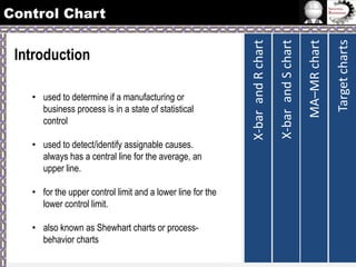
- 1. • used to detect/identify assignable causes. always has a central line for the average, an upper line. • for the upper control limit and a lower line for the lower control limit. • also known as Shewhart charts or processbehavior charts Target charts MA–MR chart • used to determine if a manufacturing or business process is in a state of statistical control X-bar and S chart Introduction X-bar and R chart Control Chart
- 2. • charts applied to data that follow a continuous distribution. • Are typically used used in pairs: • monitors process average • monitors the variation in the process • A quality characteristic that is measured on a numerical scale is called a variable. • dimension • length, width • weight • temperature • volume Target charts Variable Control Charts MA–MR chart • charts applied to data that follow a discrete distribution. X-bar and S chart Attributes Control Charts X-bar and R chart Control Chart
- 3. • Moving average–moving range chart (also called MA–MR chart) • Target charts (also called difference charts, deviation charts and nominal charts) • CUSUM (cumulative sum chart) • EWMA (exponentially weighted moving average chart) Target charts • X-bar and s chart MA–MR chart • X-bar and R chart (also called averages and range chart) X-bar and S chart Variable Control Charts X-bar and R chart Control Chart
- 4. • is advantageous in the following situations: • The sample size is relatively small (n ≤ 10) • The sample size is constant • Humans must perform the calculations for the chart Target charts MA–MR chart • is a type of control chart used to monitor variables data when samples are collected atis a type of control chart used to monitor variables data when samples are collected at regular intervals from a business or industrial process. X-bar and S chart X Bar and R Chart Variable Control Chart
- 5. R Chart • is a control chart that is used to monitor process variation when the variable of interest is a quantitative measure. • Range Chart Target charts • is used to monitor the average value, or mean, of a process over time. • Mean chart or average chart MA–MR chart X bar Charts X-bar and S chart X Bar and R Chart Variable Control Chart
- 6. • If the R chart indicates the sample variability is in statistical control, the X bar chart is examined to determine if the sample mean is also in statistical control. • If the sample variability is not in statistical control, then the entire process is judged to be not in statistical control regardless of what the X bar chart indicates. Target charts • The R chart is examined first before the X bar chart MA–MR chart Guidelines in X Bar and R Chart: X-bar and S chart X Bar and R Chart Variable Control Chart
- 7. Target charts Control chart is out of statistical control if: MA–MR chart Reading Control Charts X-bar and S chart X Bar and R Chart Variable Control Chart
- 8. R Chart Control Limits x Chart Control UCL = D 4 R UCL = x + A 2 R LCL = D 3 R LCL = x - A 2 R Limits Target charts • in order to construct x bar and R charts, we must first find the upper- and lower-control limits: MA–MR chart The Chart Construction Process X-bar and S chart X Bar and R Chart Variable Control Chart
- 9. X Bar and R Chart Constants for X-bar and R charts Target charts MA–MR chart X-bar and S chart Variable Control Chart
- 10. 2. Find the range of each subgroup R(i) where R(i)=biggest value - smallest value for each subgroup i. 3. Find the centerline for the R chart, denoted by RBAR=summation of R(i)/ k 4. Find the UCL and LCL 5. Plot the subgroup data and determine if the process is in statistical control. Target charts 1. Select k successive subgroups where k is at least 20, in which there are n measurements in each subgroup. Typically n is between 1 and 9. 3, 4, or 5 measurements per subgroup is quite common. MA–MR chart Steps in Constructing an R chart X-bar and S chart X Bar and R Chart Variable Control Chart
- 11. Observation (xi) Average 1 11.90 11.92 12.09 11.91 12.01 2 12.03 12.03 11.92 11.97 12.07 3 11.92 12.02 11.93 12.01 12.07 4 11.96 12.06 12.00 11.91 11.98 5 11.95 12.10 12.03 12.07 12.00 6 11.99 11.98 11.94 12.06 12.06 7 12.00 12.04 11.92 12.00 12.07 8 12.02 12.06 11.94 12.07 12.00 9 12.01 12.06 11.94 11.91 11.94 10 11.92 12.05 11.92 12.09 12.07 Range (R) Target charts Sample SPC for bottle filling: MA–MR chart EXAMPLE: X-bar and S chart X Bar and R Chart Variable Control Chart
- 12. Observation (xi) Average Range (R) 1 11.90 11.92 12.09 11.91 12.01 11.97 2 12.03 12.03 11.92 11.97 12.07 12.00 3 11.92 12.02 11.93 12.01 12.07 11.99 4 11.96 12.06 12.00 11.91 11.98 11.98 5 11.95 12.10 12.03 12.07 12.00 12.03 0.15 6 11.99 11.98 11.94 12.06 12.06 12.01 0.12 7 12.00 12.04 11.92 12.00 12.07 12.01 0.15 8 12.02 12.06 11.94 12.07 12.00 12.02 0.13 9 12.01 12.06 11.94 11.91 11.94 11.97 0.15 10 11.92 12.05 11.92 12.09 12.07 12.01 0.17 R 0 . 15 0.19 0.15 0.15 0.15 Target charts Sample MA–MR chart Calculating the subgroup ranges and mean of ranges X-bar and S chart X Bar and R Chart Variable Control Chart
- 13. ( 2 . 11 )( 0 . 15 ) LCL = D 3 R ( 0 )( 0 . 15 ) 0 0.32 Target charts UCL = D 4 R MA–MR chart Calculating the UCL and LCL X-bar and S chart X Bar and R Chart Variable Control Chart
- 14. X Bar and R Chart R-CHART UCL = 0.32 R = 0.15 LCL = 0.00 Target charts MA–MR chart X-bar and S chart Variable Control Chart
- 15. Target charts 1.Find the mean of each subgroup and the grand mean of all subgroups. 2. Find the UCL and LCL 3. Plot the LCL, UCL, centerline, and subgroup means 4. Interpret the data using the following guidelines to determine if the process is in control: MA–MR chart Steps in Constructing the X Bar Chart X-bar and S chart X Bar and R Chart Variable Control Chart
- 16. Average Range (R) 0.19 1 11.90 11.92 12.09 11.91 12.01 11.97 2 12.03 12.03 11.92 11.97 12.07 12.00 3 11.92 12.02 11.93 12.01 12.07 11.99 4 11.96 12.06 12.00 11.91 11.98 11.98 5 11.95 12.10 12.03 12.07 12.00 12.03 0.15 6 11.99 11.98 11.94 12.06 12.06 12.01 0.12 7 12.00 12.04 11.92 12.00 12.07 12.01 0.15 8 12.02 12.06 11.94 12.07 12.00 12.02 0.13 9 12.01 12.06 11.94 11.91 11.94 11.97 0.15 10 11.92 12.05 11.92 12.09 12.07 12.01 0.17 X 12 . 00 Target charts i MA–MR chart Calculating the sample means and the grand mean Sample Observation (x ) X-bar and S chart X Bar and R Chart Variable Control Chart 0.15 0.15 0.15
- 17. LCL = x - A 2 R 12 0 .58 ( 0 .15 )= 12 . 09 12 - 0 .58 ( 0 .15 )= 11 . 91 Target charts UCL = x + A 2 R MA–MR chart Calculating the UCL and LCL X-bar and S chart X Bar and R Chart Variable Control Chart
- 18. X = 12.00 LCL = 11.90 Target charts UCL = 12.10 MA–MR chart X BAR CHART X-bar and S chart X Bar and R Chart Variable Control Chart
- 19. 1. The sample size n is moderately large, n > 10 or 12 2. The sample size n is variable The Construction of X-bar and S Chart Setting up and operating control charts for Xbar and S requires about the same sequence of step as those for the X-bar and R charts, except that for each sample we must calculate the average X-bar and sample standard deviation S. Target charts X-bar and S Chart MA–MR chart X-bar and S chart X Bar and R Chart Variable Control Chart
- 20. si Variance ( xi n x) 1 2 Target charts Standard Deviation MA–MR chart X-bar and S chart X Bar and R Chart Variable Control Chart
- 21. Formula 2 Formula 1 X-bar and S chart X Bar and R Chart For σ not given For σ given Target charts MA–MR chart Variable Control Chart
- 22. Piston for automotive engine are produced by a forging process. We wish to establish statistical control of inside diameter of the ring manufactured by this process using X-bar and S charts. Twenty-five (25) samples, each of size five (5), have been taken when we think the process is in control. The inside diameter measurement data from these samples are shown in table. TABLE Target charts Example MA–MR chart X-bar and S chart X Bar and R Chart Variable Control Chart
- 23. UCL = x + B 4 S 74 . 001 LCL = x - B 3 S 1 . 435 ( 0 .0094 )= 74 . 014 74 . 001 - 0 . 565 ( 0 .0094 )= 73 . 996 Calculating the UCL and LCL (S Chart) UCL = B LCL = B ANSWER-1 4 3 S S 1 . 435 ( 0 .0094 )= 0 . 0135 0 . 565 ( 0 .0094 )= 0 . 0053 ANSWER-2 Table of Constant Target charts Calculating the UCL and LCL (X bar Chart) MA–MR chart X-bar and S chart X Bar and R Chart Variable Control Chart
- 24. MA-MR charts • In situations where data are collected slowly over a period of time, or where data are expensive to collect, moving average charts are beneficial. • Moving Average / Range Charts are a set of control charts for variables data (data that is both quantitative and continuous in measurement, such as a measured dimension or time). The Moving Average chart monitors the process location over time, based on the average of the current subgroup and one or more prior subgroups. The Moving Range chart monitors the variation between the subgroups over time. Target charts MA–MR chart X-bar and S chart X Bar and R Chart Variable Control Chart
- 25. MA–MR chart X-bar and S chart X Bar and R Chart Image for MA- MR chart Target charts Variable Control Chart
- 26. Moving range (MR) • n= number of measuremens in moving average • MR= l current measurement – previous measurement I • R = total of MRs/ total numbers of MRs • X = total of measurements/ total numbers of measurements Target charts MA–MR chart X-bar and S chart X Bar and R Chart Variable Control Chart
- 27. Formula MR UCL= 3.267 x R LCL= 0 Formula MA Target charts MA–MR chart X-bar and S chart X Bar and R Chart Variable Control Chart
- 28. Target charts MA–MR chart X-bar and S chart X Bar and R Chart Variable Control Chart Example where; n=2 Observations (X) 1) 2) 3) 4) 5) 6) 7) 8) 9) 100 101.7 104.5 105.2 99.6 101.4 94.5 1010.6 99.1 10) 11) 12) 13) 14) 15) 16) 17) 18) 96.5 105.2 95.1 93.2 93.6 103.3 100.1 98.3 98.5 19) 100.9 20) 98.6 21) 105.9
- 29. Measurement (X) 100 101.7 104.5 105.2 99.6 101.4 94.5 101.6 99.1 96.5 105.2 95.1 93.2 93.6 103.3 100.1 98.3 98.5 100.9 98.6 105.9 mA 100 101.7 104.5 105.2 99.6 101.4 94.5 101.6 99.1 96.5 105.2 95.1 93.2 93.6 103.3 100.1 98.3 98.5 100.9 98.6 mR - 100.9 103.1 104.9 102.4 100.5 98 98.1 101.6 97.8 100.9 100.2 93.4 98.5 101.7 99.2 98.4 99.7 99.7 99.8 102.3 1.7 2.8 0.7 5.6 1.8 6.9 7.1 2.5 2.6 8.7 10.1 1.9 0.4 9.7 3.2 1.8 0.2 2.4 2.3 7.3 Target charts Table MA–MR chart X-bar and S chart X Bar and R Chart Variable Control Chart
- 30. UCL= 3.267 x R LCL= 0 = 3.267 X 3.985 = 13.02 Target charts For mA n=2 R=79.7/20=3.985 X= 2096.8/21= 99.85 For MR For mR MA–MR chart X-bar and S chart X Bar and R Chart Variable Control Chart
- 31. Target charts MA–MR chart X-bar and S chart X Bar and R Chart Variable Control Chart Target Chart
- 32. Target charts MA–MR chart X-bar and S chart X Bar and R Chart Variable Control Chart Difference Chart • Is a type of Short Run SPC (Statistical Process Control)
- 33. Target charts MA–MR chart X-bar and S chart X Bar and R Chart Variable Control Chart Difference Chart • Red Line – Our production rate for the past 6 months. • Green Line - The competitor’s production rate for the past 6 months. • Shaded Region – Is the difference between the 2 production rate
- 34. Target charts MA–MR chart X-bar and S chart X Bar and R Chart Variable Control Chart Deviation Column Chart A 1 2 B C D E F Budget and Actual Revenues Budget Actual Dev Pos Dev Neg Dev 3 AB 1200 1250 4.2% 4.2% 0.0% 4 CD 1000 900 -10.0% 0.0% -10.0% 5 EF 900 950 5.6% 5.6% 0.0% 6 GH 1150 1100 -4.3% 0.0% -4.3%
- 35. Target charts MA–MR chart X-bar and S chart X Bar and R Chart Variable Control Chart Deviation Column Chart
- 36. Target charts MA–MR chart X-bar and S chart X Bar and R Chart Variable Control Chart • Computation Deviation = (Actual – Budget) / Budget
- 37. Target charts MA–MR chart X-bar and S chart X Bar and R Chart Variable Control Chart Short Run SPC Approaches • Nominal Short Run SPC • Target Short Run SPC
- 38. Target charts MA–MR chart X-bar and S chart X Bar and R Chart Variable Control Chart Short Run Nominal X Bar and R Chart • The nominal x bar and R chart is used to monitor the behavior of a process running different part numbers and still retain the ability to assess control. • This is done by coding the actual measured readings in a subgroup as a variation from a common reference point, in this case the nominal print specification.
- 39. Target charts MA–MR chart X-bar and S chart X Bar and R Chart Variable Control Chart Nominal and Target X Bar and R Chart
- 40. Target charts MA–MR chart X-bar and S chart X Bar and R Chart Variable Control Chart Historical Average or Nominal?
- 41. Target charts MA–MR chart X-bar and S chart X Bar and R Chart Variable Control Chart
- 42. Target charts MA–MR chart X-bar and S chart X Bar and R Chart Variable Control Chart Example Suppose the historical average based on 10 measurements taken from the last time a given part number was run is 20.4 and the sample standard deviation was 1.07. Determine if the nominal of 20.0 or the historical average of 20.4 should be used.
- 43. Target charts MA–MR chart X-bar and S chart X Bar and R Chart Variable Control Chart SOLUTION • Calculate the difference • Multiply the f1 value times the standard deviation • Compare the difference and the product
- 45. EWMA CONSTANT CUSUM charts show cumulative sums of subgroup or individual measurements from a target value. CUSUM charts can help you decide whether a process is in a state of statistical control by detecting small, sustained shifts in the process mean. CUSUM Cumulative Sum Chart Tab THANK YOU END
- 46. EWMA CONSTANT THANK YOU END • A visual procedure proposed by Barnard in 1959, known as the V-Mask, is sometimes used to determine whether a process is out of control. A VMask is an overlay shape in the form of a V on its side that is superimposed on the graph of the cumulative sums. CUSUM • CUSUM works as follows: Let us collect m samples, each of size n, and compute the mean of each sample. Then the cumulative sum (CUSUM) control chart is formed. In either case, as long as the process remains in control centered at , the CUSUM plot will show variation in a random pattern centered about zero. If the process mean shifts upward, the charted CUSUM points will eventually drift upwards, and vice versa if the process mean decreases.
- 47. CUSUM EWMA The origin point of the V-Mask (see diagram below) is placed on top of the latest cumulative sum point and past points are examined to see if any fall above or below the sides of the V. As long as all the previous points lie between the sides of the V, the process is in control. Otherwise (even if one point lies outside) the process is suspected of being out of control. CONSTANT THANK YOU END
- 48. THANK YOU END • We can design a V-Mask using h and k or we can use an alpha and beta design approach. For the latter approach we must specify. CONSTANT • Are each the average of samples of size 4 taken from a process that has an estimated mean of 325. Based on process data, the process standard deviation is 1.27 and therefore the sample means have a standard deviation of 1.27/(41/2) = 0.635. EWMA • An example will be used to illustrate the construction and application of a V-Mask. The 20 data points 324.925, 324.675, 324.725, 324.350, 325.350, 325.225, 324.125, 324.525, 325.225, 324.600, 324.625, 325.150, 328.325, 327.250, 327.825, 328.500, 326.675, 327.775, 326.875, 328.350 CUSUM • In practice, designing and manually constructing a V-Mask is a complicated procedure. A CUSUM spreadsheet style procedure will be shown below is more practical, unless you have statistical software that automates the V-Mask methodology. Before describing the spreadsheet approach, we will look briefly at an example of a VMask in graph form.
- 49. CUSUM In our example we choose α = 0.0027, and β= 0.01. Finally, we decide we want to quickly detect a shift as large as 1 sigma, which sets δ = 1. When the V-Mask is placed over the last data point, the mask clearly indicates an out of control situation. EWMA CONSTANT THANK YOU END
- 50. EWMA CONSTANT THANK YOU END We next move the V-Mask and back to the first point that indicated the process was out of control. This is point number 14, as shown below. Most users of CUSUM procedures prefer tabular charts over the V-Mask. The V-Mask is actually a carry-over of the precomputer era. The tabular method can be quickly implemented by standard spreadsheet software. To generate the tabular form we use the h and k parameters expressed in the original data units. CUSUM We next move the V-Mask and back to the first point that indicated the process was out of control. This is point number 14, as shown below.
- 51. Increase in mean Decrease in mean Shi 325-k-x Slo CUSUM 1 324.93 -0.07 -0.39 0.00 -0.24 0.00 -0.007 2 324.68 -0.32 -0.64 0.00 0.01 0.01 -0.40 3 324.73 -0.27 -0.59 0.00 -0.04 0.00 -0.67 4 324.35 -0.65 -0.97 0.00 0.33 0.33 -1.32 5 325.35 0.35 0.03 0.03 -0.67 0.00 -0.97 6 325.23 0.23 -0.09 0.00 -0.54 0.00 -0.75 7 324.13 -0.88 -1.19 0.00 0.56 0.56 -1.62 8 324.53 -0.48 -0.79 0.00 0.16 0.72 -2.10 9 325.23 0.23 -0.09 0.00 0.54 0.17 -1.87 10 324.60 -0.40 -0.72 0.00 0.08 0.25 -2.27 11 324.63 -0.38 -0.69 0.00 0.06 0.31 -2.65 12 325.15 0.15 -0.17 0.00 0.47 0.00 -2.50 13 328.33 3.32 3.01 3.01 -3.64 0.00 0.83 14 327.25 2.25 1.93 4.94* -0.57 0.00 3.08 15 327.83 2.82 2.51 7.45* -3.14 0.00 5.90 16 328.50 3.50 3.18 10.63* -3.82 0.00 9.40 17 326.68 1.68 1.36 11.99* -1.99 0.00 11.08 18 327.78 2.77 2.46 14.44* -3.09 0.00 13.85 19 326.88 1.88 1.56 16.00* -2.19 0.00 15.73 20 328.35 3.35 3.03 19.04* -3.67 0.00 19.08 END x-325-k THANK YOU x-325 CONSTANT x EWMA Group CUSUM h k We will construct a CUSUM tabular chart for the example described above. For this example, the parameter are 4.1959 and k = 0.3175. Using these h = 4.1959 0.3175 325 design values, the tabular form of the example is
- 52. Definition CONSTANT THANK YOU END • In statistical quality control, the EWMA chart (or exponentially-weighted moving average chart) is a type of control chart used to monitor either variables or attributes-type data using the monitored business or industrial process's entire history of output. While other control charts treat rational subgroups of samples individually, the EWMA chart tracks the exponentially-weighted moving average of all prior sample means. EWMA • The Exponentially Weighted Moving Average (EWMA) is a statistics for monitoring the process that averages the data in a way that gives less and less weight to data as they are further removed in time. CUSUM EWMA Control Charts
- 53. Where: THANK YOU END The equation is due to Roberts (1959). CONSTANT • EWMA0 is the mean of historical data (target) • Yt is the observation at time t • n is the number of observations to be monitored including EWMA0 • 0 < λ ≤ 1 is a constant that determines the depth of memory of the EWMA. EWMA EWMAt = λ Yt + (1 - λ) EWMAt-1 for t = 1, 2, ..., n. CUSUM The statistic that is calculated is:
- 54. THANK YOU where the factor k is either set equal 3 or chosen using the Lucas and Saccucci (1990) tables. The data are assumed to be independent and these tables also assume a normal population. CONSTANT UCL = EWMA0 + ksewma LCL = EWMA0 - ksewma EWMA The center line for the control chart is the target value or EWMA0. The control limits are: CUSUM Definition of control limits for EWMA END
- 55. Example of calculation of parameters for an EWMA Control chart CUSUM EWMA0 = 50 EWMA To illustrate the construction of an EWMA control chart, consider a process with the following parameters calculated from historical data: s = 2.0539 47.0 51.0 50.1 51.2 50.5 49.6 47.6 49.9 51.3 47.8 51.2 52.6 52.4 53.6 52.1 END 52.0 47.0 53.0 49.3 50.1 THANK YOU Consider the following data consisting of 20 points CONSTANT with λ chosen to be 0.3 so that λ / (2-λ) = .3 / 1.7 = 0.1765 and the square root = 0.4201. The control limits are given by UCL = 50 + 3 (0.4201)(2.0539) = 52.5884 LCL = 50 - 3 (0.4201) (2.0539) = 47.4115
- 56. 49.92 49.75 49.36 50.73 50.56 49.85 49.52 51.23 50.18 50.26 50.05 51.94 50.16 50.33 49.38 51.99 END 49.52 THANK YOU 49.21 50.11 CONSTANT 50.60 EWMA These data represent control measurements from the process which is to be monitored using the EWMA control chart technique. The corresponding EWMA statistics that are computed from this data set are: CUSUM EWMA statistics for sample data
- 57. CUSUM RAW DATA AND EWMA statistics for sample data EWMA CONSTANT THANK YOU END
- 58. CUSUM The control chart is given below EWMA CONSTANT THANK YOU END
- 59. EWMA CONSTANT The red dots are the raw data; the jagged line is the EWMA statistics over time. The chart tells us that the process is in control because all EWMA lie between the control limits. However, there seems to be a trend upwards for the last 5 periods. CUSUM Interpretation of EWMA Control chart THANK YOU END
- 61. CONSTANT THANK YOU Alina, Jassfer D. Alvarez, Son Robert C. Bautista, Billy Joe Calosa Gilbert Cristobal, Arnel Mark John Mercado, Kim Nath EWMA Group 5 QCT CUSUM THANK YOU END