
Recomendados
Más contenido relacionado
La actualidad más candente
La actualidad más candente (9)
Destacado
Similar a Data-Driven Color Palettes for Categorical Maps
Similar a Data-Driven Color Palettes for Categorical Maps (20)
Más de nacis_slides
Más de nacis_slides (20)
Último
Último (20)
Data-Driven Color Palettes for Categorical Maps
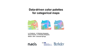
- 1. Data-driven color palettes for categorical maps NACIS - 2016 - Colorado Springs Luc Guillemot - UC Berkeley Geography David O’Sullivan - UC Berkeley Geography
- 2. Too many categories: hard to read! Qualitative maps (and colors) tend to emphasize more differences than similarities. Categories are not always equally distant to each other, e.g. geodemographics. We can relate the distance between colors to degrees of difference between categories on the map.
- 3. Background: Socio-demographics categories are useful to understand neighborhood change. State of the art: Only a limited number of categories or dimensions can be represented on a map. Proposition: Project the distance between categories on a color space. Outline
- 4. Background Neighborhood Change and the uncertainty of ACS data
- 5. American Community Survey (ACS): Since 2006, the Census Bureau provides yearly estimates of population data. ACS data is yearly but uncertain: The margin of errors due to the sampling method is often more important than the change recorded in the data. Describe types of neighborhoods: Overcome the “variable paradigm” Any geographic entity is a holistic unity that is a combination of features. Track change: Use census data as a proxy to understand population change and movements How to describe socio-demographic features of the Bay?
- 6. How to describe socio-demographic features of the Bay? American Community Survey (ACS): Since 2006, the Census Bureau provides yearly estimates of population data. ACS data is yearly but uncertain: The margin of errors due to the sampling method is often more important than the change recorded in the data. Describe types of neighborhoods: Overcome the “variable paradigm” Any geographic entity is a holistic unity that is a combination of features. Track change: Use census data as a proxy to understand population change and movements
- 7. Reducing dimensionality by clustering GEO Pop Age Educ 1 32 45 45 2 45 52 87 3 63 63 23 4 137 33 56 ACS data clustering Geodemographic typology
- 8. How to read the categories ColorBrewer’s 12 qualitative colors + 3 shades of grey = Hard to read… “As a general rule of thumb, cartographers seldom use more than seven classes on a choropleth map.” (Harrower & Brewer, 2013)
- 9. State of the art: Multivariate data, categorical maps and colors
- 10. Perceptually consistent color spaces: They are based on perceptually consistent color spaces, which means ou can measure a “just notifiable difference” that is consistent all over the color space. Tools: ColorBrewer, IWantHue or Colorgorical are tools to select predefined palettes. They aim at providing colors that are the most distinguishable possible. Tools to select predefined color palettes
- 11. The issue of color spreading: Large coherent groups visually suppress smaller groups and are often visually dominant in an image. Class visibility: locally distinguish the perceptual intensities of coarse and finer spatial structures. Enables more context-dependent color choices, but still focuses on differentiation. Further research on color palette for maps still focus on differences rather than similarities (Lee, Sips, & Seidel, 2013)
- 12. Danny Dorling ’s colored cartogram of Chernoff faces How many dimensions can “flatland” hold? Dorling, 1991 ++
- 13. Proposition: Project the distance between categories on a color space
- 14. The distance between categories can be quantified 1 1 2 2 3 4 3 4
- 15. Principal Components on L*a*b* color space → PC1 PC2 ↑ clusters Tracts
- 16. Common rules for bivariate maps (Trumbo, 1981): 1) Colors should be mutually distinguishable 2) Progression in any direction should make sense 3) Diagonal should be visible to display positive association We are interested in relative distances, not a value on an axis: Colors should reflect the relative distance of each clusters with all the others. The direction of the colormap can be modified without reducing the legend’s relevance. Bivariate color maps Bernard et alii, 2015
- 17. How to project the distance between categories on the color space? Force Directed Graph Gives an optimal relational distribution of clusters, given forces. Not perfect, but optimal: The mechanism of stabilization doesn’t solve all issues. Distances are not completely interpretable. But it’s a solution that allows to detect spatial patterns.
- 19. Color spreading is counterbalanced by sharp contrasts Class visibility is context-wise strengthen for differences that actually matter. The data itself is used to discriminate how distinctive colors should be. Color contrast increases class visibility
- 20. Change Coherent color system: Each line represents a Census Tract, each column is a year. Thanks to the coherent color system, you can track change. Change in color matches the importance of the actual change: Change in the “amount” of color matches the socio-demographic change.
- 21. Data-driven color palettes for categorical maps luc.guillemot@gmail.com @lucguillemot