SlideShare una empresa de Scribd logo
1 de 10
Evaluation Activities:<br />EVALUATION ACTIVITY 1In what ways does your media product use, develop or challenge forms and conventions of real media products?<br />Masthead-<br />For my master head the font I used was Nueva, Regular, 48pt, crisp. I used this as I liked the style of the font, I decided to use very feminine colours to show that my magazine is intended for female readers as while doing my research I saw that many of the music magazines used dark colours indicating that they were intended for male readers which made me want to make a magazine intended for women. I noticed that many of the magazines that I looked at had the title in the top left hand of the cover page so I wanted to keep to this convention by putting my title in the left hand side at the top of my page. I also looked at how I wanted to make my title to stand out so I looked at different glows and shadows that I could put onto my mast head to really make it come off of the page until I found the one that I thought made it stand out the best this was a risk as I hadn’t seen a  Another thing that I decided was that I wanted to split the page by having the top of my page in a different colour so that I could keep to the similar theme of having a box around my title but instead I had it going the whole way across the page rather than just around the title. Magazines such as “Q” uses a box around there masthead so I wanted to keep to this convention by changing it slightly.<br /> <br />“Q” magazine is one of the magazines that I looked at that uses a box around it and I liked this look but I wanted mine to be different so I challenged this convention by making a strip of colour behind the masthead rather than just putting it into a box as this seemed more bland, and because my masthead is quite long it nearly reaches from one side to the other so I thought a strip would look more effective than having a little of the section blank.<br />Miss-en-scene of images-<br />I believe that my magazine follows the codes and conducts of most magazines which are some of the top selling magazines. This is because I stuck to many of the normal conventions like where the masthead goes and where to put my main image etc. my main image also follows their mode of address, as the girls are looking directly into the camera the majority of the time.<br />Costumes and Props-<br />The costumes and props used throughout glamorous R&B are conventional, as they follow some of the magazines featured but I also wanted to give my magazine a feminine feel as I noticed that most music magazines are targeted at men rather than women so I used glamorous artists and my main image was based on two fashionable girls, I used grey, white and black costumes to fit in with my background on my cover page, which sounds dull and not at all feminine but it worked really well with my page.<br />People-<br />The people featured in my magazine are quite unconventional as they are young compared to many artists but at the moment younger artists have started to become known as music artists so this wasn’t that unconventional. Also the girls I used would not have been as extreme with their appearance and in a way this would have been hard as many musicians will have very expensive clothing which we would not be able to afford but I tried to make the girls look as effective as I could. In real magazines they tend to use around four male members for a band rather than having less people and having females as well, so I went against this convention by using two artists which were both female so this was a challenge as I didn’t know if it would work well or not.<br />Title, Font and Style-<br />The title of my magazine is the name of my band, “unique” I just used the text tool to create my title and used the brush script std font as I found this the most effective to go with the style of my magazine as it’s a more feminine style of font which goes with the whole theme of my magazine. My title is slightly unconventional as most magazines tend to keep there titles in a straight line whereas I’ve curved mine round with the “create warped text” tool. However I do believe this made my magazine stand out and more effective, and also helped to give it more of a flow and feminine sort of style and fits in well where it sits above my main image.<br />Written content-<br />The written content of my magazine follows the codes and conventions of real music magazines by covering the same sorts of topics in my magazine such as using things in my contents page such as news, gig guide, feedback etc. I got the idea from another magazine as it had things like this on its contents page. All of these topics could be found in a real life magazine aimed at younger people which is what I wanted.<br />Music genre and how your magazine suggests it-<br />The main genre of my magazine is R&B but does include some soft rock influences. This is quite clear as it is shown throughout my magazine by the types of artists that I have chosen and by the way my artists look such as the choice of costume in which I chose for my main artists. It is also shown by the name of my magazine as this is a big give away because the magazine itself is called glamorous R&B. In addition to this the artists and bands used in my magazine are that of the same genre which also hints to the audience what sort of magazine it is and who its target audience is. As well as this the choice of colours also show that my magazine is not that of a rock, indie magazine etc. Real music magazines tend to show the genre of their magazine by the Mis-en-scene of their images, their bands, and the colours used in their magazines showing that I used the codes and conventions of a real magazine in my own work.<br />Layout-<br />The layout of my magazine does follow many conventions but I have challenged some of these conventions by making my magazine slightly different to how I believe my magazine is at its most effective. The Layout of my magazine is shown to follow many conventions by such things as it is highlighted in my double-page spread that I have laid it out so that it looks like an interview with the artist using real speech from the artist like a real magazine would use. This is used in the written piece and in addition to this it is also used around the page along with pictures to quote what the artist has said and to help the audience to catch the eye of the bold quotes to catch there attention first so that they read the quotes which then draws them into wanting to read the whole article about the artist.<br />As well as following some of the conventions in my double-page spread I also followed the common conventions in my cover page such as having my title at the top of the page, I didn’t feel this needed to be challenged as I feel it’s the best place for the title to go as the reader will tend to look at the top left hand corner first. I also used the main headline in the middle of the page above my main picture which I found is quite a common convention in a real magazine. My barcode is slightly unconventional as it is at the bottom of the page but I decided to place it at the bottom left hand corner of the page as I felt it worked around the rest of my layout better than having at the right hand corner of my page.<br />Contents page-<br />My contents page does use elements of a conventional magazine as I looked through different real magazines to come up with some ideas of a layout I the end I decided that I wanted a picture at the top and the contents details underneath as I had seen it laid out like that, I wanted to change this slightly so I decided to use a few different pictures so I used three different artists and placed them at the top of the page slanted and tried to bring them off the page by using drop shadows on the pictures, I then used conventional things such as news, gig guide etc as titles and slanted these in boxes to make them stand out more, I then placed the different features of my magazine under the write category (title) so that the audience could understand where everything that they would want to look at was easy for them to find.<br />-3905253270252. How does your media product represent particular social groups?<br /><br />My music magazine follows some of the typical conventions of a music magazine but the style I have used for my magazine is completely different from the magazines that are out to buy. I have challenged this convention because I noticed when doing my research that all the top music magazines out there to buy use very dark colours and the people used on them wear very dark clothing etc. I then researched further and found that many people who buy the top selling music magazines are male or women who do not keep to the stereotypical style and music of a stereotypical woman. This interested me so I decided to break this convention and make a magazine which appealed to your everyday woman.<br />I have used the Kerrang magazine to show the way in which I challenged this convention, firstly I decided on the costuming, lights and different positions of my models for my photo shoot. I picked these carefully to go with the type of magazine in which I was aiming for so I used very feminine models, costuming and lighting to show this. I have also used a very feminine type of font compared with the Kerrang magazine as it uses a very bold masculine type of font for the title.<br />3. What kind of media institution might distribute your media product and why?<br />I think that both Bauer and IPC could be good media institutions in which both could distribute my product as they both have a wide range of different types of magazines in which they distribute, and as my magazine is a new type of magazine as it challenges some of the everyday conventions I think that they would both be willing to distribute my new idea.<br />IPC owns NME which is a very popular music magazine in the music industry and sells a fair amount of its magazines. This is good as it shows that IPC knows how to sell its merchandise effectively and it also shows that they distribute some of the best selling magazines. Because of the fact that it distributes some great selling magazines shows that they have many loyal costumers in which buy their magazines meaning that there will be more of a population to try my music magazine out on and that because they distribute to more people then there is a bigger chance that a bigger percentage of their audience will enjoy my music magazine.<br />I then went on to find that Bauer distributes magazines such as kerrang, kiss 100 and 4music which shows that they have an even wider range of music magazines and distribute kerrang, in which is one of the top selling music magazines along with NME. This shows that they also have many loyal buyers, in which may enjoy a new type of music magazine such as mine.<br />Because my music magazine is different from others it would attract a different type of audience from the ones in which the other music magazines attract which would make it difficult to decide which distribution company would be best for me as it would attract a whole new audience rather than attracting the audience in which both distribution companies already have, so if I had to decide on one music distribution company then I would probably choose Bauer as it releases many different music magazines of different tastes and would probably attract more attention for my magazine than IPC would.<br />4. Who would be the audience for your media product?<br />My music magazine is targeted for young everyday women, as when I was researching different types of music magazines in which were popular I found that none of the top selling music magazines were very feminine at all, every little detail of them was set out in a masculine way. This made me think and I decided to break take a risk and try to break this convention by making a feminine type of music magazine. The type of music advertised in my magazine ranges to suit different types of tastes, for people who like different genres of music instead of sticking to one type, the artists advertised in my magazine will be people who are in the charts for having the most music download and CD sales for their music, so that my magazine appeals to a wider range of people, as it will feature the most liked artists with it. This will help me to attract a bigger audience which will help in sales of the magazine and will also help to make my magazine to appeal to the highest of its standards.<br />5. How did you attract/address your audience?<br />571500890905I have used very feminine colours to help prevent the attraction of the wrong target group, and to attract the attention of my targeted audience.I attracted my targeted audience by making my magazine to suit the needs of my targeted audience and to suit what sort of things that my targeted audience would want to see I did this through looking deeply into every aspect of my magazine from colour, font, picture to information, artists etc. <br />I used this feminine font to attract the female audience in which my magazine was aimed at.<br />I have advertised free gifts to help the reader feel like they are getting something out of buying the product.I created my own tickets to display on my page to gain the attention of fans of the artist in which fits the genre of the targeted audience in which I am trying to attract. <br />I have used well known artists to draw my reader’s attention in, because they will be familiar with these artists, which will make the reader want to read the magazine.<br />6. What have you learnt about technologies from the process of constructing this product?<br />I used adobe Photoshop to firstly learn how to create pages out of a magazine. I did this by creating my preliminary task work which was the first time I had ever used Photoshop. I found it very hard to use Photoshop to start with as I am not very technical and did not have a clue how to use any of it so I found it very difficult. After being shown some of the different things in which I could do on Photoshop I then note them all down and started to learn a lot more. At the end of my preliminary task I felt I had used the software well, but it wasn’t until I started to create my main task that I learnt even more new skills and therefore realised how little I really had learned for my preliminary task.<br />This is the computer I used to create both my preliminary task and my main task on, I did the majority of my work on this but i also did use my laptop at home to upload things to my WIX.<br />19050-466725<br />This is the memory stick in which I used to save all of my documents on in order to keep them safe and to help me be able to transfer all my work to my laptop at home in order to upload all my photo’s and files to my WIX as the school computer system does not enable me to do this. <br />19050100965<br />   <br />I used WIX to present all the work in which I have achieved this year in my media studies classes, it was the first time in which I had used the programme and even now I am finding new things to learn on it each and every time I do use it. WIX is a good programme to use and when shown how to do things using the programme it can be a very smart way to present my work.<br />Overall I have learnt a lot about different types of technology as many of the things in which I used to create my magazine and to present my magazine and the content of my work were programmes in which I had never even seen before let alone used and worked with, so I did find this a challenge but rewarding to be able to learn new skills.<br /> 7. Looking back at your preliminary task (the school magazine task), what do you feel you have learnt in the progression from it to full product?<br />-14287535560289560035560<br />-1428751911352952750200660<br />Above I have from top to bottom my main task cover and contents page and below that is my preliminary task cover and contents page. Looking back now I can see how far I have actually come and I am shocked now at how bad my preliminary task cover and contents page actually are. Over the last year I have learnt so many different skills when using the Photoshop piece of software and I am pleased at how far I have come. As I had never used the software before and rarely use a computer/laptop at home unless it being for coursework in which case I only use word and power points, this sort of technology is an unfamiliar type of technology and I found it extremely hard to use. As I slowly progressed to learn how to use different aspects of the Photoshop programme it finally began to become easier and I began to feel more comfortable with it. I felt more comfortable with the software when designing my preliminary task but it wasn’t until I started to create my main task that I progressed a lot more and at a quicker rate as I was starting to feel more comfortable with the software that I was not so worried about messing my work up. I feel I have definitely come a long way with my work and I am unfortunate enough that I have not had longer to progress my skills further to making a good quality piece of work in which may actually sell if it were in the shop. As I have learnt a lot from this experience though I will now progress my skills further for any future work in which may need this piece of software.    <br />
Evaluation activities

Más contenido relacionado

Destacado (10)

CSAL
CSAL CSAL
CSAL
 
Invited talk: Second Search Computing workshop
Invited talk: Second Search Computing workshopInvited talk: Second Search Computing workshop
Invited talk: Second Search Computing workshop
 
ADT Stack
ADT StackADT Stack
ADT Stack
 
Enhance Technology Desktop Raid PPT
Enhance Technology Desktop Raid PPTEnhance Technology Desktop Raid PPT
Enhance Technology Desktop Raid PPT
 
Ficha autoevaluacion trabajo final (4)
Ficha autoevaluacion trabajo final (4)Ficha autoevaluacion trabajo final (4)
Ficha autoevaluacion trabajo final (4)
 
Josh Groban Mi Mancherai
Josh Groban Mi MancheraiJosh Groban Mi Mancherai
Josh Groban Mi Mancherai
 
The race
The raceThe race
The race
 
Infarto
InfartoInfarto
Infarto
 
T5 a hamelinck_consequences of inaction
T5 a hamelinck_consequences of inactionT5 a hamelinck_consequences of inaction
T5 a hamelinck_consequences of inaction
 
St. Peter Plans
St. Peter PlansSt. Peter Plans
St. Peter Plans
 

Último

The basics of sentences session 3pptx.pptx
The basics of sentences session 3pptx.pptxThe basics of sentences session 3pptx.pptx
The basics of sentences session 3pptx.pptx
heathfieldcps1
 
Russian Escort Service in Delhi 11k Hotel Foreigner Russian Call Girls in Delhi
Russian Escort Service in Delhi 11k Hotel Foreigner Russian Call Girls in DelhiRussian Escort Service in Delhi 11k Hotel Foreigner Russian Call Girls in Delhi
Russian Escort Service in Delhi 11k Hotel Foreigner Russian Call Girls in Delhi
kauryashika82
 

Último (20)

Spatium Project Simulation student brief
Spatium Project Simulation student briefSpatium Project Simulation student brief
Spatium Project Simulation student brief
 
How to Give a Domain for a Field in Odoo 17
How to Give a Domain for a Field in Odoo 17How to Give a Domain for a Field in Odoo 17
How to Give a Domain for a Field in Odoo 17
 
Dyslexia AI Workshop for Slideshare.pptx
Dyslexia AI Workshop for Slideshare.pptxDyslexia AI Workshop for Slideshare.pptx
Dyslexia AI Workshop for Slideshare.pptx
 
Python Notes for mca i year students osmania university.docx
Python Notes for mca i year students osmania university.docxPython Notes for mca i year students osmania university.docx
Python Notes for mca i year students osmania university.docx
 
UGC NET Paper 1 Mathematical Reasoning & Aptitude.pdf
UGC NET Paper 1 Mathematical Reasoning & Aptitude.pdfUGC NET Paper 1 Mathematical Reasoning & Aptitude.pdf
UGC NET Paper 1 Mathematical Reasoning & Aptitude.pdf
 
On National Teacher Day, meet the 2024-25 Kenan Fellows
On National Teacher Day, meet the 2024-25 Kenan FellowsOn National Teacher Day, meet the 2024-25 Kenan Fellows
On National Teacher Day, meet the 2024-25 Kenan Fellows
 
ICT role in 21st century education and it's challenges.
ICT role in 21st century education and it's challenges.ICT role in 21st century education and it's challenges.
ICT role in 21st century education and it's challenges.
 
Introduction to Nonprofit Accounting: The Basics
Introduction to Nonprofit Accounting: The BasicsIntroduction to Nonprofit Accounting: The Basics
Introduction to Nonprofit Accounting: The Basics
 
psychiatric nursing HISTORY COLLECTION .docx
psychiatric  nursing HISTORY  COLLECTION  .docxpsychiatric  nursing HISTORY  COLLECTION  .docx
psychiatric nursing HISTORY COLLECTION .docx
 
This PowerPoint helps students to consider the concept of infinity.
This PowerPoint helps students to consider the concept of infinity.This PowerPoint helps students to consider the concept of infinity.
This PowerPoint helps students to consider the concept of infinity.
 
Understanding Accommodations and Modifications
Understanding  Accommodations and ModificationsUnderstanding  Accommodations and Modifications
Understanding Accommodations and Modifications
 
The basics of sentences session 3pptx.pptx
The basics of sentences session 3pptx.pptxThe basics of sentences session 3pptx.pptx
The basics of sentences session 3pptx.pptx
 
Russian Escort Service in Delhi 11k Hotel Foreigner Russian Call Girls in Delhi
Russian Escort Service in Delhi 11k Hotel Foreigner Russian Call Girls in DelhiRussian Escort Service in Delhi 11k Hotel Foreigner Russian Call Girls in Delhi
Russian Escort Service in Delhi 11k Hotel Foreigner Russian Call Girls in Delhi
 
Grant Readiness 101 TechSoup and Remy Consulting
Grant Readiness 101 TechSoup and Remy ConsultingGrant Readiness 101 TechSoup and Remy Consulting
Grant Readiness 101 TechSoup and Remy Consulting
 
Sociology 101 Demonstration of Learning Exhibit
Sociology 101 Demonstration of Learning ExhibitSociology 101 Demonstration of Learning Exhibit
Sociology 101 Demonstration of Learning Exhibit
 
Unit-IV- Pharma. Marketing Channels.pptx
Unit-IV- Pharma. Marketing Channels.pptxUnit-IV- Pharma. Marketing Channels.pptx
Unit-IV- Pharma. Marketing Channels.pptx
 
Third Battle of Panipat detailed notes.pptx
Third Battle of Panipat detailed notes.pptxThird Battle of Panipat detailed notes.pptx
Third Battle of Panipat detailed notes.pptx
 
Application orientated numerical on hev.ppt
Application orientated numerical on hev.pptApplication orientated numerical on hev.ppt
Application orientated numerical on hev.ppt
 
SOC 101 Demonstration of Learning Presentation
SOC 101 Demonstration of Learning PresentationSOC 101 Demonstration of Learning Presentation
SOC 101 Demonstration of Learning Presentation
 
Unit-IV; Professional Sales Representative (PSR).pptx
Unit-IV; Professional Sales Representative (PSR).pptxUnit-IV; Professional Sales Representative (PSR).pptx
Unit-IV; Professional Sales Representative (PSR).pptx
 

Evaluation activities

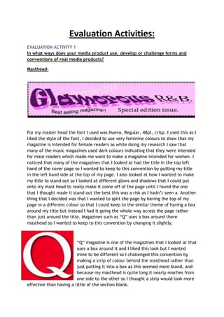
  • 1. Evaluation Activities:<br />EVALUATION ACTIVITY 1In what ways does your media product use, develop or challenge forms and conventions of real media products?<br />Masthead-<br />For my master head the font I used was Nueva, Regular, 48pt, crisp. I used this as I liked the style of the font, I decided to use very feminine colours to show that my magazine is intended for female readers as while doing my research I saw that many of the music magazines used dark colours indicating that they were intended for male readers which made me want to make a magazine intended for women. I noticed that many of the magazines that I looked at had the title in the top left hand of the cover page so I wanted to keep to this convention by putting my title in the left hand side at the top of my page. I also looked at how I wanted to make my title to stand out so I looked at different glows and shadows that I could put onto my mast head to really make it come off of the page until I found the one that I thought made it stand out the best this was a risk as I hadn’t seen a Another thing that I decided was that I wanted to split the page by having the top of my page in a different colour so that I could keep to the similar theme of having a box around my title but instead I had it going the whole way across the page rather than just around the title. Magazines such as “Q” uses a box around there masthead so I wanted to keep to this convention by changing it slightly.<br /> <br />“Q” magazine is one of the magazines that I looked at that uses a box around it and I liked this look but I wanted mine to be different so I challenged this convention by making a strip of colour behind the masthead rather than just putting it into a box as this seemed more bland, and because my masthead is quite long it nearly reaches from one side to the other so I thought a strip would look more effective than having a little of the section blank.<br />Miss-en-scene of images-<br />I believe that my magazine follows the codes and conducts of most magazines which are some of the top selling magazines. This is because I stuck to many of the normal conventions like where the masthead goes and where to put my main image etc. my main image also follows their mode of address, as the girls are looking directly into the camera the majority of the time.<br />Costumes and Props-<br />The costumes and props used throughout glamorous R&B are conventional, as they follow some of the magazines featured but I also wanted to give my magazine a feminine feel as I noticed that most music magazines are targeted at men rather than women so I used glamorous artists and my main image was based on two fashionable girls, I used grey, white and black costumes to fit in with my background on my cover page, which sounds dull and not at all feminine but it worked really well with my page.<br />People-<br />The people featured in my magazine are quite unconventional as they are young compared to many artists but at the moment younger artists have started to become known as music artists so this wasn’t that unconventional. Also the girls I used would not have been as extreme with their appearance and in a way this would have been hard as many musicians will have very expensive clothing which we would not be able to afford but I tried to make the girls look as effective as I could. In real magazines they tend to use around four male members for a band rather than having less people and having females as well, so I went against this convention by using two artists which were both female so this was a challenge as I didn’t know if it would work well or not.<br />Title, Font and Style-<br />The title of my magazine is the name of my band, “unique” I just used the text tool to create my title and used the brush script std font as I found this the most effective to go with the style of my magazine as it’s a more feminine style of font which goes with the whole theme of my magazine. My title is slightly unconventional as most magazines tend to keep there titles in a straight line whereas I’ve curved mine round with the “create warped text” tool. However I do believe this made my magazine stand out and more effective, and also helped to give it more of a flow and feminine sort of style and fits in well where it sits above my main image.<br />Written content-<br />The written content of my magazine follows the codes and conventions of real music magazines by covering the same sorts of topics in my magazine such as using things in my contents page such as news, gig guide, feedback etc. I got the idea from another magazine as it had things like this on its contents page. All of these topics could be found in a real life magazine aimed at younger people which is what I wanted.<br />Music genre and how your magazine suggests it-<br />The main genre of my magazine is R&B but does include some soft rock influences. This is quite clear as it is shown throughout my magazine by the types of artists that I have chosen and by the way my artists look such as the choice of costume in which I chose for my main artists. It is also shown by the name of my magazine as this is a big give away because the magazine itself is called glamorous R&B. In addition to this the artists and bands used in my magazine are that of the same genre which also hints to the audience what sort of magazine it is and who its target audience is. As well as this the choice of colours also show that my magazine is not that of a rock, indie magazine etc. Real music magazines tend to show the genre of their magazine by the Mis-en-scene of their images, their bands, and the colours used in their magazines showing that I used the codes and conventions of a real magazine in my own work.<br />Layout-<br />The layout of my magazine does follow many conventions but I have challenged some of these conventions by making my magazine slightly different to how I believe my magazine is at its most effective. The Layout of my magazine is shown to follow many conventions by such things as it is highlighted in my double-page spread that I have laid it out so that it looks like an interview with the artist using real speech from the artist like a real magazine would use. This is used in the written piece and in addition to this it is also used around the page along with pictures to quote what the artist has said and to help the audience to catch the eye of the bold quotes to catch there attention first so that they read the quotes which then draws them into wanting to read the whole article about the artist.<br />As well as following some of the conventions in my double-page spread I also followed the common conventions in my cover page such as having my title at the top of the page, I didn’t feel this needed to be challenged as I feel it’s the best place for the title to go as the reader will tend to look at the top left hand corner first. I also used the main headline in the middle of the page above my main picture which I found is quite a common convention in a real magazine. My barcode is slightly unconventional as it is at the bottom of the page but I decided to place it at the bottom left hand corner of the page as I felt it worked around the rest of my layout better than having at the right hand corner of my page.<br />Contents page-<br />My contents page does use elements of a conventional magazine as I looked through different real magazines to come up with some ideas of a layout I the end I decided that I wanted a picture at the top and the contents details underneath as I had seen it laid out like that, I wanted to change this slightly so I decided to use a few different pictures so I used three different artists and placed them at the top of the page slanted and tried to bring them off the page by using drop shadows on the pictures, I then used conventional things such as news, gig guide etc as titles and slanted these in boxes to make them stand out more, I then placed the different features of my magazine under the write category (title) so that the audience could understand where everything that they would want to look at was easy for them to find.<br />-3905253270252. How does your media product represent particular social groups?<br /><br />My music magazine follows some of the typical conventions of a music magazine but the style I have used for my magazine is completely different from the magazines that are out to buy. I have challenged this convention because I noticed when doing my research that all the top music magazines out there to buy use very dark colours and the people used on them wear very dark clothing etc. I then researched further and found that many people who buy the top selling music magazines are male or women who do not keep to the stereotypical style and music of a stereotypical woman. This interested me so I decided to break this convention and make a magazine which appealed to your everyday woman.<br />I have used the Kerrang magazine to show the way in which I challenged this convention, firstly I decided on the costuming, lights and different positions of my models for my photo shoot. I picked these carefully to go with the type of magazine in which I was aiming for so I used very feminine models, costuming and lighting to show this. I have also used a very feminine type of font compared with the Kerrang magazine as it uses a very bold masculine type of font for the title.<br />3. What kind of media institution might distribute your media product and why?<br />I think that both Bauer and IPC could be good media institutions in which both could distribute my product as they both have a wide range of different types of magazines in which they distribute, and as my magazine is a new type of magazine as it challenges some of the everyday conventions I think that they would both be willing to distribute my new idea.<br />IPC owns NME which is a very popular music magazine in the music industry and sells a fair amount of its magazines. This is good as it shows that IPC knows how to sell its merchandise effectively and it also shows that they distribute some of the best selling magazines. Because of the fact that it distributes some great selling magazines shows that they have many loyal costumers in which buy their magazines meaning that there will be more of a population to try my music magazine out on and that because they distribute to more people then there is a bigger chance that a bigger percentage of their audience will enjoy my music magazine.<br />I then went on to find that Bauer distributes magazines such as kerrang, kiss 100 and 4music which shows that they have an even wider range of music magazines and distribute kerrang, in which is one of the top selling music magazines along with NME. This shows that they also have many loyal buyers, in which may enjoy a new type of music magazine such as mine.<br />Because my music magazine is different from others it would attract a different type of audience from the ones in which the other music magazines attract which would make it difficult to decide which distribution company would be best for me as it would attract a whole new audience rather than attracting the audience in which both distribution companies already have, so if I had to decide on one music distribution company then I would probably choose Bauer as it releases many different music magazines of different tastes and would probably attract more attention for my magazine than IPC would.<br />4. Who would be the audience for your media product?<br />My music magazine is targeted for young everyday women, as when I was researching different types of music magazines in which were popular I found that none of the top selling music magazines were very feminine at all, every little detail of them was set out in a masculine way. This made me think and I decided to break take a risk and try to break this convention by making a feminine type of music magazine. The type of music advertised in my magazine ranges to suit different types of tastes, for people who like different genres of music instead of sticking to one type, the artists advertised in my magazine will be people who are in the charts for having the most music download and CD sales for their music, so that my magazine appeals to a wider range of people, as it will feature the most liked artists with it. This will help me to attract a bigger audience which will help in sales of the magazine and will also help to make my magazine to appeal to the highest of its standards.<br />5. How did you attract/address your audience?<br />571500890905I have used very feminine colours to help prevent the attraction of the wrong target group, and to attract the attention of my targeted audience.I attracted my targeted audience by making my magazine to suit the needs of my targeted audience and to suit what sort of things that my targeted audience would want to see I did this through looking deeply into every aspect of my magazine from colour, font, picture to information, artists etc. <br />I used this feminine font to attract the female audience in which my magazine was aimed at.<br />I have advertised free gifts to help the reader feel like they are getting something out of buying the product.I created my own tickets to display on my page to gain the attention of fans of the artist in which fits the genre of the targeted audience in which I am trying to attract. <br />I have used well known artists to draw my reader’s attention in, because they will be familiar with these artists, which will make the reader want to read the magazine.<br />6. What have you learnt about technologies from the process of constructing this product?<br />I used adobe Photoshop to firstly learn how to create pages out of a magazine. I did this by creating my preliminary task work which was the first time I had ever used Photoshop. I found it very hard to use Photoshop to start with as I am not very technical and did not have a clue how to use any of it so I found it very difficult. After being shown some of the different things in which I could do on Photoshop I then note them all down and started to learn a lot more. At the end of my preliminary task I felt I had used the software well, but it wasn’t until I started to create my main task that I learnt even more new skills and therefore realised how little I really had learned for my preliminary task.<br />This is the computer I used to create both my preliminary task and my main task on, I did the majority of my work on this but i also did use my laptop at home to upload things to my WIX.<br />19050-466725<br />This is the memory stick in which I used to save all of my documents on in order to keep them safe and to help me be able to transfer all my work to my laptop at home in order to upload all my photo’s and files to my WIX as the school computer system does not enable me to do this. <br />19050100965<br /> <br />I used WIX to present all the work in which I have achieved this year in my media studies classes, it was the first time in which I had used the programme and even now I am finding new things to learn on it each and every time I do use it. WIX is a good programme to use and when shown how to do things using the programme it can be a very smart way to present my work.<br />Overall I have learnt a lot about different types of technology as many of the things in which I used to create my magazine and to present my magazine and the content of my work were programmes in which I had never even seen before let alone used and worked with, so I did find this a challenge but rewarding to be able to learn new skills.<br /> 7. Looking back at your preliminary task (the school magazine task), what do you feel you have learnt in the progression from it to full product?<br />-14287535560289560035560<br />-1428751911352952750200660<br />Above I have from top to bottom my main task cover and contents page and below that is my preliminary task cover and contents page. Looking back now I can see how far I have actually come and I am shocked now at how bad my preliminary task cover and contents page actually are. Over the last year I have learnt so many different skills when using the Photoshop piece of software and I am pleased at how far I have come. As I had never used the software before and rarely use a computer/laptop at home unless it being for coursework in which case I only use word and power points, this sort of technology is an unfamiliar type of technology and I found it extremely hard to use. As I slowly progressed to learn how to use different aspects of the Photoshop programme it finally began to become easier and I began to feel more comfortable with it. I felt more comfortable with the software when designing my preliminary task but it wasn’t until I started to create my main task that I progressed a lot more and at a quicker rate as I was starting to feel more comfortable with the software that I was not so worried about messing my work up. I feel I have definitely come a long way with my work and I am unfortunate enough that I have not had longer to progress my skills further to making a good quality piece of work in which may actually sell if it were in the shop. As I have learnt a lot from this experience though I will now progress my skills further for any future work in which may need this piece of software. <br />