SlideShare una empresa de Scribd logo
1 de 23
Descargar para leer sin conexión
Natascha Wilson

Illustration
Design
Art Direction
Information Architecture
This presentation is an overview of my work, to view my full portfolio please
click here.
And to see a selection of my banner ads please click here.

I have 12 years experience in Digital, I started with (3 years ) Fine Art Degree
and at one time I was working as a painter and sculptor before I decided to
move full time into design. I studied commercial design as well as desktop
publishing and multi-media graphics.

I trained whilst working client side, in Flash, Dreamweaver, IA and Usability.
I have also attended effective management courses while I was client side, and
participated in team building courses such as Myers Briggs. Before I pitched
in the inhouse digital team to the owners of Onetel Sydney, I was working as a
marketing manager, I worked at Onetel for 8 years and my role was wide and
varied.
In the last four years I have worked agency side on many large brands in
senior positions . I have worked as a Creative Director, Art Director, Creative
Lead and Digital team manager, I have also had the opportunity to project
manage large scale web builds and redesigns.
I am always keen to learn more and to challenge myself where I can.
Art Direction
noitceriD trA


   Jorje.
   Pitch work for a small business dealing in web sites, needed a conceptual to
   create some site design for a brand in Melbourne that is a fashion warehouse
   that sells to retailers.They have no real brand to speak of, so I took their last
   campaign photography and created contemporary, mid range and CMS styled
   designs as a variation of web site and brand styles. I also used their logo of the
   small bird as inspiration and incorporated that into the designs.
   Unfortunately the project was shelved as the client was still unsure of whether
   to go digital or just do things the way they had always done them. But they
   took away some wire frames and also some interesting design concepts as a
   base for when they do decide that pursuing digital is a good idea for future
   growth.
Art Direction
noitceriD trA


   Impulse

   I was working as the Creative Director at Craik Jones and the client needed to
   re brand their web site and digital presence.
   Their current web site at the time looked like a cross between Urban Outfitters and
   Nike, and was flash heavy, action scripted badly, with full weighted videos that were
   not compressed enough, so the site was cumbersome, not branded right and
   basically didn’t work well navigationally.
   I took their current campaign of Romance, which was the creative direction the
   company wanted to go and created layouts using HTML as a base and flash
   components.
   I teamed with a writer and we created a lovely sequence of Romance type sections.
   And I created the overall look and feel.
   I built the flash video components and the animated spray section, which was to
   give a sense of what each bottle contained, with in a light, pretty and summery feel
   to it.
Design
ngiseD


  Boots - Craik Jones
  Designing large emails using the brand guidelines and incorporating all the main
  products. Boots liked their emails to be image heavy and also informational.
  This lead to very long emails, but the client liked that style very much and used it as
  a basis for all their emails after this design style was created.
  They wanted a more glamorous style and less company corporate style.
Design
ngiseD


  Boots - Surf
  Working in tandem with the print art director, to create emails and the web site to
  match the print. Incorporating their TV ad on the home page. And also downloads
  for music and their offerings, like competitions.
Design
ngiseD


  Bayer

  Digitas ( formerly Modem Media)
  This Agency I had a very good relationship with and had many repeat bookings
  with for a couple of years. I worked at Modem, Digitas and Publicis.
  I also worked on the Hewlett Packard pitch , which Modem Media won, for their
  Global Digital work and this was then sold to Publicis, when MM was sold between
  Digitas and Publicis.
  I was brought onto the Bayer account with Digitas, who are heavily weighted toward
  Pharmaceutical clients.
  While working closely with the IA to create the Ajax site that was for a new
  thrombosis drug, Bayer had made - the site was to be used by Doctors.

  I was also asked if I would illustrate the medical pictures for Doctors to download
  and also create illustrations for the Motion Graphics animator, as they wanted to
  make an internal world of the body, zooming in and out and showing how
  thrombosis occurs and how the new Bayer drug worked.
  This was a 1 million pound budgeted project, and we worked very long hours with
  the staff brought over from the American arm of Digitas.


  The concept of the illustration was to brand it with a style that looked like glass and
  semi 3 dimensional, realistic but with a glassy effect.
  I worked closely with the entire team, and liaised a couple of times a week with the
  client and also the doctors, to educate on usability and design and to make sure the
  illustrations were as correct as I could get them.
Illustration   Bayer
Art Direction
noitceriD trA


   Hand Bag.com - Hearst Digital agency
   This web site is a combination of many women’s magazines. The project required
   ideas for pitch. The client Diet Coke had brought out a vitamin drink and needed a
   micro site that appealed to women 16- 50+
   As this target market was very broad; I was hired to help on the creative strategy. I
   suggested a Shoreditch/ Soho house type of site, where each room catered to
   certain age groups, e.g.: 16-21 year olds would have a room where they can vote for
   the hottest guys in movies or sport and sign up for sample cosmetics.
   Another room 22-30 would be more geared towards going out, the hottest spots in
   London etc..
   30-40 would be cross sold the latest perfumes, cosmetics for youthful skin and
   makeup.. the 50+ would be in the VIP area and be offered a more sophisticated
   experience on health and beauty.
   I created the main design and then handed it to the team, and they created the rest
   of the site. The work was then pitched in by the CD and they won the pitch.
   I was also tasked with creating some rich media for Kiwi, they were unhappy with
   their last campaign of banners and wanted something fun and interesting. As the
   Kiwi brand was very 1950s looking and traditional, they were attempting to take
   the brand forward. At the time Tango Zebra had created the interconnect banners,
   where three banner ads worked as one and talked to each other, so the animations
   could flow one to the other.
   I created stills showing a Dr Zeus styled shoe factory, showing the new gel party
   feet shoe inlays that Kiwi were pushing, they liked the idea and we built the banners.
   That campaign was one of the first to use the component as TZ was launching at
   the same time as our banners. Click here to view.
Art Direction
noitceriD trA


   Jameson - Libertine.
   This project was a large one; I was hired to be the brand illustrator and designer.
   Jameson UK had next to no digital presence unlike its American counterpart and
   they wanted to create something special. Only problem on this project was, the
   something special kept eluding the client, as there was no contract in place between
   the client and the agency. This project became client lead, and also lead to the Art
   Director quitting, so I was asked to step in. I worked with the writer to create
   layouts and direction.
   This took many different directions as the client kept changing their mind.
   Originally the Art D, writer and I were going down the motion graphics route,
   combining old world charm with conceptual imagery.
   We pitched in the use of photography and illustration. The client liked it, but
   decided they wanted something more masculine, green and video driven.

   They also said to use rubix cube, this is about the time the Art D quit. I took the
   Rubix cube idea, the fact client like the 3D perspective of Bravia site and also the
   sections of many others and attempted to create a premium site that used allot of
   video and paper vision. I worked on the Art direction, design and wire framing for
   three months.

   Jameson Illustration styles.
   Concept was to use flash and motion graphics in an illustrative way, using the de-
   scriptions of Whiskey, which can consist of leather, wood, citrus, honey, nuts etc..
   Combining vector, sketch and photography, to create a juxtaposition of elements to
   define the taste of the different Whiskeys.
   Also using a carousel flash type menu systems to pick and choose the desired
   whiskey, to see it spring to life in creative and delightful ways.

   While working at Libertine I also created site design for Tabasco they had no Digital
   brand in the UK, I created a few different styles before I left and also designed the
   flash micro site for Ryvita’s Limbos product launch.
Art Direction
noitceriD trA


   True Blue

   Working as a freelance CD in a small company in Qld for around 3 months,
   I was asked by the owner to re brand his company site and create a digital arm
   brand.This digital arm was to be small, but very Australian as their clients were
   mining types etc..
   I re branded their corporate site, made it into an umbrella site for his other busi-
   nesses. Created the small digital arm, True blue, created the brand mascot Bluey,
   wrote a brand story, created the colours and some designs and wrote brand
   guidelines.
   The banners reflected the same style and I mentored a print designer in her first lot
   of banner ads, which she did a marvelous job.
Illustration
noitartsullI                            Design
                                        ngiseD


      Le Boudoir and Grace Designs

      A personal client who started their own lifestyle business for women, so throwing
      product parties and selling products on the web site that were boudoir driven.
      Soft, sophisticated and feminine. I was briefed to take a Max Oliver brand approach
      to the illustration but also to create images that were Audrey Hepburn inspired and
      16th century furniture to create the ultimate boudoir.
      The logo for the clients clothing line, Grace Designs also followed the sketch style. I
      coloured all the brand illustration in photoshop, flat color but rich.
Illustration
noitartsullI                            Design
                                        ngiseD


      Vodafone - Adding Value ( small agency - personal client)

      I was hired on an ongoing basis to illustrate for print, flash and help build the flash
      micro site. All the work was for internal communications, it covered from sponsor-
      ship and events, to printed calendars to animated banners for internal landing pages.
      All the work needed to be high end just like B2C... I needed to follow the strict
      guidelines of Vodafone illustration and brand.
      There was a very large amount of work created for this client, all the work was in
      the same sort of creative direction.
      I also would sketch the work first, get client approval, before redrawing in vectors,
      colouring and animating. I would also story board animation in sketch form first for
      client sign off.
Design
ngiseD


  Freelance varied- ID Work.
  These are some examples of Logo work, ranging from changing the Rhino
  records logo to sit in a 3d TV, I drew in illustrator.
  This client wanted a 50s type TV in a
  3d style with their logo on the screen

  Corporate logo for Stock, very strong
  print style was needed. A minimalist
  direction to create a strong, structured
  logo for all company ID.
  Rype, a small I.T company, the brief
  was a desire for a contemporary and
  fresh logo.
  I illustrated the logo from a sketch,
  no fonts were used.
IA and Template Design for iPad - ACP Magazines                                                         Information Architecture
                                                                                                        erutcetihcrA noitamrofnI   Design
                                                                                                                                   ngiseD
( Publishing - Client side )


Page wire framing to show placement without the distraction of design and to
perfect usability.

Master template created to help educate the print designers at ACP with designing layouts in Pho-
toshop, instead of Indesign and preparing images for digital so that the work can be best under-
stood by their developers in India. I created this master to show menu states, function and layout
for both portrait and landscape.
I also supplied tech spec links from Apples site and a few other links for articles on user interface
design for the iPad and the basics of good design principles for iPad.
And links from the Nielson Norman group on user testing results for the iPad.
Information Architecture
erutcetihcrA noitamrofnI   Design
                           ngiseD
Illustration
noitartsullI                            Design
                                        ngiseD


      Altium ( Software company - Client side )
      I was brought on board for 2 months, to illustrate and create icons for Altium’s lat-
      est software. I have also created style guides and master templates of the icons, so
      that future icon design will have some brand style to it.
      This has been an educational process for the client, as they have never dealt in
      brand guidelines or style guides.

      I am also helping with their user interface; to download, update, remove and buy
      plug-ins, the interface is built around an iTunes styled shop. I am taking what they
      have already created and adding my user experience background and software de-
      sign experience also, so that the interface navigates intuitively and sticks to basic
      design principles.

      The second half of this contract is to work on the campaign creative for the release
      of the new software on 31st of January, 2011.
www.krop.com/nataschayolanda

Más contenido relacionado

La actualidad más candente

Coqtail presentatie januari
Coqtail presentatie januariCoqtail presentatie januari
Coqtail presentatie januariCoen Fredriks
 
Idea development- Task Two
Idea development- Task TwoIdea development- Task Two
Idea development- Task TwoAlex Walker
 
Swaits evaluation
Swaits evaluationSwaits evaluation
Swaits evaluationTop_Boy
 
Idea development- Task Two
Idea development- Task TwoIdea development- Task Two
Idea development- Task TwoAlex Walker
 
Bruce Ads And Design Low
Bruce Ads And Design LowBruce Ads And Design Low
Bruce Ads And Design Lowbigmanb
 
Lash Creative Case Study
Lash Creative Case StudyLash Creative Case Study
Lash Creative Case StudyLash Creative
 
Evaluation (task 9)
Evaluation (task 9)Evaluation (task 9)
Evaluation (task 9)PJG123
 
Evaluation (task 9)
Evaluation (task 9)Evaluation (task 9)
Evaluation (task 9)PJG123
 
A LOGO IS NOT A BRAND
A LOGO IS NOT A BRANDA LOGO IS NOT A BRAND
A LOGO IS NOT A BRANDPaul Hebron
 
CG_Portfolio_April2016
CG_Portfolio_April2016CG_Portfolio_April2016
CG_Portfolio_April2016Mayra Valle
 
Parminder Chand - Digital Resume
Parminder Chand - Digital ResumeParminder Chand - Digital Resume
Parminder Chand - Digital ResumeParminder Chand
 
Iridian 2015 Annual Report
Iridian 2015 Annual ReportIridian 2015 Annual Report
Iridian 2015 Annual ReportIRiDiAN GROUP
 

La actualidad más candente (20)

Alberto Graphic Designer Portfolio
Alberto Graphic Designer PortfolioAlberto Graphic Designer Portfolio
Alberto Graphic Designer Portfolio
 
portofolio2
portofolio2portofolio2
portofolio2
 
Evaluation
EvaluationEvaluation
Evaluation
 
Jeff Goodby
Jeff GoodbyJeff Goodby
Jeff Goodby
 
0133795640
01337956400133795640
0133795640
 
Kamau Resume
Kamau ResumeKamau Resume
Kamau Resume
 
Billboard design company
Billboard design companyBillboard design company
Billboard design company
 
Coqtail presentatie januari
Coqtail presentatie januariCoqtail presentatie januari
Coqtail presentatie januari
 
Idea development- Task Two
Idea development- Task TwoIdea development- Task Two
Idea development- Task Two
 
Swaits evaluation
Swaits evaluationSwaits evaluation
Swaits evaluation
 
Idea development- Task Two
Idea development- Task TwoIdea development- Task Two
Idea development- Task Two
 
Bruce Ads And Design Low
Bruce Ads And Design LowBruce Ads And Design Low
Bruce Ads And Design Low
 
Actionidentity
ActionidentityActionidentity
Actionidentity
 
Lash Creative Case Study
Lash Creative Case StudyLash Creative Case Study
Lash Creative Case Study
 
Evaluation (task 9)
Evaluation (task 9)Evaluation (task 9)
Evaluation (task 9)
 
Evaluation (task 9)
Evaluation (task 9)Evaluation (task 9)
Evaluation (task 9)
 
A LOGO IS NOT A BRAND
A LOGO IS NOT A BRANDA LOGO IS NOT A BRAND
A LOGO IS NOT A BRAND
 
CG_Portfolio_April2016
CG_Portfolio_April2016CG_Portfolio_April2016
CG_Portfolio_April2016
 
Parminder Chand - Digital Resume
Parminder Chand - Digital ResumeParminder Chand - Digital Resume
Parminder Chand - Digital Resume
 
Iridian 2015 Annual Report
Iridian 2015 Annual ReportIridian 2015 Annual Report
Iridian 2015 Annual Report
 

Similar a Presentation 02

pvitale_Interactive Classic_Web 1.0
pvitale_Interactive Classic_Web 1.0pvitale_Interactive Classic_Web 1.0
pvitale_Interactive Classic_Web 1.0guest27cd49
 
Rosalyn Halford Portfolio
Rosalyn Halford PortfolioRosalyn Halford Portfolio
Rosalyn Halford PortfolioRosalyn Halford
 
The House London Portfolio
The House London PortfolioThe House London Portfolio
The House London PortfolioTheHouseLondon
 
SaptaIDC portfolio_010116
SaptaIDC portfolio_010116SaptaIDC portfolio_010116
SaptaIDC portfolio_010116Archana Belani
 
13A kailiorchard
13A kailiorchard13A kailiorchard
13A kailiorchardkaiorch1
 
Jason Yip Portfolio
Jason Yip PortfolioJason Yip Portfolio
Jason Yip Portfoliojasonyip
 
Letts_Cody_Electronic Portfolio
Letts_Cody_Electronic PortfolioLetts_Cody_Electronic Portfolio
Letts_Cody_Electronic PortfolioCody Letts
 
247Creating_CompanyProfile_EN
247Creating_CompanyProfile_EN247Creating_CompanyProfile_EN
247Creating_CompanyProfile_ENHa Trinh
 
JQG_PorfolioSamples_2016_Samples_Sm
JQG_PorfolioSamples_2016_Samples_SmJQG_PorfolioSamples_2016_Samples_Sm
JQG_PorfolioSamples_2016_Samples_SmJavier Quant
 
Graphic design portfolio
Graphic design portfolioGraphic design portfolio
Graphic design portfolioAmanda Sanchez
 
Portfolio Lucas Leigneil
Portfolio Lucas LeigneilPortfolio Lucas Leigneil
Portfolio Lucas LeigneilLucasLeigneil
 
Design Portfolio Oliver Schneider
Design Portfolio Oliver SchneiderDesign Portfolio Oliver Schneider
Design Portfolio Oliver SchneiderOliver Schneider
 
Kieron Rose's Resume
Kieron Rose's ResumeKieron Rose's Resume
Kieron Rose's ResumeKieron Rose
 
Ravi's portfolio #4 'the 'bottom draw', 6 campaign concepts, myintuition@yaho...
Ravi's portfolio #4 'the 'bottom draw', 6 campaign concepts, myintuition@yaho...Ravi's portfolio #4 'the 'bottom draw', 6 campaign concepts, myintuition@yaho...
Ravi's portfolio #4 'the 'bottom draw', 6 campaign concepts, myintuition@yaho...Ravi David Prasad
 

Similar a Presentation 02 (20)

pvitale_Interactive Classic_Web 1.0
pvitale_Interactive Classic_Web 1.0pvitale_Interactive Classic_Web 1.0
pvitale_Interactive Classic_Web 1.0
 
Rosalyn Halford Portfolio
Rosalyn Halford PortfolioRosalyn Halford Portfolio
Rosalyn Halford Portfolio
 
Digital Portfolio
Digital PortfolioDigital Portfolio
Digital Portfolio
 
GotDesign-portfolio
GotDesign-portfolioGotDesign-portfolio
GotDesign-portfolio
 
The House London Portfolio
The House London PortfolioThe House London Portfolio
The House London Portfolio
 
SaptaIDC portfolio_010116
SaptaIDC portfolio_010116SaptaIDC portfolio_010116
SaptaIDC portfolio_010116
 
13A kailiorchard
13A kailiorchard13A kailiorchard
13A kailiorchard
 
Cv current
Cv currentCv current
Cv current
 
Jason Yip Portfolio
Jason Yip PortfolioJason Yip Portfolio
Jason Yip Portfolio
 
Vasili_Portfolio
Vasili_PortfolioVasili_Portfolio
Vasili_Portfolio
 
DJC - Mini Portfolio
DJC - Mini PortfolioDJC - Mini Portfolio
DJC - Mini Portfolio
 
Letts_Cody_Electronic Portfolio
Letts_Cody_Electronic PortfolioLetts_Cody_Electronic Portfolio
Letts_Cody_Electronic Portfolio
 
247Creating_CompanyProfile_EN
247Creating_CompanyProfile_EN247Creating_CompanyProfile_EN
247Creating_CompanyProfile_EN
 
JQG_PorfolioSamples_2016_Samples_Sm
JQG_PorfolioSamples_2016_Samples_SmJQG_PorfolioSamples_2016_Samples_Sm
JQG_PorfolioSamples_2016_Samples_Sm
 
Graphic design portfolio
Graphic design portfolioGraphic design portfolio
Graphic design portfolio
 
Portfolio Lucas Leigneil
Portfolio Lucas LeigneilPortfolio Lucas Leigneil
Portfolio Lucas Leigneil
 
Design Portfolio Oliver Schneider
Design Portfolio Oliver SchneiderDesign Portfolio Oliver Schneider
Design Portfolio Oliver Schneider
 
Kieron Rose's Resume
Kieron Rose's ResumeKieron Rose's Resume
Kieron Rose's Resume
 
Slik Vic Illustration Porty 2012
Slik Vic Illustration Porty 2012Slik Vic Illustration Porty 2012
Slik Vic Illustration Porty 2012
 
Ravi's portfolio #4 'the 'bottom draw', 6 campaign concepts, myintuition@yaho...
Ravi's portfolio #4 'the 'bottom draw', 6 campaign concepts, myintuition@yaho...Ravi's portfolio #4 'the 'bottom draw', 6 campaign concepts, myintuition@yaho...
Ravi's portfolio #4 'the 'bottom draw', 6 campaign concepts, myintuition@yaho...
 

Presentation 02

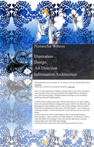
  • 1. Natascha Wilson Illustration Design Art Direction Information Architecture This presentation is an overview of my work, to view my full portfolio please click here. And to see a selection of my banner ads please click here. I have 12 years experience in Digital, I started with (3 years ) Fine Art Degree and at one time I was working as a painter and sculptor before I decided to move full time into design. I studied commercial design as well as desktop publishing and multi-media graphics. I trained whilst working client side, in Flash, Dreamweaver, IA and Usability. I have also attended effective management courses while I was client side, and participated in team building courses such as Myers Briggs. Before I pitched in the inhouse digital team to the owners of Onetel Sydney, I was working as a marketing manager, I worked at Onetel for 8 years and my role was wide and varied. In the last four years I have worked agency side on many large brands in senior positions . I have worked as a Creative Director, Art Director, Creative Lead and Digital team manager, I have also had the opportunity to project manage large scale web builds and redesigns. I am always keen to learn more and to challenge myself where I can.
  • 2. Art Direction noitceriD trA Jorje. Pitch work for a small business dealing in web sites, needed a conceptual to create some site design for a brand in Melbourne that is a fashion warehouse that sells to retailers.They have no real brand to speak of, so I took their last campaign photography and created contemporary, mid range and CMS styled designs as a variation of web site and brand styles. I also used their logo of the small bird as inspiration and incorporated that into the designs. Unfortunately the project was shelved as the client was still unsure of whether to go digital or just do things the way they had always done them. But they took away some wire frames and also some interesting design concepts as a base for when they do decide that pursuing digital is a good idea for future growth.
  • 3. Art Direction noitceriD trA Impulse I was working as the Creative Director at Craik Jones and the client needed to re brand their web site and digital presence. Their current web site at the time looked like a cross between Urban Outfitters and Nike, and was flash heavy, action scripted badly, with full weighted videos that were not compressed enough, so the site was cumbersome, not branded right and basically didn’t work well navigationally. I took their current campaign of Romance, which was the creative direction the company wanted to go and created layouts using HTML as a base and flash components. I teamed with a writer and we created a lovely sequence of Romance type sections. And I created the overall look and feel. I built the flash video components and the animated spray section, which was to give a sense of what each bottle contained, with in a light, pretty and summery feel to it.
  • 4. Design ngiseD Boots - Craik Jones Designing large emails using the brand guidelines and incorporating all the main products. Boots liked their emails to be image heavy and also informational. This lead to very long emails, but the client liked that style very much and used it as a basis for all their emails after this design style was created. They wanted a more glamorous style and less company corporate style.
  • 5. Design ngiseD Boots - Surf Working in tandem with the print art director, to create emails and the web site to match the print. Incorporating their TV ad on the home page. And also downloads for music and their offerings, like competitions.
  • 6. Design ngiseD Bayer Digitas ( formerly Modem Media) This Agency I had a very good relationship with and had many repeat bookings with for a couple of years. I worked at Modem, Digitas and Publicis. I also worked on the Hewlett Packard pitch , which Modem Media won, for their Global Digital work and this was then sold to Publicis, when MM was sold between Digitas and Publicis. I was brought onto the Bayer account with Digitas, who are heavily weighted toward Pharmaceutical clients. While working closely with the IA to create the Ajax site that was for a new thrombosis drug, Bayer had made - the site was to be used by Doctors. I was also asked if I would illustrate the medical pictures for Doctors to download and also create illustrations for the Motion Graphics animator, as they wanted to make an internal world of the body, zooming in and out and showing how thrombosis occurs and how the new Bayer drug worked. This was a 1 million pound budgeted project, and we worked very long hours with the staff brought over from the American arm of Digitas. The concept of the illustration was to brand it with a style that looked like glass and semi 3 dimensional, realistic but with a glassy effect. I worked closely with the entire team, and liaised a couple of times a week with the client and also the doctors, to educate on usability and design and to make sure the illustrations were as correct as I could get them.
  • 7. Illustration Bayer
  • 8. Art Direction noitceriD trA Hand Bag.com - Hearst Digital agency This web site is a combination of many women’s magazines. The project required ideas for pitch. The client Diet Coke had brought out a vitamin drink and needed a micro site that appealed to women 16- 50+ As this target market was very broad; I was hired to help on the creative strategy. I suggested a Shoreditch/ Soho house type of site, where each room catered to certain age groups, e.g.: 16-21 year olds would have a room where they can vote for the hottest guys in movies or sport and sign up for sample cosmetics. Another room 22-30 would be more geared towards going out, the hottest spots in London etc.. 30-40 would be cross sold the latest perfumes, cosmetics for youthful skin and makeup.. the 50+ would be in the VIP area and be offered a more sophisticated experience on health and beauty. I created the main design and then handed it to the team, and they created the rest of the site. The work was then pitched in by the CD and they won the pitch. I was also tasked with creating some rich media for Kiwi, they were unhappy with their last campaign of banners and wanted something fun and interesting. As the Kiwi brand was very 1950s looking and traditional, they were attempting to take the brand forward. At the time Tango Zebra had created the interconnect banners, where three banner ads worked as one and talked to each other, so the animations could flow one to the other. I created stills showing a Dr Zeus styled shoe factory, showing the new gel party feet shoe inlays that Kiwi were pushing, they liked the idea and we built the banners. That campaign was one of the first to use the component as TZ was launching at the same time as our banners. Click here to view.
  • 9. Art Direction noitceriD trA Jameson - Libertine. This project was a large one; I was hired to be the brand illustrator and designer. Jameson UK had next to no digital presence unlike its American counterpart and they wanted to create something special. Only problem on this project was, the something special kept eluding the client, as there was no contract in place between the client and the agency. This project became client lead, and also lead to the Art Director quitting, so I was asked to step in. I worked with the writer to create layouts and direction. This took many different directions as the client kept changing their mind. Originally the Art D, writer and I were going down the motion graphics route, combining old world charm with conceptual imagery. We pitched in the use of photography and illustration. The client liked it, but decided they wanted something more masculine, green and video driven. They also said to use rubix cube, this is about the time the Art D quit. I took the Rubix cube idea, the fact client like the 3D perspective of Bravia site and also the sections of many others and attempted to create a premium site that used allot of video and paper vision. I worked on the Art direction, design and wire framing for three months. Jameson Illustration styles. Concept was to use flash and motion graphics in an illustrative way, using the de- scriptions of Whiskey, which can consist of leather, wood, citrus, honey, nuts etc.. Combining vector, sketch and photography, to create a juxtaposition of elements to define the taste of the different Whiskeys. Also using a carousel flash type menu systems to pick and choose the desired whiskey, to see it spring to life in creative and delightful ways. While working at Libertine I also created site design for Tabasco they had no Digital brand in the UK, I created a few different styles before I left and also designed the flash micro site for Ryvita’s Limbos product launch.
  • 10.
  • 11.
  • 12.
  • 13. Art Direction noitceriD trA True Blue Working as a freelance CD in a small company in Qld for around 3 months, I was asked by the owner to re brand his company site and create a digital arm brand.This digital arm was to be small, but very Australian as their clients were mining types etc.. I re branded their corporate site, made it into an umbrella site for his other busi- nesses. Created the small digital arm, True blue, created the brand mascot Bluey, wrote a brand story, created the colours and some designs and wrote brand guidelines. The banners reflected the same style and I mentored a print designer in her first lot of banner ads, which she did a marvelous job.
  • 14.
  • 15. Illustration noitartsullI Design ngiseD Le Boudoir and Grace Designs A personal client who started their own lifestyle business for women, so throwing product parties and selling products on the web site that were boudoir driven. Soft, sophisticated and feminine. I was briefed to take a Max Oliver brand approach to the illustration but also to create images that were Audrey Hepburn inspired and 16th century furniture to create the ultimate boudoir. The logo for the clients clothing line, Grace Designs also followed the sketch style. I coloured all the brand illustration in photoshop, flat color but rich.
  • 16. Illustration noitartsullI Design ngiseD Vodafone - Adding Value ( small agency - personal client) I was hired on an ongoing basis to illustrate for print, flash and help build the flash micro site. All the work was for internal communications, it covered from sponsor- ship and events, to printed calendars to animated banners for internal landing pages. All the work needed to be high end just like B2C... I needed to follow the strict guidelines of Vodafone illustration and brand. There was a very large amount of work created for this client, all the work was in the same sort of creative direction. I also would sketch the work first, get client approval, before redrawing in vectors, colouring and animating. I would also story board animation in sketch form first for client sign off.
  • 17. Design ngiseD Freelance varied- ID Work. These are some examples of Logo work, ranging from changing the Rhino records logo to sit in a 3d TV, I drew in illustrator. This client wanted a 50s type TV in a 3d style with their logo on the screen Corporate logo for Stock, very strong print style was needed. A minimalist direction to create a strong, structured logo for all company ID. Rype, a small I.T company, the brief was a desire for a contemporary and fresh logo. I illustrated the logo from a sketch, no fonts were used.
  • 18. IA and Template Design for iPad - ACP Magazines Information Architecture erutcetihcrA noitamrofnI Design ngiseD ( Publishing - Client side ) Page wire framing to show placement without the distraction of design and to perfect usability. Master template created to help educate the print designers at ACP with designing layouts in Pho- toshop, instead of Indesign and preparing images for digital so that the work can be best under- stood by their developers in India. I created this master to show menu states, function and layout for both portrait and landscape. I also supplied tech spec links from Apples site and a few other links for articles on user interface design for the iPad and the basics of good design principles for iPad. And links from the Nielson Norman group on user testing results for the iPad.
  • 20. Illustration noitartsullI Design ngiseD Altium ( Software company - Client side ) I was brought on board for 2 months, to illustrate and create icons for Altium’s lat- est software. I have also created style guides and master templates of the icons, so that future icon design will have some brand style to it. This has been an educational process for the client, as they have never dealt in brand guidelines or style guides. I am also helping with their user interface; to download, update, remove and buy plug-ins, the interface is built around an iTunes styled shop. I am taking what they have already created and adding my user experience background and software de- sign experience also, so that the interface navigates intuitively and sticks to basic design principles. The second half of this contract is to work on the campaign creative for the release of the new software on 31st of January, 2011.
  • 21.
  • 22.