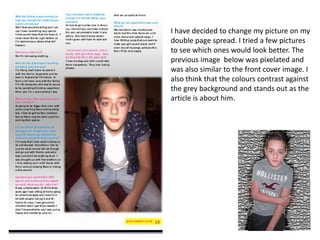
1. I have decided to change my picture on my
double page spread. I tried a few pictures
to see which ones would look better. The
previous image below was pixelated and
was also similar to the front cover image. I
also think that the colours contrast against
the grey background and stands out as the
article is about him.
2. Another change that I have made to my double page spread is the font colour. Before i
used pink for the main text. Now I have used the same two colours, pink and blue, but
have alternated between each questions. For the main font i have used black so that it is
easier to read but have still stuck to the housestyle by using two house style colours for
the questions.