Online usability for conversion marketing
•
0 recomendaciones•413 vistas

This presentation provides you with an overview of the most famous usability findings for regular web sites having acquisition flows. It also provides do's and don'ts to address those. Enjoy.

Recomendados
Recomendados
Más contenido relacionado
La actualidad más candente
La actualidad más candente (20)
Similar a Online usability for conversion marketing
Similar a Online usability for conversion marketing (20)
Último
Último (20)
Online usability for conversion marketing
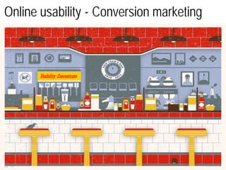
- 1. Online usability - Conversion marketing Usability Concentrate
- 2. Online usability – Presentation objectives The goal of this presentation is to share top studied online usability findings from conferences, books, prominent web sites, surveys, influential bloggers that apply to your online activities. It introduces practical guidelines that purposely avoid some popular and/or inspirational themes (7+/-2 principle, 3-click rule, 80/20 Pareto rule, Fitt’s law, focus on do’s and don’ts to baby duck syndrome, ..) and instead achieve conversion-oriented marketing.
- 3. Online usability – Introduction Usability is the proven key to conversion for remote users in general and internet users in particular. UX is studied and measured. Every recommendation within this presentation works when applied in the right context. Some sources used: uxdesign.smashingmagazine, nngroup, uxmag, useit, cardinalpath, etc.
- 4. 1 Meet your average web user: a scanner Average Web user
- 5. Guideline 1: Web pages must be ‘scannable’ Page are scanned first, not read. As soon as the user’s eye cannot structure content easily, attention is lost and the sale is lost. Many items matter: UCD, content balance, spacing and out, simple IA, scrolling factor, physical consistency, ‘mystery meat navigation’, legibility, WUAUD intuition, … Sequential flow doesn’t apply on the web. Content must be obvious and self-explanatory. Content, once written, must be ‘organized’.
- 6. 2 For the impatient web user less is more
- 7. Guideline 2: Web copy must be short Eliminate fancy phrases or falsely naïve questions. Effective online writing is not about sophisticated vocabulary. It’s about communicating clear. Avoid redundancy . Use short, simple words. Some best practices Headings: 8 words or less Get to the point. And then stop. Sentences: 15 – 20 words Paragraphs: 40 – 70 words Pg word count: 250+ words Study what works online, ‘cliffhanger effect’, inverted pyramid, .. Kill promotional writing for plain objective language. Copy must be as short as relevant. From relevance marketing comes engagement.
- 8. 3 Bad USP finish first (nice features finish last)
- 9. Guideline 3: Focus on USP not features We know a lot about our products, users don’t have to. Don’t hesitate to skip features to highlight 1 or few USPs. Prioritize content (tabs, etc.). Relevance marketing helps build trust & is valued by user. When anything is user-repulsive, always explain. Copy helps design to keep users from thinking. A feature describes a product or service. A benefit is what the user gains from using that product or service Don’t say, ” Our duvets are warm and comfortable,” say “You’ll be warm and comfortable in one of our duvets.” In other words focus on making sure every line of your copy is dedicated to what’s in it for them.
- 10. 4 CTA is the name of the game
- 11. Guideline 4: Drive and write towards CTA The goal of web copy (content) is to The goal of text is to inform. get people to do something: a simulation/application. Once content has user attention then selling becomes possible. Therefore we must drive the user towards applying and write with CTAs in mind. The user’s attention must be focused on CTAs. Through structure, through text, graphically but also by use of the picture protagonist’s eyes . Information architecture & navigation should be predictable to empower web user who wants to be in control.
- 13. Guideline 5: Use images with parsimony Banner blindness within UI is eye-tracked & proven: banner is noticed but ignored. It extends to other too colorful zones. Users focus on page parts where they assume relevant information is: small text, links when few, .. Worse, images take away attention from USP and from CTA. They should never monopolize the ‘screenful’. So they should be used with strict rules and in relation with CTA. Don’t advertize. Lead the user. Use facts to achieve it. Users appreciate credibility and quality.
- 14. 6 Fear what your web design says about you
- 15. Guideline 6: Web design is like a first date.. .. With users cognitive brain: elements such as layout, contrast, typography, color palette, style, consistency, tangibility, color of links (..) all affect how users perceive our web site. Our brain is visual, vision is 40% faster than audio. Users don’t make right choices, they opt for first reasonable option, they follow intuition. Beyond that, design and content must be carefully mixed to optimize UX and therefore chosen inclusion may impact content. Design adds up to performance: remember 0.1” additional load time decreases sales by 1% at Amazon.
- 16. 7 The you in ‘yousability’ Yousability
- 17. Guideline 7: On the web write conversational ‘Readability’ is key. Write for the web reader conversational. You is a powerful word, use it as web users are receptive to it. ‘Self-reference effect’: we must connect to users personal concepts. Surveys show that finance web users hate corporate speak, local surveys show users don’t trust big banks. They just need them. So avoid corporate speak, avoid repeating product name. The web user is as impatient as assertive. He likes to think of himself as an aware customer who doesn’t want to be inspired ‘as in fooled’. So he wants clear short information ? Then give him that. Avoid classic ad story & visual. Avoid wordy wishy-washy phrases. Testimonials may add value if it clarifies a complex topic, if actual, if visual seems actual
- 18. 8 What’s the point of a great copy if nobody finds it ? W he r e is it ?
- 19. Guideline 8: On the web write to be found Write for how web users search. Use keywords that are popular with our targets. Research it. This increases SEM efficiency and eventually sales. Headings should also include searched-for keywords. Adjectives and prepositions (and, a, the, of) should be avoided. Before writing, copyists must be made aware of the keywords & phrases to use, to weave those words into the copy. Optimize SE with micro-format, systematic labeling, etc. Keywords and phrases supporting sites: www.overture.com www.wordtracker.com
- 20. 9 What’s the point of a great copy if nobody views it ? View what ?
- 21. Guideline 9: On the web write for the eye The ‘fold’ must be taken into account as the area guaranteeing highest revenues. It is not critical given screen resolution. The ‘foveal’ area is a tight area where users perceive the maximum level of detail (200/300 pixels), rest is blurred As visuals attract, most important messages and CTA should be displayed accordingly. The eye also follows ‘hard lines’, layout must direct to CTA. Also to take into account: left to right pattern, left alignment, pre-filling free fields, spacing & spacing out, priority ordering, ‘Gestalt’ alignment, …
- 22. 10 What’s true today may be wrong tomorrow
- 23. Guideline 10: Love being in beta Usability must be a permanent concern as technology evolves fast which challenges best practices. Design & copy must be verified frequently: quality & credibility matter to users - especially in corporate sectors. ‘TETO’ should be your motto. Usability testing is iterative, the earlier the better. Testing one user early is better than 50 near the end Weinberg’s law confirms neither designer nor developer should test his work.
- 24. Online usability – Conclusion keep it simple. It is a complex job to Never let the user think too much. Yet usability is not about a 10-guidelines summary. Neither the sole responsibility of the creative agency. It must be re-assessed everyday and tracked. Therefore a usability validation must systematically occur for any piece of the online acquisition path e-mail template, landing page, advertizing display, product page, application form, … Any optimization must then be tested whether it’s multivariate or A/B/.. and challenged as long as your conversion hasn’t reached 100% …
- 25. Thank you – Nicolas1.Robert@skynet.be Usability concentrate Nicolas1.Robert@skynet.be 0032(0)498.12.51.53