
Recomendados
Más contenido relacionado
La actualidad más candente
La actualidad más candente (20)
Similar a My Magazine cover breakdown
Similar a My Magazine cover breakdown (20)
Último
Último (20)
My Magazine cover breakdown
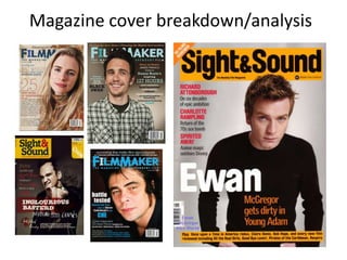
- 2. The breakdown will be centred around this mock up, I will be looking at the text, photos, composition and logos. I am trying to tap into the same audience as ‘sight and sound’ magazine and that’s why I have copied there titles and composition in order to try and attract there audience by offering the features that they enjoy with the actual ‘sight and sound’ magazine which, should hopefully attract them to my magazine with my effects and similar topics.
- 3. This is the ‘sight and sound’ logo that I chose for the mock up because I liked its square shape which made it easier to position on the poster and had a bigger impact because it is not as integrated as the other options that are available meaning that the logo will stick in an audiences mind. I also liked this logo but it did not have a background so I felt that although I could still place it well on the images it would not carry very much impact ,especially on the darker backgrounds where some of its colour is lost (it is bland and forgettable). The text itself is also not very bold which did not appeal to me and did not work with my idea after testing it on some of my earlier images. This logo is alike the one I chose but the reason it did not make the cut was because it is not as vibrant. The background to text ratio is equal but smaller than the other logos meaning it is weaker and not as strong than the logo I chose.
- 4. This logo was important as it is seen to be a convention of the ‘sight and sound’ magazines but due to its curvature it is harder to edit thus making it look slightly rough on the magazine, but hopefully with some more experience on Photoshop this issue can be rectified. I feel that I may have to change this photo because when it is enlarged it is slightly blurry, this is due to poor camerawork so in order to make my magazine look more professional I may have to retake the photo. The photo itself is quite similar to those that are featured on several independent film magazine covers, they all seem to feature a large headshot or mid shot of a large or new character within the industry. Learning from my previous feedback that I received from my poster I am going remove the spots and blemishes of the actors face in order for the magazine to look of industry standard.
- 5. Here our some other images that I tried using for the magazine mock up: This photo was good but I felt it was too far out and I wanted more of a close up, but I did like the background because it is original and does not require much editing and it also fits with my actors/directors attire and the theme of ‘sight and sound’. The reason this photo was not chosen was again due to poor camerawork, resulting in the photo being blurry. I liked the stance and facial expressions as I feel it could add a seriousness to the magazine. I also enjoyed the dark background making the figure seem prominent and powerful within the industry.
- 6. I opted to use two different colours for the cover lines and slogans (titles) on the side of the magazine because it attracts the audiences attention to the topics that are featured within the magazine. Various independent magazines also use this technique. To the right is an example of that said technique. I also decided to try and carry on the colour scheme I used for my poster as I felt it was effective. One area for improvement is the titles as they could be a different font to the cover lines just to show that each section displays a different topic, making it easier for the reader to differentiate. I do not feel that this font works on the background so for the next mock up I will look at changing the font and colour, that applies to the tag line as well as the title. I should also think about adding the price (for around £2.99). I do not want to charge too much because I cant offer the same content as the higher priced mainstream magazines such as ‘EMPIRE for example. In order to differentiate my magazine from my poster I will need to add the barcode on a second mock up.