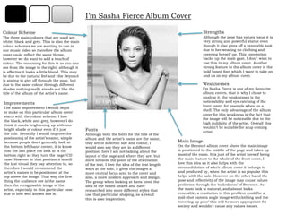
SlideShare una empresa de Scribd logo
1 de 6
I’m Sasha Fierce Album Cover Strengths Although the pose has values issue it is very strong and powerful statue even though it also gives off a venerable look due to her wearing no clothing and covering herself up. This convention backs up the male gaze, I don’t wish to use this in my album cover. Another strong feature to the album cover is the bold boxed font which I want to take on and us on my album cover.  Colour Scheme The three main colours that are used are, white, black and grey. This is also the main colour schemes we are wanting to use in our music video so therefore the album cover could reflect the same theme, however we do want to add a touch of colour. The reasoning for this is as you can see from the image to the right, although it is affective it looks a little bland. This may be due to the natural feel and vibe Beyoncé is aiming to give off through the pose, but due to the same colour through different shades nothing really stands out like the title of the album of the artist’s name. Weaknesses I’m Sasha Fierce is one of my favourite album covers, that is why I chose to analyse it, the weaknesses is the noticeability and eye catching of the front cover, for example when on a shelf. The only advantage of the album cover for this weakness is the fact that the image will be noticeable due to the high publicity of the artist. Overall this wouldn’t be suitable for a up coming artist.  Improvements The main improvement I would begin to make on this particular album cover starts with the colour scheme, I love the black, white and grey, however I do think it needs brightening up with one bright shade of colour even if it just the title. Secondly I would improve the positioning of the artist’s name, simple because people don’t generally look at the bottom left hand corner, it is know that the last place the look at is the bottom right as they turn the page/CD case. However in that position it is still the last visual they pay attention to, so therefore I would recommend the artist’s names to be positioned at the top above the image. That way the first thing the audience see is the name then the recognisable image of the artist, especially in this particular case due to how well known she is. Fonts Although both the fonts for the title of the album and the artist’s name are the same, they are of different size and colour, I would also say they are in a different position, here I am not talking about the layout of the page and where they are, but more towards the point of the orientation of the text. I love the idea of the text length ways at the side, it gives the images a more central focus area to the cover and also, a more modern approach and design. The group when looking at fonts loved the idea of the boxed looked and have researched into more different styles that use that particular shaping, as a result this is also inspiration. Main Image On the Beyoncé album cover above the main image is positioned in the middle of the page and takes up most of the room. It is just of the artist herself being the main feature to the whole of the front cover, I love this idea as it also helps with the reconsolidation of who’s album cover it belongs to and produced by, when the artist is so popular this helps with the sale. However on the other hand the pose and reflectivity of the image may cause values problems through the ‘nakedness’ of Beyoncé. As the main look is natural, and almost looks venerable, a resolution to this problem could be a mid-shot camera angle image with clothing and the ‘covering up pose’ this will be more appropriate for society and wouldn’t cause any values issues.
I’m Sasha Fierce Back of Album Improvements The only improvement I would make to the album cover is the us of a bright colour for the font, purely for visibility and eye-catching contrast. It will also draw viewers attention to important factors such ad the track list.  Colour Scheme The colour scheme on the back of the album is basically the same as the front however a little colour has been added of gold for the outfit that the artist is wearing.  It has an added effect of the light being shone on the image, where shading and contrast is used, this highlights certain features and areas and gives a lovely effect on an image rather than just block plain colours. It also looks more professional and modern. The black colour mainly gives a picture frame shaping round the edge of the page. Strengths I love the use of the gold colour of the clothing as it works so well with the black, white and grey colour scheme of the CD all round. Another feature I would consider to be a strength is the pose through the image of Beyoncé being strong, this is the opposite feel to the image on the front cover, possible showing the connotation of two sides to the artist herself.  Track List The CD itself contains two discs and this is illustrated on the track lists, providing a detailed encounter of what tracks are on what CD disc.  Disc one includes: ,[object Object]
Halo
Disappear
Broken Hearted Girl
Ave Maria

Más contenido relacionado

La actualidad más candente

Semiotic Analysis Of Album Covers
Semiotic Analysis Of Album CoversSemiotic Analysis Of Album Covers
Semiotic Analysis Of Album CoversNic JM
 
Digipack Presentation
Digipack PresentationDigipack Presentation
Digipack Presentationmrbentastic
 
Indie-Rock CD covers
Indie-Rock CD coversIndie-Rock CD covers
Indie-Rock CD coversmarinasoph
 
Cd cover analysis media studies
Cd cover analysis media studiesCd cover analysis media studies
Cd cover analysis media studiesmaden171
 
Digipak and Advert Analysis
Digipak and Advert AnalysisDigipak and Advert Analysis
Digipak and Advert Analysisediemurray
 
Album Cover Analysis
Album Cover AnalysisAlbum Cover Analysis
Album Cover AnalysisKhalid
 
Album covers Analysis
Album covers AnalysisAlbum covers Analysis
Album covers AnalysisJordan
 
Analyse magazine adverts or digipak
Analyse magazine adverts or digipakAnalyse magazine adverts or digipak
Analyse magazine adverts or digipakshayward99
 
Generic conventions of r&b digipaks
Generic conventions of r&b digipaksGeneric conventions of r&b digipaks
Generic conventions of r&b digipaksSam Benzie
 
Album cover analysis
Album cover analysisAlbum cover analysis
Album cover analysisKristyWright
 
Album cover analysis
Album cover analysisAlbum cover analysis
Album cover analysisSian Hurst
 
Cd cover analysis
Cd cover analysisCd cover analysis
Cd cover analysisJoeLingel
 
Rock Cover Analysis
Rock Cover AnalysisRock Cover Analysis
Rock Cover Analysisunipal390
 
Research case studies - Album art work and inserts
Research case studies - Album art work and insertsResearch case studies - Album art work and inserts
Research case studies - Album art work and insertsadinachante
 
Cd cover/magazine adverts analysis
Cd cover/magazine adverts analysisCd cover/magazine adverts analysis
Cd cover/magazine adverts analysis08BMolla
 
Electronic Rock Album Covers
Electronic Rock Album CoversElectronic Rock Album Covers
Electronic Rock Album CoversKateBracher
 
Cd album cover analysis
Cd album cover analysisCd album cover analysis
Cd album cover analysis07wilsk
 
Digipak and poster analysis (2)l
Digipak and poster analysis (2)lDigipak and poster analysis (2)l
Digipak and poster analysis (2)lholliemorriss
 

La actualidad más candente (20)

Semiotic Analysis Of Album Covers
Semiotic Analysis Of Album CoversSemiotic Analysis Of Album Covers
Semiotic Analysis Of Album Covers
 
Digipack Presentation
Digipack PresentationDigipack Presentation
Digipack Presentation
 
Indie-Rock CD covers
Indie-Rock CD coversIndie-Rock CD covers
Indie-Rock CD covers
 
Cd cover analysis media studies
Cd cover analysis media studiesCd cover analysis media studies
Cd cover analysis media studies
 
Digipak and Advert Analysis
Digipak and Advert AnalysisDigipak and Advert Analysis
Digipak and Advert Analysis
 
Album Cover Analysis
Album Cover AnalysisAlbum Cover Analysis
Album Cover Analysis
 
Album covers Analysis
Album covers AnalysisAlbum covers Analysis
Album covers Analysis
 
Analyse magazine adverts or digipak
Analyse magazine adverts or digipakAnalyse magazine adverts or digipak
Analyse magazine adverts or digipak
 
Digipak analysis
Digipak analysis Digipak analysis
Digipak analysis
 
Generic conventions of r&b digipaks
Generic conventions of r&b digipaksGeneric conventions of r&b digipaks
Generic conventions of r&b digipaks
 
Album cover analysis
Album cover analysisAlbum cover analysis
Album cover analysis
 
Analysis of Pop CD Covers
Analysis of Pop CD CoversAnalysis of Pop CD Covers
Analysis of Pop CD Covers
 
Album cover analysis
Album cover analysisAlbum cover analysis
Album cover analysis
 
Cd cover analysis
Cd cover analysisCd cover analysis
Cd cover analysis
 
Rock Cover Analysis
Rock Cover AnalysisRock Cover Analysis
Rock Cover Analysis
 
Research case studies - Album art work and inserts
Research case studies - Album art work and insertsResearch case studies - Album art work and inserts
Research case studies - Album art work and inserts
 
Cd cover/magazine adverts analysis
Cd cover/magazine adverts analysisCd cover/magazine adverts analysis
Cd cover/magazine adverts analysis
 
Electronic Rock Album Covers
Electronic Rock Album CoversElectronic Rock Album Covers
Electronic Rock Album Covers
 
Cd album cover analysis
Cd album cover analysisCd album cover analysis
Cd album cover analysis
 
Digipak and poster analysis (2)l
Digipak and poster analysis (2)lDigipak and poster analysis (2)l
Digipak and poster analysis (2)l
 

Destacado

Digipak Analysis
Digipak AnalysisDigipak Analysis
Digipak Analysisanum7
 
Album cover analysis
Album cover analysisAlbum cover analysis
Album cover analysisLeahMountain
 
Album cover analysis
Album cover analysisAlbum cover analysis
Album cover analysislouisa09
 
Katy Perry - CD Artwork Analysis
Katy Perry - CD Artwork AnalysisKaty Perry - CD Artwork Analysis
Katy Perry - CD Artwork AnalysisChloë Wallis
 
Cd cover analysis rihanna – loud
Cd cover analysis rihanna – loudCd cover analysis rihanna – loud
Cd cover analysis rihanna – loudsophiejvbell
 

Destacado (6)

Digipak Analysis
Digipak AnalysisDigipak Analysis
Digipak Analysis
 
Album cover analysis
Album cover analysisAlbum cover analysis
Album cover analysis
 
Mika CD Cover Analysis
Mika CD Cover AnalysisMika CD Cover Analysis
Mika CD Cover Analysis
 
Album cover analysis
Album cover analysisAlbum cover analysis
Album cover analysis
 
Katy Perry - CD Artwork Analysis
Katy Perry - CD Artwork AnalysisKaty Perry - CD Artwork Analysis
Katy Perry - CD Artwork Analysis
 
Cd cover analysis rihanna – loud
Cd cover analysis rihanna – loudCd cover analysis rihanna – loud
Cd cover analysis rihanna – loud
 

Similar a Analysis

Album cover analysing
Album cover analysingAlbum cover analysing
Album cover analysingsnipez21
 
Digipak analysis
Digipak analysisDigipak analysis
Digipak analysisset418
 
Digipack presentation
Digipack presentationDigipack presentation
Digipack presentationABM06
 
Digipack presentation
Digipack presentation Digipack presentation
Digipack presentation Nikachu
 
The process of creating my cd cover
The process of creating my cd coverThe process of creating my cd cover
The process of creating my cd coverbethanywchs
 
Analysis Of DVD Covers
Analysis Of DVD CoversAnalysis Of DVD Covers
Analysis Of DVD CoversAdil AbbAs
 
Magazine Advert Analysis
Magazine Advert Analysis Magazine Advert Analysis
Magazine Advert Analysis Browner97
 
Analysis Of 3 CD Digipak
Analysis Of 3 CD DigipakAnalysis Of 3 CD Digipak
Analysis Of 3 CD DigipakFrankParnell123
 
Cd album mag advert analysis
Cd album mag advert analysisCd album mag advert analysis
Cd album mag advert analysis07wilsk
 
Audience feedback
Audience feedback Audience feedback
Audience feedback Jessica
 
Kanye West
Kanye WestKanye West
Kanye Westsamritam
 
My creative decisions- images
My creative decisions-  imagesMy creative decisions-  images
My creative decisions- images014395
 
CD cover analysis
CD cover analysisCD cover analysis
CD cover analysisBrowner97
 

Similar a Analysis (20)

Album cover analysing
Album cover analysingAlbum cover analysing
Album cover analysing
 
Digipak analysis
Digipak analysisDigipak analysis
Digipak analysis
 
Digipack presentation
Digipack presentationDigipack presentation
Digipack presentation
 
Digipack presentation
Digipack presentation Digipack presentation
Digipack presentation
 
The process of creating my cd cover
The process of creating my cd coverThe process of creating my cd cover
The process of creating my cd cover
 
Digipaks
DigipaksDigipaks
Digipaks
 
Digipak Research
Digipak ResearchDigipak Research
Digipak Research
 
Analysis Of DVD Covers
Analysis Of DVD CoversAnalysis Of DVD Covers
Analysis Of DVD Covers
 
Anclilary products
Anclilary products Anclilary products
Anclilary products
 
Magazine Advert Analysis
Magazine Advert Analysis Magazine Advert Analysis
Magazine Advert Analysis
 
Kanye
KanyeKanye
Kanye
 
Analysis Of 3 CD Digipak
Analysis Of 3 CD DigipakAnalysis Of 3 CD Digipak
Analysis Of 3 CD Digipak
 
Cd album mag advert analysis
Cd album mag advert analysisCd album mag advert analysis
Cd album mag advert analysis
 
Audience feedback
Audience feedback Audience feedback
Audience feedback
 
CD Case Study 1
CD Case Study 1CD Case Study 1
CD Case Study 1
 
Beyonce
BeyonceBeyonce
Beyonce
 
Kanye West
Kanye WestKanye West
Kanye West
 
My creative decisions- images
My creative decisions-  imagesMy creative decisions-  images
My creative decisions- images
 
CD cover analysis
CD cover analysisCD cover analysis
CD cover analysis
 
Digipak
Digipak Digipak
Digipak
 

Más de paige123

Beyonce Analysis Album Cover
Beyonce Analysis Album CoverBeyonce Analysis Album Cover
Beyonce Analysis Album Coverpaige123
 
Beyonce Analysis
Beyonce AnalysisBeyonce Analysis
Beyonce Analysispaige123
 
Kelly Rowland Analysis
Kelly Rowland AnalysisKelly Rowland Analysis
Kelly Rowland Analysispaige123
 
Kelly Rowland Analysis
Kelly Rowland AnalysisKelly Rowland Analysis
Kelly Rowland Analysispaige123
 
RIh Album Cover
RIh Album CoverRIh Album Cover
RIh Album Coverpaige123
 
Rihanna Analysis
Rihanna AnalysisRihanna Analysis
Rihanna Analysispaige123
 
Analysis of Album Cover
Analysis of Album CoverAnalysis of Album Cover
Analysis of Album Coverpaige123
 
Analysis of Album Cover
Analysis of Album CoverAnalysis of Album Cover
Analysis of Album Coverpaige123
 

Más de paige123 (12)

Beyonce Analysis Album Cover
Beyonce Analysis Album CoverBeyonce Analysis Album Cover
Beyonce Analysis Album Cover
 
Beyonce Analysis
Beyonce AnalysisBeyonce Analysis
Beyonce Analysis
 
Kelly Rowland Analysis
Kelly Rowland AnalysisKelly Rowland Analysis
Kelly Rowland Analysis
 
Kelly Rowland Analysis
Kelly Rowland AnalysisKelly Rowland Analysis
Kelly Rowland Analysis
 
RIh Album Cover
RIh Album CoverRIh Album Cover
RIh Album Cover
 
Rihanna Analysis
Rihanna AnalysisRihanna Analysis
Rihanna Analysis
 
Poster
PosterPoster
Poster
 
Digi Pack
Digi PackDigi Pack
Digi Pack
 
Anaylsis
AnaylsisAnaylsis
Anaylsis
 
Analysis of Album Cover
Analysis of Album CoverAnalysis of Album Cover
Analysis of Album Cover
 
Analysis of Album Cover
Analysis of Album CoverAnalysis of Album Cover
Analysis of Album Cover
 
Pitch
PitchPitch
Pitch
 

Último

Apidays New York 2024 - The value of a flexible API Management solution for O...
Apidays New York 2024 - The value of a flexible API Management solution for O...Apidays New York 2024 - The value of a flexible API Management solution for O...
Apidays New York 2024 - The value of a flexible API Management solution for O...apidays
 
Cloud Frontiers: A Deep Dive into Serverless Spatial Data and FME
Cloud Frontiers:  A Deep Dive into Serverless Spatial Data and FMECloud Frontiers:  A Deep Dive into Serverless Spatial Data and FME
Cloud Frontiers: A Deep Dive into Serverless Spatial Data and FMESafe Software
 
Emergent Methods: Multi-lingual narrative tracking in the news - real-time ex...
Emergent Methods: Multi-lingual narrative tracking in the news - real-time ex...Emergent Methods: Multi-lingual narrative tracking in the news - real-time ex...
Emergent Methods: Multi-lingual narrative tracking in the news - real-time ex...Zilliz
 
Spring Boot vs Quarkus the ultimate battle - DevoxxUK
Spring Boot vs Quarkus the ultimate battle - DevoxxUKSpring Boot vs Quarkus the ultimate battle - DevoxxUK
Spring Boot vs Quarkus the ultimate battle - DevoxxUKJago de Vreede
 
Strategies for Landing an Oracle DBA Job as a Fresher
Strategies for Landing an Oracle DBA Job as a FresherStrategies for Landing an Oracle DBA Job as a Fresher
Strategies for Landing an Oracle DBA Job as a FresherRemote DBA Services
 
MS Copilot expands with MS Graph connectors
MS Copilot expands with MS Graph connectorsMS Copilot expands with MS Graph connectors
MS Copilot expands with MS Graph connectorsNanddeep Nachan
 
presentation ICT roal in 21st century education
presentation ICT roal in 21st century educationpresentation ICT roal in 21st century education
presentation ICT roal in 21st century educationjfdjdjcjdnsjd
 
Axa Assurance Maroc - Insurer Innovation Award 2024
Axa Assurance Maroc - Insurer Innovation Award 2024Axa Assurance Maroc - Insurer Innovation Award 2024
Axa Assurance Maroc - Insurer Innovation Award 2024The Digital Insurer
 
Polkadot JAM Slides - Token2049 - By Dr. Gavin Wood
Polkadot JAM Slides - Token2049 - By Dr. Gavin WoodPolkadot JAM Slides - Token2049 - By Dr. Gavin Wood
Polkadot JAM Slides - Token2049 - By Dr. Gavin WoodJuan lago vázquez
 
Corporate and higher education May webinar.pptx
Corporate and higher education May webinar.pptxCorporate and higher education May webinar.pptx
Corporate and higher education May webinar.pptxRustici Software
 
Ransomware_Q4_2023. The report. [EN].pdf
Ransomware_Q4_2023. The report. [EN].pdfRansomware_Q4_2023. The report. [EN].pdf
Ransomware_Q4_2023. The report. [EN].pdfOverkill Security
 
Why Teams call analytics are critical to your entire business
Why Teams call analytics are critical to your entire businessWhy Teams call analytics are critical to your entire business
Why Teams call analytics are critical to your entire businesspanagenda
 
[BuildWithAI] Introduction to Gemini.pdf
[BuildWithAI] Introduction to Gemini.pdf[BuildWithAI] Introduction to Gemini.pdf
[BuildWithAI] Introduction to Gemini.pdfSandro Moreira
 
Manulife - Insurer Transformation Award 2024
Manulife - Insurer Transformation Award 2024Manulife - Insurer Transformation Award 2024
Manulife - Insurer Transformation Award 2024The Digital Insurer
 
Apidays New York 2024 - Passkeys: Developing APIs to enable passwordless auth...
Apidays New York 2024 - Passkeys: Developing APIs to enable passwordless auth...Apidays New York 2024 - Passkeys: Developing APIs to enable passwordless auth...
Apidays New York 2024 - Passkeys: Developing APIs to enable passwordless auth...apidays
 
Web Form Automation for Bonterra Impact Management (fka Social Solutions Apri...
Web Form Automation for Bonterra Impact Management (fka Social Solutions Apri...Web Form Automation for Bonterra Impact Management (fka Social Solutions Apri...
Web Form Automation for Bonterra Impact Management (fka Social Solutions Apri...Jeffrey Haguewood
 
MINDCTI Revenue Release Quarter One 2024
MINDCTI Revenue Release Quarter One 2024MINDCTI Revenue Release Quarter One 2024
MINDCTI Revenue Release Quarter One 2024MIND CTI
 
Rising Above_ Dubai Floods and the Fortitude of Dubai International Airport.pdf
Rising Above_ Dubai Floods and the Fortitude of Dubai International Airport.pdfRising Above_ Dubai Floods and the Fortitude of Dubai International Airport.pdf
Rising Above_ Dubai Floods and the Fortitude of Dubai International Airport.pdfOrbitshub
 
TrustArc Webinar - Unlock the Power of AI-Driven Data Discovery
TrustArc Webinar - Unlock the Power of AI-Driven Data DiscoveryTrustArc Webinar - Unlock the Power of AI-Driven Data Discovery
TrustArc Webinar - Unlock the Power of AI-Driven Data DiscoveryTrustArc
 
Modular Monolith - a Practical Alternative to Microservices @ Devoxx UK 2024
Modular Monolith - a Practical Alternative to Microservices @ Devoxx UK 2024Modular Monolith - a Practical Alternative to Microservices @ Devoxx UK 2024
Modular Monolith - a Practical Alternative to Microservices @ Devoxx UK 2024Victor Rentea
 

Último (20)

Apidays New York 2024 - The value of a flexible API Management solution for O...
Apidays New York 2024 - The value of a flexible API Management solution for O...Apidays New York 2024 - The value of a flexible API Management solution for O...
Apidays New York 2024 - The value of a flexible API Management solution for O...
 
Cloud Frontiers: A Deep Dive into Serverless Spatial Data and FME
Cloud Frontiers:  A Deep Dive into Serverless Spatial Data and FMECloud Frontiers:  A Deep Dive into Serverless Spatial Data and FME
Cloud Frontiers: A Deep Dive into Serverless Spatial Data and FME
 
Emergent Methods: Multi-lingual narrative tracking in the news - real-time ex...
Emergent Methods: Multi-lingual narrative tracking in the news - real-time ex...Emergent Methods: Multi-lingual narrative tracking in the news - real-time ex...
Emergent Methods: Multi-lingual narrative tracking in the news - real-time ex...
 
Spring Boot vs Quarkus the ultimate battle - DevoxxUK
Spring Boot vs Quarkus the ultimate battle - DevoxxUKSpring Boot vs Quarkus the ultimate battle - DevoxxUK
Spring Boot vs Quarkus the ultimate battle - DevoxxUK
 
Strategies for Landing an Oracle DBA Job as a Fresher
Strategies for Landing an Oracle DBA Job as a FresherStrategies for Landing an Oracle DBA Job as a Fresher
Strategies for Landing an Oracle DBA Job as a Fresher
 
MS Copilot expands with MS Graph connectors
MS Copilot expands with MS Graph connectorsMS Copilot expands with MS Graph connectors
MS Copilot expands with MS Graph connectors
 
presentation ICT roal in 21st century education
presentation ICT roal in 21st century educationpresentation ICT roal in 21st century education
presentation ICT roal in 21st century education
 
Axa Assurance Maroc - Insurer Innovation Award 2024
Axa Assurance Maroc - Insurer Innovation Award 2024Axa Assurance Maroc - Insurer Innovation Award 2024
Axa Assurance Maroc - Insurer Innovation Award 2024
 
Polkadot JAM Slides - Token2049 - By Dr. Gavin Wood
Polkadot JAM Slides - Token2049 - By Dr. Gavin WoodPolkadot JAM Slides - Token2049 - By Dr. Gavin Wood
Polkadot JAM Slides - Token2049 - By Dr. Gavin Wood
 
Corporate and higher education May webinar.pptx
Corporate and higher education May webinar.pptxCorporate and higher education May webinar.pptx
Corporate and higher education May webinar.pptx
 
Ransomware_Q4_2023. The report. [EN].pdf
Ransomware_Q4_2023. The report. [EN].pdfRansomware_Q4_2023. The report. [EN].pdf
Ransomware_Q4_2023. The report. [EN].pdf
 
Why Teams call analytics are critical to your entire business
Why Teams call analytics are critical to your entire businessWhy Teams call analytics are critical to your entire business
Why Teams call analytics are critical to your entire business
 
[BuildWithAI] Introduction to Gemini.pdf
[BuildWithAI] Introduction to Gemini.pdf[BuildWithAI] Introduction to Gemini.pdf
[BuildWithAI] Introduction to Gemini.pdf
 
Manulife - Insurer Transformation Award 2024
Manulife - Insurer Transformation Award 2024Manulife - Insurer Transformation Award 2024
Manulife - Insurer Transformation Award 2024
 
Apidays New York 2024 - Passkeys: Developing APIs to enable passwordless auth...
Apidays New York 2024 - Passkeys: Developing APIs to enable passwordless auth...Apidays New York 2024 - Passkeys: Developing APIs to enable passwordless auth...
Apidays New York 2024 - Passkeys: Developing APIs to enable passwordless auth...
 
Web Form Automation for Bonterra Impact Management (fka Social Solutions Apri...
Web Form Automation for Bonterra Impact Management (fka Social Solutions Apri...Web Form Automation for Bonterra Impact Management (fka Social Solutions Apri...
Web Form Automation for Bonterra Impact Management (fka Social Solutions Apri...
 
MINDCTI Revenue Release Quarter One 2024
MINDCTI Revenue Release Quarter One 2024MINDCTI Revenue Release Quarter One 2024
MINDCTI Revenue Release Quarter One 2024
 
Rising Above_ Dubai Floods and the Fortitude of Dubai International Airport.pdf
Rising Above_ Dubai Floods and the Fortitude of Dubai International Airport.pdfRising Above_ Dubai Floods and the Fortitude of Dubai International Airport.pdf
Rising Above_ Dubai Floods and the Fortitude of Dubai International Airport.pdf
 
TrustArc Webinar - Unlock the Power of AI-Driven Data Discovery
TrustArc Webinar - Unlock the Power of AI-Driven Data DiscoveryTrustArc Webinar - Unlock the Power of AI-Driven Data Discovery
TrustArc Webinar - Unlock the Power of AI-Driven Data Discovery
 
Modular Monolith - a Practical Alternative to Microservices @ Devoxx UK 2024
Modular Monolith - a Practical Alternative to Microservices @ Devoxx UK 2024Modular Monolith - a Practical Alternative to Microservices @ Devoxx UK 2024
Modular Monolith - a Practical Alternative to Microservices @ Devoxx UK 2024
 

Analysis

  • 1. I’m Sasha Fierce Album Cover Strengths Although the pose has values issue it is very strong and powerful statue even though it also gives off a venerable look due to her wearing no clothing and covering herself up. This convention backs up the male gaze, I don’t wish to use this in my album cover. Another strong feature to the album cover is the bold boxed font which I want to take on and us on my album cover. Colour Scheme The three main colours that are used are, white, black and grey. This is also the main colour schemes we are wanting to use in our music video so therefore the album cover could reflect the same theme, however we do want to add a touch of colour. The reasoning for this is as you can see from the image to the right, although it is affective it looks a little bland. This may be due to the natural feel and vibe Beyoncé is aiming to give off through the pose, but due to the same colour through different shades nothing really stands out like the title of the album of the artist’s name. Weaknesses I’m Sasha Fierce is one of my favourite album covers, that is why I chose to analyse it, the weaknesses is the noticeability and eye catching of the front cover, for example when on a shelf. The only advantage of the album cover for this weakness is the fact that the image will be noticeable due to the high publicity of the artist. Overall this wouldn’t be suitable for a up coming artist. Improvements The main improvement I would begin to make on this particular album cover starts with the colour scheme, I love the black, white and grey, however I do think it needs brightening up with one bright shade of colour even if it just the title. Secondly I would improve the positioning of the artist’s name, simple because people don’t generally look at the bottom left hand corner, it is know that the last place the look at is the bottom right as they turn the page/CD case. However in that position it is still the last visual they pay attention to, so therefore I would recommend the artist’s names to be positioned at the top above the image. That way the first thing the audience see is the name then the recognisable image of the artist, especially in this particular case due to how well known she is. Fonts Although both the fonts for the title of the album and the artist’s name are the same, they are of different size and colour, I would also say they are in a different position, here I am not talking about the layout of the page and where they are, but more towards the point of the orientation of the text. I love the idea of the text length ways at the side, it gives the images a more central focus area to the cover and also, a more modern approach and design. The group when looking at fonts loved the idea of the boxed looked and have researched into more different styles that use that particular shaping, as a result this is also inspiration. Main Image On the Beyoncé album cover above the main image is positioned in the middle of the page and takes up most of the room. It is just of the artist herself being the main feature to the whole of the front cover, I love this idea as it also helps with the reconsolidation of who’s album cover it belongs to and produced by, when the artist is so popular this helps with the sale. However on the other hand the pose and reflectivity of the image may cause values problems through the ‘nakedness’ of Beyoncé. As the main look is natural, and almost looks venerable, a resolution to this problem could be a mid-shot camera angle image with clothing and the ‘covering up pose’ this will be more appropriate for society and wouldn’t cause any values issues.
  • 2.
  • 9.
  • 10. Radio
  • 11. Diva
  • 14. Hello
  • 15. Ego
  • 16. Scared of LonelyI am taking into consideration the use of two CD’s, and using the layout of the tracks listed one after another rather than in a bullet pointed list like above, this therefore saves room, but on the other hand looks less formal this may give a more modern theme however. Weaknesses The main weaknesses for me that I pointed out straight the way when reviewing this album cover is the font colour, as it is black it doesn’t show up very well against the background fading. Like on the front cover I suggested a bright colour used or the title of the album and the name of the artist, the colour therefore then could be related through the theme on the back cover. The track list isn’t too bad for contrast and the colour is white. Barcode Placing the barcode at the back of the CD cover as it isn’t really aesthetically pleasing to place on the front cover. A little barcode is all the is really needed and the bottom either left of right corner will be fine, this positioning is most likely where mine will be on my album cover. Detail The name of the artist is also placed on the back of the album cover to act as a ‘reminder’ . I am most likely not to include this as I believe the image will be enough, after having the names of the artist stated clearly and bigger on the front cover. Image The image on the back cover is very different to the from although the colour scheme is the same, however just a touch of gold on the clothing, this also blends in with the colour scheme as it shines off of the page fading and then becoming a more block colour. It gives the effect of lighting on the image.
  • 17. Ms. Kelly Album Cover Strengths Although the pose has values issue it is very strong and powerful statue like a diva pose, which we all know she is. I am definitely going to use this pose on my album cover because I love the idea of a powerful women. This convention backs up the male gaze, I don’t wish to use this in my album cover, however in a more positive way that the Beyoncé album cover. Another strong feature to the album cover is the bold boxed font which I want to take on and us on my album cover. Colour Scheme The three main colours that are used are, bright pink, black and a blended grey. This is the exact colour schemes that we aim to use in our music video so therefore the album cover could reflect the same theme, the touch of colour really works and this has been a reoccurring investigation and research in our blog so far. All the colours work and match really well with each other, especially as the artist clothing also is grey and white. In comparison to the Beyoncé album cover with the natural theme, Kelly is giving off a more diva look, and a dressed up feel. Weaknesses The weaknesses is the amount of space free and bare on the front cover, for example the top and the bottom left. The only advantage of the album cover for this weakness is the fact that the font is so big and bold that people will notice it against the bare page. Overall this wouldn’t be suitable for a up coming artist. Improvements The main improvement I would begin to make on Kelly Rowland’s album cover starts with the different fonts used in the title and the name of the artist as they are different to each other I think it makes it look messy and although the artist’s name is acting as a signature it is cover the main title. Secondly I would add more features onto the front cover as the artist is standing alone and is only cover the edge of the page making the rest look bare, however on the other hand I love the fact that the title is so big and stands out more than the Beyoncé one. Including the image, I would in fact have a md shot although the pose is showing a strong statue you don’t really get a feel from the artists face, not making it very personal to the viewer. If the artist wasn’t as well known as she is the audience will have to look at her name when glancing more in comparison to the image. Having a recognisable image of the artist improves the sales. Fonts As both the titles are different fonts in my eyes it makes the album cover look messy and almost cluttered although there is a lot of bare space around it. However on the other hand having the artist’s name in a different size and colour makes it stand out more than the rest, I would improve this however by making the artists name the big font rather than the album name. I would also say they are overlapping in the positioning, I don’t like this particular effect through the fact that it is hiding other information on the album cover which is vital. Here I am not talking about the layout of the page and where they are, but more towards the point of the orientation of the text. I love the text being bold and in your face. I will most likely use a bold font on my album cover. Main Image On the Beyoncé album cover above the main image is positioned in the middle of the page and takes up most of the room. However this image it places at the side again taking up a lot of room but not acting as the main focus. It is on the other hand the artists name being the main feature to the whole of the front cover as that is the biggest part in size and mostly in the publicity. Having the clothing the same colour coordination to the album cover itself works really well, a bad point to this is that the artist’s image doesn’t stand out as much.
  • 18.
  • 21. Work
  • 26. Still in Love With My Ex
  • 27. Love
  • 29. This Is LoveI am taking into consideration the use of two CD’s, and using the layout of the tracks listed one after another rather than in a bullet pointed list like above, this therefore saves room, but on the other hand looks less formal this may give a more modern theme however. Weakness The main weaknesses for me that I pointed out straight the way when reviewing this album cover is the amount of space and the overlapping of the text. Like on the front cover I suggested a bigger picture used over-righting the title of the album and the name of the artist, the boldness of the font therefore then will still be recognised just as much. The track list isn’t too bad for contrast and the colour is white fading to pink Detail Having the image being the majority of the page acts well, however I think the two images should change from the front and back cover. The little writing at the bottom may not be as significant but it is difficult to read and visualise as the pink works well in the shading and blending part but the block colour isn't as contrasting as needed. Barcode Placing the barcode at the back of the CD cover as it isn’t really aesthetically pleasing to place on the front cover. A little barcode is all the is really needed and the bottom either left of right corner will be fine, this positioning is most likely where mine will be on my album cover. However the right hand side is the place the viewer sees last before turning the cover back to the front. Image The image on the back cover is very different to the from although the colour scheme is nearly the same, however as stated in the detail section I would change the use of images on each side as I think the back cover is more personal, still powerful, but it also take up the problem with space.
  • 30. Rude Boy Album Cover Strengths Although the pose has values issue it is very strong and powerful statue even though it also gives off a aggressive look due to her pose and covering her face up. Another strong feature to the album cover is the bold boxed font and black theme all together which I want to take on and us on my album cover. Colour Scheme The two main colours that are used are black and grey. This is also the main colour schemes we are wanting to use in our music video so therefore the album cover could reflect the same theme, however we do want to add a touch of colour. The reasoning for this is as you can see from the image to the right, although it is affective it looks very punk rock. This may be due to the strong, rebel vibe that Rihanna is aiming to give off through the pose, but due to the same colour through different shades nothing really stands out like the title of the album of the artist’s name. Weaknesses Rude Boy is one of my favourite songs, that is why I chose to analyse it, the weaknesses is the noticeability and eye catching of the front cover, for example when on a shelf. The only advantage of the album cover for this weakness is the fact that the image will be noticeable due to the high publicity of the artist. Overall this wouldn’t be suitable for a up coming artist. Improvements The main improvement I would begin to make on this particular album cover starts with the colour scheme, I love the black, white and grey, however I do think it needs brightening up with one bright shade of colour even if it just the title. Secondly I would improve and add a more of a title and the artists name and there is only an ‘R’. However in that position it is still the last visual they pay attention to mainly down to apart from the image it is the only thing there. Due to the high status of the artist her image probably is enough for the CD to be recognise. That way the first thing the audience see is the recognisable image of the artist, especially in this particular case there is no name or title for them to recognise. Main Image On the Rihanna album cover above the main image is positioned in the middle of the page and takes up all of the room. It is just of the artist herself being the main feature to the whole of the front cover, I love this idea as it also helps with the reconsolidation of who’s album cover it belongs to and produced by, when the artist is so popular this helps with the sale. However on the other hand the pose and reflectivity of the image may cause values problems through the ‘rebel’ of Rihanna. As the main look is urban, and almost looks aggressive, a resolution to this problem could be a mid-shot camera angle image with clothing and a softer visual pose, this will be more appropriate for society and wouldn’t cause any values issues. Fonts There isn't really much to comment on as the only piece of text on the page is that of the ‘R’. However I love the urban style and the hand drawn effect, I am going to take the hand drawn effect onto my album cover text.
  • 31.
  • 32. RUDE BOY (Instrumental) Strengths I would consider the strengths to mainly be the great contrasting. Overall I believe this album cover is astonishing, however there isn't really a lot to analyse rather than the attitude behind it. Barcode Placing the barcode at the back of the CD cover as it isn’t really aesthetically pleasing to place on the front cover. A little barcode is all the is really needed and the bottom either left of right corner will be fine, this positioning is most likely where mine will be on my album cover. However on this album it is place to the side at the top to the right, I haven't really ever considered the barcode being on the right but I will go onto investigate different positioning. Detail The name of the artist is also placed on the back of the album cover to act as a ‘reminder’ . I am most likely not to include this as I believe the image will be enough, after having the names of the artist stated clearly and bigger on the front cover. Another detail is the image of the front cover of the single. This I believe is not necessary and an image would be more athletically pleasing.