
Recomendados
Más contenido relacionado
Destacado
Destacado (20)
Más de palm2816
Último
Último (20)
Lab#13 responsive web design
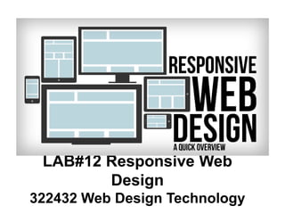
- 1. LAB#12 Responsive Web Design 322432 Web Design Technology
- 4. Responsive Web Design • • • Relative Fluid Layouts (%) • Breakpoints Media Queries • Meta Viewport • Device
- 6. •
- 7. • Relative Fluid Layouts (%) Example http://learn.shayhowe.com/advanced-html-css/responsive-web-design
- 10. Example @media screen and (min-width: 800px) and (max-width: 1200px) { .test { font- size: 14pt; } } http://www.designil.com/what-is-responsive-web-design-1.html @media screen and ( ) and ( ) and ... { /* CSS