
Recomendados
Más contenido relacionado
La actualidad más candente
La actualidad más candente (17)
Destacado
Similar a Homessless posters
Similar a Homessless posters (20)
Más de rachel1305
Último
Último (20)
Homessless posters
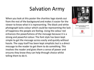
- 1. Salvation Army When you look at this poster the charities logo stands out from the rest of the background and makes it easier for the viewer to know what it is representing. The black and white photograph lacks colour which could be representing the lack of happiness the people are feeling. Using the colour red enhances the powerfulness of the message because it is a strong and powerful colour. The font style has been kept simple to get the message across easily and quickly without hassle. The copy itself has been kept simplistic but is a direct message to the reader to get them to do something. This involves the reader and gives them a sense of power and ensures they know they can help through choice whilst telling them to do it.
- 2. Thames Reach This homeless poster is a positive one. Rather than showing what homeless people live life and casting an upsetting tone, it shows a happy story and someone who has gained the help they needed and picked their life back up. This photograph of the man holding a sleeping bag indicates that is if a homeless campaign but he appears to be happy and this makes the viewer smile in return as they feel happy for him. Using the word ‘help’ gives the reader direct instructions and also involves them as they are being talked to directly. It also involves younger people because it tells you that you can help via text and this involves phones and modern technology that younger people seem to have attached to them constantly and always using.
- 3. The campaign poster starts off with a rhetorical question. This is effective because it makes the reader think and can force them to relate to how a homeless person must feel. It is also trying to say: “if you would not sleep here, why should they?”. The rest of the copy is located at the bottom of the poster and is trying to inform the reader by telling them that living on the streets is dangerous. This could make the reader feel bad/guilty for not helping homeless people so they may hand them change, food, water or get them proper help from an organisation. The photograph used on this poster is a bench and then a lot of greenery and nothingness. This is powerful in the sense of it shows you where homeless people sleep but it could have a deeper meaning to it also. The bench seems all alone and isolated from the rest of the world, almost lonely. This could be representing the homeless people being alone with nobody to help them, isolated from the rest of the population.
- 4. S.A.S.H The font style on this poster is a sans serif style. This keeps it very simple and makes it easy to get the message across quickly and effectively. The use of red expresses the powerfulness and strength of the message trying to be put across as it is a strong colour. It also catches your eye from a distance because it is a bright and vibrant shade. The company logo has been placed near to the centre to ensure you see it quickly and it has been enlarged so that you see it and it captures your eye from a distance.
- 5. When you look at this poster the first thing to catch your eye is the collage of photographs of various people. This is to show people that anyone can be homeless and you may not know it. It tries to pull people away from the stereotype of homeless people being old, dirty men with beards and mustaches who spend all their money on alcohol. The main statement of “let’s make everyone count” is in yellow and bold to make it stand out from the background and easy to read, catching your eye. The people in these photographs all look upset or scared. This makes you want to be able to help them and make them feel happy again.
- 6. YMCA Homeless When you see this campaign ad, the first thing you will see is the girl who is bent over looking very troubled and depressed. Once you see the headline “her dream is a place to call home” you understand her troubles and feel sorry for her. She appears to be a general teenage girl and not who you would typically think of when using the world homeless. The fact she is a young girl helps to get younger people to help because they can relate to her and think “she’s just like me”. The smaller text is factual and gives the reader some basic facts and information to help them try and understand the situation. It also gives information on what you can do and where to go if you find yourself in trouble and nowhere to live also.
- 7. Banksy Painting This famous painting was created by the street artist ‘Banksy’. It is a simple painting of a homeless guy sitting against a wall but his sign holds a very deep and powerful message. He is telling people that although he is homeless, he does not want people’s pity or money from them, all he wants is the way the government and society works to change. He wants people’s opinions to change and he wants more help and awareness to be offered so people understand and less people will be homeless due to them getting help. Another interpretation could be that he wants the government to change because they are to blame for all the people being homeless. Less people would be homeless if the government let all of the empty buildings around be used as shelters or flats and houses for people to live in.