The Networked Image blog: Design choices
•Descargar como DOCX, PDF•
0 recomendaciones•323 vistas

BA (Hons) Media Studies: Year 1, Semester 1 Module: The Networked Image A document containing the reasons for my design choices for my WordPress blog.

Recomendados
Más contenido relacionado
La actualidad más candente
La actualidad más candente (19)
Destacado
Similar a The Networked Image blog: Design choices
Similar a The Networked Image blog: Design choices (20)
Más de Rachel Ashby
Último
Último (20)
The Networked Image blog: Design choices
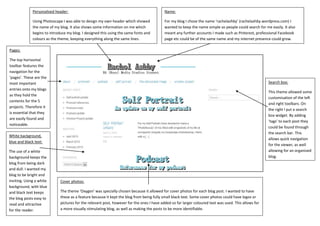
- 1. Pages: The top horizontal toolbar features the navigation for the ‘pages’. These are the most important entries onto my blogs as they hold the contents for the 5 projects. Therefore it is essential that they are easily found and noticeable. Personalised header: Using Photoscape I was able to design my own header which showed the name of my blog. It also shows some information on me which begins to introduce my blog. I designed this using the same fonts and colours as the theme, keeping everything along the same lines. Search box: This theme allowed some customisation of the left and right toolbars. On the right I put a search box widget. By adding ‘tags’ to each post they could be found through the search bar. This allows quick navigation for the viewer, as well allowing for an organised blog. Cover photos: The theme ‘Oxygen’ was specially chosen because it allowed for cover photos for each blog post. I wanted to have these as a feature because it kept the blog from being fully small black text. Some cover photos could have logos or pictures for the relevant post, however for the ones I have added so far larger coloured text was used. This allows for a more visually stimulating blog, as well as making the posts to be more identifiable. White background, blue and black text: The use of a white background keeps the blog from being dark and dull. I wanted my blog to be bright and inviting. Using a white background, with blue and black text keeps the blog posts easy to read and attractive for the reader. Name: For my blog I chose the name ‘rachelashby’ (rachelashby.wordpress.com) I wanted to keep the name simple so people could search for me easily. It also meant any further accounts I made such as Pinterest, professional Facebook page etc could be of the same name and my internet presence could grow.