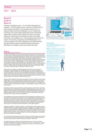
Read it! Grab it! Share it!

Creating compelling content – in a beautiful infographic for example – is only of value when it is seen by or shared with as many people as possible. As social media matures, it is no longer enough to post that infographic on your website and trust that your search engine optimization team will add the right magic to impact search results and reach your target audiences. Today social networking sites such as Facebook and Twitter are enabling a new, more sophisticated, human-led system of connecting, organizing and distributing data. As a result, companies now need to integrate social media features into their online content to facilitate sharing and increase distribution of valuable content across these networks. Written by: Rachelle Spero, Brunswick, New York

Recomendados
Recomendados
Más contenido relacionado
La actualidad más candente
La actualidad más candente (20)
Similar a Read it! Grab it! Share it!
Similar a Read it! Grab it! Share it! (20)
Más de Rachelle Spero
Más de Rachelle Spero (10)
Último
Último (20)
Read it! Grab it! Share it!
- 1. Features Brunswick Issue three Review Winter 2010 Read it! Grab it! Share it Creating compelling content – in a beautiful infographic for example – is only of value when it is seen by or shared with as many people as possible. As social media matures, it is no longer enough to post that infographic on your website and trust that your search engine optimization team will add the right magic to impact search results and reach your target audiences. Today social networking sites such as Facebook and Twitter are enabling a new, more sophisticated, human-led system of connecting, organizing and distributing data. As a result, companies now need to integrate social media features into their online content to facilitate sharing and increase distribution of valuable content across these networks. Written by: Rachelle Spero, Brunswick, New York For well over a decade people have been starting their online experience on their search engine of choice, such as Google or Microsoft’s Bing. Companies selling products or services became wise to this behavior, and quickly invested billions of dollars on search engine optimization (SEO) and search engine marketing (SEM) techniques to help their online content compete for a premium spot on the first or second page of search results. These search strategies became so successful that companies would adjust their investment based on the timing of a product launch or in the event of a crisis to manage reputation. The more money invested in specific keywords, the more likely a company’s content will appear in the top pages of the search results. This massive growth of enterprise-generated web pages, optimized for search, is now diminishing the value of the search results, driving online users to social networks of “human search engines.” Known as “curators of content,” they gather, refine and serve up relevant information to their communities of interested readers, subscribers, followers or friends. These curators of information are typically passionate consumers, former journalists or specialists on a particular subject, such as marketing, food, cars, health, technology or the environment. Curators invest their time, for free, aggregating, analyzing and editing the best sources of information on the web, and then share only the content that is most valuable to their specific audience within their social network. As a result, status updates on Facebook, tweets on Twitter or even e-mails with links to curated content are becoming the new entry points for many users accessing and connecting to relevant information online. Google and Bing recognized this growing trend towards online users navigating the web through “shared media” on social networking sites and added social search features to their results. For example, Bing has a social search feature, and Google sources content from Twitter updates, Facebook fan pages, and blogs within a segment of its search engine. So now companies must not only think about optimizing content for search, but also facilitate the sharing of content across social networks. Optimizing content for social media sharing is a technical process in which RSS, e-mail or other social media buttons are integrated into a webpage or offered alongside an article, video or other digital content to inspire users to instantaneously and systematically disperse the information via Facebook, Twitter and other social networking sites. These icons allow people to share links to articles, images and video on the web – adding to the impact on social search as well as the distribution across multiple social networking platforms. Online publishers and news sites recognize the benefits of integrating social features such as the Facebook or Twitter buttons into their sites. First, it enables readers to instantly grab a link of the article and post it into their status update, which then broadcasts the article ’s headline to a potentially new audience of readers. Second, the shared links drive traffic from the curator’s status update directly to the online news properties. Finally, these features offer a sophisticated way to track the most shared articles, and measure the most valuable content, based on the number of times it is shared via a tweet, status update, e -mail or RSS subscription. In addition to enabling your content to be shared, it is also important to allow curators to extract individual elements. It’s no longer acceptable to lock up an infographic in a 50-page PDF, or secure a video on a company website. Presenting information in a flexible way that allows curators to extract and share the elements that interest them will increase the probability of sharing. Don’t be afraid to let people “mash-up” your information with content from other sources, or to annotate it with their own comments. For example, enable the user to edit the infographic, and to select the bit that is most relevant to their audience. True, some people may still access your graphic directly on the company website, and many will still come across it through a Google search, but an increasing number of people will receive it through their social network of choice, most likely a Facebook or Twitter feed. The benefits of optimizing content for social media sharing are clear in terms of increased distribution of information. In addition, the opportunity to track and – most useful of all – measure the number of clicks, shares, retweets and subscribers can determine the effectiveness of a company’s communications investment. Rachelle Spero is a Director in Brunswick’s New York office and specializes in digital and social media communications. She is also an adjunct Professor for New York University ’s Public Page 1 / 3 Relations and Corporate Communications Graduate Program.
- 2. company’s communications investment. Rachelle Spero is a Director in Brunswick’s New York office and specializes in digital and social media communications. She is also an adjunct Professor for New York University ’s Public Relations and Corporate Communications Graduate Program. Read more 1|2|3|4|5|6 Features Brunswick Issue three Review Winter 2010 Infographics show and tell Written by: Michelangelo Bendandi, Brunswick, London You know that a trend has been established when the parodies begin. On the opposite page you will find the Big Graphic Blueprint, created by Nathan Yau, which mocks the modern trend of supplying data in some sort of chart. Certainly infographics – presenting often complicated data in an illustrative way in order to attract attention and help understanding – are very trendy just now.But the process is not at all new. Take for example the Nightingale Rose Graph, also shown opposite. It is named after its creator, Florence Nightingale, an English nurse who became famous during the Crimean War, when she looked after wounded soldiers. Nightingale was also a statistician and her graphic uses what are now commonly referred to as “polar diagrams.” It uses a type of pie chart to show the causes of mortality in the army, and was sent in a report to Queen Victoria in 1858. In the 1930s, the International System of Typographic Picture Education, Isotype, was developed by the Viennese social scientist and philosopher Otto Neurath and designer Gerd Arntz as a method for visual statistics. Neurath was the founding director of the Social and Economic Museum of Vienna, which promoted the idea that “to remember simplified pictures is better than to forget accurate pictures.” Isotype symbols, some examples of which are shown opposite, have been hugely influential in the development of information graphics. Edward Tufte is Professor Emeritus of Political Science, Statistics, and Computer Science at Yale University. A champion Business is no stranger to the chart and graph. But those pushing the boundaries of infographic of “intense clarity” and campaigner against “pitch culture,” Tufte design – normally outside the corporate world – are a multi-talented group, and are combining has been appointed by President Obama to the Recovery journalistic techniques with the visual logic of graphic design and the user -centric values of web Independent Advisory Panel to help make the Recovery.gov interfaces. The results are impressive. Corporate communicators, who are often faced with the challenge of presenting complicated data to a busy audience suffering from information overload, initiative accessible. should take note. A good place to see the whimsical illustration of weighty matter is London-based magazine Monocle – where serious economic and global affairs journalism is often presented with hyper- stylish cartoon cuteness. Monocle Creative Director Richard Spencer Powell explains: “The balance is in part to add lightness to a magazine which is serious, to inject color and wit and express certain notions which cannot be done with photography. It ’s an editorial balancing act.” On designing infographics, Spencer Powell believes that you have to have the technical skills but also a good graphic and editorial eye. “You have to be subtle, not flash. The information should be legible first and attractive second, not bombastic or distracting.” “Advertising has long known the power of simple, visual communication. Tight concepts, strong visuals and very short copy,” says David McCandless, writer, designer and author of a psychedelic ode to the infographic, Information is Beautiful. Asked to describe what infographics are in one word, McCandless answers “portals,” suggesting a gateway through which we can access data. This is perhaps where the influence of the web becomes apparent. Infographics provide, he says, “a way of accessing the flood of information we are drowning in, ” in the same way that good web apps do. Similarly, the graphic user interface (GUI) of something like the iPhone helps people navigate a plethora of information. Monocle’s Spencer Powell continues: “Apple are the world’s best information designers. Essentially they are digital librarians. All they have ever done is make a simple humanistic way to store and display information.” A good infographic achieves something similar by applying visual navigation aids, such as proportion, form and color, to a data set. The goal is the holy grail of communications: something interesting. Read more 1|2|3|4|5|6 Page 2 / 3
- 3. Features Brunswick Issue three Review Winter 2010 Infographics show and tell Written by: Michelangelo Bendandi, Brunswick, London You know that a trend has been established when the parodies begin. On the opposite page you will find the Big Graphic Blueprint, created by Nathan Yau, which mocks the modern trend of supplying data in some sort of chart. Certainly infographics – presenting often complicated data in an illustrative way in order to attract attention and help understanding – are very trendy just now.But the process is not at all new. Take for example the Nightingale Rose Graph, also shown opposite. It is named after its creator, Florence Nightingale, an English nurse who became famous during the Crimean War, when she looked after wounded soldiers. Nightingale was also a statistician and her graphic uses what are now commonly referred to as “polar diagrams.” It uses a type of pie chart to show the causes of mortality in the army, and was sent in a report to Queen Victoria in 1858. In the 1930s, the International System of Typographic Picture Education, Isotype, was developed by the Viennese social scientist and philosopher Otto Neurath and designer Gerd Arntz as a method for visual statistics. Neurath was the founding director of the Social and Economic Museum of Vienna, which promoted the idea that “to remember simplified pictures is better than to forget accurate pictures.” Isotype symbols, some examples of which are shown opposite, have been hugely influential in the development of information graphics. Edward Tufte is Professor Emeritus of Political Science, Statistics, and Computer Science at Yale University. A champion Business is no stranger to the chart and graph. But those pushing the boundaries of infographic of “intense clarity” and campaigner against “pitch culture,” Tufte design – normally outside the corporate world – are a multi-talented group, and are combining has been appointed by President Obama to the Recovery journalistic techniques with the visual logic of graphic design and the user -centric values of web Independent Advisory Panel to help make the Recovery.gov interfaces. The results are impressive. Corporate communicators, who are often faced with the challenge of presenting complicated data to a busy audience suffering from information overload, initiative accessible. should take note. A good place to see the whimsical illustration of weighty matter is London-based magazine Monocle – where serious economic and global affairs journalism is often presented with hyper- stylish cartoon cuteness. Monocle Creative Director Richard Spencer Powell explains: “The balance is in part to add lightness to a magazine which is serious, to inject color and wit and express certain notions which cannot be done with photography. It ’s an editorial balancing act.” On designing infographics, Spencer Powell believes that you have to have the technical skills but also a good graphic and editorial eye. “You have to be subtle, not flash. The information should be legible first and attractive second, not bombastic or distracting.” “Advertising has long known the power of simple, visual communication. Tight concepts, strong visuals and very short copy,” says David McCandless, writer, designer and author of a psychedelic ode to the infographic, Information is Beautiful. Asked to describe what infographics are in one word, McCandless answers “portals,” suggesting a gateway through which we can access data. This is perhaps where the influence of the web becomes apparent. Infographics provide, he says, “a way of accessing the flood of information we are drowning in, ” in the same way that good web apps do. Similarly, the graphic user interface (GUI) of something like the iPhone helps people navigate a plethora of information. Monocle’s Spencer Powell continues: “Apple are the world’s best information designers. Essentially they are digital librarians. All they have ever done is make a simple humanistic way to store and display information.” A good infographic achieves something similar by applying visual navigation aids, such as proportion, form and color, to a data set. The goal is the holy grail of communications: something interesting. Read more 1|2|3|4|5|6 Page 3 / 3