
Recomendados
Más contenido relacionado
La actualidad más candente
La actualidad más candente (20)
Destacado
Destacado (20)
Similar a Lo 3 proposal 1
Similar a Lo 3 proposal 1 (20)
Más de rdecarlo12
Último
Último (20)
Lo 3 proposal 1
- 1. Unit 13 – Planning and Pitching a Print based Media Product - Proposal Name: Rhia Decarlo Candidate Number: Center Number: 64315
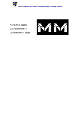
- 2. Unit 13 – Planning and Pitching a Print based Media Product - Proposal Format: Magazine I am going to produce a music magazine inspired by the Bauer media’s Mojo. I am going to create the magazine in the form of a front cover and DPS (double page spread) as part of a larger promotional project for ‘Music Matters’ magazine. Working Title: My working title is ‘MM ‘ although this might change. ‘MM’ stands for music matters and I have chosen this to be my working title as I want to show the importance of music. I have presented it in a font style I have found on Dafont.com which is a large bold font making it stand out on the page. I have chosen a white font on a black background as I wanted to keep it simple and was inspired by ‘Mojo’ magazines black and white font which is my magazine of inspiration. Genre: The sub-genre of my magazine is going to be classic rock therefore my magazine is going to be aiming to compete with magazines from the same subgenre for example my magazine of inspiration (Mojo Magazine) and magazines such as Kerrang and Classic rock. Content: The name of sub-genre entitled ‘MM’ magazine will contain many photographs related to classic rock, artists etc. The magazine will feature songs, information on the artists, gossip and useful information on gigs and concerts. The magazine will also feature less popular bands which in some cases readers may not know at all however this is going to be used as a method to help get there name’s out there. Style or Approach: • My choice of colours for this magazine are black, red, and white. These are colours frequently used by classic rock artists, for example – ACDC, the rolling stones etc. therefore I feel the genre is being shown well with the use of these colours. • My choice of font for the masthead, is bold and simple. Yet still stands out with the white font on being on a black background. I have chosen a simplistic font as a simplistic font in used on my magazine of inspiration (mojo magazine). I feel that if I had used a dramatic font it may come across as quite tacky and over the top. • The main image featured on my front cover is going to be the band ACDC as this issue of my magazine is going to be focused of them. Resulting in the majority of images inside the magazine being related to them also. Audience: The audience is mostly 35+ as the magazine has a more mature taste of music, however some younger people may enjoy it. The targeted Gender of my magazine is mainly male, hence the use of “manly” colours, although some females may find the magazine appealing. Music plays a big part in people’s lives as it Is what people use to help them focus whilst working or simply just for entertainment, making many of their activity’s and appearance is based around their style of music. This magazine isn’t targeted at any particular ethnicity many people from different ethnicity’s listen to classic rock, not any in particular. Classic rock fans are stereotyped as being the type of people into rebellion, alcohol, drugs and generally quite scruffy people. Length: • I aim to make my magazine approx 3 pages including the front and back cover, with the Dimensions:210mm x 290mm. • I have chosen these sizes because my magazine of inspiration (mojo magazine) is
- 3. Unit 13 – Planning and Pitching a Print based Media Product - Proposal