SlideShare una empresa de Scribd logo
1 de 8
Rebecca Black
Contents Pages for music magazines
Rebecca Black
Contents Pages for music magazines


Masthead
The masthead is at the top left of the contents page. The font style looks the same
throughout. There is only two colours white text on a red background this makes
the masthead stand out in comparison to the rest of the content page.

Necessary Information
The date and issue number is located at the top right of the page. There are
several page numbers located on the screen however they are not in order and
the magazine have done this because them particular page numbers will appeal
to the audience more than the others. At the bottom there is a page number to
tell you what page you are on. There are 2 websites to choose from and it is
located underneath the date and issue number.

Text
The text is quite short as it is just a sneak peak at what to expect in the magazine.
It is informal as it jokes on about going to the gym. There isn’t a lot of text in
comparison to other magazines and this is to appeal to the reader because you
want a preview what to expect not an essay. The purpose of the text is to explain
on what the sub-heading is talking about. There are several sub-heading as there
are several stories in the magazine that they want to use to appeal to the reader.
The order of the text is quite structured as the layout is around the main image.

Font
The font used is the same throughout the cover of the magazine. They have used
the same font style throughout so that one story doesn’t stand out more that the
rest. There are 4different colours that have been used. There have been no italics
used. There is bold text and that has been used for the title and the review and
they have done this so that the eye is drawn to the content underneath.

Images
There are two images used in the contents page – one main image that has a little
sub-heading, it positioned underneath and to the right of the text beside it and
writing over the top of the image and the second image is much smaller and
beside this one has several different captions beside it and this is situated
underneath the main image.

Composition
The images are framed by the text around it. The layout is quite formal. They
have also used layering for the image and on top of that they have some text.
Both images relate to the text.

Linguistic Features
There are not very noticeable linguistic features in this content.

Colour
There are only 4 colours used (red, white, black and a dark cream) in this
contents page and the images also use them three colours as they look quite
minimalist in colour.
Rebecca Black
Contents Pages for music magazines
Rebecca Black
Contents Pages for music magazines


Masthead
The masthead is in the left hand side of the screen and it is located to the right of
the corner this is strange as usually the masthead is located to the right of the left
hand corner. The masthead is in bold and there has been several colours used in
the masthead: white, black, yellow, red, green and blue.

Necessary Information
The date, website and page number is located at the bottom right of the
magazine. The issue number is located in a separate place at the top of the
magazine covers underneath the CONTENTS title.

Text
The text describes what is in the magazine but also what events are coming soon
and exclusives you can get online. The text is quite informal and friendly. Its
purpose is to advertise some of the things that will be included in the magazine.
There are several sub-headings to describe not only what is in the magazine but
also to give a headline of some of the magazines exclusives. The layout of the text
is structured well however there is a lot of text for the audience to deal with
making me think that the magazine cover is text led. They have numerical order
for the chart that is at the left hand side of the page and they also have numbers
for the different page numbers.

Font
It looks as though there is only two types of text used; one for the title and one
for the text underneath and I think they have done this to make the eye is drawn
to the sub-heading, There has been 2 colours used black and blue and they have
done this to separate each story. There have been no italics used. There has been
some text in bold and they have used bold to highlight the different celebrities
names.

Images
There have been 4 images used: the main image is situated at the middle right of
the magazine page, the rest is situated at the top of the screen underneath the
contents title and the images are of celebrities. The main image has text around it
quite closely and the other three images has numbers long the bottom right of
the image to show which page number in the magazine the celebrity will be
featured on.

Composition
They have frames this page with neat lines and structured text lines to frame the
images and the layout is very structured. They haven’t really used layering in the
magazine contents page. The images relate to text that is situated beside the
image. I think that the contents page of the magazine is text led because it has
more text than pictures however the text is quite small in comparison to the
images suggesting that the cover is image led.
Rebecca Black
Contents Pages for music magazines
Linguistic Features
There are no rhetorical questions, assonance and puns. They have used minimal
alliteration for example ‘Power Players’. They have used little paragraph features
to tease the audience (enigma code). There aren’t many linguistic features to give
a massive effect on the magazine.

Colour
The magazine has used different colours: red, green, black, white and blue. The
images colours are quite dark as the different celebrities are wearing black in
every picture. These colours make the tone of the magazine have a more
polished and professional finish and they also have used colour in the text so that
certain parts of the text stands out.
Rebecca Black
Contents Pages for music magazines
Rebecca Black
Contents Pages for music magazines
Masthead
The masthead is situated in the middle of the magazine. They have used the same
font style for the masthead however they have used to different colours: white
for the actual masthead and then after this it states ‘THIS WEEK’ they have put
this in old to separate this from the masthead and to make your eyes attract to it.

Necessary Information
The date and issue number is situated under the contents page sub-title. They
have not put a page number on this magazine. They do not have any website link
however they do have a subscription advertised at the bottom right hand side of
the magazine.

Text
The text is names of bands and there is a huge paragraph at the side of the page
that is dedicated to the editors writing. The formality of this is quite friendly and
its purpose is to give a sense of relationship to the audience as the editor is doing
the magazine to keep the audience happy. The celebrity’s names have been put in
there to let the audience know who is featured in the magazine and to hopefully
by it for that reason. There are several sub-headings to separate the different
article features in the magazine. The order in a way is structure however the
layout is quite messy. They use umbers however they don’t have the numbers in
numerical order as they are just listing the page numbers that they think the
audience would enjoy the most

Font
There are 3 different types of font used: one for them masthead, one for the text
and one for the sub-headings and they have done this to make the eye see
something new and the audience will also focus more on the changes in the text
and the eyes will be drawn to that. They have used 4 different colours: red,
yellow, white and black. They haven’t added any italic writing however they have
used bold text to carry on the theme of the masthead.

Composition
They haven’t really used the framing of the text and images very well however
the only noticeable framing is on the masthead as they have used a black strip to
separate the picture on the top half to the writing and text on the bottom half.
They have used the layout with the text by putting vertical lines to separate the
different columns. The images relate to the text that is beneath. The magazine
contents page is very image led as there has half the page just for 1 image.

Linguistic Features
They have no used any noticeable rhetorical questions, alliteration, assonance
and puns however they have used enigma codes, they have done this by using
celebrity names to give teases to the audience and in some of the articles short
paragraphs about what is to be expected.
Colour
For the text they have used 4 different colours and for the images they have used
quite dark images however they have some lighter features in them for example
the person red hair so that it matches the red in the text. Thy have used these
Rebecca Black
Contents Pages for music magazines
colours to add effect to the images and text as the colour you can see in the
magazine page your eyes will be drawn to it.

Más contenido relacionado

La actualidad más candente

Magazine analysis
Magazine analysisMagazine analysis
Magazine analysisAlice Bates
 
Evaluation presentation
Evaluation presentationEvaluation presentation
Evaluation presentationEmily Brown
 
Magazine analysis
Magazine analysisMagazine analysis
Magazine analysisAlice Bates
 
Contents page analysis
Contents page analysisContents page analysis
Contents page analysisshaniajay
 
Content page analysis
Content page analysisContent page analysis
Content page analysisGeorgia Grant
 
As media 2u
As media 2uAs media 2u
As media 2u07tjames
 
Analysing music magazines
Analysing music magazinesAnalysing music magazines
Analysing music magazines07tjames
 
Table of contents Analyze
Table of contents AnalyzeTable of contents Analyze
Table of contents AnalyzeRosie
 
Contents page analysis
Contents page analysisContents page analysis
Contents page analysisYenpopo
 
Compare and contrast of two music magazines
Compare and contrast of two music magazinesCompare and contrast of two music magazines
Compare and contrast of two music magazinesleomatcham
 
Research into codes and conventions
Research into codes and conventionsResearch into codes and conventions
Research into codes and conventionsKatherynclare
 
Evaluation powerpoint
Evaluation powerpointEvaluation powerpoint
Evaluation powerpointRezamarmulak
 
Magazine Contents page textual analysis media studies
Magazine Contents page textual analysis media studiesMagazine Contents page textual analysis media studies
Magazine Contents page textual analysis media studiesHumble Awan
 

La actualidad más candente (17)

Magazine analysis
Magazine analysisMagazine analysis
Magazine analysis
 
Evaluation presentation
Evaluation presentationEvaluation presentation
Evaluation presentation
 
As 21
As 21As 21
As 21
 
Magazine analysis
Magazine analysisMagazine analysis
Magazine analysis
 
Market Research
Market ResearchMarket Research
Market Research
 
Mojo
MojoMojo
Mojo
 
Contents page analysis
Contents page analysisContents page analysis
Contents page analysis
 
Content page analysis
Content page analysisContent page analysis
Content page analysis
 
Contents page analysis
Contents page analysisContents page analysis
Contents page analysis
 
As media 2u
As media 2uAs media 2u
As media 2u
 
Analysing music magazines
Analysing music magazinesAnalysing music magazines
Analysing music magazines
 
Table of contents Analyze
Table of contents AnalyzeTable of contents Analyze
Table of contents Analyze
 
Contents page analysis
Contents page analysisContents page analysis
Contents page analysis
 
Compare and contrast of two music magazines
Compare and contrast of two music magazinesCompare and contrast of two music magazines
Compare and contrast of two music magazines
 
Research into codes and conventions
Research into codes and conventionsResearch into codes and conventions
Research into codes and conventions
 
Evaluation powerpoint
Evaluation powerpointEvaluation powerpoint
Evaluation powerpoint
 
Magazine Contents page textual analysis media studies
Magazine Contents page textual analysis media studiesMagazine Contents page textual analysis media studies
Magazine Contents page textual analysis media studies
 

Destacado (6)

Nilda Hair
Nilda HairNilda Hair
Nilda Hair
 
Thanksgiving
ThanksgivingThanksgiving
Thanksgiving
 
Stupid thing
Stupid thingStupid thing
Stupid thing
 
K ata
K ataK ata
K ata
 
Powerpoint6
Powerpoint6Powerpoint6
Powerpoint6
 
Fm 2
Fm 2Fm 2
Fm 2
 

Similar a Contents page music magazine deconstruction

Contents Page Analysis
Contents Page AnalysisContents Page Analysis
Contents Page Analysisbanesybaby
 
Analysing contents pages
Analysing contents pagesAnalysing contents pages
Analysing contents pagesKyle150
 
Nme double page spread
Nme double page spread Nme double page spread
Nme double page spread asmediad14
 
Contents Page Analysis
Contents Page AnalysisContents Page Analysis
Contents Page AnalysisAnikayasmiin
 
Analysis of music magazines, cover, contents and double page spread
Analysis of music magazines, cover, contents and double page spreadAnalysis of music magazines, cover, contents and double page spread
Analysis of music magazines, cover, contents and double page spreadJakeyH
 
Music Magazine Research
Music Magazine ResearchMusic Magazine Research
Music Magazine ResearchOccy Occomore
 
Analysis of Music Magazines
Analysis of Music MagazinesAnalysis of Music Magazines
Analysis of Music MagazinesBeniboy39
 
Music and school Magazine analysis
Music and school Magazine analysisMusic and school Magazine analysis
Music and school Magazine analysishalimashalim
 
Tasks 1, 2 & 3 music magazine covers powerpoint
Tasks 1, 2 & 3 music magazine covers powerpointTasks 1, 2 & 3 music magazine covers powerpoint
Tasks 1, 2 & 3 music magazine covers powerpointlindseyberrill
 
Contents analysis
Contents analysisContents analysis
Contents analysisLongmark12
 
Magazine analysis
Magazine analysisMagazine analysis
Magazine analysisAlice Bates
 
Analyse of front cover, contents and double page spread
Analyse of front cover, contents and double page spreadAnalyse of front cover, contents and double page spread
Analyse of front cover, contents and double page spreadasmediae15
 
Tasks 1 4 and hwk 1
Tasks 1 4 and hwk 1Tasks 1 4 and hwk 1
Tasks 1 4 and hwk 1charlie__1
 
Magazine Contents Page Analysis
Magazine Contents Page AnalysisMagazine Contents Page Analysis
Magazine Contents Page Analysisjordanjenkins98
 

Similar a Contents page music magazine deconstruction (20)

Contents Page Analysis
Contents Page AnalysisContents Page Analysis
Contents Page Analysis
 
Analysing contents pages
Analysing contents pagesAnalysing contents pages
Analysing contents pages
 
Nme double page spread
Nme double page spread Nme double page spread
Nme double page spread
 
Researching student work
Researching student workResearching student work
Researching student work
 
Contents page analysis
Contents page analysisContents page analysis
Contents page analysis
 
Contents page analysis
Contents page analysisContents page analysis
Contents page analysis
 
Contents Page Analysis
Contents Page AnalysisContents Page Analysis
Contents Page Analysis
 
DPS
DPSDPS
DPS
 
Analysis of music magazines, cover, contents and double page spread
Analysis of music magazines, cover, contents and double page spreadAnalysis of music magazines, cover, contents and double page spread
Analysis of music magazines, cover, contents and double page spread
 
Contetns research 2
Contetns research 2Contetns research 2
Contetns research 2
 
Music Magazine Research
Music Magazine ResearchMusic Magazine Research
Music Magazine Research
 
Analysis of Music Magazines
Analysis of Music MagazinesAnalysis of Music Magazines
Analysis of Music Magazines
 
Music and school Magazine analysis
Music and school Magazine analysisMusic and school Magazine analysis
Music and school Magazine analysis
 
Tasks 1, 2 & 3 music magazine covers powerpoint
Tasks 1, 2 & 3 music magazine covers powerpointTasks 1, 2 & 3 music magazine covers powerpoint
Tasks 1, 2 & 3 music magazine covers powerpoint
 
Contents analysis
Contents analysisContents analysis
Contents analysis
 
Magazine analysis
Magazine analysisMagazine analysis
Magazine analysis
 
As 21
As 21As 21
As 21
 
Analyse of front cover, contents and double page spread
Analyse of front cover, contents and double page spreadAnalyse of front cover, contents and double page spread
Analyse of front cover, contents and double page spread
 
Tasks 1 4 and hwk 1
Tasks 1 4 and hwk 1Tasks 1 4 and hwk 1
Tasks 1 4 and hwk 1
 
Magazine Contents Page Analysis
Magazine Contents Page AnalysisMagazine Contents Page Analysis
Magazine Contents Page Analysis
 

Más de Rebecca Black

Flatplan and rationale re take as
Flatplan and rationale re take asFlatplan and rationale re take as
Flatplan and rationale re take asRebecca Black
 
Newspaper flatplan and rationale
Newspaper flatplan and rationaleNewspaper flatplan and rationale
Newspaper flatplan and rationaleRebecca Black
 
Poster flatplan and rationale
Poster flatplan and rationalePoster flatplan and rationale
Poster flatplan and rationaleRebecca Black
 
Deconstructions of poster
Deconstructions of posterDeconstructions of poster
Deconstructions of posterRebecca Black
 
Deconstruction of newspapers products
Deconstruction of newspapers productsDeconstruction of newspapers products
Deconstruction of newspapers productsRebecca Black
 
Deconstruction of newspapers products
Deconstruction of newspapers productsDeconstruction of newspapers products
Deconstruction of newspapers productsRebecca Black
 
Poster deconstruction for newspaper
Poster deconstruction for newspaperPoster deconstruction for newspaper
Poster deconstruction for newspaperRebecca Black
 
Front and inside cover deconstruction for newspaper
Front and inside cover deconstruction for newspaperFront and inside cover deconstruction for newspaper
Front and inside cover deconstruction for newspaperRebecca Black
 
Website deconstructions
Website deconstructionsWebsite deconstructions
Website deconstructionsRebecca Black
 
Media studies deconstruction newspaper for website
Media studies deconstruction newspaper for websiteMedia studies deconstruction newspaper for website
Media studies deconstruction newspaper for websiteRebecca Black
 
Media studies deconstruction newspaper website
Media studies deconstruction newspaper websiteMedia studies deconstruction newspaper website
Media studies deconstruction newspaper websiteRebecca Black
 
Newspaper powerpoint for class presentation
Newspaper powerpoint for class presentationNewspaper powerpoint for class presentation
Newspaper powerpoint for class presentationRebecca Black
 
Evaluation Question 5
Evaluation Question 5 Evaluation Question 5
Evaluation Question 5 Rebecca Black
 
Evaluation Q4 and Q5 Presentation
Evaluation Q4 and Q5 Presentation Evaluation Q4 and Q5 Presentation
Evaluation Q4 and Q5 Presentation Rebecca Black
 
Evaluation q4 and q5 presentation rachel black
Evaluation q4 and q5 presentation rachel blackEvaluation q4 and q5 presentation rachel black
Evaluation q4 and q5 presentation rachel blackRebecca Black
 
Evaluation Q4 and Q5 Presentation
Evaluation Q4 and Q5 PresentationEvaluation Q4 and Q5 Presentation
Evaluation Q4 and Q5 PresentationRebecca Black
 
Deconstruction of 3 magazines covers
Deconstruction of 3 magazines coversDeconstruction of 3 magazines covers
Deconstruction of 3 magazines coversRebecca Black
 

Más de Rebecca Black (19)

Newspaper pitch
Newspaper pitch Newspaper pitch
Newspaper pitch
 
Flatplan and rationale re take as
Flatplan and rationale re take asFlatplan and rationale re take as
Flatplan and rationale re take as
 
Newspaper flatplan and rationale
Newspaper flatplan and rationaleNewspaper flatplan and rationale
Newspaper flatplan and rationale
 
Poster flatplan and rationale
Poster flatplan and rationalePoster flatplan and rationale
Poster flatplan and rationale
 
Deconstructions of poster
Deconstructions of posterDeconstructions of poster
Deconstructions of poster
 
Deconstruction of newspapers products
Deconstruction of newspapers productsDeconstruction of newspapers products
Deconstruction of newspapers products
 
Deconstruction of newspapers products
Deconstruction of newspapers productsDeconstruction of newspapers products
Deconstruction of newspapers products
 
Poster deconstruction for newspaper
Poster deconstruction for newspaperPoster deconstruction for newspaper
Poster deconstruction for newspaper
 
Front and inside cover deconstruction for newspaper
Front and inside cover deconstruction for newspaperFront and inside cover deconstruction for newspaper
Front and inside cover deconstruction for newspaper
 
Website deconstructions
Website deconstructionsWebsite deconstructions
Website deconstructions
 
Media studies deconstruction newspaper for website
Media studies deconstruction newspaper for websiteMedia studies deconstruction newspaper for website
Media studies deconstruction newspaper for website
 
Media studies deconstruction newspaper website
Media studies deconstruction newspaper websiteMedia studies deconstruction newspaper website
Media studies deconstruction newspaper website
 
Newspaper powerpoint for class presentation
Newspaper powerpoint for class presentationNewspaper powerpoint for class presentation
Newspaper powerpoint for class presentation
 
Newspaper pitch
Newspaper pitchNewspaper pitch
Newspaper pitch
 
Evaluation Question 5
Evaluation Question 5 Evaluation Question 5
Evaluation Question 5
 
Evaluation Q4 and Q5 Presentation
Evaluation Q4 and Q5 Presentation Evaluation Q4 and Q5 Presentation
Evaluation Q4 and Q5 Presentation
 
Evaluation q4 and q5 presentation rachel black
Evaluation q4 and q5 presentation rachel blackEvaluation q4 and q5 presentation rachel black
Evaluation q4 and q5 presentation rachel black
 
Evaluation Q4 and Q5 Presentation
Evaluation Q4 and Q5 PresentationEvaluation Q4 and Q5 Presentation
Evaluation Q4 and Q5 Presentation
 
Deconstruction of 3 magazines covers
Deconstruction of 3 magazines coversDeconstruction of 3 magazines covers
Deconstruction of 3 magazines covers
 

Contents page music magazine deconstruction

  • 1. Rebecca Black Contents Pages for music magazines
  • 2. Rebecca Black Contents Pages for music magazines Masthead The masthead is at the top left of the contents page. The font style looks the same throughout. There is only two colours white text on a red background this makes the masthead stand out in comparison to the rest of the content page. Necessary Information The date and issue number is located at the top right of the page. There are several page numbers located on the screen however they are not in order and the magazine have done this because them particular page numbers will appeal to the audience more than the others. At the bottom there is a page number to tell you what page you are on. There are 2 websites to choose from and it is located underneath the date and issue number. Text The text is quite short as it is just a sneak peak at what to expect in the magazine. It is informal as it jokes on about going to the gym. There isn’t a lot of text in comparison to other magazines and this is to appeal to the reader because you want a preview what to expect not an essay. The purpose of the text is to explain on what the sub-heading is talking about. There are several sub-heading as there are several stories in the magazine that they want to use to appeal to the reader. The order of the text is quite structured as the layout is around the main image. Font The font used is the same throughout the cover of the magazine. They have used the same font style throughout so that one story doesn’t stand out more that the rest. There are 4different colours that have been used. There have been no italics used. There is bold text and that has been used for the title and the review and they have done this so that the eye is drawn to the content underneath. Images There are two images used in the contents page – one main image that has a little sub-heading, it positioned underneath and to the right of the text beside it and writing over the top of the image and the second image is much smaller and beside this one has several different captions beside it and this is situated underneath the main image. Composition The images are framed by the text around it. The layout is quite formal. They have also used layering for the image and on top of that they have some text. Both images relate to the text. Linguistic Features There are not very noticeable linguistic features in this content. Colour There are only 4 colours used (red, white, black and a dark cream) in this contents page and the images also use them three colours as they look quite minimalist in colour.
  • 3. Rebecca Black Contents Pages for music magazines
  • 4. Rebecca Black Contents Pages for music magazines Masthead The masthead is in the left hand side of the screen and it is located to the right of the corner this is strange as usually the masthead is located to the right of the left hand corner. The masthead is in bold and there has been several colours used in the masthead: white, black, yellow, red, green and blue. Necessary Information The date, website and page number is located at the bottom right of the magazine. The issue number is located in a separate place at the top of the magazine covers underneath the CONTENTS title. Text The text describes what is in the magazine but also what events are coming soon and exclusives you can get online. The text is quite informal and friendly. Its purpose is to advertise some of the things that will be included in the magazine. There are several sub-headings to describe not only what is in the magazine but also to give a headline of some of the magazines exclusives. The layout of the text is structured well however there is a lot of text for the audience to deal with making me think that the magazine cover is text led. They have numerical order for the chart that is at the left hand side of the page and they also have numbers for the different page numbers. Font It looks as though there is only two types of text used; one for the title and one for the text underneath and I think they have done this to make the eye is drawn to the sub-heading, There has been 2 colours used black and blue and they have done this to separate each story. There have been no italics used. There has been some text in bold and they have used bold to highlight the different celebrities names. Images There have been 4 images used: the main image is situated at the middle right of the magazine page, the rest is situated at the top of the screen underneath the contents title and the images are of celebrities. The main image has text around it quite closely and the other three images has numbers long the bottom right of the image to show which page number in the magazine the celebrity will be featured on. Composition They have frames this page with neat lines and structured text lines to frame the images and the layout is very structured. They haven’t really used layering in the magazine contents page. The images relate to text that is situated beside the image. I think that the contents page of the magazine is text led because it has more text than pictures however the text is quite small in comparison to the images suggesting that the cover is image led.
  • 5. Rebecca Black Contents Pages for music magazines Linguistic Features There are no rhetorical questions, assonance and puns. They have used minimal alliteration for example ‘Power Players’. They have used little paragraph features to tease the audience (enigma code). There aren’t many linguistic features to give a massive effect on the magazine. Colour The magazine has used different colours: red, green, black, white and blue. The images colours are quite dark as the different celebrities are wearing black in every picture. These colours make the tone of the magazine have a more polished and professional finish and they also have used colour in the text so that certain parts of the text stands out.
  • 6. Rebecca Black Contents Pages for music magazines
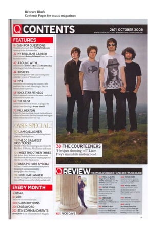
  • 7. Rebecca Black Contents Pages for music magazines Masthead The masthead is situated in the middle of the magazine. They have used the same font style for the masthead however they have used to different colours: white for the actual masthead and then after this it states ‘THIS WEEK’ they have put this in old to separate this from the masthead and to make your eyes attract to it. Necessary Information The date and issue number is situated under the contents page sub-title. They have not put a page number on this magazine. They do not have any website link however they do have a subscription advertised at the bottom right hand side of the magazine. Text The text is names of bands and there is a huge paragraph at the side of the page that is dedicated to the editors writing. The formality of this is quite friendly and its purpose is to give a sense of relationship to the audience as the editor is doing the magazine to keep the audience happy. The celebrity’s names have been put in there to let the audience know who is featured in the magazine and to hopefully by it for that reason. There are several sub-headings to separate the different article features in the magazine. The order in a way is structure however the layout is quite messy. They use umbers however they don’t have the numbers in numerical order as they are just listing the page numbers that they think the audience would enjoy the most Font There are 3 different types of font used: one for them masthead, one for the text and one for the sub-headings and they have done this to make the eye see something new and the audience will also focus more on the changes in the text and the eyes will be drawn to that. They have used 4 different colours: red, yellow, white and black. They haven’t added any italic writing however they have used bold text to carry on the theme of the masthead. Composition They haven’t really used the framing of the text and images very well however the only noticeable framing is on the masthead as they have used a black strip to separate the picture on the top half to the writing and text on the bottom half. They have used the layout with the text by putting vertical lines to separate the different columns. The images relate to the text that is beneath. The magazine contents page is very image led as there has half the page just for 1 image. Linguistic Features They have no used any noticeable rhetorical questions, alliteration, assonance and puns however they have used enigma codes, they have done this by using celebrity names to give teases to the audience and in some of the articles short paragraphs about what is to be expected. Colour For the text they have used 4 different colours and for the images they have used quite dark images however they have some lighter features in them for example the person red hair so that it matches the red in the text. Thy have used these
  • 8. Rebecca Black Contents Pages for music magazines colours to add effect to the images and text as the colour you can see in the magazine page your eyes will be drawn to it.