The Italian Renaissance and Gutenburg- History of Graphic Design
•Descargar como PPTX, PDF•
2 recomendaciones•2,103 vistas


Recomendados
Más contenido relacionado
La actualidad más candente
Similar a The Italian Renaissance and Gutenburg- History of Graphic Design
Similar a The Italian Renaissance and Gutenburg- History of Graphic Design (20)
Más de Reja Zahid
Último
Último (20)
The Italian Renaissance and Gutenburg- History of Graphic Design
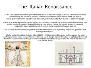
- 1. The Italian Renaissance As the Gothic spirit reached its apex in the other areas of Western Europe, Humanist scholars in Italy were slowly reviving the culture of antiquity. The Renaissance embrace of ancient Greek and Roman culture spurred a creative wave through Italian art, architecture, literature as well as letterform design. Classical art works were rediscovered and ancient treatises on science and mathematics made their way into artists' studios. (Leonardo Da Vinci blended art and science—using the human figure as a means of proportion, based upon the work of ancient Roman architect, Vitruvius, above.) Renaissance architecture employed the ancient Greek emphasis on "symmetry, proportion, geometry and the regularity of parts" Scholar and architect Leon Battista Alberti (1522—1550) considered the circle and the square the most perfect geometric forms and used them as the basis for all designs from architecture to alphabet. He revived the Roman tradition of inscribing monumental letterforms onto building facades. His Temple Malatestiano, 1450, shown below.
- 2. A Handwriting Renaissance • A Handwriting Renaissance Literature and writing were additional areas of rediscovery. Ancient manuscripts were sought throughout Europe for purchase or copied by literary agents, such as the famous Poggio Bracciolini (1380 — 1450) an Italian humanist and calligrapher, (an example of his writing above) foremost among scholars of the early Renaissance to rediscover lost, forgotten, or neglected classical Latin manuscripts in the monastic libraries of Europe. Although Renaissance scholars thought the documents were ancient, in many cases they were copying from manuscripts written during the Carolingian period in Carolingian manuscript. “Graphic Designers owe a great debt to the Humanists, for it was they who created the script that became the model for small letters. The script came about through the Humanist passion for seeking out and copying the ancient manuscripts of the classical authors they admired. They were also attracted to the clear, open handwriting of the manuscripts they believed had been written in Roman times. In actual fact, the manuscripts the Humanists admired were mostly from the Carolingian period, and their script, which we call Humanistic, was derived from the Carolingian Hand.”3
- 3. • The Lettera Antica Humanists named the newly rediscovered letterforms Antica, for their supposedly ancient origins. The same Renaissance analysis of form that was being applied to art and architecture was directed towards letterform — resulting in a more mathematically perfect or rationalized letter. Felice Feliciano, Verona. c.1460 An expert on stone lettering, he published the first geometric study of the Roman inscriptions in 1463. He employed a module of a circle enclosed by a square with two diagonal lines extending from corner to corner to define letter proportion. His drawing from Alphabetum Romanum is shown above or at GreenboatHouse Press in a modern reprint here.) In 1934 Monotype produced an all cap tilting font, Felix Titling, based upon Feliciano's alphabet. Note: Mathematical analysis would persist in later studies of letterform. As the Renaissance influences moved northward, artist Albrecht Dürer applied mathematics to both Roman and Gothic letters in his book, On the Just Shaping of Letters, 1535. (below) The entire text and images are available online at this link.
- 4. Majuscules & Minuscules "It has often been pointed out that the [Roman] capitals and the (Carolingian] minuscules were not homogeneous elements, the capitals were unmistakably an incised letter style; the Carolingian was strictly a pen design ... "Of course the scribes noticed that the capitals and small letters did not fit together well so they performed a styling job of adding serifs and finishing strokes in order to suit them to the capitals. By the time the craft of printing was introduced to Italy, the Humanistic writing afforded a fully developed basis for the type style we now call 'roman.'" 5 Niccolò de' Niccoli (1363-1437, Florence) An influential teacher of the Humanist rounded letterform, Niccoli combined classical Roman capitals with the Carolingian minuscule to form a dual alphabet. 4 He adapted the Carolingian script for faster everyday writing by sloping the letters a little (the result of holding the pen at a more comfortable angle), and allowing some of them to join up. His script, (shown below), as that of Bartolomeo Sanvito, was a forerunner of the italic type metal type to follow.
- 5. Renaissance Writing Masters • Calligraphy & Type Design When type design and printing began in the mid-1400's it was not the end of developments in writing. Scribes, displaced by printing presses still worked as writing teachers and published books to instruct their students in formal and semi-formal hands. Literacy was growing and writing was practiced by a larger non-secular audience. Legal and commercial hands were developed for business applications. A complete list of professional Italian calligraphic writers between 1501 and 1700 is complied by James Mosely at this link.
- 7. Pens Men in England "Pens men" in England, untrusting of engraved examples, relied heavily on direct observation of original manuscripts. The first English writing manual, A Booke Containing Divers Sortes of Hands, 1570 was a translation of the Jean De Beauchesne's Le Thresor d'Escripture (Paris, 1550). Included were examples of gothic and secretary hands, as well as chancery, italic.
- 8. Calligraphy's Influence on Type Design in the 20th Century • A large number of fine text faces were designed and produced around the middle twentieth century, and the practice of calligraphy is crucial to all but a few. Spectrum in the Netherlands by Jan Van Krimpen, Palatino and Aldus designed in Germany by Hermann Zapf, and Diotoma designed by Gundren Von Hesse; Figural designed in Czechoslovakia by Oldrich Menhart; Dante designed in Italy by Giovanni Marderesteig; Meridien, designed in France by Adrian Frutiger; and Berling , designed in Sweden by Karl-Erik Forsberg are all products of the 1940's and 1950s. • Each of these type families is made for book work and inc eludes both a roman and an italic. Not one of these italics could have been designed without direct practice in writing the Renaissance italic hand. And not one of the romans could have been designed without close study of Renaissance roman which likewise owe their form to direct and daily experience of writing with the broad pen. 7
- 10. The Mechanization of Writing Moveable Type15th C. Printing had been practiced in Korea, China and Japan for several centuries, and Europeans printed type with carved wooden blocks for about 100 years before a modular moveable type system was developed in Europe about 1450. Was moveable type invented by Gutenberg or Dutch printer Laurens Janszoon Coster? Daniel Berkeley Updike writes this opinion, "Before Gutenberg's day, printing from moveable types was practiced by the Dutch, and there is, perhaps reason to believe that a man named Coster was the inventor of the process ...there certainly existed in Holland before Gutenberg's time, a series of books of primitive workmanship printed from type, and the roughness of the typography of some later printers, like Caxton, is considered one proof that a group of men were under the influence of this Dutch school of printing. It has always puzzled the casual student of incunabula to account for the perfection of the books printed by Gutenberg; but if it be true that Gutenberg did not originate printing from moveable types, but simply improved the the whole practice of making them, then we can see that the early and crude typography of Holland were merely the sub structure on which Gutenberg so splendidly built." It is believed that Gutenberg learned his metal smithing skills while working with his father at a mint. Whatever the source, Gutenberg was knowledgeable in metal carving and casting, which combined with his penchant for intention, spawned a successful method of "mechanical writing."
- 12. Gutenberg's System of Casting Individual Metal Type 1. Carve a letter on the end of a steel bar, the punch. In the case of Gutenberg the letter would be a black letter style, not the roman shown in the above example. 2. That letterform is struck into a softer metal bar made of copper, to create a matrix. At this point the letter is right reading. 3. The matrix is placed into a type mold. Molten metal is poured into the opening to fill the mold to produce a wrong reading letter.
- 13. 4. The type caster shakes the mold to avoid air pockets and the letterform is almost instantly ready to remove. It is estimated that about 4.000 individual letters could be produced per day. 5. As a final step the cast letterform is released from the mold, cleaned of superfluous metal appendages and leveled for use. The wrong reading letter prints as a right reading final.
- 14. Gutenberg's BibleGutenberg's 42-Line Bible Circa 1455 Research indicates, in an attempt to pay off his business debts, Gutenberg printed papal indulgences (written dispensation for sins) sold by the church. His greatest work, the 42-line bible, is named after the number of lines per column. The variations on the same letter might not be to mimic handwriting but instead were the result of varying skills of the type casters. "Into such a mold hot metal was poured, and the typecaster then gave it a quick shake, which forced the metal into all the crannies of the matrix. By practice it became apparent that some letters needed a different sort of motion, and were more difficult to make than others, so I suppose that the variations just spoken between the different impressions of the same letter in early fonts may be attributable to the varying skill of the individual workman... mention is made of uncouth movements and swaying figures of gray-haired typecasters, who appear as if demented to anyone who did not know what they were about."
- 16. After final dressing the cast letters were distributed to storage bins. From there they were picked and arranged on a device called a composing stick. (shown above). Each stick was filled and transferred to a tray on a composing table (below). The entire page form was transferred to the press bed, where it was inked and readied for the paper contact. Despite attempts to keep the process secret, before long there were hundreds of presses operating throughout Germany and Italy.