SlideShare una empresa de Scribd logo
1 de 3
Front Cover
                             Analysis
On the front cover of my music magazine, I have used a medium close-up shot of a
teenage model aged 17. I used this type of framing as it draws the audience attention
towards her face and her body positioning. The models posture and facial expressions
give connotations of confidence and determination making her look quite rebellious
relating her back to my chosen genre – modern rock which often links with these
connotations. This can be seen through the clothing she is wearing as my target audience
would be able to relate to her more as leather jackets and shorts are popular within this
genre.

 The main cover line font of the magazine matches the masthead which is larger then any
of the other text on the front cover (convention of a magazine). I have decided to use this
as it shows that the model is a part of this magazine/branding reinforcing the idea that she
is important within the magazine. By using the tag line 'Believe The Hype' it allows the
audience to trust my brand to deliver information on bands that they enjoy helping to build
trust between the brand and the target audience.
 The use of the alliteration "Disappointment and her Determination" as the main cover line
links with the main image as the model looks determined to overcome obstacles as it also
doesn’t state what her disappointment was about it allows the audience to question it
persuading them to buy the issue.
Front Cover
                                 Analysis
By using the teaser 'PLUS' it shows that the feature stories are not the only things
 within the magazine. The use of the artists at the bottom, will appeal to the target
  audience as these bands are within the modern rock genre reinstating that the
   magazine is a modern rock magazine. By using the small image of the female
artist will appeal to girls as within my chosen genre, the target audience are mainly
   males allowing me to try and relate it to girls as well. At the bottom of the front
       cover it features the Barcode with the date and pricing which is a typical
                               convention of a magazine.

 My target audience for his magazine would be teenagers/ young adults who enjoy
  modern rock/ indie genres. On my magazine, I have tried to appeal to the male
  and female audiences by using already existing popular bands that both males
   and females will enjoy listening to within my chosen genre. I have also used a
female artist as the main image as female teenagers would be able to relate to her
  whereas males would find her attractive. By using the neutral colour 'red' it does
     not target a particular gender but can appeal to both males and females.
Front Cover
                                 Analysis
The name of my magazine is HYPE, which gives connotations of popular music and
gives the impression that the magazine delivers music and updates that the reader
wants to hear about. It also implies that the artists within the magazine want to be
promoted in some way whether to achieve fame/ fortune or just to be noticed which
would appeal to my target audience that want to achieve this. As my model, overlaps
the HYPE masthead it suggests that she is rated very highly as it gives the impression
that she is worth enough to be positioned above the HYPE title.


 As the magazine background is dark it contrasts nicely with the red/yellow/black/white
combination. By using a grungy grey background it reinforces the idea that the
magazine is a modern rock magazine. The use of the red gives connotations of
danger/rebellion and control contrasting nicely against the dark background making it
clearer for the audience to read the cover lines.

Más contenido relacionado

Destacado

Untitled 1
Untitled 1Untitled 1
Untitled 1s0014961
 
30 second
30 second 30 second
30 second s0014961
 
So, you want to be a foreign correspondent?
So, you want to be a foreign correspondent?So, you want to be a foreign correspondent?
So, you want to be a foreign correspondent?Elizabeth Becker
 
Savjeti i iskustva otvaranja tvrtke u USA
Savjeti i iskustva otvaranja tvrtke u USASavjeti i iskustva otvaranja tvrtke u USA
Savjeti i iskustva otvaranja tvrtke u USALuka Abrus
 
Poll Feedback
Poll Feedback Poll Feedback
Poll Feedback s0014961
 
Anatomi dan histologi persendian lutut
Anatomi dan histologi persendian lututAnatomi dan histologi persendian lutut
Anatomi dan histologi persendian lututMargaret Beatrik
 
Media evaluation a2
Media evaluation a2Media evaluation a2
Media evaluation a2s0014961
 

Destacado (7)

Untitled 1
Untitled 1Untitled 1
Untitled 1
 
30 second
30 second 30 second
30 second
 
So, you want to be a foreign correspondent?
So, you want to be a foreign correspondent?So, you want to be a foreign correspondent?
So, you want to be a foreign correspondent?
 
Savjeti i iskustva otvaranja tvrtke u USA
Savjeti i iskustva otvaranja tvrtke u USASavjeti i iskustva otvaranja tvrtke u USA
Savjeti i iskustva otvaranja tvrtke u USA
 
Poll Feedback
Poll Feedback Poll Feedback
Poll Feedback
 
Anatomi dan histologi persendian lutut
Anatomi dan histologi persendian lututAnatomi dan histologi persendian lutut
Anatomi dan histologi persendian lutut
 
Media evaluation a2
Media evaluation a2Media evaluation a2
Media evaluation a2
 

Front cover analysis

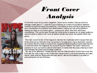
  • 1. Front Cover Analysis On the front cover of my music magazine, I have used a medium close-up shot of a teenage model aged 17. I used this type of framing as it draws the audience attention towards her face and her body positioning. The models posture and facial expressions give connotations of confidence and determination making her look quite rebellious relating her back to my chosen genre – modern rock which often links with these connotations. This can be seen through the clothing she is wearing as my target audience would be able to relate to her more as leather jackets and shorts are popular within this genre. The main cover line font of the magazine matches the masthead which is larger then any of the other text on the front cover (convention of a magazine). I have decided to use this as it shows that the model is a part of this magazine/branding reinforcing the idea that she is important within the magazine. By using the tag line 'Believe The Hype' it allows the audience to trust my brand to deliver information on bands that they enjoy helping to build trust between the brand and the target audience. The use of the alliteration "Disappointment and her Determination" as the main cover line links with the main image as the model looks determined to overcome obstacles as it also doesn’t state what her disappointment was about it allows the audience to question it persuading them to buy the issue.
  • 2. Front Cover Analysis By using the teaser 'PLUS' it shows that the feature stories are not the only things within the magazine. The use of the artists at the bottom, will appeal to the target audience as these bands are within the modern rock genre reinstating that the magazine is a modern rock magazine. By using the small image of the female artist will appeal to girls as within my chosen genre, the target audience are mainly males allowing me to try and relate it to girls as well. At the bottom of the front cover it features the Barcode with the date and pricing which is a typical convention of a magazine. My target audience for his magazine would be teenagers/ young adults who enjoy modern rock/ indie genres. On my magazine, I have tried to appeal to the male and female audiences by using already existing popular bands that both males and females will enjoy listening to within my chosen genre. I have also used a female artist as the main image as female teenagers would be able to relate to her whereas males would find her attractive. By using the neutral colour 'red' it does not target a particular gender but can appeal to both males and females.
  • 3. Front Cover Analysis The name of my magazine is HYPE, which gives connotations of popular music and gives the impression that the magazine delivers music and updates that the reader wants to hear about. It also implies that the artists within the magazine want to be promoted in some way whether to achieve fame/ fortune or just to be noticed which would appeal to my target audience that want to achieve this. As my model, overlaps the HYPE masthead it suggests that she is rated very highly as it gives the impression that she is worth enough to be positioned above the HYPE title. As the magazine background is dark it contrasts nicely with the red/yellow/black/white combination. By using a grungy grey background it reinforces the idea that the magazine is a modern rock magazine. The use of the red gives connotations of danger/rebellion and control contrasting nicely against the dark background making it clearer for the audience to read the cover lines.