SIMILAR PRODUCT RESEARCH (SPR) OF 3 CONTENTS PAGES
1. The contents page fits within the colour scheme of the overall
magazine which is red, white and blue which is keeping the whole
magazine looking sophisticated and professional. The overall contents
page is the same in every issue.
The images used within the contents page are all very grown up and
sophisticated, the use of vintage filter effects is effective as it gives
the magazine character. The use of gory images e.g. no. 76 displays
the target audience for the magazine as that would not be suitable
for the younger audience. The use of different size images is
effective as it shows what is more important/the bigger stories and
display what the producers think that the audience would enjoy
reading more. The images also display the genre of the magazine
straight away, which is effective as the reader doesn’t have to think
about it. The images that are used are plain and only contain the
page number of the story, it doesn’t include what it is and what it is
about, this is effective as it leaves the reader wanting to know what
it is about making them look for it persuading them to purchase the
magazine. The images that are used are really intriguing which again
will make the reader want to buy the magazine so that they can read
on.
Having all the key information on the right hand page is effective as
when you turn the page you usually looking at the right hand page
first, so this is the first thing that you are going too see so they have
added all the key information onto this page.
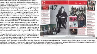
The title of this page is simply ‘contents’ which is effective as it doesn’t leave the audience guessing what it is. It also has the logo on the left hand side making it look
professional. The colour of the logo contrast against the bold red background making it stand out against the background. The bold red rectangle that contains the key
information about this issue stands out against the plain white background drawing more attention towards it.
2. The title of this page is different to other stereotypical magazines, this makes it unique and original and will
attract the audience, the text is placed in capitals and a bold black font which makes it stand out to the buyer, it is
also placed centre top of the magazine and it bigger than all the other text which makes it stand out more and
would be the first thing that the reader would see so that they have an understanding of what this page is about.
Underneath the title the date the magazine was issued on is placed this shows that it is most likely a weekly
magazine, the font this is placed in is italic so it is different from the title, making it more unique and separating it
from the title.
The colour scheme on the contents page isn’t clear but you can see that it is white and black and maybe blue as
all the images contain a part of blue, this colour scheme is original and makes the magazine look professional.
There is a wide range of images used within this contents page, the main image is placed in the centre of the
page and is slightly bigger than all the other images, this image is appealing as shows a well-known artist and the
picture is original and unique, it is also quite dark and displays that the genre could be rock. The other images are
placed around the sides of the page, this is appealing as all the images are somewhat similar but all totally
different, this would persuade the reader to buy this magazine as it portrays the wide range of content within the
magazine.
The page number for the images are placed on the photos in a white box which makes it stand out as the font is black and it juxtaposes.
The subscribe box placed in the bottom right hand corner is placed in a bold yellow box which contrasts against the colour scheme which makes it
stand out to the audience so that they notice it and read it, making them consider whether to subscribe. The font in this box is partly bold red
which again makes it stand out to the reader. There are images used in this box of previous subscription front covers which are different and
unique from the normal front covers which would then make the reader want to subscribe as they get an original copy which can then be turned
into a collectors item.
The tag lines that go with the images are different to other magazines as they take up quite a lot of space when usually they are one a couple of
words, this makes it unique to the reader. The quotes are placed in a bold font in some images and a think font in others, this makes sure that not
everything on the page is the same again making it unique.
The ‘plus’ column is also unique as many magazines have around 4 columns showing what’s in their magazine whereas this one only has one
column and the contents only uses one or two words, which keeps its short and snappy and makes the reader want to know what this is,
persuading them to buy it.
3. This contents page is unique from the ones that I have previously seen. You can clearly see
that the colour scheme of this contents page is white, black and grey, which is quite a neutral
colour scheme and portrays that the target audience for this magazine is both male and
female, you can also see that the target audience is for both genders for the use of image as
it is quite seductive which would appeal to both the genders.
The title of the page is also unique as it in split into different sections, in a bold white font
which makes it stand out again the rest of the page as everything else is darker colours. Next
to the title is the number 13 which portrays the issue number, this is very clear as it is in this
white font.
The main image of the woman on the floor is effective as it goes with the colour scheme due
to her clothes and the lighting of the images e.g. the shadows. The model is making direct
eye contact with the reader creating a personal relationship, and making them feel more
comfortable.
There is only two sections of contents on the contents page, this includes ‘features’ and
‘fashion’ which portrays that these are the two most important things. They are placed in a
fancy black font which portray that they are the title and makes them stand out a little more
than the other text. The page numbers for the content are placed in a bolder font than the
actual text so it makes it clear to the audience where the information is, this makes the
magazine more accessible.
On the left hand side of the page there is a list of clothes that the model is wearing and
where you can find it, this is typical as it is a fashion magazine and you usually find this in a
fashion magazine.