
Recomendados
Más contenido relacionado
La actualidad más candente
La actualidad más candente (19)
Destacado
Similar a Evaluation
Similar a Evaluation (20)
Último
Último (20)
Evaluation
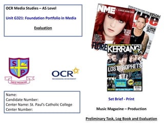
- 1. OCR Media Studies – AS Level Unit G321: Foundation Portfolio in Media Evaluation Name: Candidate Number: Center Name: St. Paul’s Catholic College Center Number: Set Brief - Print Music Magazine – Production Preliminary Task, Log Book and Evaluation
- 3. YOU MUST address the following criteria in order to achieve an A – B grade in the Evaluation.
- 4. Task • YOU MUST evaluate you’re the Pre-Production and Production tasks you have completed by answering these 7 Questions, which MUST NOT be altered in any way! • YOU MUST also utilise a variety of technologies to evaluate your work as this will ensure you achieve the full marks, for example Answering the questions on a separate Evaluation Blog Page, Presenting your answers on Prezi, embedding images/video into a presentation, Producing a Podcast OR a combination of these and many more.
- 5. In what ways does your Media product use, develop or challenge forms and conventions of real media products? In my magazine across the 4 pages I have used codes and conventions from magazines like VIBE and XXL such as the simple but effective white, red and black colour scheme which is consistent on all of my pages. I also used the same font on all of my pages as it makes the magazine look more professional. For my front cover I had to make sure I had all of the main conventions such as: barcode, date, price, issue number, main image, cover lines and a masthead. Continuing my theme I used most of these features and a lot more for my contents page a few of these are: Page numbers, promotions, another image and web address/social networking link. The last two pages I had was my double page spread where I took incentive from VIBES editorials where they have a main image on one side and then have the Interview along the side of the picture as this gave it a look of professionalism. I began with my main image on the opposite side to my heading however I then had to change it as I could see it didn't’t look very good at all, so I moved my heading so that it would fit just above and slightly to the left of my main image which is where I thought it looked best. The rest of my double page spread was very simple as I made the questions clear and easy to see as I followed my colour scheme by having one colour for the interviewer and a different colour for the person being interviewed. Just like all of my other pages I put the web address for my magazine as it meant that people would be able to see it throughout the magazine and then be more likely to go to the website.
- 6. How does your media product represent particular social groups? The denotation of representation is to act or speak on behalf of someone, whereas in this context it mean does my magazine consist of material to appeal to all social groups such as “hipsters”, “Goths” and “Emos.” if my magazine did appeal to all of these audiences and many more than it would very economically successful as there is a wider range of people who will want to buy my magazine. However in my opinion I feel that my magazine really only appeals to “hipsters” as it doesn't’t have the sort of music that the other audiences would want to listen to as it consists of the more popular chart music rather than than the “sreamo” type of music. I used a questionnaire to see what genre would be best and Hip-hop came on top with rock close behind so I have incorporated a small amount of rock in my magazine but I mainly kept it to be aimed at the hip-hop audience as this was what most people wanted to see. The genre of my magazine is hip- hop hence the representation of the well known boy band MKTO, I aimed my magazine at a younger teenage audience as they are the sort of people that will want to hear about boy bands such as MKTO as it’s a young boy band who have good voices and look good. I also incorporated a bit of pop into my magazine as it’s a very popular type of music and it also allows for the popular kids to look for pop as its popular and it allows them to climb a metaphorical ladder of popularity.
- 7. What kind of media institution (Publisher) might distribute your media product and why? Bauer Media is a multi-platform UK-based media Group consisting of many companies collected around two main divisions – Magazines and Radio - widely recognized and rewarded as being industry innovators. From the research that was completed pre-production I found that Bauer would publish “REBEAT” as they like to make personal relationships with their readers which is what my magazine does through my editorial and double page spread. My magazine also has a lot of cross media convergence as I have the social networking links on most of the pages I created, I have also added the website link for REBEAT. I think that Bauer would publish my magazine as they don’t tend to publish the genre that I have used however they are looking for a change and through the research I did I found out that they are looking for a new magazine who focus on R&B as their genre.
- 8. Who would be the audience for your media product and why? According to Hartley's seven subjectivities the age range for my magazine would be males around 14-25 years old as most of the artists I used were of the same gender, meaning I would get a larger audience of men rather then women due to the fact of men being stereotyped for rapping which is what I wanted my magazine to be stereotyped as. According to Katz’ Uses & Gratifications theory my magazine would appeal more for men as women don’t generally listen to R&B or rap as its more of a masculine type of music. However it could appeal to a female audience as they could see the men as objects and be seen as “eye candy.” According to Maslow’s hierarchy of needs, social climbers would be more likely to buy my magazine as they are looking to get as much social information as possible to use in their life.
- 9. How did you attract/address your audience? In order to attract the intended target audience for my magazine I had a lot of unique selling points or USP’s as from a questionnaire I found out that they made people want to buy my magazine more. Also using language like “exclusive” and “win” it brings peoples attention to my magazine so they pick it up and are then enticed to buy it. This also makes them feel special as it seems as if the are getting chosen to win the product as it stands out a lot. In my contents page editorial I used a lot of “you” to make the customer feel as if they are part of the magazine.
- 10. What have you learnt about technologies from the process of constructing this product? The software that I have used to construct my magazines title REBEAT was www.cooltext.com I used this website as I found it was the easiest to use and had the nicer text available. However to edit my images I used adobe Photoshop cs4 to add contrast, to crop and to saturate them so they looked the best as possible. Before this project I had minimal knowledge of Photoshop but now I feel like I can do most of the things that Photoshop has which will help me in the future when creating other things on Photoshop. In order for my magazine to fit the target audience I have already spoke about. I used a variety of tools to help it fit this target audience such as using hue and saturation to brighten the pictures to remove any sort of shadows on the peoples faces. This makes my magazine look a lot better, also to give the image a good finish I used the rubber tool to fine out all of the edges. Overall after this project I feel that I have learnt a lot about Photoshop from making the images clear to making the text fit around the images.
- 11. Photography Planning – Front Cover This was the image that I chose for my front cover as I didn't’t think it looked to bad and it went very well with my colour scheme. I cropped the picture so it was just the artists which made it look more professional.
- 12. Photography Planning - Contents These are 3 photos that I was debating to use for my music magazines contents page, I ended up only using the first two as they seemed a lot more useful and fitted a little better than the other picture.
- 13. Photography Planning - Interview These are the two pictures that I was deciding to use for my double page spread however I then thought that I could use one for my front cover and one for my double page spread and the second worked better for my double page spread
- 14. Analyzing my Front Cover Cover lines to say what will come up during the magazine. Issue number which shows if people have missed an issue of REBEAT Masthead to show the name of the magazine, has to be bold and memorable. Main image of two starts who will appear later on in the magazine Social networking links so that people know where to find out more information about REBEAT
- 15. Analyzing my Contents Page Heading so they know what page they are on Social networking links so people can view our Facebook and twitter pages Image of the editor so they know who I am Page number to help out the readers What is in the magazine so people can see what they have to look forward too
- 16. Analyzing my Double Page spread Interview Main image as it shows what the double page spread is about Introduction into the questions Interview of Malcolm from mkto
- 17. Analyzing my Double Page spread Interview More questions from the interview Heading of the page that stands outMain image again but other person in the image Social networking links
- 18. Audience Feedback - This is one method of gathering Audience Feedback needed to get a Level 4 (16 – 20 Marks) • YOU COULD produce video interviews of what people think of the work, as well as explore other more creative means of gaining feedback. • This should be neatly presented in your Blog Page (embedded).
- 19. Looking back at your Preliminary task, what do you feel you have learnt in the progression from it to the full product? I feel that, having completed the preliminary task and learning about the demands of this production process, I have learnt… There is evidence of progression that I feel particularly demonstrates how I met the demands of the production process, for example…