
Recomendados
Más contenido relacionado
La actualidad más candente
La actualidad más candente (17)
Destacado
Destacado (19)
Similar a Codes and Conventions
Similar a Codes and Conventions (20)
Último
Último (20)
Codes and Conventions
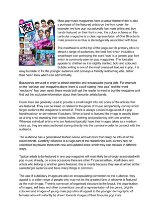
- 1. Most pop music magazines have a colour theme which is also a portrayal of the featured artists on the front cover, for example ‘we love pop’ occasionally has male artists and boy bands featured on their front cover, the colour scheme on this particular magazine is a clear representation of One Direction's male presence as blue is stereotypically associated with boys. The masthead is at the top of the page and its primary job is to attract a range of audiences, the bold font which includes a small heart icon portraying the word ‘love’ is a generic pop font which is commonly seen on pop magazines. The font also appeals to children as it is slightly slanted, bold and coloured. Bubble writing is one of the most overused features in pop, it is easy to relate to for the younger audience and conveys a friendly welcoming vibe, rather than harsh lines which can add formality. Buzzwords are used in order to attract attention and encapsulate young girls. For example on the ‘we love pop’ magazine above there is a puff stating “new pics” and the word “exclusive” has been used, these words both get the reader to want to buy the magazine and find out the exclusive information about their favourite artists/bands. Cover lines are generally used to provide a small insight into into some of the articles that are featured. They can be linked or related to the genre of music and perfectly convey which target audience the magazine is aimed at. There is always a main image used of a pop band/musician or sometimes Youtubers. When a band is featured the image is usually taken as a long shot, revealing their entire bodies, clothing and positioning with one another. Whereas individual artists who are featured typically have their images taken as a medium close up, they are also positioned staring directly into the camera in order to connect with the audience. The audience has a generalised fashion sense and will more than likely be into all of the recent trends. Celebrity influence is a huge part of the readerships lives as they rely on celebrities to provide them with new and updated looks which they can emulate in different ways. Typical artists to be featured in any pop magazine will most likely be strongly associated with pop music already, on some occasions there are other TV personalities, YouTubers and artists who belong to another genre featured, this is mostly because they are all aimed at the same target audience and have many things in common. The use of subsidiary images are also an encapsulating convention to the audience, they appeal to a wider range of people who may not be the greatest fans of whoever is featured as the main image. There is some sort of organised structure to the layout, the organisation of images, sell lines and other conventions are all a representation of the genre, brightly coloured and images of young male pop stars all appeal to the younger demographic of females who will instantly be drawn towards images of their favourite pop stars.
- 2. ‘We love pop’ generally uses a plain white background then accompanied by the selected colour scheme. White is a generic colour which makes all other features stand out. It also adds a sense of professionalism to the overall magazine in contrast to the language and images which are used to portray the pop genre. Basic information is also evident for example the barcode, price and issue date. These basic conventions are essential to any magazine as they are primary features. Fashion and style in pop is obviously different to any other genre, the generic clothes are extremely targeted towards younger generations for example Top of The Pops magazine has a section primarily on clothes, the clothing items present in this example are all pink and floral, this provides the audience with a clear representation of who the magazine is targeted at and what age range would typically be wearing this. There are a range of codes and conventions expected of a magazine, representation is very important when analysing the overall magazine as the portrayal of people, items and music have to be broken down into different subsections which should all be clearly representing the genre and target audience. Gender and ethnicity are heavily reflected in pop music, the stereotypical pop magazine will have minimal or no people of colour featured, for example the magazine cover above is visually covered in white pop artists of both genders. The class of the readership is cleverly portrayed through the blatant use of articles consisting of trashy celebrity gossip and images of young boys. Lower to middle class teenage girls are the most likely audience for this genre of magazine, there is a clear reflection throughout indicating who the target audience is.