Engineering Major for College_ Environmental Health Engineering by Slidesgo.pptx
Taylor swift digipak analysis
1. Digipak analysis - Taylor Swift
1989
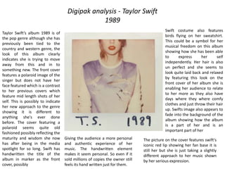
Taylor Swift’s album 1989 is of
the pop genre although she has
previously been tied to the
country and western genre, the
look of this album clearly
indicates she is trying to move
away from this and in to
something new. The front cover
features a polaroid image of the
singer but does not have her
face featured which is a contrast
to her previous covers which
feature mid length shots of her
self. This is possibly to indicate
her new approach to the genre
showing it is different to
anything she's ever done
before. The cover featuring a
polaroid seems quite old
fashioned possibly reflecting the
maturity and wisdom she now
has after being in the media
spotlight for so long. Swift has
handwritten the title of the
album in marker as the front
cover, possibly
Giving the audience a more personal
and authentic experience of her
music. The handwritten element
makes it seem personal. So even if it
sold millions of copies the owner still
feels its hand written just for them.
The picture on the cover features swift's
iconic red lip showing her fan base it is
still her but she is just taking a slightly
different approach to her music shown
by her serious expression.
Swift costume also features
birds flying on her sweatshirt.
This could be a symbol for her
musical freedom on this album
showing how she has been able
to express her self
independently. Her hair is also
un perfect and she seems to
look quite laid back and relaxed
by featuring this look on the
front cover of her album she is
enabling her audience to relate
to her more as they also have
days where they where comfy
clothes and just throw their hair
up. Swifts image also appears to
fade into the background of the
album showing how the album
is a part of her and is an
important part of her