2. This is the image I liked best after the shoot so I decided to use this as the image on my
magazine cover., I just needed to edit it firs t so I went on to Photoshop and the first thing I did
was crop the image down to get rid of most
of the background.
Then I changed the brightness and
contrast, as I wanted all the images in my
magazine to be quite bright so that they
would stand out, mainly to my teenage
target audience, but first of all I just made it
lighter so the background was more white.
3. So to make this image just a little brighter to start with a added the auto contrast effect.
Although this effect gave it the brightness that I wanted it gave it a yellow tone that I did want
in the photo frame but no as much in the rest so to get rid of this I went on the hue/saturation
effect so that I could change the lightness level a little and the saturation level. Then I changed
the brightness and contrast slightly.
4. The last thing I did to my cover image was
change the curves so that I could change
where the brightness would be and where
would be lighter. Then I had my final image.
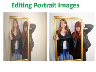
Final image. Original image.