
Recomendados
Más contenido relacionado
La actualidad más candente
La actualidad más candente (20)
Destacado
Similar a Creating a Cohesive House Style Across Media
Similar a Creating a Cohesive House Style Across Media (20)
Creating a Cohesive House Style Across Media
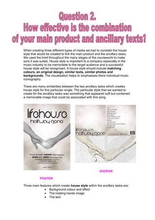
- 1. When creating three different types of media we had to consider the house style that would be created to link the main product and the ancillary tasks. We used the brief throughout the many stages of the coursework to make sure it was suited. House style is important to a company especially in the music industry to be memorable to the target audience and a successful house style will be recognised. A house style should include matching colours, an original design, similar texts, similar photos and backgrounds. The visualisation helps to emphasises there individual music iconography. There are many similarities between the two ancillary tasks which creates house style for this particular single. The particular style that we wanted to create for the ancillary tasks was something that appeared soft but contained a memorable image that could be associated with this song. DIGIPAK POSTER Three main features which create house style within the ancillary tasks are: • Background colour and effect • The holding hands image • The text
- 2. Font This style of font has been used on both the poster and the digipak. We wanted to use a simple font for both ancillary task so that it was easy to read but effective, memorable and suited our Pop Rock genre. We did not want the text to be too bold because we wanted the image to make more of a statement. “You were always hard to hold, so letting go ain’t easy…” Images These are the two similar images that appear on the middle pages of the digipak and the centre of the poster. The image creates a sense of house style which is very memorable to whomever see’s it. The characters holding hands relates to the song because during the music video the characters end up leaving each other for a while but reconnecting in the end. Therefore, the hands in the photo are holding on by fingertips which suggest that the characters always had a hold on each other. The lyrics above also relate to the characters holding hands and how letting go is going to be hard which is why they reconnect in the end of the music video. Background
- 3. The background of the poster and the digipak are exactly the same to create a strong sense of house style. The soft effect of the background which is created by clouds relates to the hands holding on by only there fingertips which creates an endearing image. More Conventions The black and white images throughout the music video also link to the two ancillary tasks. The poster and the digipak both have a similar effect on the background to a sepia effect. This colouring is not far off a black and white colouring. Therefore, there is a constant essence of the past being brought into the music video and also a dated feel into the ancillary tasks. Cross dissolves were another main effect which was used a lot throughout the music video. The cross dissolve give a soft transition which appears slower and can relate more to the slowly paced music. In parts of the song where the music is slower, for example, the verses. The cross dissolve is more suited than a fast pace cut. Poster and Digipak Influences
- 4. We needed both the ancillary tasks and the music video to be just as successful because our ancillary tasks were promoting the product and creating an image for the band. The bands which had a big influence in conventions we used for each task were the Script and also the Verve when it came to designing the poster. These bands album cover and poster were very basic yet effective and we really liked the overall feel of them. When I had recently saw the latest Script album on the shelves, the image of two people holding hands really stuck in my mind. Therefore, we thought that this was an effective and suitable image for the poster and the digipak. The verve poster has a basic background of a sky landscape and therefore we wanted the background of our poster to have a basic effect which looked liked clouds, this is something which we were able to do on Photoshop.