Student Portfolio Two
•
1 recomendación•175 vistas

PDF portfolio of student graphic and web design work with reflections

Recomendados
Más contenido relacionado
La actualidad más candente
La actualidad más candente (15)
Similar a Student Portfolio Two
Similar a Student Portfolio Two (20)
Último
Último (20)
Student Portfolio Two
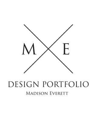
- 1. M E DESIGN PORTFOLIO Madison Everett
- 2. Madison Everett Student / Designer / Producer Hi! My name is Madison and I am currently a junior at Hidden Valley High School and at Burton Center for Arts and Technology. At Burton, I am enrolled in the Mass Communication department where we learn about the field, video production, and web design. I enjoy editing and creating news packages, videos, and graphics. Be sure to check out some of my designs below! Feel free to email me if you need a design.
- 6. CONTACT INFORMATION Email : madisoneverett180@gmail.com Website : madisoneverett.com Phone : (540)521-7542 Address : Roanoke, Virginia EXPERIENCE Cave Spring Baptist Church
- 7. Child Care Worker / 2016 - Present Supervise children from infancy through elementary school age and lead them through age appropriate craft, story, and music time. Create and follow lesson plans for the children. Roanoke County Library Volunteer / 2016 - Present Clean, organize, alphebetize and shelve DVDs. Complete any tasks given by the volunteer coordinator. DOWNLOAD RESUME JOLIE MAGAZINE IPHONE FLAT 2017 Copyrights - All Rights Reserved Madison Everett - Email me Social icons designed by Freepik from Flaticon Social icons designed by Pixel Buddha from Flaticon
- 8. MADISON EVERETT6 2 0 2 S T O N E M A N O R D R I V E R O A N O K E , V A 2 4 0 1 8 ( 5 4 0 ) 5 2 1 - 7 4 5 2 M A D I S O N E V E R E T T 1 8 0 @ G M A I L . C O M High school student with experience in the production of news packages, movies, and design. Looking to obtain an internship in the field of Mass Communication. Education HIDDEN VALLEY HIGH SCHOOL, ROANOKE, VA • Expected to graduate in June 2018 • Weighted GPA of 4.24 • Took classes focused in Microsoft Office programs and Digital Art Photography BURTON CENTER FOR ARTS AND TECHNOLOGY, SALEM, VA • Expected to graduate in June 2018 • Mass Communication (Media Production I & II, Digital Web Design) Experience CAVE SPRING BAPTIST CHURCH, ROANOKE, VA Child Care Worker, April 2016 – Present • Supervise children from infancy through elementary school age • Lead children in craft, story, and music time • Plan and follow lesson plans ROANOKE COUNTY LIBRARY, ROANOKE, VA Volunteer, August 2016 - Present • Clean, organize, alphabetize, and shelve DVDs • Any tasks given by the volunteer coordinator CAVE SPRING BAPTIST CHURCH, ROANOKE, VA Volunteer, 2011 – Present • Supervise children from infancy through elementary school age during extended session hours • Plan and follow lesson plans for each class • Lead children in age-appropriate craft and story time Additional Skills • Proficient in Microsoft Office, with a focus on Excel, Word, and PowerPoint • Skilled in Adobe Programs with focus on Illustrator, Photoshop, and Premiere • Knowledge of different editing software including Final Cut Pro, Premiere, and iMovie • Ability to effectively problem-solve • Enjoys both collaborating in a team and working independently • Strong work ethic References • Available upon request.
- 9. Table of Contents 1. MINIMALIST IPHONE DESIGN Template Provided by: a. https://www.mockupworld.co/free/black-iphone-on-macbook-mockup/ b. https://www.behance.net/gallery/45571051/iphone7-Free-PSD-Mockup Program Used: c. Adobe Photoshop 2015 This design could be used for app developers to make a more user-friendly, simple weather app for devices such as the IPhone and Android. The use of repetition in the shapes and text of this design add to the minimalistic concept. By using the same style of a san serif font, the design achieves a simplified feeling and will appeal to user who are looking for a casual, easy-to-use weather app. Contrasting colors were also used in the making of this design. By placing light text on a dark shape, or dark text on a light shape, the information on the display can be easily read and seen. Highlighting the text on a contrasting background makes the design stand-out and displays the information in a clear way, which helps attribute to the simple look of the design. While creating this design, I learned how to properly use rulers and gridlines on Photoshop in order to create an evenly spaced design. I also learned how to use the object alignment tools to keep all aspects of the design in line and centered perfectly on the screen. Looking back on my approach to this design, I would try to create symbols for the types of weather in Adobe Illustrator to more effectively showcase the weather in a more simple way then having to write out “Rainy” or “Partly Cloudy”. I also would have used the grouping tool on Photoshop to keep each aspect of the design in its own group for more clear organization. 2. LANA DEL REY POP ART Template Provided by: a. https://www.mockupworld.co/free/set-of-picture-frame-mockups/ b. http://mockups-design.com/posters-frame-mockup/ Program Used: c. Adobe Photoshop 2015 This design could be displayed in homes as a poster or in a gallery for digital artworks due to its subject, popular indie artist, Lana del Rey, and for its tribute to the style of pop art of the 1950s. One element of this design was the bright contrasting colors. The contrasting colors lets the viewer easily distinguish the different aspects of the subject, such as hair, hands, and lips. The colors also give the design a bright, comic book-esque vibe. The design also used texture in the hair and in dark shadows of the subject. The dotted texture added to the pop art effect and comic book feeling of the design as a whole. It also gave depth to each aspect of the
- 10. design where it was used. While creating this design, I learned how to apply certain filters, patterns, and blurs in order to achieve a dotted, comic look to achieve a pop art design. I also learned how to select different aspects of the subject and fill them in with the desired color with a color overlay. Looking back at my approach, I would have focused more on the hands and shadows not created with the dots, such as on her face, in order to create a more realistic shadow for her glasses and features on her hands. I also would’ve used the group tool in order to keep my layers panel more organized with the color layers. 3. JOLIE MAGAZINE COVER Template Provided by: a. https://www.mockupworld.co/free/magazine-cover-mockups/ b. http://www.pixeden.com/psd-mock-up-templates/psd-magazine-mockup-vol12 Program Used: c. Adobe Photoshop 2015 This design is to be used as a magazine cover for a make-up or beauty magazine. It displays the newest trends of make-up for the spring 2017 season. The design uses proximity to place related information near each other. The top of the magazine shows the name of the magazine, Jolie, as well as the edition date. The left side entails what is in the magazine, such as the new spring trends and an exclusive interview. The right side contains the large picture of a model portraying a spring trend related to the one said on the left side. This creates three points of interest on the cover. The design also uses contrast by using a white, marbled background with sharp black and dusty rose text as well as a dark-toned picture. This contrast draws attention to the three points of interest again: the title, the articles, and the model. Looking back on the creation of this design, I would try to manually make a drop shadow for the model and title texts. Both of these design principles carried out in this design create a modern, sleek, high-end feel for Jolie make-up magazine. I would do this instead for more personalized customization of the drop shadows and to make each aspect pop out more. 4. JOY TO THE WORLD CARD Template Provided by: a. https://www.mockupworld.co/free/christmas-card-mockup/ b. https://dribbble.com/shots/3076833-Free-Real-Photo-Invitation-Greeting-Card-Mockup Program Used: c. Adobe Illustrator 2015 This design could be used for Christmas greeting cards. The design encompasses the principles of repetition and contrast. The repetition of the poinsettia flowers* and red and green colors leads to a festive and cheerful mood that showcases the Christmas spirit. The contrast of the dark-toned, rich colors on a white background lets the message of the text and the flowers stand out. Because these elements stand out, it
- 11. helps contribute the feeling of warm Christmas greetings to those who receive this card. I would change my approach to this design by grouping the texts together as one unit that is evenly spaced, instead of three separate entities. Having three separate text boxes led to many checks of making sure they were centered and evenly spaced apart. If they were grouped as one, time would have been saved as I wouldn’t have to constantly check the spacing. 5. RUDY THE REINDEER CHRISTMAS CARD Template Provided by: a. https://www.mockupworld.co/free/free-postcard-with-envelope-mockups/ b. https://www.behance.net/gallery/36174023/FREE-postcard-mock-up Programs Used: c. Adobe Illustrator 2015 This design could be used for Christmas greeting cards, Christmas gift labels, or wrapping paper. This design uses repetition of colors, gradients, and rounded shape elements. By using the same colors, gradients, and rounded shapes it gives the illusion that the reindeer is made of one fluid body instead of many different parts and shapes. This makes the reindeer look cute and cartoonish to be put on a festive card or a child-friendly wrapping paper. The design also encompasses the principle of proximity to show the relationship between its different areas of its body. Similar shapes make up the feet and arms whereas different shapes make up that of the head and face. My approach to this design could’ve been changed by changing the way I did the arms of the reindeer. Instead of using the arc tool, I could have manually tried to bend the arms in order to make them fit the body more proportionally. 6. CHANEL LIPSTICK BACKGROUND Template Provided by: a. https://www.mockupworld.co/free/imac-on-home-desk-mockup-2/ b. https://www.dropbox.com/s/2pr0xhtpyobm950/iMac_MockaMockup_Freebie.zip?dl=0 Program Used: c. Adobe Photoshop 2015 This design could be used as a background for laptops and desktop computers as well as inspirational posters. The design uses the concept of contrast to show emphasis on certain words and the lipstick. By using a large, bolded text to show “attack” as a main point of the quote. By using a feminine font and red for “lipstick” also contrasts the connotation of “attack” and forces the viewer to read the full quote for the total effect of the message. Another principle used was alignment. The lipstick and the quote were aligned with one another to be centered on the page and so the words lipstick and the graphic of the lipstick were near to each other. I would change my approach to make the lipstick graphic in Illustrator for a more clean edge on the red part of the lipstick.
- 12. 7. COCA-COLA CAR Template Provided by: a. https://www.mockupworld.co/free/honda-civic-hatchback-car-mockup/ b. http://www.graphicsegg.com/hatchback-car-mockup-free-psd/ Program Used: c. Adobe Photoshop 2015 This design could be used as vehicle branding for Coca-Cola products and could also be translated to flyers and billboards, if needed. The design uses contrast between the red and white to enhance the design. The red is commonly recognized as a trademark sign of Coca-Cola products. The energized color draws the eye to the car and by pairing it with the brand-name, leads to easy recognition for customers. This contrast leads to a bright and energized design for the company. The design also encompasses the principle of repetition by continually using the circular shapes around the car to symbolize bubbles of the sodas Coca-Cola sells. The bubbles are red, like the red of the rest of the design, lead to an energized, “bubbly” feeling to the design. In my approach to the design, I would simplify making the circles by easily copying and pasting them using keyboard shortcuts to make it more efficient. 8. MALEFICENT MOVIE POSTER Template Provided by: a. https://www.mockupworld.co/free/poster-frame-mockup/ b. http://www.static-migration.fr/free-mock-ups-psd-frame/ Program Used: c. Adobe Photoshop 2015 This design could be used for a promotional poster or be used for décor. The poster uses the design principles of contrast and repetition. The dark black background placed behind the mystic, bright green text and swirl showcase the classic Disney concept for their evil characters. It also helps contrast Maleficent’s head on the green swirl to easily identify the character. The contrast leads to a mystical, spooky feeling of the design to show the mysterious and dangerous main character. The design also uses repetition of the color green to help identify the common evil theme of the movie as well as help them recognize the character, Maleficent. In my approach to the design, I would change the way I did the title of the movie with the black and green text. I would try to add an inner glow to make the text stand out and try to use a different way of achieving the two tone, 3D text.
- 13. 9. BUMBLING BEE STAMPS Template Provided by: a. http://freepsdfiles.net/buttons/3-free-post-stamps Program Used: b. Adobe Illustrator 2015 c. Adobe Photoshop 2015 This design could be used for postage stamps to be placed on envelopes. The design encompasses the principles of repetition and proximity. The repetition of the color yellow in all of the stamps helps identify the subject and theme of the stamps, which is that of the honeybee. It helps promote the issue that bees are becoming endangered and that we, as humans, should try to save a vital part of our ecosystem. The design also uses proximity by placing related items in each of the four stamps to create a cohesive yet individualistic look to each of the stamps. By placing a hive, jars, and other bee-related symbols in the stamps, the viewer can see the theme of bees in the stamps. I would change my approach to these stamps by attempting to make and do them all in Adobe Illustrator to make them even more customized. I would also like to try to use an online complimentary color coordinator to choose backgrounds for the stamps. 10. MADISON EVERETT LOGO Template Provided by: a. https://www.mockupworld.co/free/office-wall-decal-mockup/ b. http://www.bestpsdfreebies.com/freebie/office-mockup-freebie/ Program Used: c. Adobe Photoshop 2015 This design could be used for self-promotion and brand recognition on business cards, envelopes, posters, etc. The design uses contrast and alignment principles to create an aesthetically pleasing design. The contrast of the black and pink leads to easy recognition of the brand and leaving the viewer to look for more after looking at the pink “M”. The contrasting color choice leads to a sleek and professional feeling to the design. The design also uses alignment to create a relationship between the “M” and “Madison Everett”. By placing it underneath the “M”, it leads to viewers looking for more to learn the brand’s name. This alignment will lead to quicker recognition when the “M” is placed on business cards and other promotion devices. I would change my approach by trying to use the pen tool to make a smoother “M” for the circle.
- 14. 11. BOHEMIAN CALENDAR Template Provided by: a. https://www.mockupworld.co/free/set-of-glossy-poster-mockups/ b. https://www.behance.net/gallery/31683923/FREE-FLYER-MOCKUP Program Used: c. Adobe Illustrator 2015 This design could be used as a wall calendar, desk calendar, or be used in a personal planner. The design uses the principles of contrast and proximity to create a cohesive piece. The design uses contrast to show the differences between the month and the flower designs on each page of the calendar. This leads to an easy, casual looking design with two season themed colors on each month. The proximity of the boxes for the days leads to an easy system of the calendar and gives the user an even space to write events in. Both design principles show the bohemian lifestyle by using muted colors and an easy, simple design of the days of the month. In my approach to this design, I would try to make a one-page calendar to make the process more efficient instead of constantly needing to open a new document for each month and copy the boxes and designs for each month. 12. WINTER FORMAL INVITE Template Provided by: a. https://www.mockupworld.co/free/floating-envelope-mockup/ b. http://alienvalley.com/mockups/floating-envelope-mockup/ Program Used: c. Adobe Photoshop 2015 This design could be used as an invitation to a Winter Formal dance, or any other winter dance, such as a ball. The design could also be used on fliers and handouts for information about the Winter Formal. Design principles used in this design include repetition and contrast. The repetition of the snowflake pattern give the design a chilly, wintery feeling for the event and also gives it a cohesive elegant look of a semi-formal dance. The contrast of the grey background with icy blue and white snowflakes make the design feel cold and fresh like the cool weather of the season. I would change my approach to this by creating and using my own snowflakes I made in Illustrator for a more individualistic look.
- 15. 13. INDIE-GO FESTIVAL TICKET Template Provided by: a. https://www.mockupworld.co/free/ticket-mockup-set/ b. https://www.behance.net/gallery/30717209/Free-ticket-mockup Program Used: c. Adobe Photoshop 2015 d. Adobe Illustrator 2015 This design could be used as a ticket for a festival or concert. It could also be the base of promotional flyers, posters, and billboards. The design uses contrast and proximity to show a cohesive, bohemian look to the festival ticket. The contrast of the dark mandala designs as well as the dark indigo font on a white background makes the information and bohemian design of the ticked pop and stand out. With one glance at the ticket, the viewer can easily see the title and design of the ticket and feel the simple, bohemian vibe of the festival. The design also uses proximity to relate all similar aspects together in one area of the ticket. The name of the event as well as the headliner groups are presented on the ticket in the same area so viewers can easily see who they are paying to see. I would change my approach to this design by trying to solely achieve it in Illustrator, instead of moving the mandalas to Photoshop. This would lead to a more time efficient and take up less space on the computer and hard drive. 14. BURTON OPEN HOUSE FLYER Template Provided by: a. https://www.mockupworld.co/free/offset-paper-poster-mockup/ b. http://www.designbolts.com/2016/05/18/free-offset-paper-horizontal-poster-mock-up- psd-file/ Program Used: c. Adobe Photoshop 2015 This design could be used as a poster to display the necessary information about the open house, or be used as an advertisement online for the open house. The design uses contrast and repetition to create a completed, similar design. The contrast of the white, red, and blue creates a striking first glance when looking at the design and pulls the viewer in to read what is in the flyer. The design also uses repetition of san serif text and triangles to create a cohesive shape of the design. Both principles show a child-friendly and professional look for the school’s open house. In my approach to this design, I would try to make my shapes in Illustrator for a more accurate and precise shape to the triangles and have more freedom in the movement of the text.
- 16. 15. SNOWFLAKE HOLIDAY CARD Template Provided by: a. https://www.mockupworld.co/free/seasonal-greeting-card-mockup/ b. http://www.graphicsfuel.com/2016/10/holiday-greeting-card-mockup-psd/ Program Used: c. Adobe Illustrator 2015 This design could be used for holiday cards, or be put on winter posters. The design uses proximity and repetition to create a cool, symmetrical, wintry feeling for the snowflake. The close proximity of the branches of the snowflake makes an interesting triangular shape to the snowflake and gives it an individualistic and symmetrical look. The repetition of the same branches gives the snowflake its true form and an even symmetrical look in pair with the proximity of them. If I could change my approach to this design, I would try to create a polygon and create sectioned symbols to create a more even snowflake, like how I did for my mandala for my event ticket to save frustration, time, and energy in the production of this design.
- 32. FOR THE BEES. HOME SHOP DONATE BLOG CONTACT U NEW YORK FASHION WEEK WINTER 2017 REVIEW The brisk winter season didn't let up on New York this week with a blizzard coverin the city in a blanket of white. However, this didn't damper the hot lights of the catwalk for the many high end designers presenting their fall and winter looks for the season. Let's gear up and check out this year's hottest looks with a special backstage pass. On Wednesday, designer Ralph Lauren showcased his winter designs in his agship store on Madison Avenue. The lovely background of white orchids set the tone for his romantic Mother Nature inspired set. The color scheme for his show was inspired by the sun, sand, and searing heat of the desert. A few days later, on Saturday, Alexander Wang threw his great party on a runway with stars like Kylie Jenner and A$AP Rocky appearing in the star-studded audience. Although his invitations proclaimed NEW ADDITIONS Check out our new spring and summer season shirts, dresses, accessories, and more! New warm weather out t ideas are posted in our lookbooks! Check out this fashion inspiration. LATEST BLOG POSTS New York Fashion Week 2017 2017 Make-Up Trends: Eyeliner Redux Latest in Houseware and Decor Handbags, Shoes, and Jewelry! Oh my! BLOG Read articles about how we came to be as a company! Join our fashion curators in their weekly posts of the latests trends. SHOP All the latest trends in clothes, shoes, accessories, and makeup. A portion of all proceeds go to the Planet Bee Foundation. DONATE Didn't nd anything in our shop, but still want to help save the bees? Click here to directly donate to the Planet Bee Foundation! CONTACT US In case you need to get in touch with us a your order or how you can make a differe here's our info! MORE MORE MORE MORE
- 33. there would be no after party, Wang still made the occaision fun by having the audience stand as if they were in a club. The music in the showroom was so loud, the oor was shaking with bass. Wang's collection as one of a kind, with models wearing all black, hardwear clad pieces. The spunky looks by Wang werer perfect "After-Dark" wear for the hardcore chick. As opposed to his previous runways in the past few years with a sprinkling of menswear in the show, Wang's fall collection only showcased womens looks. New apartment? No worries! Fresh house accessories are here! Decorate your abode with the latest trends. The latest updates with our charity of choice, Planet Bee Foundation! Fresh off the belt: Too Faced releases ne pallette MORE DETAILS ©2017 BEEUTY BOUTIQUE CO. ALL RIGHTS RESERVED. HOME | SHOP | DONATE | BLOG | CONTACT US Design: TEMPLATED Images: Flickr Social Media Icons: Wissawa Khamsriwath at Flaticon
- 34. FOR THE BEES. HOME SHOP DONATE BLOG CONTACT US LATEST BLOG POSTS New York Fashion Week 2017 2017 Make-Up Trends: Eyeliner Redux Latest in Houseware and Decor Handbags, Shoes, and Jewelry! Oh my! Fresh off the belt: Too Faced releases new pallette SPRING AND SUMMER 2017 SWEET AS HONEY LOOKS. CURATED FOR YOU.
- 35. ©2017 BEEUTY BOUTIQUE CO. ALL RIGHTS RESERVED. HOME | SHOP | DONATE | BLOG | CONTACT US Design: TEMPLATED Images: Flickr Social Media Icons: Wissawa Khamsriwath at Flaticon
- 36. FOR THE BEES. HOME SHOP DONATE BLOG CONTACT US LATEST BLOG POSTS New York Fashion Week 2017 2017 Make-Up Trends: Eyeliner Redux Latest in Houseware and Decor Handbags, Shoes, and Jewelry! Oh my! Fresh off the belt: Too Faced releases new pallette OUR CHARITY OF CHOICE PLANET BEE FOUNDATION Almost 16 years ago, the founders of Planet Bee Foundation began on their journey of beekeeping. Bill Tomaszewski and his wife, Debra, enjoyed the ourdors and hiking in their freetime. As they became more experienced with beekeeping, they learned of the Colony Collapse Disorder of beehives and wanted to create a foundation to help research and save the common honey bee. Their foundation, rst called Marin Bee Company, gave free seminars and installed beehives across America. Bill and his wife also started nonpro t organizations and community gardens, and eventually moved to educating the youth at schoos and campuses. The education of youth is an essential part to the future of honeybees and our delicate ecosystem. Eventually, thorugh their evolution to educating young children, the adapted the Marin Bee Company to Planet Bee Foundation.
- 37. Planet Bee Foundation focuses on geting young children out of the classroom to learn about the world around them and the environment in their back yard. The foundation offers hands-on workshops for children, seminars at schools, a ZomBee Watch Program, Adopt-a-Hive to take care of bees, and even helps with corporate beekeeping. By donating or purchasing our clothes here at Beeuty Boutique, you educate our youth about our world and hep provide them with a once in a lifetime opportunity to learn about the honeybee. You could be supporting educational materials and excursions for our youth to take interest and take care of Mother Earth. ©2017 BEEUTY BOUTIQUE CO. ALL RIGHTS RESERVED. HOME | SHOP | DONATE | BLOG | CONTACT US Design: TEMPLATED Images: Flickr
- 38. Social Media Icons: Wissawa Khamsriwath at Flaticon
- 39. FOR THE BEES. HOME SHOP DONATE BLOG CONTACT US OTHER POSTS Summer Lookbook 2017 2017 Make-Up Trends: Eyeliner Redux Latest in Houseware and Decor Handbags, Shoes, and Jewelry! Oh my! Fresh Off the Belt: Too Faced Releases New Pallette NEW YORK FASHION WEEK WINTER 2017 REVIEW The brisk winter season didn't let up on New York this week with a blizzard coverin the city in a blanket of white. However, this didn't damper the hot lights of the catwalk for the many high end designers presenting their fall and winter looks for the season. Let's gear up and check out this year's hottest looks with a special backstage pass. On Wednesday, designer Ralph Lauren showcased his winter designs in his agship store on Madison Avenue. The lovely background of white orchids set the tone for his romantic Mother Nature inspired set. The color scheme for his show was inspired by the sun, sand, and searing heat of the desert. A few days later, on Saturday, Alexander Wang threw his great party on a runway with stars like Kylie Jenner and A$AP Rocky appearing in the star-studded audience. Although his invitations proclaimed there would be no after party, Wang still made the occaision fun by having the audience stand as if they were in a club. The music in the showroom was so loud, the oor was shaking with bass. Wang's collection as one of a kind, with models wearing all black, hardwear clad pieces. The spunky looks by Wang werer perfect "After-Dark" wear for the hardcore chick. As opposed to his previous runways in the past few years with a sprinkling of menswear in the show, Wang's fall collection only showcased womens looks. Both Lauren and Wang put on spectacular shows this season and gave all of us here at Beeuty Boutique an idea of what is to come for the upcoming seasons! Congratulations to all of the designers who were able to put on their own runways this year and thanks for giving us all a sneak peek into your creativity! ©2017 BEEUTY BOUTIQUE CO. ALL RIGHTS RESERVED. HOME | SHOP | DONATE | BLOG | CONTACT US Design: TEMPLATED
- 40. Images: Flickr Social Media Icons: Wissawa Khamsriwath at Flaticon
- 41. FOR THE BEES. HOME SHOP DONATE BLOG CONTACT US LATEST BLOG POSTS New York Fashion Week 2017 2017 Make-Up Trends: Eyeliner Redux Latest in Houseware and Decor Handbags, Shoes, and Jewelry! Oh my! Fresh off the belt: Too Faced releases new pallette INCASE YOU NEED US... LEAVE A MESSAGE... First Name: Last Name: Your Email: Message: EMAIL US... beeutyboutique@gmail.com OR FOLLOW US ON SOCIAL MEDIA...
- 42. ©2017 BEEUTY BOUTIQUE CO. ALL RIGHTS RESERVED. HOME | SHOP | DONATE | BLOG | CONTACT US Design: TEMPLATED Images: Flickr Social Media Icons: Wissawa Khamsriwath at Flaticon