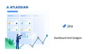
2. Do Gadgets and Dashboards Confuse you ?
A dashboard is typically the landing page of an application such as JIRA or Confluence, providing
an entry point into the different levels of functionality within the application. For applications
that support Atlassian gadgets, the dashboard is a container where users can add gadgets and
personalise their dashboard display.
A container is an application or web page that embeds and displays gadgets, either on a
dashboard or individually on a page. The application may offer a configurable dashboard where
the user can add gadgets. Or the application may offer another means of displaying a gadget,
such as a macro which embeds the gadget into a wiki page.
3. Where Does a Gadget's Information Come From?
Gadgets can supply information from a number of places. When you choose a gadget, check
where its information is coming from. A gadget's information will come from one or more of the
following sources
1. The application where your dashboard is running, such as JIRA or iGoogle.
2. Another installation of the same application. For example, you may use a gadget to collect
information from two or more JIRA servers
3. Any location on the web. For example, the Google Map Search gadget gets information from
Google Maps
Some gadgets allow you to edit the source of the information so that, when the gadget is
running on your own dashboard, the gadget displays information from a specific server
4. Making Gadgets Work for You
What do the new Atlassian gadgets and dashboards do for you?
1. Bring in content from all over, Atlassian and non-Atlassian applications, and display it on your (JIRA)
dashboard:
1. From multiple Atlassian applications e.g. from JIRA, Confluence, Bamboo etc all into one
dashboard.
2. From different instances of each application.
3. From external sources that are not Atlassian applications.
2. Make it easier to integrate other applications with JIRA (and vice versa).
3. More modern UI for dashboards:
1. Better tabs so you can flip between them more quickly.
2. Drag-and-drop to re-arrange portlets.
3. Ajax for quick reaction e.g. when delete a portlet you don't have to re-load the entire page to see
the effect.
4. Re-configure layout to multiple columns — also happens dynamically.
Continue…
5. 4. Adopt open standards:
1. Base it on the Google Gadgets spec. Already in use by Google, LinkedIn, Salesforce to both
consume and expose gadgets.
2. We want to be able to consume data from other apps in JIRA
3. We want also to expose JIRA data to other portals e.g. iGoogle. So you should be able to
display JIRA data in iGoogle and other portals
Making Gadgets Work for You
5. Re-focus the purpose of the dashboard:
1. Make it about teams, projects and tasks, not about tools. So you don't have to go to your
Bamboo dashboard(s), your JIRA dashboard(s) etc. Instead, you can pull it all into one spot. So
you go to the dashboard that represents your project, or a particular task that you're focused on,
and it gives you all the info you need for that particular task/project, all in one place
6. Gadgets and Dashboards Administration
• Adding a Gadget to the Directory of Available Gadgets
• Adding a Gadget that is Not a Plugin
• Adding a Gadget that must be Installed as a Plugin
• Removing a Gadget from the Directory of Available Gadgets
• Configuring OAuth Subscribing to Another Application's Gadgets
• Removing a Gadget Subscription
7. Gadgets and Dashboards Administration
Screenshot 1: Gadget directory with 'Add Gadget to Directory' button
9. Reporting
Reporting is an activity that you will be doing throughout a project. Jira Software has a range
of reports that you can use to show information about your project, versions, epics, sprints,
and issues.
The documentation in this section will help you configure and use the reports in Jira Software
10. Reporting
> Generating a report for Projects in JIRA and Types of Reports
Chart Applies to Purpose
Burndown Chart Sprints Tracks the total work remaining, and projects the likelihood of achieving the sprint goal.
This helps your team manage its progress and respond accordingly.
Sprint Report Sprints Shows the work completed or pushed back to the backlog in each sprint.
This helps you determine if your team is overcommitting or if there is scope creep.
Control Chart Projects, versions,
or sprints
Shows the cycle time for your product, version, or sprint.
This helps you identify whether data from the current process can be used to determine future performance.
Cumulative Flow
Diagram
Any period of
time
Shows the statuses of issues over time.
This helps you identify potential bottlenecks that need to be investigated.
Epic Report Epics Shows the progress towards completing an epic over time.
This helps you manage your team's progress by tracking the remaining incomplete and unestimated work.
Epic Burndown Epics Similar to the Epic Report, but optimized for Scrum teams that work in sprints. Tracks the projected number of sprints required to
complete the epic.
This helps you monitor whether the epic will release on time, so you can take action if work is falling behind.
Release
Burndown
Versions Similar to the Version Report, but optimized for Scrum teams that work in sprints.
Tracks the projected release date for a version. This helps you monitor whether the version will release on time, so you can take
action if work is falling behind.
Velocity Chart Sprints Tracks the amount of work completed from sprint to sprint.
This helps you determine your team's velocity, and estimate the work your team can realistically achieve in future sprints.
Version Report Versions Tracks the projected release date for a version.
This helps you monitor whether the version will release on time, so you can take action if work is falling behind.
Scrum projects
11. Reports for Kanban projects
Chart Applies to Purpose
Control Chart Projects, versions, or sprints Shows the cycle time for your product,
version, or sprint.
This helps you identify whether data from
the current process can be used to
determine future performance.
Cumulative Flow Diagram Any period of time Shows the statuses of issues over time.
This helps you identify potential bottlenecks
that need to be investigated.
12. General reports for analyzing issues
Chart Purpose
Average Age Report Shows the average age of unresolved issues for a project or filter. This helps you see whether your
backlog is being kept up to date.
Created vs Resolved
Issues Report
Maps created issues versus resolved issues over a period of time. This helps you understand whether
your overall backlog is growing or shrinking.
Pie Chart Report Shows a pie chart of issues for a project or filter grouped by a specified field. This helps you see the
breakdown of a set of issues, at a glance.
For example, you could create a chart to show issues grouped by Assignee for a particular version in a
project (using a filter).
Recently Created
Issues Report
Shows the number of issues created over a period of time for a project or filter, and how many were
resolved. This helps you understand if your team is keeping up with incoming work.
Resolution Time
Report
Shows the length of time taken to resolve a set of issues for a project or filter. This helps you identify
trends and incidents that you can investigate further.
Single Level Group
By Report
Shows issues grouped by a particular field for a filter. This helps you group search results by a field, and
see the overall status of each group.
For example, you could view the issues in a version of a project, grouped by Assignee.
Time Since Issues
Report
For a date field and project or filter, maps the issues against the date that the field was set. This can
help you track how many issues were created, updated, etc over a period of time.
Time Tracking Report Shows time tracking information on issues for a particular version of a project.
13. Other reports
•Additional reports (e.g. Gantt Chart Report, Timesheet Report, Jira SQL Plugin) are available for
download from the Atlassian Marketplace.
•Jira administrators can also create new reports with the app API . If you don't want to build an app
yourself.
•Issue filters can be exported to Microsoft Excel, where they can be further manipulated into charts
and reports.