
Recomendados
Recomendados
Más contenido relacionado
La actualidad más candente
La actualidad más candente (19)
Similar a Analysis of contents pages
Similar a Analysis of contents pages (20)
Más de suhayl786
Más de suhayl786 (12)
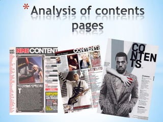
Analysis of contents pages
- 1. *
- 2. NME masthead is the same colour code as front, this is * Banner at the top is nice essential as the font colour and clear, the colour is needs to be consistent. also important as it makes the information This the band index stand out the magazine , this needs to be clear and Date is vital as it tells the bold so its readable reader when this magazine Main image is a canted was published and when it image of the touring came out special which was Sub heading blocked out into denoted in the cover black sub sections, this allows the page information to separated and become clear to the audience Bands are listed in red which is what. The colour is part of with page number in the house style which must be black, the colour allows kept consistent within the them to stand out. Also it magazine relates back to the theme Brief Heading + summary of content of music and what's with page number in red is used so included in the magazine that its clear and outlined. This is Image is edited so it looks important as the viewer needs to see like a photograph. This is where is the information that there appropriate because this looking for in the magazine makes it look realistic like Previous/Future editions its just recently happened of NME are shown with details of website/phone number etc. This allows This is a drop cap is the customer to view the used to start a past and upcoming section of editions in case they are information (text) interested for more in the and make it more magazine in which they lively, It is used to are able to call or contact draw the eye to the the producers for Editors introduction to contents of beginning of the information magazine allows the reader to see what section the magazine is about and what it will include
- 3. * MASTHEAD AND WORD CONTENTS – BOLD AT TOP WITH DATE/ISSUE NUMBER, this is vital as this information is important so It needs to be in the best view which is at top above everything in the contents page of the magazine Sub heading blocked out into black sub sections is layered as a column on the right side which is important as it is visible to everyone, this is The image is placed in the top centre of the important as this information is important and if magazine and doesn't its clear, its better for the reader. cover as much space as an image would normally do in the front cover because in the Editors introduction to contents of magazine is contents page there is constructed in the centre of the contents page more information under the image about ‘touring special’. This makes the information seem cloudless which emphasized through the use of house style colour (black/white) Previous/Future editions of NME is constructed at the bottom right. It is a characteristic of the magazine that is visible but not as important as other information otherwise it would have been placed at the top Band Index is structured on the left side of the magazine as a column which makes the information seem visible and the information set in chronological order so it makes more sense to the reader where to look on the magazine for the specific band
- 4. * They have used the letter ‘V’ The sub-heading for to represent the title of the contents page is made magazine which is called big, black and bold. ‘Vibe’. They have made it a The word has been light/faint grey colour placed split into three in the background. The letter sections to suggest to ‘V’ is a larger font then the us that the magazine is rest of the information but a little bit funky, it’s a doesn’t seem to stand at as unique twist that much. reinforces the genre of The main image is a the magazine celebrity posing on the front cover as well as the contents page. This tells us a Similar to most contents sense of wealth for pages of magazines this the magazine, as it one has a column of seems they can information which afford to use any denotes what he celebrity they want magazine features and in their magazine which page numbers you can find the information on Surprisingly the contents page contains less information then others. However it does have an effect on the viewers and is quite unique and interesting to look at. The magazine has also singled out the fashion pages and page numbers because this is a music magazine so they want to point out they added these
- 5. * The sub heading is layered out at the top right hand corner of the magazine so its visible to the audience and doesn’t take up as much space. The title itself is also spilt into 3 so it can give a unique/funky look The fade letter ‘V’ is placed in the background of the contents page. The reader is just able to see the letter (which is why the font of the letter ‘V’ is the biggest) however it doesn’t stand out as much and is not as important as the audience would already know who the producer of the magazine is by looking at the front cover which is why its behind the image and the information The features of the magazine is placed as a column like most magazines would which is to make the magazine look organized but at the same time allows the reader to view the information without problem The main image is constructed on the magazine so it can dominate the frame. It is placed slightly on the left so there is enough room for the magazines features on the right. The producer chooses the image to cover most of the frame so It can highlight what type of genre the magazine is and who its targeted to. This information is the footer which gives information about the image and music is structured on the bottom right so it saves space but is still visible to the audience