
Recomendados
Recomendados
Más contenido relacionado
Similar a Ge Tutorials Part Vi Design Principles
Similar a Ge Tutorials Part Vi Design Principles (20)
Más de tcooper66
Más de tcooper66 (20)
Último
Último (20)
Ge Tutorials Part Vi Design Principles
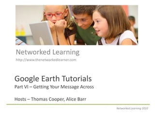
- 1. Networked Learning http://www.thenetworkedlearner.com Google Earth Tutorials Part VI – Getting Your Message Across Hosts – Thomas Cooper, Alice Barr Networked Learning 2010
- 2. Need for Graphic Design Principles Graphic design plays a key role in the appearance of almost all print, film and electronic media. It can be defined as the application art and communication skills to the needs of a business. Graphical visualization has progress from painting, print, web and now to GIS databases. As more and more information becomes visualized as part of a geographical information system, there is a need for graphic design principles to apply to the design of Google Earth placemarks. Networked Learning 2010
- 3. GE Placemarks are Web Pages Apply basic design principles found in print, magazines and web pages to your placemarks. Major Parts • Message • Color • Order • Form Endangered Species Layer Networked Learning 2010
- 4. Design Process • Understand the problem. • Do your research. • Think with your pencil or mouse in hand. • Choose your best 3 thumbnails and turn them into roughs. • Choose your best rough and turn it into a comp. Networked Learning 2010
- 5. Message First Legible Text – Contrasting Colors – Artful Photos Networked Learning 2010
- 6. Communication First The first goal of a web page is to communicate a message. Your can do this through text, images, shapes, and colors in your placemarks. This layer has excluded images in favor of bold text to get its message across. If images are worth a 1000 words, why do you think they were excluded from the placemark? Crisis in Darfur GE Layer Networked Learning 2010
- 7. Helpful Text Hints • Is the text legible? Avoid ornamental fonts in body text. Keeping it simple keeps it legible. • Does the color of the text make it distinct, easy to read? High contrast between text and background colors increase legibility. • Does the text have sufficient white space? Good use of white space contributes to a clearly understood message. Networked Learning 2010
- 8. Helpful Image Hints • Can the viewer understand why you've chosen a particular photo or illustration? • Is its purpose clearly understood? • It is better to use no graphic, than to have one that does not convey the proper message. Networked Learning 2010
- 9. Use of Color Mood – Texture – Scheme – Balance Networked Learning 2010
- 10. Color in Websites First of all, notice the number of colors used in the overall design. It is a two color palette (dusty pink, and shades of green). Why only three colors? I have found that a color palette that uses three or fewer overall colors contributes to the clarity of a web page. It reduces visual clutter, so that the Why are these colors are fitting for a eye does not have to work hard to web site about a state park? collect information from the page. Networked Learning 2010
- 11. Color in Placemarks Color is the one design element that most Web designers are acutely aware of. But remember that color is not a required element of any design. In fact, a good plan in design is to create the design without color first, then add as little color as you can to enhance the design. World Wildlife Fund Balloon Series Networked Learning 2010
- 12. Hints on Finding Colors One of the best places to find great color palettes and combinations is in Nature. I keep a digital camera with me at all times. Especially during the spring and summer, as I walk through parks, on beaches, or through gardens, I study Nature for color usage. I will often see a color palette in a flower, orchid, Miami Beach Life Guard House rock or shell, in a leaf turning color during the Fall. Networked Learning 2010
- 13. Choosing a Color Scheme Monochromatic color schemes are harmonious and peaceful. Using a single color creates unity and can help to create or tie things together. Two or more colors can be used in an analogous color scheme however, one color is often used as a dominant color while others are used as accents. United States Holocaust Museum Layer Networked Learning 2010
- 14. Contrast When most people think of contrast, they typically think of colors or black and white. But there is more to contrast than color. You can have contrasting shapes (square vs. circle), or contrasting sizes (large vs. small), or contrasting textures (smooth vs. rough). Walk on the Wild Side Layer http://walkonthewildside.wikispaces.com Networked Learning 2010
- 15. Helpful Color Hints • Do the colors you've chosen clearly convey the spirit of your message? Is it a warm appeal, an exciting pitch, or a cool approach? • Use colors seen in nature. Warm colors that engage the eye and heart. • Use watercolors for your pallet. Watercolors are like computer monitors in that semi-opaque colors are applied on a white background. • Add texture to your backgrounds instead of having large swaths of flat color. Networked Learning 2010
- 16. Create Order Emphasis – Balance – Direction - Rhythm Layout is about arranging type and visuals on two-dimensional surface so all information is legible, clear and attractive. Networked Learning 2010
- 17. Successful Layouts • Who will be looking at or reading this? • What style is appropriate for this audience? • What is the purpose of this design? • What information or message has to be communicated? Networked Learning 2010
- 18. Emphasis Emphasis is what the eye is drawn to in a design. It's tempting to give everything equal emphasis or try to emphasize everything in a design, but this ends up making the design bland and flat. Instead, as a designer you should determine the hierarchy of the page and then apply the emphasis to the elements based on that hierarchy. World Wildlife Fund Balloon Series Networked Learning 2010
- 19. Establishing Emphasis • Make it the brightest. • Make it a different color, create contrast. • Move it in a different direction, contrast of position. • Make it the biggest. • Have all other elements lead to it. • Make it a different shape. • Isolate it. Networked Learning 2010
- 20. Balance Balance is the distribution of heavy and light elements on the page. Fair Trade Layer Networked Learning 2010
- 21. Unity • Unity describes the relationship of the parts of a design. In order for a layout to be successful, it must hold together. Devices can be used to establish unity. – Rhythm – Direction – Closure – Proximity Networked Learning 2010
- 22. Rhythm Rhythm is also called repetition, or more formally correspondance. Rhythm brings an internal consistency to your Web designs. Patterns are easy for humans to comprehend, and repetition provides patterns that make your placemark easier to comprehend. Networked Learning 2010
- 23. Direction Direction gives your Web designs motion. In most designs there is a sense of movement in a direction across the design. Good designs lead the eye through the design in a deliberate fashion so that the viewer sees what the designer wants. Global Heritage Fund Networked Learning 2010
- 24. The Grid Grids are used as guides for placing textual and visual elements on a page. Tables can be used to align objects or place similar shaped objects together. The idea is to create an underlying structure that maintains clarity, legibility, balance and unity. Engendered Species Layer (old version) Networked Learning 2010
- 25. Artful Forms Lines - Shapes – White Space - Size Networked Learning 2010
- 26. Lines Lines and other shapes can be used to enclose text and visual elements on a page. These include borders and rules. They can be horizontal or vertical and help delineate the spaces around elements in a palcemark. Poetry of Place Layer http://poetryofplace.wikispaces.com Networked Learning 2010
- 27. Shape Shapes make up any enclosed contour in the design. Shapes on most Web pages are square or rectangular. But they don't have to be. You can use icons, geometric shapes, or lettering to generate unique shapes within your designs. Earth Watch Layer Networked Learning 2010
- 28. White Space On the Web, white space is essential when the viewer is required to read large amounts of content. Generous margins and clear simple layouts make it easier for the eye to work. Cluttered layouts tire the eye quickly and hinder clarity. Earth Watch Layer Networked Learning 2010
- 29. Size • Space is prime real estate. Use space wisely. Don’t leave too much empty space and don’t make placemarks so big that the viewer has to scroll. I tell students to keep the size of placemarks between 300-500 pixels. • Create emphasis, but don’t have a particular object too big that it takes over the entire placemark. I tell my students to keep their pictures between 300 – 450 width. • Don’t have too much text. Use links (text or buttons) to web pages or wikis to give users more information. Make the link text stand out by using different colors and a clear message that makes the user want to click on the link. Networked Learning 2010
- 30. Hint - Learn Order from the Masters Web designers can enhance their craft by studying the work of great graphic designers. Graphic Design Solutions reviews the basic design principles and provides images from numerous famous designers. You could also think about having students look at famous artists though history to see how they created order in their work. By Robin Landa Networked Learning 2010
- 31. In Summary • Good web design is clear, and easily understood. Make sure all elements used in your web design speak clearly. If they are not easily understood by the viewer, they will not be taken seriously. Networked Learning 2010