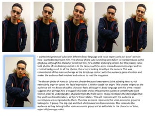
1. I wanted the photos of Luke with different body language and facial expressions as I wasn’t certain
how I wanted to represent him. The photos where Luke is smiling were taken to represent Luke as the
good guy, although his character is not like this; he’s a bitter and angry person. For this reason, I also
took photos of him looking neutral in to the camera with his arms crossed to connote anger and his
criminal background. In all the photos, the actor is looking directly at the camera. This was
conventional of the main anchorage as the direct eye contact with the audience gains attention and
makes the audience feel involved and enticed to read the magazine.
The chosen photo of Harry as Luke was chosen because it represents Luke as being neutral, not
necessarily angry or upset. His facial expression is neither upset nor angry. This creates enigma as the
audience will not know what this character feels although his body language with his arms crossed
suggests that perhaps he’s a thuggish character and so this gives the audience something to work
from in order to understand his character from the front cover. It also reinforces the stereotype that
the youth are troublemakers, as Dyer’s theory states. This will resonate with the audience as
stereotypes are recognisable to them. The mise en scene represents the socio-economic group he
belongs to: D group. The big coat and the t-shirt makes him look common. This relates to the
audience as they belong to this socio-economic group and so will relate to the character of Luke,
especially teenage males.
2. The character of David is to be positioned next to Luke and taking into the consideration the chosen main cover line, “Who was pushed?”, I
didn’t want to give away who the victim was through body language or facial expressions. After taking the photos for Luke, I had Bob pose
in a similar way. This would create similarity between the characters and so the audience is not pushed towards thinking that one character
is more likely the victim in the storyline than the other, therefore creating enigma.
The character is not represented as a thug and appears more ‘classy’ as he’s wearing a shirt. Rather than representing him as a criminal,
the shirt instead represents him as a casanova almost which ties into the affair storyline that he is in. This is an archetype that the audience
can recognise as in many media texts, especially soap operas, there is often a smooth-talking ‘bad boy’ who causes trouble on the scene.
His shirt is dark which connotes to mystery. In the trailer, this character is not presented physically and so seeing his face on the front cover
with this representation adds to the enigma surrounding his character.
This one photo is unusable as the
actor closes his eyes and it is
necessary for him to look into the
camera as conventional of the main
anchorage.
3. In order to place the image into InDesign, it was
important for me to make the image partly transparent,
removing the background of the photo to allow the
photo to be moved in InDesign in a way that is
professional and allows the image to work in accordance
with the text and the rest of the images I have chosen.
I also decreased the saturation of the image slightly and
increased the lighting. By doing this, the shine on his
skin would not be as bright and also his skin colour
would not be dramatically different from the character
of David who will be positioned next to him. The
difference in colour between the two characters may
look unprofessional and so it was important to make the
colour less bright.
It was only a small requirement to lower the saturation of
this photo because his skin colour was suitable for the
main anchorage.
I also removed the background of this photo for the same
reason it was removed for the photo of Luke: so the
image could be moved around InDesign and placed in
front of text and other images to create professionalism.
4. I wanted to represent the additional character of Pete, who will be a thumbnail image, as pensive and in
thought. This is to match the text that will go with his image: ‘Trouble for Pete!’, as it suggests to the
audience that the character is thinking of a way to get out of the troubling, implying that whatever is
happening to this character is serious. The character of Pete, with his hand underneath his chin in thought,
represents him as someone belonging to the socio-economic group C1 and higher. I have decided to
represent him this way because form my research I found that television listings magazines often aim to
appeal to a mass audience, although their focus may be on one specific social group. This means that I had
to add diversity to the page and ensure that a range of socio-economic groups were appealed to.
5. I tried different facial expressions for this pregnant character because they
held different representations of the character. With an upset expression,
the character would be represented as unhappy with her pregnancy
although I wanted to represent her as being happy in order to go against
the stereotype of teenagers having unwanted pregnancies. For this
reason, I had her smiling. Additionally, other characters I have decided to
use on my front cover are not smiling and so it was important for me to
have a face on the front cover that would be friendly to the audience in
order to ‘invite’ them to read the magazine.