Shoppers can buy what you sell in any number of places!
•
1 recomendación•1,553 vistas

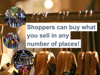
Shopping will be all about the experience rather that about transactional purchases – shoppers can buy what you sell in any number of places, so you have to think about how you influences your customers emotions. Page 25 is now what Amazon GO is about

Recomendados
Recomendados
Más contenido relacionado
La actualidad más candente
La actualidad más candente (20)
Destacado
Similar a Shoppers can buy what you sell in any number of places!
Similar a Shoppers can buy what you sell in any number of places! (20)
Más de Thorleif Astrup Hallund
Último
Último (8)
Shoppers can buy what you sell in any number of places!
- 1. Shoppers can buy what you sell in any number of places!
- 2. Your sales floor and displays require constant reinvention so that shoppers don’t get bored and go somewhere else. Let’s take a look at areas that typically need attention.
- 3. GRAB THEIR ATTENTION Create a sensational first impression
- 4. Many retailers don’t pay enough attention on windows It takes eight seconds to walk by a typical storefront. Once someone is two seconds past the door, they won’t turn round. That means retailers must capture customers attention in the first four seconds of their approach. Each window should tell a story and remember that it's also important to avoid mess. If you cram items together in a window they'll look cheap.
- 5. THE DECOMPRESSION ZONE The very first area that customers step into DECOMPRESSION ZONE
- 6. Minimal sales in the threshold area The threshold area, also known as the "decompression zone", is the very first area that customers step into when they enter your store. The decompression zone is typically the first 1 to 4 meters inside the front door depending on how big your store is. Understand that shoppers will miss anything you place here, that’s why is not the ideal place for any product, signs or carts you place there because customers will walk right past them!
- 7. ROAM THE SALES FLOOR FREELY Avoid aisles that ends at nothing
- 8. Take control to increase sales Typically shoppers never see more than 50% of your sales floor? That’s why your floor plan plays a critical role in managing store flow and traffic. The choice of which floor plan is right for you will depend on a number of factors including the size of your store, the products that you sell and more importantly, your customer segment. What are your customers like? Are they shopping in a hurry or can they take their time, do they prefer self-service or..? These are just some of the questions you have to ask when deciding on your floor plan. The more they see, the more opportunity they have to buy!
- 9. Different types of floor plans Straight floor plan – Involves positioning shelves or racks in straight lines to create an organized flow of traffic. It’s mostly used in large retail spaces and supermarkets. Diagonal floor plan – Offers more visibility for staff and shoppers. It’s recommended for smaller retail spaces and self-service shops. Angular floor plan – Consist of curves and angles to give off a sophisticated vibe. Is usually adopted by high-end retailers and it reduces the amount of display area you have but focuses instead on fewer, more popular lines. Geometric floor plan – Utilizes racks and fixtures to create a unique store feel and design. Go with this layout if you’re showcasing trendy products.
- 10. THE HERO WALL The first wall after turning right
- 11. Design the customer journey Despite being one of the most important elements in any retail design, customer journey are often an afterthought by many retailers. Customers typically shop the same way they drive a car, customers have a tendency to turn right when they enter a store if they drive on the right side of the road. The first wall they should see is often referred to as a "Hero product presentation Wall" and acts as a high-impact first impression. If you use this area to house basic product you are making a mistake. This Hero Wall has to display new and seasonal items, high demand and high profit items.
- 12. LOOK, TOUCH AND PLAY Let customers experience your products
- 13. Create multisensory experiences The brain loves multisensory experiences. In other words, people enjoy being able to look, touch, and play with products. If your are a tech Retailer try to create a place where our customers can experience the wonderful technology that are available to today, along with a glimpse at what’s to come in the future. You can also include an explorer area, where customers can try out new apps in an apps bar or a lifestyle area where customers can see how the latest mobile devices can enhance their lives when matched with the right applications or accessories.
- 14. CREATE ”SPEED BUMPS” Inspire your customers to slow down
- 15. Slow them down with “speed bumps” The last thing you want to happen is for customers to hurry past your merchandising, ultimately limiting the number of products they'll purchase. Create speed bumps. Essentially, this can be anything that gives customers a visual break and can be achieved through signage, and special or seasonal displays. Also, remembering to keep high-demand products displayed at eye-level is important while placing lower grossing products at the bottom or higher-up. And be sure to rotate the product on your speed bumps to create a continued sense of novelty for returning visitors.
- 16. MAKE THEM SPEND MORE TIME Incorporate some type of waiting area
- 17. Make sure they are comfortable Be aware of something known as the "butt-brush effect, that a typical customer, especially women will avoid going after merchandise in an area where they could potentially brush another customers backside or have their backside brushed. This holds true even if the customer is very interested in a given item. An easy way to avoid this problem is to ensure that your sales floor and displays allow them to have more than adequate personal space. Make your store comfortable by incorporating some type of waiting area, which will encourage customers to spend more time in your store. Especially, if a shopper is accompanied by someone not interested in making a purchase. (( ))
- 18. WHAT DO YOU SMELL? Scents can increase sales
- 19. If it smells, it sells Take a big breathe, what do you smell? If you answer is nothing then Aromacology – the science of scents, can help you increase sales. Remember that old retail adage: “If it smells, it sells”? It turns out to be true, pleasant smelling environments have a positive effect on how customers shop. The scent of grapefruit energizes shoppers, vanilla is calming, and cinnamon is said to attract money. So put out the potpourri or purchase scent diffusers and place them throughout the store.
- 20. AVOID FRUSTRATION Strong correlation between waiting time and experience
- 21. Reduce perceived waiting time There are a strong correlation between waiting time and customer experience. Free Smart Cellular Shop use a unique interactive bench. It’s an interactive-waiting-station that allow the customers to connect their smartphones and play video games on the huge power wall in the shop. Give the customers an indication of when their wait will be over, it will make the process for the customer seems more finite, rather than endless. Any of your attention-diverting techniques should be targeted towards the 2nd or 3rd person in the queue – the first person will be too busy watching the sales staffs signal.
- 22. CHECKOUT COUNTERS Can create an “us vs. them” mentality
- 23. Minimize your checkout counters Checkout counters is what customers experience last and they often often separate employees from customers, at least psychologically. This doesn’t benefit sales because it can create an “us vs. them” mentality and sends the wrong signals. If a counter is essential then remember to create enough room for your employees, at least one meter per person behind the cash register. Avoid overcrowding the counter with impulse items because if you put too much up there all at the same time, the customers are just going to ignore all that stuff.
- 24. The front right is not the best place for checkout counters Where to place your checkout counter is a question you can ask yourself for days and generate pros and cons and still end up confused. You may argue that it’s nice to have one right up front to say hello to shoppers as they enter the store, but a greeter can solve that problem on busy days. So if customers naturally turn right when they enter, and you've managed to have them go through and circle all the way around, you'll realize that the left-hand side at the front is probably the ideal location for your checkout counter.
- 25. The future will take checkout even further In the not-too-distant future a customer will be able to walk into the store, grab what she wants and simply leave. Electronic virtual networks is going to dramatic change the customer experience. People will say that when checkout is working really well, it will feel like stealing, you simply grab a pair of shoes and you just walk out. A population of sensor technologies placed strategically within stores, retailers will recognize customers when they walk in the door. Stores will have payment cards on file and customers will be billed when they leave the store, essentially bypassing the checkout.
- 26. SHOP-IN-SHOP AND KIOSK The success and failure
- 27. The success of one kiosk and failure of others? At Envirosell, they researched that question in depth for some of the leading kiosk-based retailers in the US. The bottom line is that retailers who know how to take advantage of people per hour passing their kiosk are those who will succeed and live on to multiply. A small increase in the percentage of customers noticing a kiosk can lead to a healthy increase in the location’s bottom line. For example, if the percentage of passersby noticing a kiosk increased from 20 percent per hour to 30 percent per hour, then the number of purchasing customers would increase from four to six per hour. 550 people per hour passes a kiosk per day (based on average mall traffic on a weekend day) 110 of all passing customers per hour per day will notice a mall kiosk. 15 percent of those who notice a kiosk will actually stop to shop—or about 16 customers per hour. 25 percent will make a purchase, which translates into four purchasing customers per hour.
- 28. By showing what you are selling you increase capture power One of the best ways to increase the capture power of a kiosk is to emphasize how it looks from a distance. Mall customers walk at such a speed that it takes a lot to slow them down. It’s important that customers can tell what a kiosk is selling from at least 14 meters away. Kiosks that sell small items need to work on how the product itself can actually work as a sign. A blowup of a product’s packaging can work effectively to project from a distance what is being sold. Kiosk retailers should put up as large and strongly noticeable signage as possible. Getting a passing customer to notice and stop does not start at the kiosk itself—it starts 14 meters away, from both directions.
- 29. Not all mall traffic is the same Take a close look at the traffic flow on both sides of the kiosk, as well as the sightlines of the approaching customer. One side of the kiosk may receive much more passing traffic than the other. Product and employee placement, needs to be based on mall traffic flow and first-sight lines. If the first thing the customer sees is the back of an employee sitting on a stool, then capture power will be “compromised.” You can make all the fine adjustments, but it won’t matter if customers don’t notice the kiosk in the first place.
- 30. Landing the sales Of course, getting noticed from a distance is not the only factor that determines the success of a mall kiosk. Salesperson-assistance is key. Studies made by Envirosell have found that customer conversion rates at kiosks go from less than 10 percent to more than 40 percent when the customer is assisted by a salesperson. Product-accessibility also makes a difference. If product is displayed on multiple levels (shelves of varying heights) the product is much more easily shopped and therefore more likely to be purchased.
- 31. Designing your retail experience is a never-ending process, where you can always be switching up, tweaking, adding, or taking away to create a resonating customer journey and experience. At the end of the day though, that's exactly what you want to focus on, the customer journey, which you'll want to test out and optimize for constantly.
- 32. Thank you Contact information: thorleif@hallund.com
- 33. Source: Brian Dyches, chief experience officer of retail branding firm Ikonic Tonic in Los Angeles Store design and display consultant Linda Cahan of Cahan & Co. in West Linn, Ore Colin Shaw is the founder and CEO of Beyond Philosophy Bob Phibbs, owner of the Retail Doctor Michael Chui, a partner at the McKinsey Global InsMtute, the business and economics unit for consultant McKinsey & Co. Consumer behaviour expert Paco Underhill Craig Childress Envirosell