SlideShare una empresa de Scribd logo
1 de 19
Flood Hydrographs Rainfall.  This shows when the rain fell and how much fell. The most rain fell between 18 and 24 hours. Discharge.  This line shows how the water level in the river has changed since the storm. Lag time.  Time in between the peak rainfall to the peak discharge, in this case 39 hours (21 hours to 60). 6am – start of rainfall. Look at the shape of the graph.  Use the key and the notes below to work out what the graph is showing.  Does the level of the river (discharge) rise quickly or slowly?  How quickly does it respond to rainfall? (what is the lag time?)
Choropleth Maps Look at the title and key.  What is this map about?  What is the overall pattern shown on the map?  Where do most people live?  Where do least people live? (answer in km 2 ).  Core: area of dense population (this line did  not  appear on the exam paper). Periphery: area of lower population density. You need to locate the area that is circled below.  Name specific countries as examples.
Divided Bar Graphs Look at the title and key.  Each bar graph adds up to 100%.  Use a ruler to accurately measure percentages, e.g the percentage of secondary industry in New Zealand is 22% and  not  35% - make sure you understand this! USA Switzerland/Japan USA
Climate Graphs Climate graphs show average rainfall and temperature for a specific place over a year.  They may appear as two separate graphs or as one combined graph.  If the graph is combined, the rainfall scale will appear down one side of the graph and the temperature scale will appear down the other – if this is the case, don’t get the two confused! Temperature.  Usually shown as a line graph and measured in  o c. Rainfall.  Usually shown as a bar graph and measured in mm. Months of the year are usually shown on the x axis. ‘ Mean’ is the average for the year. ‘ Describe’ means  write exactly  what you see.  For example: January:  temperatures are lower than average for the year at approximately 10 o c.  Rainfall is higher than average for the year at approximately 100mm. ‘ Suggest’ in this case means  say why  think the climate affects farming.  For example: In the summer months of  June to September rainfall is low.  This would mean that the farmer has to irrigate (water) the crops. Using the examples given, attempt the rest of these questions for yourself.
News Articles ,[object Object],[object Object],[object Object],[object Object],[object Object],The headline will usually indicate what the article is about. There might be a map.  What is it showing?  Read the key.  Use the smaller inset map to check what country/countries you’re looking at. The main story. Use the inset map to check where Canada is. You are expected to use the article to think about this one – the answer needs understanding, not reading skills.
Systems Diagrams Systems diagrams are common in the Economic Systems section as they show how industries operate.  Systems typically consist of ‘inputs’ ‘processes’ and ‘outputs’, which are often shown by arrows going into or out of a diagram.  These questions are often not difficult if you understand how systems diagrams work. The systems diagram below shows a supermarket.  There are only inputs and outputs on this systems diagram.  You are expected to know what goes into the supermarket and what comes out of the supermarket. Outputs shown as arrows going away from the diagram. Inputs shown as arrows going towards the diagram. Sometimes the correct words are provided for you. Have a go at this one yourself!
Cartoons and Diagrams Some cartoons and diagrams are informative and helpful.  Others just illustrate a point that you are expected to know already. This cartoon tells us very little, unless we understand what global warming is.  The cartoon is relevant to the question, but it will not necessarily help you to answer it. This cartoon contains all of the information that we need to answer the question.  You must look at the writing as well as the pictures. ,[object Object],[object Object],[object Object],[object Object]
Photographs Questions using photographs expect you to study the photograph carefully. This village contains houses that are irregularly spaced out and all different sizes.  This usually means that the houses are older. The roads leading into and out of the village are small and winding.  This suggests that the village has very little ‘through traffic’ This village contains houses that are evenly spaced out and all the same size.  Often newer houses are built like this. The roads leading into and out of the village are larger and straight.  This suggests that a lot of traffic passes through the village. You are expected to use your own knowledge of growing settlements to answer this.
Satellite Images Satellite images are often used to show weather patterns, such as depressions or hurricanes.  They can also be used to show land uses. You need to understand depressions and hurricanes in order to answer these questions. White areas are colder and therefore they usually show the where clouds are. The shape of countries is often shown as a grey line. Dark areas are warmer.  They usually show clear skies.  This is the Mediterranean. Describe means ‘say what you see’.  What shape is the cloud?  Where exactly is the cloud? This is asking for an explanation – swirls like this often show depressions.  What are depressions?
To use the satellite map look at the key carefully.
X Y Y Which blue colour would be along the coast? Which blue colour would be amongst the fields?
Map work Look at the line of longitude. It curves so follow it to find the most westerly member Look at the line to find the most easterly new member. Check the key The position of most new  members is from Eastern Europe, except Norway and Iceland which are in the North and North West. All new members are on the periphery of the current member countries.
Look at the shape the rainfall makes. Where does mot rain occur? Where does least rain occur? Use the mm of rainfall in your answer. The heaviest rainfall,1000mm occurs along the Northern and Eastern coasts. The rainfall decreases rapidly as you southwards and inland. The least rainfall is in the centre southern area where less than 200mm falls. The capitals will be where the temperature is coolest at 20 ºC . The centre is desert and very hot so communications are made by boat, also importing goods and trade.
Looking at maps First look where the severe drought areas are. (Near the tropics not on the equator .) Are the starved recently areas the same as drought areas? If not what are the similarities and differences? What is the climate like in the areas of drought? How reliable is the rainfall? These areas are semi desert with mostly less than 50mm of rain each year, recently the rains have not occurred at all. Some say this is because of global warming. Human activity in these areas is mostly farming often with cattle which means the grass is eaten and the trees cut down for firewood. The more people that live here the worse this gets so that there is not enough food to feed the people and too little water, so they starve. The animals destroy the grass by eating it and destroying the roots as they are hungry. Often it is worse around water holes, which encourage more animals and people because of the constant water supply
[object Object],[object Object],[object Object],[object Object],[object Object],[object Object],[object Object],[object Object],[object Object],[object Object]
Describe the location of Pattoki in Pakistan.  (2) Look at both maps, use the key, scale and other settlements. Look at the compass. Pattoki is in North East Pakistan. Near the North Western border with India. It is on the lowland, below 500m, near the River Indus. How close to the nearest settlement is it? Use the scale. Pattoki. Can you say anything about the height of the land? Is the river important? Understanding maps
Understanding Tables Read the question- which hazard has the  greatest impact? For each hazard add up the totals for impact. ( or see which one has thee most number ‘3’s) Think which columns refer to impact? Add up the last four columns. (Or the most number ‘3’s)
Understanding tables Describe the changes- Note the time interval is every 10 years. Has it gone up a little each year or faster in some? What is the difference between 1960 and 2000?  For doctors it gradually increased form 1960 at roughly 20 per 10,000 people, but jumped in 1980 to 1990 by 43 per 10,000. people.  What else can you add? Finally the number of doctors has almost doubled. The final question is asking you to look at all the measures.  Have they gone up or down?  Which ones went up?  Which ones went down?  Which ones stayed the same?  What is new? Are all the measures positive? Why do you think this is? You are expected to write in sentences. Think- money, Employment,education
Understanding population pyramids. Very steep angle so many people are dying  Straight edges many survive to the next age group. Wide base, many children born Narrow base, few children born but most survive. Triangular shape. Column or bottle shape Few older people, narrow top. Wide top,people live longer. ( c) Look at graph B.  Increasing elderly population which needs to be cared for. Less workers as birth rate is declining so less money being made  to pay for the pensions of the increasing elderly pop. Less workers to do the work in the future ,older people will have to retire later.

Más contenido relacionado

Similar a Skills booklet

Geography Revision Pack AQA/Edexcel
Geography Revision Pack AQA/EdexcelGeography Revision Pack AQA/Edexcel
Geography Revision Pack AQA/Edexcel
anicholls1234
 
Mapskills Revision
Mapskills RevisionMapskills Revision
Mapskills Revision
Ecumene
 
Map Skills Revision
Map Skills RevisionMap Skills Revision
Map Skills Revision
whiskeyhj
 
TASK_ONE_IELTS_Writing.docx
TASK_ONE_IELTS_Writing.docxTASK_ONE_IELTS_Writing.docx
TASK_ONE_IELTS_Writing.docx
ech48776
 
Maneesha Palakurthi
Maneesha PalakurthiManeesha Palakurthi
Maneesha Palakurthi
badgermole
 
Gapminder teachersguide200years
Gapminder teachersguide200yearsGapminder teachersguide200years
Gapminder teachersguide200years
Zoely Mamizaka
 
L2 location and climate of trf ap
L2 location and climate of trf apL2 location and climate of trf ap
L2 location and climate of trf ap
SHS Geog
 

Similar a Skills booklet (20)

La Pedriza
La PedrizaLa Pedriza
La Pedriza
 
GEOGRAPHY IGCSE: GRAPH SKILLS
GEOGRAPHY IGCSE: GRAPH SKILLSGEOGRAPHY IGCSE: GRAPH SKILLS
GEOGRAPHY IGCSE: GRAPH SKILLS
 
Geography Revision Pack AQA/Edexcel
Geography Revision Pack AQA/EdexcelGeography Revision Pack AQA/Edexcel
Geography Revision Pack AQA/Edexcel
 
Displaying and describing categorical data
Displaying and describing categorical dataDisplaying and describing categorical data
Displaying and describing categorical data
 
Lesson 2 PPT.pptx
Lesson 2 PPT.pptxLesson 2 PPT.pptx
Lesson 2 PPT.pptx
 
Analytical writing- line graph
Analytical writing- line graphAnalytical writing- line graph
Analytical writing- line graph
 
Statistics For Management 3 October
Statistics For Management 3 OctoberStatistics For Management 3 October
Statistics For Management 3 October
 
Mapskills Revision
Mapskills RevisionMapskills Revision
Mapskills Revision
 
NCV 4 Mathematical Literacy Hands-On Support Slide Show - Module 2 Part 3
NCV 4 Mathematical Literacy Hands-On Support Slide Show - Module 2 Part 3NCV 4 Mathematical Literacy Hands-On Support Slide Show - Module 2 Part 3
NCV 4 Mathematical Literacy Hands-On Support Slide Show - Module 2 Part 3
 
Problem Of Global Warming Argument. Online assignment writing service.
Problem Of Global Warming Argument. Online assignment writing service.Problem Of Global Warming Argument. Online assignment writing service.
Problem Of Global Warming Argument. Online assignment writing service.
 
Map Skills Revision
Map Skills RevisionMap Skills Revision
Map Skills Revision
 
TASK_ONE_IELTS_Writing.docx
TASK_ONE_IELTS_Writing.docxTASK_ONE_IELTS_Writing.docx
TASK_ONE_IELTS_Writing.docx
 
Maneesha Palakurthi
Maneesha PalakurthiManeesha Palakurthi
Maneesha Palakurthi
 
Toposheet interpretation
Toposheet interpretationToposheet interpretation
Toposheet interpretation
 
Gapminder teachersguide200years
Gapminder teachersguide200yearsGapminder teachersguide200years
Gapminder teachersguide200years
 
find-a-rainbow-day.pptx
find-a-rainbow-day.pptxfind-a-rainbow-day.pptx
find-a-rainbow-day.pptx
 
GEOGRAPHY IGCSE: MAP SKILLS
GEOGRAPHY IGCSE: MAP SKILLSGEOGRAPHY IGCSE: MAP SKILLS
GEOGRAPHY IGCSE: MAP SKILLS
 
L2 location and climate of trf ap
L2 location and climate of trf apL2 location and climate of trf ap
L2 location and climate of trf ap
 
The language of maps
The language of mapsThe language of maps
The language of maps
 
The language of maps
The language of mapsThe language of maps
The language of maps
 

Más de tonybattista

Geog Challenege Week 1 Results
Geog Challenege Week 1 ResultsGeog Challenege Week 1 Results
Geog Challenege Week 1 Results
tonybattista
 
Engagement of Students
Engagement of StudentsEngagement of Students
Engagement of Students
tonybattista
 
Extended Writing - Caroline Sherwood
Extended Writing - Caroline SherwoodExtended Writing - Caroline Sherwood
Extended Writing - Caroline Sherwood
tonybattista
 
Twitter T and L Briefing Nicki Helps
Twitter T and L Briefing Nicki HelpsTwitter T and L Briefing Nicki Helps
Twitter T and L Briefing Nicki Helps
tonybattista
 
Briefing 17 sept jw lazy teacher ideas
Briefing 17 sept jw lazy teacher ideasBriefing 17 sept jw lazy teacher ideas
Briefing 17 sept jw lazy teacher ideas
tonybattista
 
Holderness case study
Holderness case studyHolderness case study
Holderness case study
tonybattista
 
Best Practice Sept 30th 2011
Best Practice Sept 30th 2011Best Practice Sept 30th 2011
Best Practice Sept 30th 2011
tonybattista
 
Rivers forms and processes
Rivers   forms and processesRivers   forms and processes
Rivers forms and processes
tonybattista
 

Más de tonybattista (20)

Excellence as Standard INSET Autumn 2017
Excellence as Standard INSET Autumn 2017Excellence as Standard INSET Autumn 2017
Excellence as Standard INSET Autumn 2017
 
Geog Challenege Week 1 Results
Geog Challenege Week 1 ResultsGeog Challenege Week 1 Results
Geog Challenege Week 1 Results
 
Engagement of Students
Engagement of StudentsEngagement of Students
Engagement of Students
 
Learn 2 Learn
Learn 2 LearnLearn 2 Learn
Learn 2 Learn
 
Extended Writing - Caroline Sherwood
Extended Writing - Caroline SherwoodExtended Writing - Caroline Sherwood
Extended Writing - Caroline Sherwood
 
Twitter T and L Briefing Nicki Helps
Twitter T and L Briefing Nicki HelpsTwitter T and L Briefing Nicki Helps
Twitter T and L Briefing Nicki Helps
 
EAL Lydie Charlot
EAL Lydie CharlotEAL Lydie Charlot
EAL Lydie Charlot
 
Progression
ProgressionProgression
Progression
 
Progress hub
Progress hubProgress hub
Progress hub
 
Hub challenge
Hub challengeHub challenge
Hub challenge
 
Learning menu
Learning menuLearning menu
Learning menu
 
Thinking menus
Thinking menusThinking menus
Thinking menus
 
Briefing 17 sept jw lazy teacher ideas
Briefing 17 sept jw lazy teacher ideasBriefing 17 sept jw lazy teacher ideas
Briefing 17 sept jw lazy teacher ideas
 
Progress Powerpoint
Progress PowerpointProgress Powerpoint
Progress Powerpoint
 
Geography and the GA in Changing Times
Geography and the GA in Changing TimesGeography and the GA in Changing Times
Geography and the GA in Changing Times
 
Holderness case study
Holderness case studyHolderness case study
Holderness case study
 
Ga Dawlish 2012
Ga Dawlish 2012Ga Dawlish 2012
Ga Dawlish 2012
 
Dick's 15.11.11 final earthquake presentation
Dick's 15.11.11  final earthquake presentationDick's 15.11.11  final earthquake presentation
Dick's 15.11.11 final earthquake presentation
 
Best Practice Sept 30th 2011
Best Practice Sept 30th 2011Best Practice Sept 30th 2011
Best Practice Sept 30th 2011
 
Rivers forms and processes
Rivers   forms and processesRivers   forms and processes
Rivers forms and processes
 

Último

Salient Features of India constitution especially power and functions
Salient Features of India constitution especially power and functionsSalient Features of India constitution especially power and functions
Salient Features of India constitution especially power and functions
KarakKing
 

Último (20)

ICT role in 21st century education and it's challenges.
ICT role in 21st century education and it's challenges.ICT role in 21st century education and it's challenges.
ICT role in 21st century education and it's challenges.
 
General Principles of Intellectual Property: Concepts of Intellectual Proper...
General Principles of Intellectual Property: Concepts of Intellectual  Proper...General Principles of Intellectual Property: Concepts of Intellectual  Proper...
General Principles of Intellectual Property: Concepts of Intellectual Proper...
 
REMIFENTANIL: An Ultra short acting opioid.pptx
REMIFENTANIL: An Ultra short acting opioid.pptxREMIFENTANIL: An Ultra short acting opioid.pptx
REMIFENTANIL: An Ultra short acting opioid.pptx
 
Holdier Curriculum Vitae (April 2024).pdf
Holdier Curriculum Vitae (April 2024).pdfHoldier Curriculum Vitae (April 2024).pdf
Holdier Curriculum Vitae (April 2024).pdf
 
Beyond_Borders_Understanding_Anime_and_Manga_Fandom_A_Comprehensive_Audience_...
Beyond_Borders_Understanding_Anime_and_Manga_Fandom_A_Comprehensive_Audience_...Beyond_Borders_Understanding_Anime_and_Manga_Fandom_A_Comprehensive_Audience_...
Beyond_Borders_Understanding_Anime_and_Manga_Fandom_A_Comprehensive_Audience_...
 
Single or Multiple melodic lines structure
Single or Multiple melodic lines structureSingle or Multiple melodic lines structure
Single or Multiple melodic lines structure
 
ICT Role in 21st Century Education & its Challenges.pptx
ICT Role in 21st Century Education & its Challenges.pptxICT Role in 21st Century Education & its Challenges.pptx
ICT Role in 21st Century Education & its Challenges.pptx
 
This PowerPoint helps students to consider the concept of infinity.
This PowerPoint helps students to consider the concept of infinity.This PowerPoint helps students to consider the concept of infinity.
This PowerPoint helps students to consider the concept of infinity.
 
Accessible Digital Futures project (20/03/2024)
Accessible Digital Futures project (20/03/2024)Accessible Digital Futures project (20/03/2024)
Accessible Digital Futures project (20/03/2024)
 
How to setup Pycharm environment for Odoo 17.pptx
How to setup Pycharm environment for Odoo 17.pptxHow to setup Pycharm environment for Odoo 17.pptx
How to setup Pycharm environment for Odoo 17.pptx
 
Unit 3 Emotional Intelligence and Spiritual Intelligence.pdf
Unit 3 Emotional Intelligence and Spiritual Intelligence.pdfUnit 3 Emotional Intelligence and Spiritual Intelligence.pdf
Unit 3 Emotional Intelligence and Spiritual Intelligence.pdf
 
Micro-Scholarship, What it is, How can it help me.pdf
Micro-Scholarship, What it is, How can it help me.pdfMicro-Scholarship, What it is, How can it help me.pdf
Micro-Scholarship, What it is, How can it help me.pdf
 
How to Manage Global Discount in Odoo 17 POS
How to Manage Global Discount in Odoo 17 POSHow to Manage Global Discount in Odoo 17 POS
How to Manage Global Discount in Odoo 17 POS
 
Basic Civil Engineering first year Notes- Chapter 4 Building.pptx
Basic Civil Engineering first year Notes- Chapter 4 Building.pptxBasic Civil Engineering first year Notes- Chapter 4 Building.pptx
Basic Civil Engineering first year Notes- Chapter 4 Building.pptx
 
Python Notes for mca i year students osmania university.docx
Python Notes for mca i year students osmania university.docxPython Notes for mca i year students osmania university.docx
Python Notes for mca i year students osmania university.docx
 
Salient Features of India constitution especially power and functions
Salient Features of India constitution especially power and functionsSalient Features of India constitution especially power and functions
Salient Features of India constitution especially power and functions
 
How to Give a Domain for a Field in Odoo 17
How to Give a Domain for a Field in Odoo 17How to Give a Domain for a Field in Odoo 17
How to Give a Domain for a Field in Odoo 17
 
NO1 Top Black Magic Specialist In Lahore Black magic In Pakistan Kala Ilam Ex...
NO1 Top Black Magic Specialist In Lahore Black magic In Pakistan Kala Ilam Ex...NO1 Top Black Magic Specialist In Lahore Black magic In Pakistan Kala Ilam Ex...
NO1 Top Black Magic Specialist In Lahore Black magic In Pakistan Kala Ilam Ex...
 
Application orientated numerical on hev.ppt
Application orientated numerical on hev.pptApplication orientated numerical on hev.ppt
Application orientated numerical on hev.ppt
 
Exploring_the_Narrative_Style_of_Amitav_Ghoshs_Gun_Island.pptx
Exploring_the_Narrative_Style_of_Amitav_Ghoshs_Gun_Island.pptxExploring_the_Narrative_Style_of_Amitav_Ghoshs_Gun_Island.pptx
Exploring_the_Narrative_Style_of_Amitav_Ghoshs_Gun_Island.pptx
 

Skills booklet

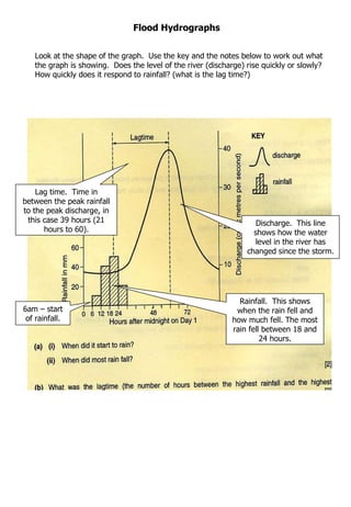
  • 1. Flood Hydrographs Rainfall. This shows when the rain fell and how much fell. The most rain fell between 18 and 24 hours. Discharge. This line shows how the water level in the river has changed since the storm. Lag time. Time in between the peak rainfall to the peak discharge, in this case 39 hours (21 hours to 60). 6am – start of rainfall. Look at the shape of the graph. Use the key and the notes below to work out what the graph is showing. Does the level of the river (discharge) rise quickly or slowly? How quickly does it respond to rainfall? (what is the lag time?)
  • 2. Choropleth Maps Look at the title and key. What is this map about? What is the overall pattern shown on the map? Where do most people live? Where do least people live? (answer in km 2 ). Core: area of dense population (this line did not appear on the exam paper). Periphery: area of lower population density. You need to locate the area that is circled below. Name specific countries as examples.
  • 3. Divided Bar Graphs Look at the title and key. Each bar graph adds up to 100%. Use a ruler to accurately measure percentages, e.g the percentage of secondary industry in New Zealand is 22% and not 35% - make sure you understand this! USA Switzerland/Japan USA
  • 4. Climate Graphs Climate graphs show average rainfall and temperature for a specific place over a year. They may appear as two separate graphs or as one combined graph. If the graph is combined, the rainfall scale will appear down one side of the graph and the temperature scale will appear down the other – if this is the case, don’t get the two confused! Temperature. Usually shown as a line graph and measured in o c. Rainfall. Usually shown as a bar graph and measured in mm. Months of the year are usually shown on the x axis. ‘ Mean’ is the average for the year. ‘ Describe’ means write exactly what you see. For example: January: temperatures are lower than average for the year at approximately 10 o c. Rainfall is higher than average for the year at approximately 100mm. ‘ Suggest’ in this case means say why think the climate affects farming. For example: In the summer months of June to September rainfall is low. This would mean that the farmer has to irrigate (water) the crops. Using the examples given, attempt the rest of these questions for yourself.
  • 5.
  • 6. Systems Diagrams Systems diagrams are common in the Economic Systems section as they show how industries operate. Systems typically consist of ‘inputs’ ‘processes’ and ‘outputs’, which are often shown by arrows going into or out of a diagram. These questions are often not difficult if you understand how systems diagrams work. The systems diagram below shows a supermarket. There are only inputs and outputs on this systems diagram. You are expected to know what goes into the supermarket and what comes out of the supermarket. Outputs shown as arrows going away from the diagram. Inputs shown as arrows going towards the diagram. Sometimes the correct words are provided for you. Have a go at this one yourself!
  • 7.
  • 8. Photographs Questions using photographs expect you to study the photograph carefully. This village contains houses that are irregularly spaced out and all different sizes. This usually means that the houses are older. The roads leading into and out of the village are small and winding. This suggests that the village has very little ‘through traffic’ This village contains houses that are evenly spaced out and all the same size. Often newer houses are built like this. The roads leading into and out of the village are larger and straight. This suggests that a lot of traffic passes through the village. You are expected to use your own knowledge of growing settlements to answer this.
  • 9. Satellite Images Satellite images are often used to show weather patterns, such as depressions or hurricanes. They can also be used to show land uses. You need to understand depressions and hurricanes in order to answer these questions. White areas are colder and therefore they usually show the where clouds are. The shape of countries is often shown as a grey line. Dark areas are warmer. They usually show clear skies. This is the Mediterranean. Describe means ‘say what you see’. What shape is the cloud? Where exactly is the cloud? This is asking for an explanation – swirls like this often show depressions. What are depressions?
  • 10. To use the satellite map look at the key carefully.
  • 11. X Y Y Which blue colour would be along the coast? Which blue colour would be amongst the fields?
  • 12. Map work Look at the line of longitude. It curves so follow it to find the most westerly member Look at the line to find the most easterly new member. Check the key The position of most new members is from Eastern Europe, except Norway and Iceland which are in the North and North West. All new members are on the periphery of the current member countries.
  • 13. Look at the shape the rainfall makes. Where does mot rain occur? Where does least rain occur? Use the mm of rainfall in your answer. The heaviest rainfall,1000mm occurs along the Northern and Eastern coasts. The rainfall decreases rapidly as you southwards and inland. The least rainfall is in the centre southern area where less than 200mm falls. The capitals will be where the temperature is coolest at 20 ºC . The centre is desert and very hot so communications are made by boat, also importing goods and trade.
  • 14. Looking at maps First look where the severe drought areas are. (Near the tropics not on the equator .) Are the starved recently areas the same as drought areas? If not what are the similarities and differences? What is the climate like in the areas of drought? How reliable is the rainfall? These areas are semi desert with mostly less than 50mm of rain each year, recently the rains have not occurred at all. Some say this is because of global warming. Human activity in these areas is mostly farming often with cattle which means the grass is eaten and the trees cut down for firewood. The more people that live here the worse this gets so that there is not enough food to feed the people and too little water, so they starve. The animals destroy the grass by eating it and destroying the roots as they are hungry. Often it is worse around water holes, which encourage more animals and people because of the constant water supply
  • 15.
  • 16. Describe the location of Pattoki in Pakistan. (2) Look at both maps, use the key, scale and other settlements. Look at the compass. Pattoki is in North East Pakistan. Near the North Western border with India. It is on the lowland, below 500m, near the River Indus. How close to the nearest settlement is it? Use the scale. Pattoki. Can you say anything about the height of the land? Is the river important? Understanding maps
  • 17. Understanding Tables Read the question- which hazard has the greatest impact? For each hazard add up the totals for impact. ( or see which one has thee most number ‘3’s) Think which columns refer to impact? Add up the last four columns. (Or the most number ‘3’s)
  • 18. Understanding tables Describe the changes- Note the time interval is every 10 years. Has it gone up a little each year or faster in some? What is the difference between 1960 and 2000? For doctors it gradually increased form 1960 at roughly 20 per 10,000 people, but jumped in 1980 to 1990 by 43 per 10,000. people. What else can you add? Finally the number of doctors has almost doubled. The final question is asking you to look at all the measures. Have they gone up or down? Which ones went up? Which ones went down? Which ones stayed the same? What is new? Are all the measures positive? Why do you think this is? You are expected to write in sentences. Think- money, Employment,education
  • 19. Understanding population pyramids. Very steep angle so many people are dying Straight edges many survive to the next age group. Wide base, many children born Narrow base, few children born but most survive. Triangular shape. Column or bottle shape Few older people, narrow top. Wide top,people live longer. ( c) Look at graph B. Increasing elderly population which needs to be cared for. Less workers as birth rate is declining so less money being made to pay for the pensions of the increasing elderly pop. Less workers to do the work in the future ,older people will have to retire later.