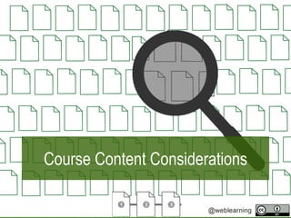
Course Content Considerations
•Descargar como PPTX, PDF•
0 recomendaciones•93 vistas

Subject matter experts usually have loads of course available to them. But before cthis content can be uploaded onto the LMS, a few issues three "course content consideration" issues require attention. This presentation introduces the viewer to copyright, file types and style.

Recomendados
Más contenido relacionado
La actualidad más candente
La actualidad más candente (20)
Similar a Course Content Considerations
Similar a Course Content Considerations (20)
Más de Derek Moore
Más de Derek Moore (20)
Último
Último (20)
Course Content Considerations
- 2. Outline • Curating Content • Common File Types • Creating a Style Guide
- 4. Overview • Copyright & Content • Using Creative Commons Licences • Usage Standards
- 7. OER • Open educational resources (OER) are freely accessible, openly licensed text, media, and other digital assets that are useful for teaching, learning, & assessing as well as for research purposes
- 15. FILE TYPES
- 17. File Types • Types of files • How to provide files to students
- 22. Style Guide The Good, the Bad and the Ugly (or common design standards)
- 23. The GoodThe Good
- 24. Consistent Functionality • Opening Links • Opening Documents
- 25. Familiarity & Consistency • Same Design Elements – Font – Headings – Line Height
- 26. Look & Feel • Is there continuity? – Colour Scheme – Boarders – Images
- 27. Optimization • What about the low bandwidth student – Pictures as .jpg – Audio as .mp3 – Video as .mp4
- 28. Accessibility • Have you considered all students – Visually impaired – Hard of hearing
- 29. The BadThe Bad Six typographic errors.
- 30. It is tempting to try squeeze as much as possible within the margins of the page. When we wanted to save paper, this might have been an understandable practice. You wanted to communicate as much as possible within limited amount of wasted paper. We need to remember that full pages of text are hard work on the eyes and this makes it much more difficult to comprehend. Although you may want to make as much of the space available, you also should avoid “squeezing the margin” and trying to fit in too much. It could be helpful to look at adverts and see how they have made use of white space. White Space
- 31. “A little text and a lot of white space gives a classic and elegant look.” White Space
- 32. – Do you want your text left, centre, or right justified. • Choose one alignment and stick with it! Keep text and graphics away from the edges of the screen. Keep an eye out for vertical alignment (top, middle, or bottom). Choose a font that is larger than 18. Alignment
- 33. Alignment Alignment is very important so that the user can scan and read text easily. Left aligned text is what most people are used to and you don’t want to frustrate readers comprehension
- 34. Bullets • Although • spaghetti • westerns • are • full • of • bullets • your • presentation • should • NOT • fire • too • many • rounds.
- 35. Bullets • Start with a verb or noun • Focus on key words • Reduce sentences to phrases • Remeber 6 6 6
- 36. Fonts • Using too many fonts causes the presentation to look cluttered and sloppy. • Use a maximum of two fonts, preferably a combination of serif and sans serif
- 37. Fonts • Serif fonts have little tails on the letters; • Sans serif fonts do not.
- 38. Case CAPITALS ARE USUALLY USED TO EMPHAISE A POINT. AN AUDIENCE MEMBER WILL USUALLY PAUSE WHEN THEY SEE CAPITAL LETTERS.
- 39. Case Use UPPER and lower case letter for readability
- 40. Over suppply In many presentations there is too much writing. The presenter thinks that it is important that every word gets seen by his/her audience. Or sometimes the presenter used the presentation as a place to dump notes. While it might be tempting to think that your viewer hanging on each of your words, it’s more likely that they have become glazed over (much like you are feeling now) and are suffering from cognitive load and can’t really take all the information in. Sometimes the presenter might even try to reduce the font size to ensure that everything fits in. But this does not work, because the excess of text has already caused him/her to loose an audience and now the audience can’t see what he/she has written.
- 41. Simple presentation & language • Hast thou e’er been irritated whilst a comrade spaketh in o’erbearing tongues that soared right over thine pate
- 42. Simple presentation & language Have you ever been annoyed to hear your friend speak in language that was far too formal for the setting?
- 43. Remember “Less is more” Mies van der Rohe
- 44. The Ugly Six yucky things to do in a presentation
- 45. Colour Choices Poor colour choices can make it extremely difficult to read your slides. In a light room, use a dark background In a dark room, use a white background
- 46. Fuzzy Edges Colour Combinations Vibrate RED BROWN BLUE
- 49. Too many… • Slide transitions
- 50. Too many… • Slide transitions and
- 51. Too many… • Slide transitions and inappropriate sounds
- 52. Silly pointless text effects will not enhance your presentation. Typewriter text
- 53. Summary: Curating Content • Copyright • Creative Commons
- 54. Summary: Common File Types • Images • Multimedia • Written content
- 55. Summary: Good, Bad & Ugly • Style guide – Good Practice – Typography – Visuals
- 56. The End By Derek Moore
Notas del editor
- CC 0 https://pixabay.com/en/needle-in-a-haystack-needle-haystack-1752846/
- State of the Commons, 2017 CC BY
- State of the Commons, 2017 CC BY
- https://www.flickr.com/photos/mwichary/2481681915