How Responsive Website Design Works?
•Descargar como DOCX, PDF•
0 recomendaciones•292 vistas

How Responsive Website Design Works? Original Blog Posted here on: http://westmidlandwebsites.blogspot.in/2015/06/how-responsive-website-design-works.html

Recomendados
Más contenido relacionado
Destacado
Destacado (20)
Similar a How Responsive Website Design Works?
Similar a How Responsive Website Design Works? (20)
Último
Último (20)
How Responsive Website Design Works?
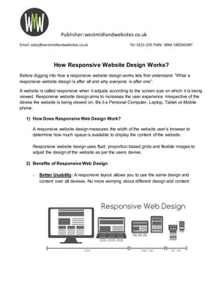
- 1. Publisher:westmidlandwebsites.co.uk Email:satej@westmidlandwebsites.co.uk Tel:0121-270-7549/ 0044 1902541947 How Responsive Website Design Works? Before digging into how a responsive website design works lets first understand “What a responsive website design is after all and why everyone is after one”. A website is called responsive when it adjusts according to the screen size on which it is being viewed. Responsive website design aims to increases the user experience irrespective of the devise the website is being viewed on. Be it a Personal Computer, Laptop, Tablet or Mobile phone. 1) How Does Responsive Web Design Work? A responsive website design measures the width of the website user’s browser to determine how much space is available to display the content of the website. Responsive website design uses fluid, proportion based grids and flexible images to adjust the design of the website as per the users devise. 2) Benefits of Responsive Web Design - Better Usability: A responsive layout allows you to use the same design and content over all devises. No more worrying about different design and content.
- 2. Publisher:westmidlandwebsites.co.uk Email:satej@westmidlandwebsites.co.uk Tel:0121-270-7549/ 0044 1902541947 - Saves Time and Money: - You have to invest in a website only once and maintain only one website, thus saving you money and time. There is no need to make a mobile website or mobile app. One website will work on all devises and browsers. - SEO: Instead of having to build links and traffic to multiple sites, responsive web design lets you concentrate all your SEO efforts on one website
- 3. Publisher:westmidlandwebsites.co.uk Email:satej@westmidlandwebsites.co.uk Tel:0121-270-7549/ 0044 1902541947 3) Why should you choose a responsive website design? 1. Google’s Recommendation: “Google recommends webmasters follow the industry best practice of using responsive web design, namely serving the same HTML for all devises and only using CSS media queries to decide the rendering on each devise “ 2. Lesser Bounce Rate: In responsive web design, the page opens almost instantly, fitting to the screen size of different devises. This makes the user stay on the webpage and browse around easily, thereby reducing the bounce rate and giving a better user experience.
- 4. Publisher:westmidlandwebsites.co.uk Email:satej@westmidlandwebsites.co.uk Tel:0121-270-7549/ 0044 1902541947 3. Easier Maintenance: You are paying for maintenance of only one website which works on different browsers and devises. 4. Guaranteed Return on Investment (ROI): With a responsive design you can target audience using all platform and devises thus increasing your chances of conversions. In short you have a website that “responds” to visitors, thus increasing the opportunity of them responding back to you. Witheverincreasingnumberof smartphone andtabletusersinBirmingham, UKitis necessarytogear upand make your website responsive.We are a website designcompanybasedinBirmingham.We canhelpyou respondbettertoyourcustomersby designinganddevelopingwebsiteswhichare responsive. We helplocal businessesinBirminghamgain more customers by designingandpromoting websitesthat are effective.Call us todayon 012102707549 to have a no obligationdiscussionaboutyourwebsite oremail uson info@westmidlandwebsites.co.uk Original Blog Posted here on:WestMidlandWebsite UK