Creating your own_color_palettes
•Descargar como PPTX, PDF•
4 recomendaciones•631 vistas


Recomendados
Más contenido relacionado
La actualidad más candente
Destacado
Similar a Creating your own_color_palettes
Similar a Creating your own_color_palettes (20)
Más de Attaporn Ninsuwan
Más de Attaporn Ninsuwan (20)
Creating your own_color_palettes
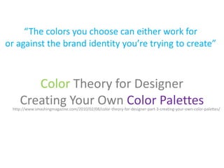
- 1. “The colors you choose can either work for or against the brand identity you’re trying to create” Color Theory for Designer Creating Your Own Color Palettes http://www.smashingmagazine.com/2010/02/08/color-theory-for-designer-part-3-creating-your-own-color-palettes/
- 2. Traditional Color Scheme Types
- 3. Monochromatic color schemes are made up of different tones, shades and tints within a specific hue. These are the simplest color schemes to create, as they’re all taken from the same hue, making it harder to create a jarring Monochromatic or ugly scheme (though both are still possible).
- 5. 1 2 3 4 5 • Here are three examples of monochrome color schemes. For the most part with these schemes, the first color (if we look at this from left to right) would likely be used for headlines. The second color would be used for body text or possibly the background. The third color would likely be used for the background (or body text if color #2 was used as the background). And the last two colors would be used as accents or within graphics.
- 6. Monochrome
- 7. Analogous schemes are created by using three colors that are next to each other on the 12- spoke color wheel. Generally,analogous color schemes all have the same chroma level, but by using tones, shades and tints we can add interest to these schemes and adapt them to our needs for designing websites. Analogous
- 8. Analogus
- 9. Analogus ere’s a color scheme with the same hues as the one above, This is a traditional but with the chroma adjusted analogous color to give more variety. It’s now scheme, and while it’s much more suitable for use in visually appealing, there a website. isn’t enough contrast between the colors for an effective website design. Example of a traditional analogous scheme.
- 10. Analogus
- 11. Dyads or Complementary • Complementary schemes are created by combining colors from opposite sides of the color wheel. In their most basic form, these schemes consist of only two colors, but can easily be expanded using tones, tints, and shades. • A word of warning, though: using colors that are exact opposites with the same chroma and/or value right next to each other can be very jarring visually .This is best avoided (either by leaving white space between them or by adding another, transitional color between them).
- 13. Dyads or Complementary A wide range of tints, shades, and tones makes this a very versatile color scheme. Another complementary color scheme with a wide range of chromas. Don’t forget that beige and brown are really tints and shades of orange.
- 14. Triadic • Triadic schemes are made up of hues equally spaced around the 12-spoke color wheel. This is one of the more diverse color schemes.
- 15. Triadic Alternately, using one very bright hue with paired muted hues makes the single bright hue stand out more Using a very pale or dark version of one color in the triad, along with two shades/tones/tints of the other two colors makes the single color almost work as a neutral within the scheme.
- 16. Triadic
- 17. Double-Complementary (Tetradic) Tetradic color schemes are probably the most difficult schemes to pull off effectively. A rather unimpressive tetradic color scheme. The best way to use a scheme like this is to use one color as the primary color in a design and the others just as accents.
- 18. Double-Complementary (Tetradic) Tetradic color schemes can work well for creating color schemes with similar chromas and values. Just add a neutral It works just as well for (such as dark gray or black) darker color schemes. for text and accents.
- 19. Using Photos for Color Schemes
- 20. Using Photos for Color Schemes Colorful
- 21. Using Photos for Color Schemes Bright
- 22. Using Photos for Color Schemes Dark
- 23. Using Photos for Color Schemes Dark
- 24. 10 Sites With Great Color Schemes • http://wentings.com/ • http://www.trivuong.com/ • http://www.oscarbarber.com/ • http://northeastpeace.com/ • http://www.mbaarc.com/ • http://www.studio13.fr/ • http://www.joyproject.it/en • http://blog.morphix.si/ • http://www.eldesigno.ca/ • http://lemonstandapp.com/
- 35. 10 Super Useful Tools for Choosing the Right Color Palette • http://www.colorotate.org/ • http://kuler.adobe.com/ • http://colorschemedesigner.com/ • http://www.colourlovers.com/ • http://www.colourlovers.com/copaso • http://www.colorblender.com/ • http://aviary.com/tools/toucan • http://www.colormunki.com/ • http://www.colorsontheweb.com/colorwizard.asp • http://colorexplorer.com/