
Recomendados
Más contenido relacionado
Destacado
Destacado (14)
Último
Último (20)
Poster analysis
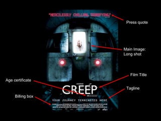
- 1. Tagline Film Title Main Image: Long shot Press quote Billing box Age certificate
- 2. This film poster’s targets a large London audience. It is hard to pin the target audience as it is an unconventional horror. From the film poster alone, it is aimed to target Londoners, people aged between 18-35. The reason that there is a large age scale is because horror targets new fans and old fans that are familiar with early horror and B-movies. The London train carriage in the film poster is heavily photo- manipulated in to create a ominous sense of looming danger while also making the underground a dingy and dank place.
- 3. The poster sticks to the rule of thirds. Although the image is centered the lines and content sticks to the rule of thirds and enhances the eye flow The eye flow is in a C shape which is guided by the harsh horizontal and vertical lines. The curved topped roof guides the eye across from the press quote down to the image and around to the film title. The text correlates to the train tracks in the image. This adds a sense of proportion and emphasizes the distance and isolation that is a motif in the film.
- 4. The hand grabbing the window with a trail of blood gives the target audience a sense of the narrative and content of the film. The white background, although clinical, is paradoxical against the gritty and dim surrounding. This gives a greater sense of isolation when juxtaposed against the tracks. The red light of the train connotes signals of caution. Moreover, the red light comes on when the train is halting – the motif of danger is connoted through the colour red being the only predominant colour.