SlideShare una empresa de Scribd logo
1 de 20
Descargar para leer sin conexión
The MobileWeb
with
By Kent Lester & KendallTotten
Presented by
What’s Inside
Introduction..............................................2
Mobile Apps and the Smartphone OSWars;Expanding
Marketing and Advertising Opportunities;Tablets are the
New Laptops;Mobile Markets and Applications
Native Smartphone Applications................6
Meet the Mobile Rosetta Stones
TheWeb is the Universal Standard..............8
Drupal is a Strong Player in the Mobile Field;Third-party
Gateways;Native Applications +Web Services
ResponsiveWeb Design............................10
How ResponsiveWeb DesignWorks
Omega + Drupal = Mobile Ready..............12
Page Design with Context & Delta;Other Responsive
Themes
Summary................................................18
About the Authors;About Mediacurrent
Appendix-Resources................................19
Sites;Books;Videos
Glossary..................................................20
2
Phone:	678.580.1690
Toll Free:	 1.866.507.0005
Fax:	770.360.5776
5755 North Point Parkway, Suite 60, Alpharetta, Georgia 30022
mediacurrent.com
Contents Copyright 2012, Mediacurrent. All Rights Reserved
Introduction
Introduction
We live in a new digital world where only the nimble survive. Organizations are racing to rebuild
their business strategies around the new “Social Web.” Those who can keep up with the Facebooks,
Twitters, and Googles of the world stand to benefit from a more motivated and involved consumer base.
Organizations who move too slowly risk rapid extinction.
Now, the explosion in Smartphones and Tablets threatens to remake the Webosphere yet again. As
content goes mobile, young consumers rely more and more on their smartphones, rather than their
desktops and laptops, for news, information, and shopping. The “social web” is now the “mobile web” and
things will never be the same.
According to Neilson’s third quarter 2011 Mobile Media Report, over 44 percent of all US mobile phone
subscribers now own a smartphone. That’s up from 18 percent, just two years ago. When you look at
the prime purchasers, aged 25-34, the number is even larger. Over 62 percent of this age group relies on
smartphones for their Web content. Among 8-24 and 35-44 years old, smartphone penetration hovers
near 54 percent. There are many practical reasons for the move to the “mobile web.”
•	 Young people are always on the go, always connected to the Web. It makes practical sense to consume
that content on a device that can be carried in a pocket or jacket.
•	 For marketers, smartphones put purchasing power nearest the point of consumption. It makes sense
to access purchasing and price data while perusing the shelves of a local store. The nearest restaurant
or pub is just a click away.
•	 Location-aware applications add additional value to “point of sale” marketing, often automating the
retrieval of information at the precise time and place that it is needed.
•	 Smartphones are convenient, less than an arm’s length away, allowing busy consumers to fill non-
productive moments with value added activity.
3
Phone:	678.580.1690
Toll Free:	 1.866.507.0005
Fax:	770.360.5776
5755 North Point Parkway, Suite 60, Alpharetta, Georgia 30022
mediacurrent.com
Contents Copyright 2012, Mediacurrent. All Rights Reserved
Introduction
After younger adults, boomers, aged 55-64, make up the second fastest-growing smartphone
demographic. Older consumers who might never think of keeping a laptop with them can use
Smartphones to access, maps, email, and deal-of-the-day websites like Groupon or Living Social.
According to Forrester research, mobile commerce will reach $31 billion in 2016. Can your organization
afford to ignore a market of that size? Now is the time to leverage content for the mobile economy.
Mobile Apps and the Smartphone OSWars
Rather than consolidating, smartphone operating systems have diverged. The most popular phone in
the country during the third quarter of 2009 was a feature phone—the Motorola RAZR—while Apple’s
iPhone 4 wore the crown last quarter, further emphasizing the ongoing shift in the wireless market
toward smartphones.
While the iPhone is the most popular smartphone, the Android operating system remains the most
popular interface found on mobile devices. There are hundreds of different devices running several
different versions of the Android OS. Then there are Windows 7, Blackberry, Symbion, and Palm
smartphones. What does all this diversity mean? That the creation of dedicated phone apps for such a
diverse market remains a huge nightmare. The two largest OS shares, Android & iPhone, use completely
different development environments and programming languages, forcing developers to duplicate efforts
when building dedicated applications. To build a viable Mobile strategy, organizations will need to
consider the costs of development and maintenance.
4
Phone:	678.580.1690
Toll Free:	 1.866.507.0005
Fax:	770.360.5776
5755 North Point Parkway, Suite 60, Alpharetta, Georgia 30022
mediacurrent.com
Contents Copyright 2012, Mediacurrent. All Rights Reserved
Introduction
Expanding Marketing and Advertising Opportunities
Despite the challenges, the marketing opportunities in the Mobile Web are too promising to ignore.
With easy and persistent access to information, smartphones offer corporations, non-profits, advertisers,
and marketers new opportunities to share their message with consumers. The enormous potential of
this opportunity has certainly not been lost on the two major manufacturers of smartphone operating
systems.
Google recently acquired the mobile advertising company AdMob for $750 Million. As one of the first
mobile ad servers, AdMob is popular on the iPhone, giving Google direct access to reams of usage
data for the iPhone. Apple promptly retaliated by acquiring Quattro Wireless for $275 Million. As an
advertising competitor to AdMob, Quattro Wireless gives Apple its first foray into Mobile advertising and
a beachhead against Google’s advertising plans.
Tablets are the New Laptops
While smartphone growth has been spirited, the recent growth in tablets and e-books has simply
been astounding. The recent launch of the Kindle Fire and Barnes and Nobles’ latest Nook tablet created
some serious competition for Apple’s iPad and triggered a meteoric rise in tablet ownership.
The share of adults in the United States owning either a tablet or an e-book jumped from 18% in
December to 29% in January. That’s almost a doubling of product penetration in one month, an
unprecedented growth rate. With such profound growth in such a short period, organizations have no
choice but to move into the mobile arena ASAP.
5
Phone:	678.580.1690
Toll Free:	 1.866.507.0005
Fax:	770.360.5776
5755 North Point Parkway, Suite 60, Alpharetta, Georgia 30022
mediacurrent.com
Contents Copyright 2012, Mediacurrent. All Rights Reserved
Introduction
And NowWe Have“Phablets”on theWay
Samsung recently introduced the Galaxy Note, a smartphone with a
sprawling 5.3-inch HD Super AMOLED 1,280-by-800 (285ppi) WXGA display.
Combining the functionality of a full voice phone with a tablet form factor,
Samsung is betting that future mobile users will want a single device to handle all
their mobile needs.
Mobile Markets and Applications
The light & small form factor of mobile devices, combined with accessibility
and location information offer opportunities for new markets and applications.
Companies like Groupon, Facebook, Twitter, Foursquare, and game developer
Zynga have already made fortunes in the four-year-old mobile arena. But these
examples may be the tip of the iceberg. Developers are finding new ways to
leverage the “crowd” in mobile applications. For instance, local city governments
have found mobile devices to be the perfect tool in increase voter awareness and
participation. CitySourced, a mobile development company, offers government
apps that allow citizens to report potholes, crime, vandalism, and graffiti in real
time. Citizen reports are often accompanied by a photograph which not only speeds response, but
provides evidence for criminal proceedings.
So How doYouTap into this Huge Potential?
Fortunately, there are several ways to bring a mobile solution to market. These are the four main paths:
•	 Native smartphone applications
•	 Third-party gateways such as Mobify
•	 The integration of existing Internet websites with smartphones via web services
•	 Responsive Websites that adapt automatically to the screen size of the display device
City Sourced smartphone reports can update a central map in real time, allowing government officials to respond quickly.
Samsung’s new Galaxy Note
offers a form factor between a
smartphone and tablet.
6
Phone:	678.580.1690
Toll Free:	 1.866.507.0005
Fax:	770.360.5776
5755 North Point Parkway, Suite 60, Alpharetta, Georgia 30022
mediacurrent.com
Contents Copyright 2012, Mediacurrent. All Rights Reserved
Native
Smartphone
Applications
Native Smartphone Applications
Native smartphone applications written specifically for the mobile device’s operating system
provide the best combination of performance and revenue potential, if they provide users with a unique
experience or tap into the smartphone’s native functions. Simply copying the functionality of a central
website can be a waste of time and resources.
“Apps” as they are commonly called, can produce a significant revenue stream if they succeed in
providing popular benefits or services. Since Apple introduced the “App Store,” over 425,000 third-party
apps have been developed. Most of these sold for a nominal fee ($1-$5) with Apple pocketing 30% of
the take and the developer receiving the rest. Other phone manufacturers soon followed with their own
app stores, using similar business models. As of Jan. 2012, the “Android Market” has over 400,000 apps,
putting it on par with the App Store.
A native application’s main advantage comes from its direct access to the phone’s API. It opens the
application up to all of the smartphone’s capabilities, such as the GPS location system, camera, text, and
voice features. But each phone platform is different. Native app development is complex and demanding,
as it requires a mastery of several different programming and development environments.
Apple’s IOS system uses Objective C as its base language. You’ll need an Apple computer to develop your
application, using the iPhone SDK & simulator, and a development environment such as XCode. There
is an initial fee of $99 to register as an iPhone developer and any apps developed are contingent on an
approval process by Apple. In the past, approvals could drag on for weeks or months, but recently, Apple
has succeeded in shortening this process to two weeks in most cases.
Android’s development process is a bit more flexible, perhaps because of its device agnostic roots
and late entry into the field, but the development platform is very different, and some say, difficult to
use. Android’s OS is based on Java, so you will need a Java Development Kit, the Android Software
Development Kit, a good Java development environment such as Eclipse, and the Android platform.
Since there are several versions of Android being used on many different smartphone devices, care must
be taken to accommodate all the different feature sets, capabilities, and screen sizes.
The Blackberry OS is different still, based on Blackberry’s own unique Java Development Environment. If
you prefer to develop at a higher level of abstraction, you can choose to use Rim’s “Mobile Data System.”
The Blackberry MDS is a flexible framework for application development that provides quick access to
Blackberry connection services.
Advantages
•	 High performance
•	 Access to built-in smartphone capabilities like
GPS & cameras
•	 Revenue potential through app sales
Disadvantages
•	 Must code in, and support multiple development
platforms
•	 Limited data storage
•	 Approval required for some app markets
Once you have these multiple development environments in place, you’ll need to plan for different
feature sets and capabilities between the various platforms. Programmers proficient in several languages
will need to be hired and their development coordinated. You’ll also have to consider software updates
and maintenance. If this is starting to sound like a “Tower of Babel” scenario, you’re right!
What the mobile market needs is a Rosetta Stone . . .
7
Phone:	678.580.1690
Toll Free:	 1.866.507.0005
Fax:	770.360.5776
5755 North Point Parkway, Suite 60, Alpharetta, Georgia 30022
mediacurrent.com
Contents Copyright 2012, Mediacurrent. All Rights Reserved
Native
Smartphone
Applications
Meet the Mobile Rosetta Stones
In an attempt to “disentangle” the development process, several organizations have introduced
unified development platforms. These platforms attempt to provide a single, common environment for
development. After the application design is complete, these platforms then attempt to create device
specific code for each different smartphone OS. However, the two platforms described below use very
different methods to achieve this “device agnostic” functionality.
AppceleratorTitanium
Appcelerator’s Titanium is an open source, cross-platform environment based on Javascript. Using
a set of API’s to emulate smartphone functionality, Titanium compiles the central Javascript application
into native code for the Android, Desktop, iOS, and iPad operating systems. Appcelerator has recently
added support for the Blackberry, but it is still in beta. Since it is based on Javascript, the Titanium
platform leverages the expertise of existing web developers. Appcelerator simplifies programming and
support by focusing on a single codebase.
Because the final application is compiled into native code for each device, its performance is generally
very good. Developers report that although working with Titanium gives fast results—making Titanium
well suited for prototyping—there are issues around the differences in API’s. Stability, features, and
memory management can be a problem. Appcelerator has had some reported memory leak issues,
although workarounds have been developed. As a result of these limitations, developers often end up re-
writing their apps in native code before final release, thereby negating many of Titanium’s advantages.
Phonegap
Phonegap is a hybrid mobile development platform. Developers can work with familiar languages
like Javascript, HTML5, and CSS3. The rendering of the page is done through the Webkit, using HTML5.
HTML5 plugins provide most of the familiar smartphone graphical elements like buttons and forms. The
resulting applications are part HTML5 and part native code.
Because of this hybrid approach, applications developed in PhoneGap may have limited access to a
specific device’s API. That may restrict the use of cameras and GPS, for instance. Performance issues
Appcelerator provides a single development environment to build applications for multiple operating systems.
8
Phone:	678.580.1690
Toll Free:	 1.866.507.0005
Fax:	770.360.5776
5755 North Point Parkway, Suite 60, Alpharetta, Georgia 30022
mediacurrent.com
Contents Copyright 2012, Mediacurrent. All Rights Reserved
The
Web
is
the
Universal
Standard
have also been reported, requiring developers to invest a lot of time in optimization. Phonegap does have
broad support for mobile devices however: iOS, Android, Windows Phone 7, Symbion, Bada, Blackberry,
and WebOS.
Phonegap was recently acquired by Adobe, so you can expect feature enhancements and integration with
existing Adobe products, like Dreamweaver. This may make Phonegap a good solution in the future.
Summary
Alas, nothing in life is free. While universal development environments help to address issues
surrounding mobile app development, they often result in performance degradation and limited
functionality. Every phone platform has distinct features, advantages, and disadvantages, and getting
one application to behave identically on all phones and operating systems is probably an unrealistic
expectation.
If only there were a universal Web standard . . .
TheWeb is the Universal Standard
There is one universal interface that all mobile devices have in common: the Web Browser. For this
reason, applications that depend on the Web can usually run without modification on any mobile device.
The standards forced by HTML and the Web makes all mobile devices perform the same, just as they do
with desktops and laptops.
If your organization already has a mature Web presence, you can leverage that investment for mobile
devices, often far more quickly and easily than through native applications. However, building an
effective mobile website is not without its own challenges.
Drupal is a Strong Player in the Mobile Field
Drupal’s content management system has been a powerful social media player for several years. As
a leading Content Management System, it is perfectly positioned to provide access to mobile phones
and tablets. In fact, the future of mobile technology is so critical that the Drupal 8 initiative is centered
around a “mobile first” architecture. There will be a code freeze for Drupal 8 in December, 2012 with final
release at least two years away or more. In the meantime, there is a tremendous amount of functionality
available for users and developers of Drupal 7. Support for web services and responsive web design have
been embraced by the Drupal community.
Think of Drupal as a key “hub & spoke” strategy for mobile devices. Initially, organizations tend to
reach their customers through a main website. Once an audience is mature, it is natural to branch out to
mobile devices. In this way, smartphones and tablets function as peripherals to a central database core. It
combines the best features of centralized data and distributed access.
This is, in fact, how the leaders in social networking have evolved. Facebook, Google, and Youtube built
a strong presence on the Web first. Then, mobile devices became the peripheral of choice for accessing
legacy data. This “mobile device as peripheral” paradigm best leverages the limited performance of
phones and tablets, while keeping the “processing intensive” activities firmly placed on enterprise servers.
This contrasts significantly with native applications, which are typically self contained and limited in
scope. Updating a central website is far easier than pushing out a new software edition of a phone app.
9
Phone:	678.580.1690
Toll Free:	 1.866.507.0005
Fax:	770.360.5776
5755 North Point Parkway, Suite 60, Alpharetta, Georgia 30022
mediacurrent.com
Contents Copyright 2012, Mediacurrent. All Rights Reserved
The
Web
is
the
Universal
Standard
There are three basic ways to access a Drupal website through mobile devices:
•	 Third-party gateways
•	 Native apps using web services to retrieve data
•	 Basic web browsing using responsive web design
Third-party Gateways
Third-party gateways simplify the process of building mobile friendly websites by acting as an
intermediary between existing sites and the mobile browser interface.
Mobify
Mobify is a gateway that integrates with existing websites. If you want mobile capability without
having to completely redesign your website, then Mobify provides a rather unique way to accomplish that
goal. To “mobify” a site, you use an online utility to highlight website content that should be displayed
in mobile devices. Once content is selected, some CSS theming will be required to finish out the design.
Once the key elements have been selected, a javascript routine on the website detects and reroutes mobile
traffic to Mobify’s servers. The site’s existing URL is preserved and Mobify optimizes mobile delivery.
Mobify is not a plug & play solution: a considerable amount of theming and templating may be necessary,
but it is faster than re-theming an existing site, saving perhaps 50-70% of the time necessary for a
complete redesign. While Mobify has a free version, high traffic sites can cost anywhere from $295
per month to thousands for an enterprise site. Is it worth the money? If your organization has a large
investment in an existing site, and mobile functionality is needed in record time, then the answer is
“perhaps.” Visit mobify.com for more information.
If you have the time and ability for a redesign, Drupal offers another exciting option . . .
Native Applications +Web Services
We talked earlier about the advantages and challenges of native applications. Appcelerator and
Phonegap can simplify that. But what if you want to access your existing website directly on the mobile
device? One way to accomplish this is to use a native application to contact your Drupal website through
web services. In this way, native apps can be much simpler, off-loading much of the data processing to
your Drupal website. Because data is stored in the cloud, data updates can be as simple as updating the
Drupal database, without the need to re-deploy a new version of your native application.
The Drupal Services module allows native applications to make Service callbacks with multiple interfaces
like REST, XMLRPC, JSON, JSON-RPC, SOAP, AMF, etc. The native application provides interface
functionality through the native API, but the data can come from the Drupal website. This allows users to
access and update content from any device, whether desktop or mobile.
The Phonegap contrib module provides a launching point for a services-based Drupal site. It consists
of two parts: the Phonegap source code, which can be compiled for Android or iOS, and the Phonegap
module, which is added to the Drupal site to make the final connection. Phonegap exposes Drupal
content and users through edit screens on a mobile device. The Services module is also required.
Jeff Linwood of modulesunraveled.com is currently working on a Phonegap plugin to automate much of
the process of developing a Drupal Based Phonegap application.
10
Phone:	678.580.1690
Toll Free:	 1.866.507.0005
Fax:	770.360.5776
5755 North Point Parkway, Suite 60, Alpharetta, Georgia 30022
mediacurrent.com
Contents Copyright 2012, Mediacurrent. All Rights Reserved
Responsive
Web
Design
ResponsiveWeb Design
So why are native applications needed for viewing websites? Don’t all mobile devices have web
browsers? The answer becomes obvious after browsing a few websites that have not been optimized for
the mobile web. The screen real estate of mobile devices make reading a full website virtually impossible
without a ton of “finger zooming.” A recent Google study found that 61% of mobile visitors are unlikely
to return to a website that has non-mobile theme.
Over the past few years many web developers have created completely
different mobile themes for their website, using javascript to redirect
users to this dedicated theme. This is the strategy used by Mobify. But
keeping up with two sites, or two themes adds additional maintenance
headaches and formatting issues. This problem only gets worse as
tablets enter the mobile arena. Websites need to adjust to many
different screen sizes.
What if you could create one theme that could detect the device
viewing and “respond” by redrawing the site in a format optimized
for that device? This is the exciting promise of Responsive Web
Design. The idea is to respond­
—not to the specific requirements of
the thousands of tablets, desktops, laptops, and mobile phones on the
market—but to deliver elegant visual experiences regardless of the size
of the user’s display and the limitations or capabilities of the device.
A lot of exciting work has been done recently with responsive Drupal
themes that achieve this goal. Adaptive Theme, Arctica, and Omega
are three responsive Drupal themes that vastly simplify the task of
formatting your Drupal website to match the requirements of mobile
devices. These themes have an added bonus: they depend heavily on
HTML5 and CSS3, cutting edge technologies that enhance theming,
improve search engine optimization, and “future-proof” your site.
On an iPhone, the standard Wall Street Journal
website is practically impossible to read.
Viewing a Drupal article Edit a Drupal article directly on
the mobile device
Setup how the content is viewed on
the mobile device
Post an article to a Drupal website
using a smartphone
The Drupal PhoneGap module allows full integration between a PhoneGap application and an existing Drupal website. With it, users can create and modify
Drupal content directly on a mobile device.
11
Phone:	678.580.1690
Toll Free:	 1.866.507.0005
Fax:	770.360.5776
5755 North Point Parkway, Suite 60, Alpharetta, Georgia 30022
mediacurrent.com
Contents Copyright 2012, Mediacurrent. All Rights Reserved
Responsive
Web
Design
How ResponsiveWeb DesignWorks
Responsive themes make use of “media queries” in CSS, that link a specific stylesheet for different
screen sizes. The media query works in real time, so if a viewer rotates a tablet, the media query will
update the style sheet dynamically. Media queries are a great improvement over the older methods of
using javascript to determine screen size. Most modern browsers, including virtually all smartphones and
tablets, support CSS media queries, which solves the issue of compatibility. On legacy browsers, such as
Internet Explorer 7, a “default” style sheet is loaded, which will format to a classic desktop format.
Responsive themes should be a “mobile first” design. In other words, the mobile stylesheet is the “default.”
Mobile designs can be built for maximum effectiveness for smartphones and will display properly on
legacy phones that might lack full media query compatibility. A good responsive theme will load lower
bandwidth items first and add graphics heavy elements only when media queries detect a larger screen
display. Because of the CSS “cascade” the “last in” stylesheets will overrule the default “mobile only”
design. This approach provides the best possible performance for low bandwidth devices.
Advantages
•	 One codebase for the website
•	 No need for custom apps
•	 Data from Internet & mobile visitors are
combined
•	 Quick transition of legacy websites
Disadvantages
•	 Possibly higher bandwidth requirements than
native applications
•	 Need to find balance between bandwidth heavy
Internet and bandwidth light mobile data
network
•	 Retrofitting can be a challenge
A responsive web design automatically reformats the page layout to accommodate the size & orientation of the display device.
12
Phone:	678.580.1690
Toll Free:	 1.866.507.0005
Fax:	770.360.5776
5755 North Point Parkway, Suite 60, Alpharetta, Georgia 30022
mediacurrent.com
Contents Copyright 2012, Mediacurrent. All Rights Reserved
Omega
+
Drupal
=
Mobile
Ready
Omega + Drupal = Mobile Ready
One of the most powerful and popular responsive themes for Drupal has to be the Omega base theme.
It’s fully HTML5 compatible, uses some elements of CSS3, is based on the 960 grid, and provides many
layout tools directly in the Drupal interface. When used properly, the web designer can accomplish
almost all theming without writing a single line of PHP or messing with templates. Since Omega is a
“base theme,” the designer can setup a sub-theme to customize the design, while letting the Omega base
theme do all the responsive “heavy lifting.”
In addition, you can take advantage of two modules that work beautifully with Omega; Delta & Omega
Tools. The Omega Tools module automates many theming tasks, such as importing/exporting theme
settings, setting up a sub-theme, and setting theme defaults. The Delta module, when used in conjunction
with the Context and Features modules, can achieve sophisticated page layouts that change dynamically
based on virtually any need. Let’s take a closer look at how this responsive theme works.
OmegaTools
The Omega Tools module provides a set of helper functions for
working with, and creating Omega sub-themes. These tools can
simplify and speed up the theme development process.
•	 Export Theme Settings. Allows you to export the theme settings
stored in the database to a file. You can then overwrite the
corresponding section in your theme’s .info file with the exported
values. Reverting the theme settings will load the default values.
•	 Revert Theme Settings. This button loads the default theme
settings from the theme’s .info file. This destroys the database copy
of modified settings, and reverts to the original values.
•	 Drush Integration. You can easily create your Omega sub-themes
with Drush, a command line shell and scripting interface for
Drupal.
•	 Subtheme Wizard. In addition to Drush integration there is also
a Wizard that will guide you through the creation of a new Omega
subtheme based on the HTML5 or XHTML starterkits.
Customizing the Omega Layout
The Omega theme’s page layout can be customized directly from the theme’s settings page without the
need for coding. Omega uses the default 960 grid system by default. You can however, switch to a totally
fluid theme or even create a custom grid, if needed. Media query settings can also be tweaked from this
interface. The Omega Theme for Drupal 7 supports the following default CSS media queries which will
load specific stylesheets when needed for the appropriate device:
•	 small. (default)–0px to 740px wide
•	 narrow. 741px to 979px wide
•	 normal. 980px to 1219px wide
•	 wide. 1220px and wider
Drupal MobileThemes
•	Omega**
•	ST Conch
•	ST Alphorn
•	AdaptiveTheme**
•	AdaptiveTheme Mobile
•	Pixture Reloaded
•	Sky
•	Corolla
•	AT Commerce
•	Fusion**
•	Arctica**
•	TouchPro
•	Arti
		 ** Base Theme
13
Phone:	678.580.1690
Toll Free:	 1.866.507.0005
Fax:	770.360.5776
5755 North Point Parkway, Suite 60, Alpharetta, Georgia 30022
mediacurrent.com
Contents Copyright 2012, Mediacurrent. All Rights Reserved
Omega
+
Drupal
=
Mobile
Ready
Omega Page Structure
Due to the modular nature of Omega and the 960 grid it depends on, some new layout terminology
is needed. When Omega alters the layout to accommodate different devices, it must decide the order in
which to display page elements. Sections and Zones help to manage this stacking order at varying widths.
Sections are main page elements that serve as containers for Zones. Zones provide containers for
Regions. (This is the standard Drupal region.) These regions will be stacked in a vertical format for
the default mobile-first layout. Regions in turn, contain the Drupal Blocks, that are also displayed in a
vertical stack. When the media query detects a wider format, the regions can be forced into a left-to-right
configuration to approximate a standard desktop web layout.
Omega automatically resizes the width of the region blocks to best accommodate the width of the display
device. Custom CSS can be applied in style sheets for each media query, but even without custom CSS,
the Omega base theme can successfully provide an elastic layout that works on most mobile devices.
Zone and Region Configuration
If additional regions are needed, start by defining them in the theme’s info file. This is found in your
Drupal installation, sites/all/themes/theme_name folder. Then, on your Drupal site, go to the theme
settings page, and click on the “Zone and Region Configuration” tab. The bottom of the page shows any
un-assigned regions, including your new custom region. You can then position it in whichever zone you
need, without any custom coding. The 960 grid will take care of all region widths and positioning.
When you choose a region, you can specify the zone you’d like to place it in. If choosing a zone, you can
specify the section to place it in. You can use a 12 or 16 column format for each zone, and the regions you
Sections and zones are specific to the Omega theme and act as containers for the standard layout regions.
14
Phone:	678.580.1690
Toll Free:	 1.866.507.0005
Fax:	770.360.5776
5755 North Point Parkway, Suite 60, Alpharetta, Georgia 30022
mediacurrent.com
Contents Copyright 2012, Mediacurrent. All Rights Reserved
Omega
+
Drupal
=
Mobile
Ready
place in these zones should have a total width that matches the zone’s number of columns. For instance,
with a 12 column zone, you could have a first sidebar of 3 columns, a content section of 6 columns, and a
second sidebar of 3 columns. If more spacing between columns is desired, you can specify prefix and/or
suffix areas that function as extra spacing.
You can also choose weight and column count in
this interface. In this example, the footer regions are
all 4 columns wide, so they will fit side-by -side in
the normal or wide layout.
By default the region with the heaviest weight
within its respective zone will drop below the other
regions, when displayed in the stacked mobile
layout. Block order operates in the same way. Don’t
forget to test out your site on different screen sizes
to see how it reacts, and then add CSS to adjust
accordingly.
Debug Settings
In the debugging menu, you can turn off the handy grid overlay that floats on the page, as well as the
“resize me” image. Or you can simply disable the grid overlay and debug blocks from being shown by
Zones contain Drupal regions, which will hold Drupal blocks. An optional full width zone wrapper is available for theming.
NOTE: Make sure to use “region-content-inner” classes to set any additional padding or margins to your content. Setting
margins or padding on the region div will break the 960 grid settings since they alter the region’s width values.
15
Phone:	678.580.1690
Toll Free:	 1.866.507.0005
Fax:	770.360.5776
5755 North Point Parkway, Suite 60, Alpharetta, Georgia 30022
mediacurrent.com
Contents Copyright 2012, Mediacurrent. All Rights Reserved
Omega
+
Drupal
=
Mobile
Ready
default when the page is loaded, but they are only a click away on the right side of the screen should you
need them.
Toggle Libraries
There are several handy code libraries used by Omega that be turned off when not needed, all from
the user interface:
Formalize–This library helps you make consistent form styles across all browsers.
Media Queries–The magic sauce behind the Omega Theme.
Equal Heights–Enable this if you’d like blocks within the same region to automatically become the
same height. This is a great solution for footers. You can also force the child elements of a zone or
region to be equal heights.
Toggle Styles
If the default style sheets of the base theme get in your way, simply disable them from the interface.
Stylesheets from contributed modules can also be conveniently disabled from this interface.
Toggle Advanced Elements
Turn off unwanted elements like breadcrumbs, feed icons, or tabs. Or, quickly hide page titles, the site
name or slogan (but keep them available for screen readers). It’s simpler than embedding “display:none”
to your custom stylesheets.
ExportTheme Settings
After all custom settings are complete, it’s nice to know that you can export a file that can then be
added back to the theme’s .info file. If your theme is then reused elsewhere, your custom settings will
automatically become the default.
What About Internet Explorer?
Just how well does IE interact with Omega? As you might expect,
IE7 and IE8 do not interpret media queries properly, meaning that
if you scale your browser window, it will still render the normal
layout as if it were any other theme. It’s an elegant degradation, that
maintains compatibility with old technology.
Page Design with Context & Delta
The Omega theme has one more trick up its sleeve: the Delta
module. The Delta module allows you to build custom page layouts
for different parts of your site. It essentially clones the theme settings
page, so that you can design multiple configurations / layouts for
your site. While designed specifically for the Omega theme, Delta
will also work with other themes. These “Deltas” can completely
reconfigure sidebars, footers, and content areas for different sections
of a site.
Drupal Mobile Modules
•	 Mobile Tools
•	 SMS Framework
•	 Phonegap
•	 Respond.js
•	 Modernizr
•	 Fit Text
•	 Adaptive Image Styles
•	 Adaptive Image
•	 Client Side Adaptive
Image
•	 Services
16
Phone:	678.580.1690
Toll Free:	 1.866.507.0005
Fax:	770.360.5776
5755 North Point Parkway, Suite 60, Alpharetta, Georgia 30022
mediacurrent.com
Contents Copyright 2012, Mediacurrent. All Rights Reserved
Omega
+
Drupal
=
Mobile
Ready
Once these custom configurations have been defined, you can trigger them through the Context module.
The Context module can trigger certain “reactions” based on defined “conditions.” For example, you can
specify a “condition” that all URL paths beginning with /news* or /events* should trigger a “reaction” to
use “Delta Template XYZ,” instead of the core theme settings. You can also use Context to hide or show
blocks, add body classes, add section titles and more, based on conditions like URL paths, content types,
user roles, or taxonomy terms.
When a specific Delta has been triggered, the default layout of the original settings page will be
“overruled” by the Delta configuration. The combination of custom “Deltas” and “Contexts” can create
elegant website intelligence. For instance, a one column page layout could be triggered when webforms
are displayed, or a special layout can be triggered for the front page of the site. These are tasks that were
previously done with the Panels module, or by custom programing the logic into PHP templates. The
Omega Delta module provides all that power straight from the Drupal interface.
On the Context edit page, a specific Delta configuration can be chosen as a reaction to some Context trigger.
Delta allows completely different theme layouts based on Context. Here, the front page has three columns & a slideshow, while the blog page has one column.
17
Phone:	678.580.1690
Toll Free:	 1.866.507.0005
Fax:	770.360.5776
5755 North Point Parkway, Suite 60, Alpharetta, Georgia 30022
mediacurrent.com
Contents Copyright 2012, Mediacurrent. All Rights Reserved
Omega
+
Drupal
=
Mobile
Ready
Setting up Delta
Install the Delta and Context modules. After installation you’ll notice a new “Delta” tab on the
theme settings page. Create a new Omega “template” and then click on the configuration link to build
the custom layout in much the same way you configured the default Omega settings page. Once the
Delta template is complete, go to the Context page and define a trigger for whatever special condition
you desire. Under the “reactions” section of the context edit page, you’ll find a list of all custom Delta
templates that you have previously defined. Choose the desired Delta template and save. Now, whenever
that Context is triggered on your site, that Delta’s layout will be used instead of the default Omega theme
settings.
Useful Delta Settings
Additional zone classes: Enter CSS classes to be added to a particular zone. This can change the
appearance of that zone without having to add any logic to the original PHP template.
Additional wrapper classes: Enter any CSS classes to be added to a particular zone wrapper for theming.
This will only be used if the option to provide a full width wrapper around the zone is enabled.
With these two options, you can build special theming into certain pages and optionally make them look
completely different from the default theme.
MobileTools + Context
The Mobile Tools Module can add sophisticated device detection to your Omega theme beyond the
simple display size used by media queries. With Delta + Context, we can rearrange elements to fit mobile
devices, but what if some elements are not ideal for mobile, like drop-down menus? We might want to
display a different, mobile-friendly menu instead.
Mobile Tools adds device detection to the Context Module, providing a new contextual rule with “mobile
devices” as a condition. When Mobile Tools detects a mobile device, a Delta template can be enabled or
specific regions can be enabled or disabled.
One thing to be aware of is caching issues. If you switch themes based on device type, there is a chance
that caching will bypass the device detection for the next user and pull the incorrect theme from the
cache. This can be solved by reading the documentation in the mobile_tools_cache.inc file and adjusting
your settings.php file accordingly. Relying on user agent detection on the server could be an issue for
some. Currently, there’s a lot of debate about the accuracy of user agent detection.
ThemingWorkflow with Features
So, you’ve built a complex layout with Omega, Context, Delta, and Mobile Tools on your sandbox site.
Now what? How can you easily transfer these custom settings to a production website? This is one reason
why web designers have avoided database heavy themes in the past. It was too difficult to transfer the
database settings to production.
Not any more. Omega comes to the rescue with support for the Features Module. This module allows
you to package up the Delta and Context configurations into code-based modules that can easily be
transferred or maintained with version control systems. With this last innovation, the Omega Theme
promises to become one of the most powerful and flexible theming solutions available for Drupal.
18
Phone:	678.580.1690
Toll Free:	 1.866.507.0005
Fax:	770.360.5776
5755 North Point Parkway, Suite 60, Alpharetta, Georgia 30022
mediacurrent.com
Contents Copyright 2012, Mediacurrent. All Rights Reserved
Summary
Other ResponsiveThemes
Omega is just one solution to Responsive Web Design. Several other responsive themes are available
and have loyal followings. Here are a couple of alternatives:
AdaptiveTheme
Like Omega, AdaptiveTheme has been around for awhile and boasts strong support from the Drupal
community. At adaptivethemes.com, you will find a good selection of professional subthemes based on
the AdaptiveTheme base engine.
Arctica
This is a new responsive base theme that focuses on a lean, simple design. New subthemes are
becoming available at a rapid pace.
Summary
About the Authors
Kent Lester is an author, futurist, and Drupal consultant. He is the cofounder of the Atlanta Drupal
User’s Group and provides independent consulting and training services.
Kendall Totten is a Drupal Designer and Themer at Mediacurrent.
About Mediacurrent
Mediacurrent helps organizations architect custom websites by leveraging our proven processes and
deep expertise in Drupal. A wide range of Drupal services are offered, including custom module
development, theming, post-launch support, training, SEO, and strategic consulting. As an Acquia
Enterprise Partner, Mediacurrent has a proven track record with clients that include established
businesses, startups, nonprofit organizations, agencies, universities, and foundations. As an active
member of the Drupal community, Mediacurrent regularly participates in (and sponsors) events and
forums to expand the reach of social networking and Drupal in particular. Formal relationships with the
following companies and organizations expand their in-house experience:
Partner/Affiliate:
•	 Acquia (Drupal hosting, support &
networking services)
•	 Open Source Training (Drupal training)
•	 Rackspace (hosting)
•	 Volacci (Drupal SEO)
•	 Times 3 Design (graphic design)
Member:
•	 Drupal Association
•	 Atlanta Drupal User’s Group
•	 Technology Association of Georgia
•	 Atlanta Interactive Marketing Association
•	 American Marketing Association
•	 Atlanta Ad Club
19
Phone:	678.580.1690
Toll Free:	 1.866.507.0005
Fax:	770.360.5776
5755 North Point Parkway, Suite 60, Alpharetta, Georgia 30022
mediacurrent.com
Contents Copyright 2012, Mediacurrent. All Rights Reserved
Appendix-Resources
Appendix-Resources
Sites
•	 symphonythemes.com–Premium Drupal Theme Club for Omega sub-themes
•	 developmentgeeks.com–Home website for the Omega base theme
•	 omega.developmentgeeks.com/documentation–Documentation for Omega
•	 drupal.org/node/819164–Handbook page for Omega on Drupal.org
•	 adaptivethemes.com–Documentation and theme site for the AdaptiveTheme family of themes and
subthemes
•	 sooperthemes.com–Premium Drupal Themes for the Arctica base theme
•	 drupal.org/handbooks–provides basic instruction in Drupal and is supported by the community
•	 drupal.org/planet–aggregates Drupal-related newsfeeds. The sites linked from this page are full of
interesting Drupal information
Books
•	 Drupal 7 Themes: Ric Shreves. Filled with practical examples, this book helps you to understand the
logic behind the theming system employed in Drupal 7, and how to make it work for you.
•	 The Definitive Guide to Drupal 7: Benjamin Melancon, Jacine Luisi, Karoly Negyesi, Bojhan
Somers, Stephane Corlosquet, Stefan Freudenberg, Ryan Szrama, Dan Hakimzadeh, Amye Scavarda,
Allie Micka, Roy Scholten, Kasey Dolin, Sam Boyer, Mike Gifford. One of the most comprehensive
books ever written on Drupal, specifically, Drupal 7. This indispensable guide will provide a broad
knowledge of the inner workings of Drupal 7.
•	 Using Drupal: Angela Byron, Addison Berry, Nathan Haug, & Jeff Eaton. Written by the best-known
names in Drupal development and teaches practical skills by applying them to real-world Web sites.
•	 Pro Drupal Development: John K. VanDyk. Covers module development, and is an excellent
addition to the bookshelf of any experienced PHP programmer.
Videos
The Drupal community has been extremely active in producing free “screencasts”, where an expert
visually shows you the steps to do a specific task. Numerous screencasts are listed at:
•	 drupal.org/handbook/customization/videocasts
•	 drupaltherapy.com
•	 gotdrupal.com
•	 learnbythedrop.com
20
Phone:	678.580.1690
Toll Free:	 1.866.507.0005
Fax:	770.360.5776
5755 North Point Parkway, Suite 60, Alpharetta, Georgia 30022
mediacurrent.com
Contents Copyright 2012, Mediacurrent. All Rights Reserved
Glossary
Glossary
Responsive Web Design: A web design approach that responds to the user’s display device, size, platform
and orientation. Through the use of CSS media queries, a responsive design will alter the page layout
through a grid system to best match the display device, whether a desktop, tablet, or mobile phone.
Media Queries: A new specification in CSS3 that allows for the detection of different display resolutions.
Media Queries will respond by loading different CSS stylesheets based on the layout needed for the
detected display.
Mobile First: Since older phones lack compatibility with CSS3 Media Queries, it is best to design the
default layout of a website to render properly on these older devices rather than attempting a “graceful
degradation” of a complex layout. For smartphones and PC’s, media queries can load additional
graphical elements to enhance layout.
Smartphone: A mobile phone that has extended capabilities including, but not limited to, web browsing
and dedicated special use applications.
Web Services: A Web service is a method of communication between two electronic devices over the
Web. Service requests can be made through several web-related standards including REST, SOAP,
XML-RPC, typically conveyed using HTTP with an XML serialization.
APP: A mobile application, commonly written in a native language and marketed through a web-based
application store, such as the Apple Appstore and Android Marketplace.

Más contenido relacionado

Destacado

Aspectos a evaluar CAMPAÑA. Credihogar Plus,
Aspectos a evaluar CAMPAÑA. Credihogar Plus,Aspectos a evaluar CAMPAÑA. Credihogar Plus,
Aspectos a evaluar CAMPAÑA. Credihogar Plus,Ing Comerciales
 
Studietur, Sundheds- og Omsorgsudvalget 2015, San Francisco
Studietur, Sundheds- og Omsorgsudvalget 2015, San FranciscoStudietur, Sundheds- og Omsorgsudvalget 2015, San Francisco
Studietur, Sundheds- og Omsorgsudvalget 2015, San FranciscoNiels Christian Selchau-Mark
 
Tendencias en MEX2015 - Leonardo1452
Tendencias en MEX2015 - Leonardo1452Tendencias en MEX2015 - Leonardo1452
Tendencias en MEX2015 - Leonardo1452Leonardo1452
 
Презентация системы Web Tutor Coloris
Презентация системы Web Tutor ColorisПрезентация системы Web Tutor Coloris
Презентация системы Web Tutor ColorisColoris Soft
 
Regularización personas trabajadoras en GDF
Regularización personas trabajadoras en GDF Regularización personas trabajadoras en GDF
Regularización personas trabajadoras en GDF Styfe Gdf
 
InteGREAT! Social Media and New Technology and the Traditional Marketing Plan
InteGREAT!  Social Media and New Technology and the Traditional Marketing PlanInteGREAT!  Social Media and New Technology and the Traditional Marketing Plan
InteGREAT! Social Media and New Technology and the Traditional Marketing PlanCeci Dadisman
 
10 Tips para el uso del Email Marketing
10 Tips para el uso del Email Marketing10 Tips para el uso del Email Marketing
10 Tips para el uso del Email MarketingExistaya.com
 
Oncogenes
OncogenesOncogenes
OncogenesPamizu
 
Presentación_Regional_costanero_audiencia_contraloría
Presentación_Regional_costanero_audiencia_contraloríaPresentación_Regional_costanero_audiencia_contraloría
Presentación_Regional_costanero_audiencia_contraloríaaguas de cordoba sa esp
 

Destacado (15)

Resistencia antibiotica
Resistencia antibioticaResistencia antibiotica
Resistencia antibiotica
 
Aspectos a evaluar CAMPAÑA. Credihogar Plus,
Aspectos a evaluar CAMPAÑA. Credihogar Plus,Aspectos a evaluar CAMPAÑA. Credihogar Plus,
Aspectos a evaluar CAMPAÑA. Credihogar Plus,
 
Studietur, Sundheds- og Omsorgsudvalget 2015, San Francisco
Studietur, Sundheds- og Omsorgsudvalget 2015, San FranciscoStudietur, Sundheds- og Omsorgsudvalget 2015, San Francisco
Studietur, Sundheds- og Omsorgsudvalget 2015, San Francisco
 
La charla de la charla
La charla de la charlaLa charla de la charla
La charla de la charla
 
Tendencias en MEX2015 - Leonardo1452
Tendencias en MEX2015 - Leonardo1452Tendencias en MEX2015 - Leonardo1452
Tendencias en MEX2015 - Leonardo1452
 
36 Frigo Master Titanium Nitride For Rf Windows Enzo Palmieri
36 Frigo Master Titanium Nitride For Rf Windows Enzo Palmieri36 Frigo Master Titanium Nitride For Rf Windows Enzo Palmieri
36 Frigo Master Titanium Nitride For Rf Windows Enzo Palmieri
 
Creatividad aplicada a la logistica
Creatividad aplicada a la logisticaCreatividad aplicada a la logistica
Creatividad aplicada a la logistica
 
İlker ALTINSOY - ME399
İlker ALTINSOY - ME399İlker ALTINSOY - ME399
İlker ALTINSOY - ME399
 
Презентация системы Web Tutor Coloris
Презентация системы Web Tutor ColorisПрезентация системы Web Tutor Coloris
Презентация системы Web Tutor Coloris
 
Regularización personas trabajadoras en GDF
Regularización personas trabajadoras en GDF Regularización personas trabajadoras en GDF
Regularización personas trabajadoras en GDF
 
InteGREAT! Social Media and New Technology and the Traditional Marketing Plan
InteGREAT!  Social Media and New Technology and the Traditional Marketing PlanInteGREAT!  Social Media and New Technology and the Traditional Marketing Plan
InteGREAT! Social Media and New Technology and the Traditional Marketing Plan
 
10 Tips para el uso del Email Marketing
10 Tips para el uso del Email Marketing10 Tips para el uso del Email Marketing
10 Tips para el uso del Email Marketing
 
Mma historia y reglas
Mma historia y reglasMma historia y reglas
Mma historia y reglas
 
Oncogenes
OncogenesOncogenes
Oncogenes
 
Presentación_Regional_costanero_audiencia_contraloría
Presentación_Regional_costanero_audiencia_contraloríaPresentación_Regional_costanero_audiencia_contraloría
Presentación_Regional_costanero_audiencia_contraloría
 

Mobile web with_drupal

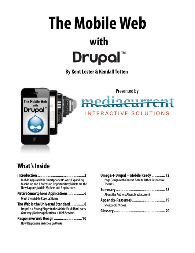
  • 1. The MobileWeb with By Kent Lester & KendallTotten Presented by What’s Inside Introduction..............................................2 Mobile Apps and the Smartphone OSWars;Expanding Marketing and Advertising Opportunities;Tablets are the New Laptops;Mobile Markets and Applications Native Smartphone Applications................6 Meet the Mobile Rosetta Stones TheWeb is the Universal Standard..............8 Drupal is a Strong Player in the Mobile Field;Third-party Gateways;Native Applications +Web Services ResponsiveWeb Design............................10 How ResponsiveWeb DesignWorks Omega + Drupal = Mobile Ready..............12 Page Design with Context & Delta;Other Responsive Themes Summary................................................18 About the Authors;About Mediacurrent Appendix-Resources................................19 Sites;Books;Videos Glossary..................................................20
  • 2. 2 Phone: 678.580.1690 Toll Free: 1.866.507.0005 Fax: 770.360.5776 5755 North Point Parkway, Suite 60, Alpharetta, Georgia 30022 mediacurrent.com Contents Copyright 2012, Mediacurrent. All Rights Reserved Introduction Introduction We live in a new digital world where only the nimble survive. Organizations are racing to rebuild their business strategies around the new “Social Web.” Those who can keep up with the Facebooks, Twitters, and Googles of the world stand to benefit from a more motivated and involved consumer base. Organizations who move too slowly risk rapid extinction. Now, the explosion in Smartphones and Tablets threatens to remake the Webosphere yet again. As content goes mobile, young consumers rely more and more on their smartphones, rather than their desktops and laptops, for news, information, and shopping. The “social web” is now the “mobile web” and things will never be the same. According to Neilson’s third quarter 2011 Mobile Media Report, over 44 percent of all US mobile phone subscribers now own a smartphone. That’s up from 18 percent, just two years ago. When you look at the prime purchasers, aged 25-34, the number is even larger. Over 62 percent of this age group relies on smartphones for their Web content. Among 8-24 and 35-44 years old, smartphone penetration hovers near 54 percent. There are many practical reasons for the move to the “mobile web.” • Young people are always on the go, always connected to the Web. It makes practical sense to consume that content on a device that can be carried in a pocket or jacket. • For marketers, smartphones put purchasing power nearest the point of consumption. It makes sense to access purchasing and price data while perusing the shelves of a local store. The nearest restaurant or pub is just a click away. • Location-aware applications add additional value to “point of sale” marketing, often automating the retrieval of information at the precise time and place that it is needed. • Smartphones are convenient, less than an arm’s length away, allowing busy consumers to fill non- productive moments with value added activity.
  • 3. 3 Phone: 678.580.1690 Toll Free: 1.866.507.0005 Fax: 770.360.5776 5755 North Point Parkway, Suite 60, Alpharetta, Georgia 30022 mediacurrent.com Contents Copyright 2012, Mediacurrent. All Rights Reserved Introduction After younger adults, boomers, aged 55-64, make up the second fastest-growing smartphone demographic. Older consumers who might never think of keeping a laptop with them can use Smartphones to access, maps, email, and deal-of-the-day websites like Groupon or Living Social. According to Forrester research, mobile commerce will reach $31 billion in 2016. Can your organization afford to ignore a market of that size? Now is the time to leverage content for the mobile economy. Mobile Apps and the Smartphone OSWars Rather than consolidating, smartphone operating systems have diverged. The most popular phone in the country during the third quarter of 2009 was a feature phone—the Motorola RAZR—while Apple’s iPhone 4 wore the crown last quarter, further emphasizing the ongoing shift in the wireless market toward smartphones. While the iPhone is the most popular smartphone, the Android operating system remains the most popular interface found on mobile devices. There are hundreds of different devices running several different versions of the Android OS. Then there are Windows 7, Blackberry, Symbion, and Palm smartphones. What does all this diversity mean? That the creation of dedicated phone apps for such a diverse market remains a huge nightmare. The two largest OS shares, Android & iPhone, use completely different development environments and programming languages, forcing developers to duplicate efforts when building dedicated applications. To build a viable Mobile strategy, organizations will need to consider the costs of development and maintenance.
  • 4. 4 Phone: 678.580.1690 Toll Free: 1.866.507.0005 Fax: 770.360.5776 5755 North Point Parkway, Suite 60, Alpharetta, Georgia 30022 mediacurrent.com Contents Copyright 2012, Mediacurrent. All Rights Reserved Introduction Expanding Marketing and Advertising Opportunities Despite the challenges, the marketing opportunities in the Mobile Web are too promising to ignore. With easy and persistent access to information, smartphones offer corporations, non-profits, advertisers, and marketers new opportunities to share their message with consumers. The enormous potential of this opportunity has certainly not been lost on the two major manufacturers of smartphone operating systems. Google recently acquired the mobile advertising company AdMob for $750 Million. As one of the first mobile ad servers, AdMob is popular on the iPhone, giving Google direct access to reams of usage data for the iPhone. Apple promptly retaliated by acquiring Quattro Wireless for $275 Million. As an advertising competitor to AdMob, Quattro Wireless gives Apple its first foray into Mobile advertising and a beachhead against Google’s advertising plans. Tablets are the New Laptops While smartphone growth has been spirited, the recent growth in tablets and e-books has simply been astounding. The recent launch of the Kindle Fire and Barnes and Nobles’ latest Nook tablet created some serious competition for Apple’s iPad and triggered a meteoric rise in tablet ownership. The share of adults in the United States owning either a tablet or an e-book jumped from 18% in December to 29% in January. That’s almost a doubling of product penetration in one month, an unprecedented growth rate. With such profound growth in such a short period, organizations have no choice but to move into the mobile arena ASAP.
  • 5. 5 Phone: 678.580.1690 Toll Free: 1.866.507.0005 Fax: 770.360.5776 5755 North Point Parkway, Suite 60, Alpharetta, Georgia 30022 mediacurrent.com Contents Copyright 2012, Mediacurrent. All Rights Reserved Introduction And NowWe Have“Phablets”on theWay Samsung recently introduced the Galaxy Note, a smartphone with a sprawling 5.3-inch HD Super AMOLED 1,280-by-800 (285ppi) WXGA display. Combining the functionality of a full voice phone with a tablet form factor, Samsung is betting that future mobile users will want a single device to handle all their mobile needs. Mobile Markets and Applications The light & small form factor of mobile devices, combined with accessibility and location information offer opportunities for new markets and applications. Companies like Groupon, Facebook, Twitter, Foursquare, and game developer Zynga have already made fortunes in the four-year-old mobile arena. But these examples may be the tip of the iceberg. Developers are finding new ways to leverage the “crowd” in mobile applications. For instance, local city governments have found mobile devices to be the perfect tool in increase voter awareness and participation. CitySourced, a mobile development company, offers government apps that allow citizens to report potholes, crime, vandalism, and graffiti in real time. Citizen reports are often accompanied by a photograph which not only speeds response, but provides evidence for criminal proceedings. So How doYouTap into this Huge Potential? Fortunately, there are several ways to bring a mobile solution to market. These are the four main paths: • Native smartphone applications • Third-party gateways such as Mobify • The integration of existing Internet websites with smartphones via web services • Responsive Websites that adapt automatically to the screen size of the display device City Sourced smartphone reports can update a central map in real time, allowing government officials to respond quickly. Samsung’s new Galaxy Note offers a form factor between a smartphone and tablet.
  • 6. 6 Phone: 678.580.1690 Toll Free: 1.866.507.0005 Fax: 770.360.5776 5755 North Point Parkway, Suite 60, Alpharetta, Georgia 30022 mediacurrent.com Contents Copyright 2012, Mediacurrent. All Rights Reserved Native Smartphone Applications Native Smartphone Applications Native smartphone applications written specifically for the mobile device’s operating system provide the best combination of performance and revenue potential, if they provide users with a unique experience or tap into the smartphone’s native functions. Simply copying the functionality of a central website can be a waste of time and resources. “Apps” as they are commonly called, can produce a significant revenue stream if they succeed in providing popular benefits or services. Since Apple introduced the “App Store,” over 425,000 third-party apps have been developed. Most of these sold for a nominal fee ($1-$5) with Apple pocketing 30% of the take and the developer receiving the rest. Other phone manufacturers soon followed with their own app stores, using similar business models. As of Jan. 2012, the “Android Market” has over 400,000 apps, putting it on par with the App Store. A native application’s main advantage comes from its direct access to the phone’s API. It opens the application up to all of the smartphone’s capabilities, such as the GPS location system, camera, text, and voice features. But each phone platform is different. Native app development is complex and demanding, as it requires a mastery of several different programming and development environments. Apple’s IOS system uses Objective C as its base language. You’ll need an Apple computer to develop your application, using the iPhone SDK & simulator, and a development environment such as XCode. There is an initial fee of $99 to register as an iPhone developer and any apps developed are contingent on an approval process by Apple. In the past, approvals could drag on for weeks or months, but recently, Apple has succeeded in shortening this process to two weeks in most cases. Android’s development process is a bit more flexible, perhaps because of its device agnostic roots and late entry into the field, but the development platform is very different, and some say, difficult to use. Android’s OS is based on Java, so you will need a Java Development Kit, the Android Software Development Kit, a good Java development environment such as Eclipse, and the Android platform. Since there are several versions of Android being used on many different smartphone devices, care must be taken to accommodate all the different feature sets, capabilities, and screen sizes. The Blackberry OS is different still, based on Blackberry’s own unique Java Development Environment. If you prefer to develop at a higher level of abstraction, you can choose to use Rim’s “Mobile Data System.” The Blackberry MDS is a flexible framework for application development that provides quick access to Blackberry connection services. Advantages • High performance • Access to built-in smartphone capabilities like GPS & cameras • Revenue potential through app sales Disadvantages • Must code in, and support multiple development platforms • Limited data storage • Approval required for some app markets Once you have these multiple development environments in place, you’ll need to plan for different feature sets and capabilities between the various platforms. Programmers proficient in several languages will need to be hired and their development coordinated. You’ll also have to consider software updates and maintenance. If this is starting to sound like a “Tower of Babel” scenario, you’re right! What the mobile market needs is a Rosetta Stone . . .
  • 7. 7 Phone: 678.580.1690 Toll Free: 1.866.507.0005 Fax: 770.360.5776 5755 North Point Parkway, Suite 60, Alpharetta, Georgia 30022 mediacurrent.com Contents Copyright 2012, Mediacurrent. All Rights Reserved Native Smartphone Applications Meet the Mobile Rosetta Stones In an attempt to “disentangle” the development process, several organizations have introduced unified development platforms. These platforms attempt to provide a single, common environment for development. After the application design is complete, these platforms then attempt to create device specific code for each different smartphone OS. However, the two platforms described below use very different methods to achieve this “device agnostic” functionality. AppceleratorTitanium Appcelerator’s Titanium is an open source, cross-platform environment based on Javascript. Using a set of API’s to emulate smartphone functionality, Titanium compiles the central Javascript application into native code for the Android, Desktop, iOS, and iPad operating systems. Appcelerator has recently added support for the Blackberry, but it is still in beta. Since it is based on Javascript, the Titanium platform leverages the expertise of existing web developers. Appcelerator simplifies programming and support by focusing on a single codebase. Because the final application is compiled into native code for each device, its performance is generally very good. Developers report that although working with Titanium gives fast results—making Titanium well suited for prototyping—there are issues around the differences in API’s. Stability, features, and memory management can be a problem. Appcelerator has had some reported memory leak issues, although workarounds have been developed. As a result of these limitations, developers often end up re- writing their apps in native code before final release, thereby negating many of Titanium’s advantages. Phonegap Phonegap is a hybrid mobile development platform. Developers can work with familiar languages like Javascript, HTML5, and CSS3. The rendering of the page is done through the Webkit, using HTML5. HTML5 plugins provide most of the familiar smartphone graphical elements like buttons and forms. The resulting applications are part HTML5 and part native code. Because of this hybrid approach, applications developed in PhoneGap may have limited access to a specific device’s API. That may restrict the use of cameras and GPS, for instance. Performance issues Appcelerator provides a single development environment to build applications for multiple operating systems.
  • 8. 8 Phone: 678.580.1690 Toll Free: 1.866.507.0005 Fax: 770.360.5776 5755 North Point Parkway, Suite 60, Alpharetta, Georgia 30022 mediacurrent.com Contents Copyright 2012, Mediacurrent. All Rights Reserved The Web is the Universal Standard have also been reported, requiring developers to invest a lot of time in optimization. Phonegap does have broad support for mobile devices however: iOS, Android, Windows Phone 7, Symbion, Bada, Blackberry, and WebOS. Phonegap was recently acquired by Adobe, so you can expect feature enhancements and integration with existing Adobe products, like Dreamweaver. This may make Phonegap a good solution in the future. Summary Alas, nothing in life is free. While universal development environments help to address issues surrounding mobile app development, they often result in performance degradation and limited functionality. Every phone platform has distinct features, advantages, and disadvantages, and getting one application to behave identically on all phones and operating systems is probably an unrealistic expectation. If only there were a universal Web standard . . . TheWeb is the Universal Standard There is one universal interface that all mobile devices have in common: the Web Browser. For this reason, applications that depend on the Web can usually run without modification on any mobile device. The standards forced by HTML and the Web makes all mobile devices perform the same, just as they do with desktops and laptops. If your organization already has a mature Web presence, you can leverage that investment for mobile devices, often far more quickly and easily than through native applications. However, building an effective mobile website is not without its own challenges. Drupal is a Strong Player in the Mobile Field Drupal’s content management system has been a powerful social media player for several years. As a leading Content Management System, it is perfectly positioned to provide access to mobile phones and tablets. In fact, the future of mobile technology is so critical that the Drupal 8 initiative is centered around a “mobile first” architecture. There will be a code freeze for Drupal 8 in December, 2012 with final release at least two years away or more. In the meantime, there is a tremendous amount of functionality available for users and developers of Drupal 7. Support for web services and responsive web design have been embraced by the Drupal community. Think of Drupal as a key “hub & spoke” strategy for mobile devices. Initially, organizations tend to reach their customers through a main website. Once an audience is mature, it is natural to branch out to mobile devices. In this way, smartphones and tablets function as peripherals to a central database core. It combines the best features of centralized data and distributed access. This is, in fact, how the leaders in social networking have evolved. Facebook, Google, and Youtube built a strong presence on the Web first. Then, mobile devices became the peripheral of choice for accessing legacy data. This “mobile device as peripheral” paradigm best leverages the limited performance of phones and tablets, while keeping the “processing intensive” activities firmly placed on enterprise servers. This contrasts significantly with native applications, which are typically self contained and limited in scope. Updating a central website is far easier than pushing out a new software edition of a phone app.
  • 9. 9 Phone: 678.580.1690 Toll Free: 1.866.507.0005 Fax: 770.360.5776 5755 North Point Parkway, Suite 60, Alpharetta, Georgia 30022 mediacurrent.com Contents Copyright 2012, Mediacurrent. All Rights Reserved The Web is the Universal Standard There are three basic ways to access a Drupal website through mobile devices: • Third-party gateways • Native apps using web services to retrieve data • Basic web browsing using responsive web design Third-party Gateways Third-party gateways simplify the process of building mobile friendly websites by acting as an intermediary between existing sites and the mobile browser interface. Mobify Mobify is a gateway that integrates with existing websites. If you want mobile capability without having to completely redesign your website, then Mobify provides a rather unique way to accomplish that goal. To “mobify” a site, you use an online utility to highlight website content that should be displayed in mobile devices. Once content is selected, some CSS theming will be required to finish out the design. Once the key elements have been selected, a javascript routine on the website detects and reroutes mobile traffic to Mobify’s servers. The site’s existing URL is preserved and Mobify optimizes mobile delivery. Mobify is not a plug & play solution: a considerable amount of theming and templating may be necessary, but it is faster than re-theming an existing site, saving perhaps 50-70% of the time necessary for a complete redesign. While Mobify has a free version, high traffic sites can cost anywhere from $295 per month to thousands for an enterprise site. Is it worth the money? If your organization has a large investment in an existing site, and mobile functionality is needed in record time, then the answer is “perhaps.” Visit mobify.com for more information. If you have the time and ability for a redesign, Drupal offers another exciting option . . . Native Applications +Web Services We talked earlier about the advantages and challenges of native applications. Appcelerator and Phonegap can simplify that. But what if you want to access your existing website directly on the mobile device? One way to accomplish this is to use a native application to contact your Drupal website through web services. In this way, native apps can be much simpler, off-loading much of the data processing to your Drupal website. Because data is stored in the cloud, data updates can be as simple as updating the Drupal database, without the need to re-deploy a new version of your native application. The Drupal Services module allows native applications to make Service callbacks with multiple interfaces like REST, XMLRPC, JSON, JSON-RPC, SOAP, AMF, etc. The native application provides interface functionality through the native API, but the data can come from the Drupal website. This allows users to access and update content from any device, whether desktop or mobile. The Phonegap contrib module provides a launching point for a services-based Drupal site. It consists of two parts: the Phonegap source code, which can be compiled for Android or iOS, and the Phonegap module, which is added to the Drupal site to make the final connection. Phonegap exposes Drupal content and users through edit screens on a mobile device. The Services module is also required. Jeff Linwood of modulesunraveled.com is currently working on a Phonegap plugin to automate much of the process of developing a Drupal Based Phonegap application.
  • 10. 10 Phone: 678.580.1690 Toll Free: 1.866.507.0005 Fax: 770.360.5776 5755 North Point Parkway, Suite 60, Alpharetta, Georgia 30022 mediacurrent.com Contents Copyright 2012, Mediacurrent. All Rights Reserved Responsive Web Design ResponsiveWeb Design So why are native applications needed for viewing websites? Don’t all mobile devices have web browsers? The answer becomes obvious after browsing a few websites that have not been optimized for the mobile web. The screen real estate of mobile devices make reading a full website virtually impossible without a ton of “finger zooming.” A recent Google study found that 61% of mobile visitors are unlikely to return to a website that has non-mobile theme. Over the past few years many web developers have created completely different mobile themes for their website, using javascript to redirect users to this dedicated theme. This is the strategy used by Mobify. But keeping up with two sites, or two themes adds additional maintenance headaches and formatting issues. This problem only gets worse as tablets enter the mobile arena. Websites need to adjust to many different screen sizes. What if you could create one theme that could detect the device viewing and “respond” by redrawing the site in a format optimized for that device? This is the exciting promise of Responsive Web Design. The idea is to respond­ —not to the specific requirements of the thousands of tablets, desktops, laptops, and mobile phones on the market—but to deliver elegant visual experiences regardless of the size of the user’s display and the limitations or capabilities of the device. A lot of exciting work has been done recently with responsive Drupal themes that achieve this goal. Adaptive Theme, Arctica, and Omega are three responsive Drupal themes that vastly simplify the task of formatting your Drupal website to match the requirements of mobile devices. These themes have an added bonus: they depend heavily on HTML5 and CSS3, cutting edge technologies that enhance theming, improve search engine optimization, and “future-proof” your site. On an iPhone, the standard Wall Street Journal website is practically impossible to read. Viewing a Drupal article Edit a Drupal article directly on the mobile device Setup how the content is viewed on the mobile device Post an article to a Drupal website using a smartphone The Drupal PhoneGap module allows full integration between a PhoneGap application and an existing Drupal website. With it, users can create and modify Drupal content directly on a mobile device.
  • 11. 11 Phone: 678.580.1690 Toll Free: 1.866.507.0005 Fax: 770.360.5776 5755 North Point Parkway, Suite 60, Alpharetta, Georgia 30022 mediacurrent.com Contents Copyright 2012, Mediacurrent. All Rights Reserved Responsive Web Design How ResponsiveWeb DesignWorks Responsive themes make use of “media queries” in CSS, that link a specific stylesheet for different screen sizes. The media query works in real time, so if a viewer rotates a tablet, the media query will update the style sheet dynamically. Media queries are a great improvement over the older methods of using javascript to determine screen size. Most modern browsers, including virtually all smartphones and tablets, support CSS media queries, which solves the issue of compatibility. On legacy browsers, such as Internet Explorer 7, a “default” style sheet is loaded, which will format to a classic desktop format. Responsive themes should be a “mobile first” design. In other words, the mobile stylesheet is the “default.” Mobile designs can be built for maximum effectiveness for smartphones and will display properly on legacy phones that might lack full media query compatibility. A good responsive theme will load lower bandwidth items first and add graphics heavy elements only when media queries detect a larger screen display. Because of the CSS “cascade” the “last in” stylesheets will overrule the default “mobile only” design. This approach provides the best possible performance for low bandwidth devices. Advantages • One codebase for the website • No need for custom apps • Data from Internet & mobile visitors are combined • Quick transition of legacy websites Disadvantages • Possibly higher bandwidth requirements than native applications • Need to find balance between bandwidth heavy Internet and bandwidth light mobile data network • Retrofitting can be a challenge A responsive web design automatically reformats the page layout to accommodate the size & orientation of the display device.
  • 12. 12 Phone: 678.580.1690 Toll Free: 1.866.507.0005 Fax: 770.360.5776 5755 North Point Parkway, Suite 60, Alpharetta, Georgia 30022 mediacurrent.com Contents Copyright 2012, Mediacurrent. All Rights Reserved Omega + Drupal = Mobile Ready Omega + Drupal = Mobile Ready One of the most powerful and popular responsive themes for Drupal has to be the Omega base theme. It’s fully HTML5 compatible, uses some elements of CSS3, is based on the 960 grid, and provides many layout tools directly in the Drupal interface. When used properly, the web designer can accomplish almost all theming without writing a single line of PHP or messing with templates. Since Omega is a “base theme,” the designer can setup a sub-theme to customize the design, while letting the Omega base theme do all the responsive “heavy lifting.” In addition, you can take advantage of two modules that work beautifully with Omega; Delta & Omega Tools. The Omega Tools module automates many theming tasks, such as importing/exporting theme settings, setting up a sub-theme, and setting theme defaults. The Delta module, when used in conjunction with the Context and Features modules, can achieve sophisticated page layouts that change dynamically based on virtually any need. Let’s take a closer look at how this responsive theme works. OmegaTools The Omega Tools module provides a set of helper functions for working with, and creating Omega sub-themes. These tools can simplify and speed up the theme development process. • Export Theme Settings. Allows you to export the theme settings stored in the database to a file. You can then overwrite the corresponding section in your theme’s .info file with the exported values. Reverting the theme settings will load the default values. • Revert Theme Settings. This button loads the default theme settings from the theme’s .info file. This destroys the database copy of modified settings, and reverts to the original values. • Drush Integration. You can easily create your Omega sub-themes with Drush, a command line shell and scripting interface for Drupal. • Subtheme Wizard. In addition to Drush integration there is also a Wizard that will guide you through the creation of a new Omega subtheme based on the HTML5 or XHTML starterkits. Customizing the Omega Layout The Omega theme’s page layout can be customized directly from the theme’s settings page without the need for coding. Omega uses the default 960 grid system by default. You can however, switch to a totally fluid theme or even create a custom grid, if needed. Media query settings can also be tweaked from this interface. The Omega Theme for Drupal 7 supports the following default CSS media queries which will load specific stylesheets when needed for the appropriate device: • small. (default)–0px to 740px wide • narrow. 741px to 979px wide • normal. 980px to 1219px wide • wide. 1220px and wider Drupal MobileThemes • Omega** • ST Conch • ST Alphorn • AdaptiveTheme** • AdaptiveTheme Mobile • Pixture Reloaded • Sky • Corolla • AT Commerce • Fusion** • Arctica** • TouchPro • Arti ** Base Theme
  • 13. 13 Phone: 678.580.1690 Toll Free: 1.866.507.0005 Fax: 770.360.5776 5755 North Point Parkway, Suite 60, Alpharetta, Georgia 30022 mediacurrent.com Contents Copyright 2012, Mediacurrent. All Rights Reserved Omega + Drupal = Mobile Ready Omega Page Structure Due to the modular nature of Omega and the 960 grid it depends on, some new layout terminology is needed. When Omega alters the layout to accommodate different devices, it must decide the order in which to display page elements. Sections and Zones help to manage this stacking order at varying widths. Sections are main page elements that serve as containers for Zones. Zones provide containers for Regions. (This is the standard Drupal region.) These regions will be stacked in a vertical format for the default mobile-first layout. Regions in turn, contain the Drupal Blocks, that are also displayed in a vertical stack. When the media query detects a wider format, the regions can be forced into a left-to-right configuration to approximate a standard desktop web layout. Omega automatically resizes the width of the region blocks to best accommodate the width of the display device. Custom CSS can be applied in style sheets for each media query, but even without custom CSS, the Omega base theme can successfully provide an elastic layout that works on most mobile devices. Zone and Region Configuration If additional regions are needed, start by defining them in the theme’s info file. This is found in your Drupal installation, sites/all/themes/theme_name folder. Then, on your Drupal site, go to the theme settings page, and click on the “Zone and Region Configuration” tab. The bottom of the page shows any un-assigned regions, including your new custom region. You can then position it in whichever zone you need, without any custom coding. The 960 grid will take care of all region widths and positioning. When you choose a region, you can specify the zone you’d like to place it in. If choosing a zone, you can specify the section to place it in. You can use a 12 or 16 column format for each zone, and the regions you Sections and zones are specific to the Omega theme and act as containers for the standard layout regions.
  • 14. 14 Phone: 678.580.1690 Toll Free: 1.866.507.0005 Fax: 770.360.5776 5755 North Point Parkway, Suite 60, Alpharetta, Georgia 30022 mediacurrent.com Contents Copyright 2012, Mediacurrent. All Rights Reserved Omega + Drupal = Mobile Ready place in these zones should have a total width that matches the zone’s number of columns. For instance, with a 12 column zone, you could have a first sidebar of 3 columns, a content section of 6 columns, and a second sidebar of 3 columns. If more spacing between columns is desired, you can specify prefix and/or suffix areas that function as extra spacing. You can also choose weight and column count in this interface. In this example, the footer regions are all 4 columns wide, so they will fit side-by -side in the normal or wide layout. By default the region with the heaviest weight within its respective zone will drop below the other regions, when displayed in the stacked mobile layout. Block order operates in the same way. Don’t forget to test out your site on different screen sizes to see how it reacts, and then add CSS to adjust accordingly. Debug Settings In the debugging menu, you can turn off the handy grid overlay that floats on the page, as well as the “resize me” image. Or you can simply disable the grid overlay and debug blocks from being shown by Zones contain Drupal regions, which will hold Drupal blocks. An optional full width zone wrapper is available for theming. NOTE: Make sure to use “region-content-inner” classes to set any additional padding or margins to your content. Setting margins or padding on the region div will break the 960 grid settings since they alter the region’s width values.
  • 15. 15 Phone: 678.580.1690 Toll Free: 1.866.507.0005 Fax: 770.360.5776 5755 North Point Parkway, Suite 60, Alpharetta, Georgia 30022 mediacurrent.com Contents Copyright 2012, Mediacurrent. All Rights Reserved Omega + Drupal = Mobile Ready default when the page is loaded, but they are only a click away on the right side of the screen should you need them. Toggle Libraries There are several handy code libraries used by Omega that be turned off when not needed, all from the user interface: Formalize–This library helps you make consistent form styles across all browsers. Media Queries–The magic sauce behind the Omega Theme. Equal Heights–Enable this if you’d like blocks within the same region to automatically become the same height. This is a great solution for footers. You can also force the child elements of a zone or region to be equal heights. Toggle Styles If the default style sheets of the base theme get in your way, simply disable them from the interface. Stylesheets from contributed modules can also be conveniently disabled from this interface. Toggle Advanced Elements Turn off unwanted elements like breadcrumbs, feed icons, or tabs. Or, quickly hide page titles, the site name or slogan (but keep them available for screen readers). It’s simpler than embedding “display:none” to your custom stylesheets. ExportTheme Settings After all custom settings are complete, it’s nice to know that you can export a file that can then be added back to the theme’s .info file. If your theme is then reused elsewhere, your custom settings will automatically become the default. What About Internet Explorer? Just how well does IE interact with Omega? As you might expect, IE7 and IE8 do not interpret media queries properly, meaning that if you scale your browser window, it will still render the normal layout as if it were any other theme. It’s an elegant degradation, that maintains compatibility with old technology. Page Design with Context & Delta The Omega theme has one more trick up its sleeve: the Delta module. The Delta module allows you to build custom page layouts for different parts of your site. It essentially clones the theme settings page, so that you can design multiple configurations / layouts for your site. While designed specifically for the Omega theme, Delta will also work with other themes. These “Deltas” can completely reconfigure sidebars, footers, and content areas for different sections of a site. Drupal Mobile Modules • Mobile Tools • SMS Framework • Phonegap • Respond.js • Modernizr • Fit Text • Adaptive Image Styles • Adaptive Image • Client Side Adaptive Image • Services
  • 16. 16 Phone: 678.580.1690 Toll Free: 1.866.507.0005 Fax: 770.360.5776 5755 North Point Parkway, Suite 60, Alpharetta, Georgia 30022 mediacurrent.com Contents Copyright 2012, Mediacurrent. All Rights Reserved Omega + Drupal = Mobile Ready Once these custom configurations have been defined, you can trigger them through the Context module. The Context module can trigger certain “reactions” based on defined “conditions.” For example, you can specify a “condition” that all URL paths beginning with /news* or /events* should trigger a “reaction” to use “Delta Template XYZ,” instead of the core theme settings. You can also use Context to hide or show blocks, add body classes, add section titles and more, based on conditions like URL paths, content types, user roles, or taxonomy terms. When a specific Delta has been triggered, the default layout of the original settings page will be “overruled” by the Delta configuration. The combination of custom “Deltas” and “Contexts” can create elegant website intelligence. For instance, a one column page layout could be triggered when webforms are displayed, or a special layout can be triggered for the front page of the site. These are tasks that were previously done with the Panels module, or by custom programing the logic into PHP templates. The Omega Delta module provides all that power straight from the Drupal interface. On the Context edit page, a specific Delta configuration can be chosen as a reaction to some Context trigger. Delta allows completely different theme layouts based on Context. Here, the front page has three columns & a slideshow, while the blog page has one column.
  • 17. 17 Phone: 678.580.1690 Toll Free: 1.866.507.0005 Fax: 770.360.5776 5755 North Point Parkway, Suite 60, Alpharetta, Georgia 30022 mediacurrent.com Contents Copyright 2012, Mediacurrent. All Rights Reserved Omega + Drupal = Mobile Ready Setting up Delta Install the Delta and Context modules. After installation you’ll notice a new “Delta” tab on the theme settings page. Create a new Omega “template” and then click on the configuration link to build the custom layout in much the same way you configured the default Omega settings page. Once the Delta template is complete, go to the Context page and define a trigger for whatever special condition you desire. Under the “reactions” section of the context edit page, you’ll find a list of all custom Delta templates that you have previously defined. Choose the desired Delta template and save. Now, whenever that Context is triggered on your site, that Delta’s layout will be used instead of the default Omega theme settings. Useful Delta Settings Additional zone classes: Enter CSS classes to be added to a particular zone. This can change the appearance of that zone without having to add any logic to the original PHP template. Additional wrapper classes: Enter any CSS classes to be added to a particular zone wrapper for theming. This will only be used if the option to provide a full width wrapper around the zone is enabled. With these two options, you can build special theming into certain pages and optionally make them look completely different from the default theme. MobileTools + Context The Mobile Tools Module can add sophisticated device detection to your Omega theme beyond the simple display size used by media queries. With Delta + Context, we can rearrange elements to fit mobile devices, but what if some elements are not ideal for mobile, like drop-down menus? We might want to display a different, mobile-friendly menu instead. Mobile Tools adds device detection to the Context Module, providing a new contextual rule with “mobile devices” as a condition. When Mobile Tools detects a mobile device, a Delta template can be enabled or specific regions can be enabled or disabled. One thing to be aware of is caching issues. If you switch themes based on device type, there is a chance that caching will bypass the device detection for the next user and pull the incorrect theme from the cache. This can be solved by reading the documentation in the mobile_tools_cache.inc file and adjusting your settings.php file accordingly. Relying on user agent detection on the server could be an issue for some. Currently, there’s a lot of debate about the accuracy of user agent detection. ThemingWorkflow with Features So, you’ve built a complex layout with Omega, Context, Delta, and Mobile Tools on your sandbox site. Now what? How can you easily transfer these custom settings to a production website? This is one reason why web designers have avoided database heavy themes in the past. It was too difficult to transfer the database settings to production. Not any more. Omega comes to the rescue with support for the Features Module. This module allows you to package up the Delta and Context configurations into code-based modules that can easily be transferred or maintained with version control systems. With this last innovation, the Omega Theme promises to become one of the most powerful and flexible theming solutions available for Drupal.
  • 18. 18 Phone: 678.580.1690 Toll Free: 1.866.507.0005 Fax: 770.360.5776 5755 North Point Parkway, Suite 60, Alpharetta, Georgia 30022 mediacurrent.com Contents Copyright 2012, Mediacurrent. All Rights Reserved Summary Other ResponsiveThemes Omega is just one solution to Responsive Web Design. Several other responsive themes are available and have loyal followings. Here are a couple of alternatives: AdaptiveTheme Like Omega, AdaptiveTheme has been around for awhile and boasts strong support from the Drupal community. At adaptivethemes.com, you will find a good selection of professional subthemes based on the AdaptiveTheme base engine. Arctica This is a new responsive base theme that focuses on a lean, simple design. New subthemes are becoming available at a rapid pace. Summary About the Authors Kent Lester is an author, futurist, and Drupal consultant. He is the cofounder of the Atlanta Drupal User’s Group and provides independent consulting and training services. Kendall Totten is a Drupal Designer and Themer at Mediacurrent. About Mediacurrent Mediacurrent helps organizations architect custom websites by leveraging our proven processes and deep expertise in Drupal. A wide range of Drupal services are offered, including custom module development, theming, post-launch support, training, SEO, and strategic consulting. As an Acquia Enterprise Partner, Mediacurrent has a proven track record with clients that include established businesses, startups, nonprofit organizations, agencies, universities, and foundations. As an active member of the Drupal community, Mediacurrent regularly participates in (and sponsors) events and forums to expand the reach of social networking and Drupal in particular. Formal relationships with the following companies and organizations expand their in-house experience: Partner/Affiliate: • Acquia (Drupal hosting, support & networking services) • Open Source Training (Drupal training) • Rackspace (hosting) • Volacci (Drupal SEO) • Times 3 Design (graphic design) Member: • Drupal Association • Atlanta Drupal User’s Group • Technology Association of Georgia • Atlanta Interactive Marketing Association • American Marketing Association • Atlanta Ad Club
  • 19. 19 Phone: 678.580.1690 Toll Free: 1.866.507.0005 Fax: 770.360.5776 5755 North Point Parkway, Suite 60, Alpharetta, Georgia 30022 mediacurrent.com Contents Copyright 2012, Mediacurrent. All Rights Reserved Appendix-Resources Appendix-Resources Sites • symphonythemes.com–Premium Drupal Theme Club for Omega sub-themes • developmentgeeks.com–Home website for the Omega base theme • omega.developmentgeeks.com/documentation–Documentation for Omega • drupal.org/node/819164–Handbook page for Omega on Drupal.org • adaptivethemes.com–Documentation and theme site for the AdaptiveTheme family of themes and subthemes • sooperthemes.com–Premium Drupal Themes for the Arctica base theme • drupal.org/handbooks–provides basic instruction in Drupal and is supported by the community • drupal.org/planet–aggregates Drupal-related newsfeeds. The sites linked from this page are full of interesting Drupal information Books • Drupal 7 Themes: Ric Shreves. Filled with practical examples, this book helps you to understand the logic behind the theming system employed in Drupal 7, and how to make it work for you. • The Definitive Guide to Drupal 7: Benjamin Melancon, Jacine Luisi, Karoly Negyesi, Bojhan Somers, Stephane Corlosquet, Stefan Freudenberg, Ryan Szrama, Dan Hakimzadeh, Amye Scavarda, Allie Micka, Roy Scholten, Kasey Dolin, Sam Boyer, Mike Gifford. One of the most comprehensive books ever written on Drupal, specifically, Drupal 7. This indispensable guide will provide a broad knowledge of the inner workings of Drupal 7. • Using Drupal: Angela Byron, Addison Berry, Nathan Haug, & Jeff Eaton. Written by the best-known names in Drupal development and teaches practical skills by applying them to real-world Web sites. • Pro Drupal Development: John K. VanDyk. Covers module development, and is an excellent addition to the bookshelf of any experienced PHP programmer. Videos The Drupal community has been extremely active in producing free “screencasts”, where an expert visually shows you the steps to do a specific task. Numerous screencasts are listed at: • drupal.org/handbook/customization/videocasts • drupaltherapy.com • gotdrupal.com • learnbythedrop.com
  • 20. 20 Phone: 678.580.1690 Toll Free: 1.866.507.0005 Fax: 770.360.5776 5755 North Point Parkway, Suite 60, Alpharetta, Georgia 30022 mediacurrent.com Contents Copyright 2012, Mediacurrent. All Rights Reserved Glossary Glossary Responsive Web Design: A web design approach that responds to the user’s display device, size, platform and orientation. Through the use of CSS media queries, a responsive design will alter the page layout through a grid system to best match the display device, whether a desktop, tablet, or mobile phone. Media Queries: A new specification in CSS3 that allows for the detection of different display resolutions. Media Queries will respond by loading different CSS stylesheets based on the layout needed for the detected display. Mobile First: Since older phones lack compatibility with CSS3 Media Queries, it is best to design the default layout of a website to render properly on these older devices rather than attempting a “graceful degradation” of a complex layout. For smartphones and PC’s, media queries can load additional graphical elements to enhance layout. Smartphone: A mobile phone that has extended capabilities including, but not limited to, web browsing and dedicated special use applications. Web Services: A Web service is a method of communication between two electronic devices over the Web. Service requests can be made through several web-related standards including REST, SOAP, XML-RPC, typically conveyed using HTTP with an XML serialization. APP: A mobile application, commonly written in a native language and marketed through a web-based application store, such as the Apple Appstore and Android Marketplace.