Recomendados

Recomendados
Más contenido relacionado
La actualidad más candente
Destacado
Destacado (20)
Similar a Double page spread 2
Similar a Double page spread 2 (20)
Más de JESUSHASRISEN
Más de JESUSHASRISEN (20)
Último
Último (20)
Double page spread 2
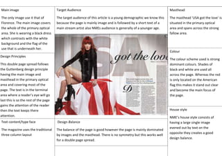
- 1. Masthead The masthead ‘USA got the love’ is situated in the primary optical area and spans across the strong fallow area. House style NME’s house style consists of having a large single image evened out by text on the opposite they creates a good design balance. Main image The only image use it that of Florence. The main image covers the whole of the primary optical area. She is wearing a black dress which contrasts with the white background and the flag of the use that is underneath her. Text content/type face The magazine uses the traditional three column layout Design Principles This double page spread follows the Guttenberg design principle having the main image and masthead in the primary optical area and covering most of the page. The text is in the terminal area where a reader’s eye will go last this is so the rest of the page gains the attention of the reader then the text keeps there attention. Design Balance The balance of the page is good however the page is mainly dominated by images and the masthead. There is no symmetry but this works well for a double page spread. Colour The colour scheme used is strong dominant colours. Shades of black and white are used all across the page. Whereas the red is only located on the American flag this makes it stand out clear and become the main focus of the page. Target Audience The target audience of this article is a young demographic we know this because the page is mainly image and is followed by a short text of a main stream artist also NMEs audience is generally of a younger age.