![[object Object],[object Object],[object Object],[object Object]](data:image/gif;base64,R0lGODlhAQABAIAAAAAAAP///yH5BAEAAAAALAAAAAABAAEAAAIBRAA7)
Recomendados
Más contenido relacionado
La actualidad más candente
La actualidad más candente (19)
Destacado
Destacado (20)
Similar a Music mag research
Similar a Music mag research (20)
Último
Último (20)
Music mag research
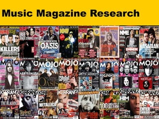
- 3. NME Music Magazine Features Plain Font, differing only in colour and size. Draws attention to the main feature by overlapping the logo. Smaller font size and positioning shows these features to be less significant than the main article. Masthead positioned at the very top of the page. Formal positioning of title and features. List of bands at the bottom of the page gives an insight into the content of the magazine.
- 5. Mojo Magazine Features Two columns either side of the picture give a formal image. Like NME, the main image overlaps the logo in order to show the significance of the article. List of old bands gives an insight into the content and features of this magazine. Gift inside the magazine offers an insentive for readers to buy. Unlike NME there is no indication that any of the other articles are less important, as all feature the same font size and positioning. Tries to attract audiences by showing an exclusive interview.
- 7. Kerrang Music Magazine Features Much more informal syle than either NME or Mojo. One off article gives an insentive for people to buy the magazine. Like NME and Mojo, Kerrang shows a list of bands to indicate the content of this music magazine. Picture overlapping title. Small amounts of writing in big fonts and colours give the magazine a shouting image. Appealing to the reader by giving them an active part in the magazine.