

Recomendados
Recomendados
Más contenido relacionado
La actualidad más candente
La actualidad más candente (20)
Destacado
Destacado (12)
Similar a Inequality chartbook (all)
Similar a Inequality chartbook (all) (20)
Último
Último (20)
Inequality chartbook (all)
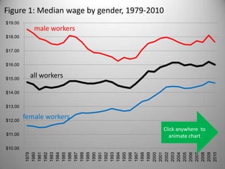
- 1. Figure 1: Median wage by gender, 1979-2010 $19.00 male workers $18.00 $17.00 $16.00 $15.00 all workers $14.00 $13.00 $12.00 female workers Click anywhere to $11.00 animate chart $10.00 2001 2005 1979 1980 1981 1982 1983 1984 1985 1986 1987 1988 1989 1990 1991 1992 1993 1994 1995 1996 1997 1998 1999 2000 2002 2003 2004 2006 2007 2008 2009 2010
- 2. 130% Figure 2: Education Pays, 1979-2010 120% $24.91 110% 100% $12.20 $20.75 $14.05 $13.30 less than HS 90% high school BA or higher 80% $9.96 70% Click anywhere to 60% animate chart
- 3. Figure 3: Education Pays, 2010 BLS at http://www.bls.gov/emp/ep_chart_001.htm
- 4. Figure 4: Top-Half and Bottom-Half Wage Inequality, 1974-2005 Source: Claudia Goldin and Lawrence Katz, Long-Run Changes in the Wage Structure: Narrowing, Widening, Polarizing, Brookings Papers on Economic Activity 2 (2007), Figure 3
- 5. Figure 5: Growing Apart Income Growth by Quintile, 1947-2010 400 productivity 375 350 top 5 percent 325 median income 300 275 lowest (20%) income group 250 225 200 175 150 125 Click anywhere 100 to animate chart 75 1947 1950 1953 1956 1959 1962 1965 1968 1971 1974 1977 1980 1983 1986 1989 1992 1995 1998 2001 2004 2007
- 6. Figure 6: Share of Income Going to Top 10 percent 50% 45% 40% 35% Click anywhere to 30% animate chart share of income going to the top 10 percent 25% Piketty and Saez, "Income Inequality in the United States, 1913-1998," Quarterly Journal of Economics (2003); Tables and Figures Updated to 2008, July 2010)
- 7. Figure 7: Income Share of Top 1%, 1980 and 2008 2008 1980 Hoeller, P. (2012), “Less Income Inequality and More Growth – Are they Compatible?: Part 4. Top Incomes”, OECD Economics Department Working Papers, No. 927, OECD Publishing.
- 8. Figure 8: Income Share of Top 1%, 1990 to 2007 OECD, Divided We Stand (2011), at http://www.oecd-ilibrary.org
- 9. Figure 9: After-Tax Income Growth, 1979-2007 300 $1,319,700 250 Click anywhere animate chart 200 150 100 50 $17,700 $15,300 0 $346,000 $15,900 1979 1980 1981 1982 1983 1984 1985 1986 1987 1988 1989 1990 1991 1992 1993 1994 1995 1996 1997 1998 1999 2000 2001 2002 2003 2004 2005 2006 2007 -50 Bottom 20 percent 21st to 80th 81st to 99th Top 1 percent CBO, Trends in the Distribution of Household Income between 1979 and 2007 (2011)
- 10. Figure 10: Household Wealth, 1983-2007 100 90 80 70 bottom 40 percent 60 next 20 percent next 20 percent 50 next 10 percent next 5 percent 40 next 4 percent top 1 percent 30 20 Click anywhere 10 animate chart 0 1983 1989 1992 1995 1998 2001 2004 2007 Edward Wolf, Recent Trends in Household Wealth (Levy Economics Institute Working Paper 589), March 2010
- 11. Figure 11: Wealth in Selected OECD Countries, circa 2000 top 1% top 5% Bonesmo Fredriksen, K. (2012), “Less Income Inequality and More Growth – Are they Compatible?: Part 6. The Distribution of Wealth”, OECD Economics Department Working Papers, No. 929, OECD Publishing.
- 12. Figure 12:The Great Gatsby Curve: Intergenerational Mobility Source: Alan Krueger (2012); Miles Corak (2012), Inequality from Generation to Generation: The United States in Comparison, in Robert Rycroft (editor), The Economics of Inequality, Poverty, and Discrimination in the 21st Century, ABC- CLIO, forthcoming)
- 13. Figure 13: Trade as a percentage share of GDP 20% 20% Click anywhere 15% 15% to animate chart 10% 10% 5% 5% 0% 0% -5% -5% -10% -10% -15% -15% -20% -20% exports as share of GDP imports as share of GDP trade balance Bureau of Economic Analysis, GDP and International Transactions at http://www.bea.gov/iTable/index_ita.cfm
- 14. Figure 14: Imports and Exports as % of GDP, OECD 2008 90 80 70 60 50 40 30 20 10 0 OECD at http://www.oecd-ilibrary.org/trade/trade-in-goods-and-services_20743920-table1
- 15. Figure 15: The Great Doubling Richard Freeman, “The Great Doubling” (2006)
- 16. Figure 16: Change in Employment by Occupation, 1979-2009 David Autor, "The Polarization of Job Opportunities in the U.S. Labor Market (April 2010)
- 17. Figure 17: Family Type and Family Income, 1951-2010 100% 100,000 single female householder 90% 90,000 single male householder 80% 80,000 married, wife not in the labor force 70% 70,000 married, wife in labor force 60% 60,000 family income (2010 dollars) married, wife in labor force 50% 50,000 married, wife not in the labor 40% 40,000 force single male householder 30% 30,000 single female householder 20% 20,000 10% 10,000 Click anywhere to 0% - animate chart 1990 1993 1951 1954 1957 1960 1963 1966 1969 1972 1975 1978 1981 1984 1987 1996 1999 2002 2005 2008
- 18. Figure 18: Share of Single-Headed Households in OECD OECD, Divided We Stand (2011), at http://www.oecd-ilibrary.org
- 19. Figure 19: Poverty Rates, families with one and two workers Poverty rate, one worker family Poverty rate, two worker family Pisu, M. (2012), “Less Income Inequality and More Growth – Are they Compatible?: Part 5. Poverty in OECD Countries”, OECD Economics Department Working Papers, No. 928, OECD Publishing.
- 20. Figure 20: Poverty Rates, families with and without kids Poverty rate, households without kids Poverty rate, households with kids Pisu, M. (2012), “Less Income Inequality and More Growth – Are they Compatible?: Part 5. Poverty in OECD Countries”, OECD Economics Department Working Papers, No. 928, OECD Publishing.
- 21. Figure 21: Assortative Mating Mare and Schwartz, INCOME INEQUALITY AND EDUCATIONAL ASSORTATIVE MATING (2006)
- 22. Figure 22: Assortative Mating Mare and Schwartz, INCOME INEQUALITY AND EDUCATIONAL ASSORTATIVE MATING (2006)
- 23. Figure 23: Right to Work, 1947-2011 1948 1986 1947 0 1963 1947 1947 1957 1952 1955 (2012) 1958 1947 1947 1947 1948 2001 1947 1954 1960 1953 1947 1947 1976 1944 Note: Indiana passed RTW in 1957, repealed it in 1965, and passed it again in 2012
- 24. Figure 24: Unions and Shared Prosperity, 1917-2011 50% 45% 40% 35% 30% Click anywhere to animate chart 25% 20% 15% 10% union membership share of income going to the top 10 percent 5% 0% 1918 1928 1938 1948 1958 1968 1978 1988 1998 2008
- 25. Figure 25: Union Density, trends and peaks United States (1935-2010), and peers (1960-2010) 100 90 dots indicates peak union density 80 70 Sweden 60 Denmark 50 Belgium Italy 40 Canada United Kingdom 30 United States 20 10 Click anywhere 0 to animate chart 1989 1992 1935 1938 1941 1944 1947 1950 1953 1956 1959 1962 1965 1968 1971 1974 1977 1980 1983 1986 1995 1998 2001 2004 2007 2010 Source: OECD Stat Extracts
- 26. Figure 26: Union Density and Inequality in the OECD OECD, Divided We Stand (2011), at http://www.oecd-ilibrary.org
- 27. Figure 27: Average Annual Premiums for Single and Family Coverage, 1999-2011 * Estimate is statistically different from estimate for the previous year shown (p<.05). Source: Kaiser/HRET Survey of Employer-Sponsored Health Benefits, 1999-2011.
- 28. Figure 28: Cumulative Increases in Health Insurance Premiums, Workers’ Contributions to Premiums, Inflation, and Workers’ Earnings, 1999-2011 Source: Kaiser/HRET Survey of Employer-Sponsored Health Benefits, 1999-2011. Bureau of Labor Statistics, Consumer Price Index, U.S. City Average of Annual Inflation (April to April), 1999-2011; Bureau of Labor Statistics, Seasonally Adjusted Data from the Current Employment Statistics Survey, 1999-2011 (April to April).
- 29. Figure 29: Job-based Health Insurance from own employer, selected percentiles, 1979-2010 Click anywhere to animate chart 100% 90% high wage (top percentile) workers 80% 70% middle wage workers 60% 50% 40% 30% low wage (bottom percentile) workers 20% 10% 0% John Schmitt, Health-insurance Coverage for Low-wage Workers, 1979-2010 and Beyond (CEPR, February 2012)
- 30. Figure 30: Uninsurance Rates Among Workers, various characteristics, 2010 50 45 40 35 30 25 20 part time workers lowest wage fifith 15 less than HS foreign born 10 all workers hispanic 5 black 0 Adapted from Elise Gould, A Decade of Declines in Employer-Sponsored Health Insurance Coverage (EPI, February 2012), Table 4.
- 31. Figure 31: Pension Participation Private Sector Male Workers, 25-64 by Earnings Tercile 100% 90% 80% 70% 60% pension offered 50% take-up rate 40% overall participation 30% 20% 10% Click anywhere 0% to animate chart upper income middle income lower income Center for Retirement Research, Is Pension Inequality Growing? (January 2010)
- 32. Figure 33: Pension Plan Types, 1982-2008 Source: Munnell et al, An Update on 401(k) Plans (Center For Retirement Research, 2009)
- 33. Figure 34: Pension Participation Rate Private Sector Male Workers, 25-64 by Earnings Tercile and Plan Type, 2007 100% Click anywhere to animate chart 90% 80% 70% 60% 50% 40% 30% 20% 10% 0% upper income middle income lower income defined benefit defined contribution Center for Retirement Research, Is Pension Inequality Growing? (January 2010)
- 34. Figure 34: Net Benefit of Social Programs for Low-Income Households cash benefits market income direct taxes net benefit OECD, Divided We Stand (2011), at http://www.oecd-ilibrary.org
- 35. Figure 35: Income Inequality before and after In-Kind Benefits inequality (gini) before in-kind services inequality (gini) after in-kind services OECD, Divided We Stand (2011), at http://www.oecd-ilibrary.org
- 36. Figure 36: Social Security and Senior Poverty, 1937-2010 $2,000 90 $1,800 80 $1,600 70 $1,400 60 $1,200 50 $1,000 Click anywhere 40 $800 to animate chart 30 $600 $400 20 $200 10 $0 0 1967 1981 1995 2009 1937 1939 1941 1943 1945 1947 1949 1951 1953 1955 1957 1959 1961 1963 1965 1969 1971 1973 1975 1977 1979 1983 1985 1987 1989 1991 1993 1997 1999 2001 2003 2005 2007 per person social security spending % seniors in poverty
- 37. Figure 37: The Impact of Recession-Era Benefits (2010) CBPP, Poverty and Financial Distress Would Have Been Substantially Worse in 2010 Without Government Action (November 2011)
- 38. Figure 38: The Real Minimum Wage, 1938-2010 $10 $9 Poverty level for family of three, just over $17,000/yr—about $8.50/hr for a full time worker in 2009 $8 May 2009 dollars $7 $6 $5 $4 Click anywhere to animate chart $3 $2 1948 1968 1938 1943 1953 1958 1963 1973 1978 1983 1988 1993 1998 2003 2008
- 39. Figure 39: Minimum Wage, US and Peers, 2000-2010 (at US exchange rate) 14 12 Luxembourg 10 Australia France 8 Ireland Belgium Netherlands 6 Canada Japan 4 New Zealand United Kingdom Click anywhere to United States 2 animate chart 0 2000 2001 2002 2003 2004 2005 2006 2007 2008 2009 2010 http://stats.oecd.org
- 40. Figure 40: Tax Rate for Highest Bracket, 1913-2010 100 90 80 70 60 50 40 30 20 Click anywhere to animate chart 10 0
- 41. Figure 41: Who Pays the Taxes? Individual and corporate taxes as share of federal revenue, 1934-2016 60% 50% 40% 30% Click anywhere to 20% animate chart 10% 0% 1934 1939 1944 1949 1954 1959 1964 1969 1974 1978 1983 1988 1993 1998 2003 2008 2013 est. individual income taxes corporate income taxes payroll taxes
- 42. Figure 42: Effect of Taxes and Transfers on Poverty Pisu, M. (2012), “Less Income Inequality and More Growth – Are they Compatible?: Part 5. Poverty in OECD Countries”, OECD Economics Department Working Papers, No. 928, OECD Publishing.
- 43. Figure 43: Redistributive Effects of Tax-Benefit Policies Bargain et al (2011) at http://www.ceps.lu/pdf/11/art1619.pdf
- 44. 30 Figure 44: Rise of Finance Value-Added as a share of GDP, 1947-2010 25 finance and 20 real estate Click anywhere to animate chart 15 manufacturing 10 education and health retail 5 information construction agriculture 0 1947 1950 1953 1956 1959 1962 1965 1968 1971 1974 1977 1980 1983 1986 1989 1992 1995 1998 2001 2004 2007 2010
- 45. Figure 45: Household Debt and Personal Income, 1960-2010 (percent change from previous year) 20.0 Sharp rise in debt with credit card deregulation 15.0 10.0 5.0 0.0 Click anywhere to -5.0 animate chart -10.0 1984 1960 1966 1972 1978 1990 1996 2002 2008 personal income outstanding household debt St. Louis Federal Reserve, http://research.stlouisfed.org/fred2/graph/
- 46. 18 Figure 46: Executive Pay, 1936-2005 16 CEO compensation (millions 2000$) 14 Click anywhere to 12 animate chart 10 8 median richest 10% 6 4 2 0 1940-45 1980-89 1936-39 1946-49 1950-59 1960-69 1970-79 1990-99 2000-05 Frydman and Saks. 2005. “Historical Trends in Executive Compensation: 1936-2003,” Sloan School of Management, MIT, working paper
- 47. 350 Figure 47: Ratio of CEO pay to average worker pay 300 Click anywhere to 250 animate chart 200 each hard hat equals the average pay of 10 production workers 150 100 50 0 2001 1965 1967 1969 1971 1973 1975 1977 1979 1981 1983 1985 1987 1989 1991 1993 1995 1997 1999 2003 2005 2007 2009
- 48. $0 $500,000 $1,000,000 $1,500,000 $2,000,000 china (shanghai) $2,500,000 taiwan india poland malaysia argentina venzuala japan south korea china (hong kong) spain australia brazil netherlands Figure 48: CEO Remuneration (2005) sweden south africa Towers and Perrin, Managing Global Pay and Benefits (2005-6) belgium mexico singapore canada italy germany united kingdom france switzerland united states $2,164,952
- 49. Figure 49: Political Contributions CEO pay and corporate governance to Economic Inequality rise of financial sector shifting tax burden High-end (median to 90th percentile) inequality Low-end (median to 10th percentile) inequality minimum wage (especially for women) collapse in social programs union decline (especially for men) decline in job-based benefits 1960 1970 1980 1990 2000 2010
Notas del editor
- Start with wages Aside from a spike during the boom of the late 1990s, the median wage has stagnatedIncreased occupational opportunities over the last generation have yielded a modest increase in the median wage for womenWhile the median wage for men has fallen—and is now a dollar less than it was 30 years ago
- Over this same span we have seen a growing wage gap based on education achievementThe median wage for those with less than a HS education has fallen by almost 20 percent in the last 30 yearsThe median wage for those with just a high school diploma has fallen slightlyAnd the median age for those with a University education has risen about 20 percentIn 1979, the median wage for a worker with a University education was about $8.00 higher than the median wage for a worker who had not graduate high school; today that gap is closer to $15.00/hour
- And we can see the same gap at work in the short-termIn the recent recession (here looking at #s from 2010), both employment security and wages increased dramatically with educational achievement
- During the 1970s and 1980s, the wage gap widened at both ends of the income spectrum: the gap between the poorest 10 percent of workers and those a the median wage grew at roughly the same rate as the gap between those at the median and the richest 10 percentSince then, the gap has been much more pronounced at the top end: the gap between the poorest and the median has leveled off, while the gap between the richest and the median has continued to grow
- Wage inequality captures the gap between wage-earning individualsLets shift our attention to a more common measure of household incomeThis includes non wage forms of income like investmentsAnd it groups individuals into households—the same logic by which our incomes are counted for tax purposesHere, the basic story is simple and compellingFor the first 30 years after World War II, income for all groups (shown here are the median, the top 5% and the bottom 20%) closely tracked the expansion of the postwar economy: we were growing togetherFor the last 30 years, the gains have been starkly unequal: we are growing apart.
- Research based on tax returns over nearly a century confirm this patternThe share of income claimed by the top 10 percent of households rose during the roaring twenties and fell back slightly with the onset of the great depressionIt then fell dramatically in response to the political innovations and institutions of the New Deal and held at that lower level into the 1970sAs the New Deal was dismantled, however, so too was the relative equality that it had sustained – the share of income claimed by the top 10 percent has no risen to levels not since the 1920s.
- While these trends can be found across the industrialized world, they are undeniably starker in the United StatesIn 1980 the share of income going to the top 1 percent (the lighter blue bars in this graph) was on the high side—about 8%, but similar to that of its international peersBy 2008, this share had ballooned to 18 percent—sharply higher than that of any of its peers, and more than double the share claimed by the top 1 percent in most of those other settings
- Narrowing our attention to just the past 20 years, the American “one percenters” start with a bigger share than that of any of their peers, and gain more over that span than any of them
- The magnitude of that redistribution is driven home by recent research from the CBOFrom 1979 to 2007, the after-tax incomes of the poorest 20 percent grew very little, gaining almost nothing in real (inflation-adjusted) value from 1979 to the mid-1990s and inching up during the late 1990s—for a net gain of about 15%Incomes for the middles 60 percent of workers echoed this trend—while the next richest 19 % did only a little betterBut the lion’s share has gone to the top 1%--whose incomes over that span have almost tripled
- Finally, lets turn from income to wealth—a measure that includes savings and investment s and debts.Here the US pattern of inequality is starker stillThe top 1 percent claim about a third of the nation’s wealthThe top 5 percent claim over 60%The top 10 percent claim over 70 percentThe top 20 percent claim over 80 percentThe next two percentiles—those falling between the richest 20 percent and poorest 40 percent—together claim a little more than 10 percent. . . . leaving the poorest 40 percent with a share of national wealth that is nearly imperceptible on the chart
- This distribution of wealth is starkly at odds with that of our international personal peersThe share claimed by the top 1 percent in the US comes closer to the share claimed by the top 5 percent in most other settingsAnd the share claimed by the top 5 percent in the US, exceeds that claimed by the top 10 percent in all other settings
- Our exposure to trade has increased in the last fifty years: exports (the red bars) have grown from about 5% to about 12 % of the economy; imports (blue) have grown from about 4% to 15%and the trade balance—negative since the mid-1970s—now runs about 5% of GNPBut it important not to overstate thisthe footloose mobility of capital is a useful myth, but the world is not flat: indeed most of the economy is rooted in place by labor markets, supply chains, or consumers
- More to the point, there is no clean and clear relationship between exposure to trade and inequalityAs we have learned, wage and income inequality is starker in the US than in almost any other developed nationYet, as we can see on this graph, the US is less exposed to trade than ANY of it international peers
- More important, among the various dimensions of globalization, is the dramatic increase in the global labor supplyWith the integration of China, India, and the former Soviet bloc into the global economy, the supply of labor has essentially doubledThis has skewed the ratio between global capital and global labor in such a way as to dramatically increase the ability of firms to move production, or to wring concessions from workers in exchange for staying put.
- As a result, we see substantial losses in the middle of the labor market (administration, production, fabrication—decline in manufacturing),accompanied by growth at the edgesin low-wage low-skill jobs at one end (protective services, food preparation, landscaping, home health care), and in high-wage, high-skill jobs at the other(managers, professionals, technicians)
- Since income is a “household” measure, the rising rate of single parent households is often invoked to explain inequalityOn this graph, the bars capture the share of all families by family type: married with a wife in the labor forcemarried with wife out of the labor forcesingle male household headand single female household head And the lines of corresponding colors trace median family income for each family typeAs we can see, the most prosperous family units (married wife in the labor force) are also decline as a share of families just as the least prosperous (single female head of household) are rising as a share of all families
- Indeed the US second (only to Sweden) in the rate of single-headed families in OECDThis, of course, raises an obvious question: if single families are the driving source of income inequality, why are the rates highest in the OECD settings where inequality is severe (the United States) and where inequality is mild (Sweden)?
- The differences, it turns out, are political rather than demographic. Against their OECD peers, two-earner families in the United States do fairly well (only 5 percent fall below the poverty line). But US families with only one worker—over a quarter of which fall below the poverty line—are at a much sharper disadvantage than similar families elsewhere
- At the same time, the presence of kids—in the absence of family leave and publically supported child care found in much of the rest of the world—is a distinct economic burdenchildless US households have one of the lowest poverty rates in the OECD, at under 6%While households with children in the US—at nearly 20%--have one of the highest poverty rate
- Finally, among these demographic trends, we turn to patterns of marriage, and particularly what social demographers call “assortative mating”Much has been made of the fact that men and women are, over the last half-century, decreasingly likely to cross an educational or income barrier when they get married
- And more and more likely to find themselves in homogomous marriages: in crude terms, as it is often put: in 1960 doctors married nurses. Today they marry other doctors.This is an attractive explanation, because it is seemingly driven by personal choices immune to political intervention. But it is not a very effective explanation. Best estimates are that assortative mating might account for 10 to 15 percent of income gap between the poor and the median, and little of the gap between the median and the rich. And it is unclear whether assortative mating is best understood as a cause or a consequence of background inequality. While greater homogamy (fewer individuals crossing educational or income boundaries in order to marry) might deepen income (household) inequality, such choices may themselves be driven by trends in wage (individual) inequality.
- Net result is telling: This graph plots the importance of unions to shared prosperity and to a robust middle class Early in the century, the share of the American workforce which belonged to a union (the blue line) was meager, barely 10 percent of the labor force At the same time, inequality was stark--the share of national income going to the richest 10% of Americans (the red line) stood at nearly 40 percent This gap widened in the 1920s, but in 1935 the New Deal granted workers basic collective bargaining rights in the organizing drives of the late 1930s, union membership grew dramatically –followed by an equally dramatic decline in income inequality This yielded an era of broadly shared prosperity, running from the 1940s into the 1970s After that, however, unions came under attack—in the workplace, in the courts, and in public policy As a result, union membership has fallen and income inequality has worsened—reaching levels not seen the 1920s
- Common estimate is that declining unionization accounts for about a third of increase in inequality in the 1990s--but probably less after that (because decline in density slows, and gap is widest within the top 10 percent)OECD – US starts at low density (1980) and falls a littleAnd there is clear relationship (bottom right to top left) between falling union density and rising inequality
- Consider the rising costs and declining coverage offered by job-based health insuranceOver just the last decade, the average annual premium for single coverage has more than doubled, and the average annual premium for family coverage has almost tripled
- Health care premiums—and workers share of those premiums--have grown much faster than either workers’ earnings or the general inflation rateThe share of Americans under age 65 covered by ESI has fallen steadily—from almost 70 percent in 2000 to under 60 percent today As many as 28 million more people under age 65 would have ESI today if the coverage rate had remained at the 2000 level.Some of the uninsured—particularly children—qualify for Medicaid or State CHIP programs
- Uneven health coverage widens inequality, rate of coverage decline sasyou descend the wage ladder, and it has fallen more dramatically over the last 30 years for the lowest wage workers
- rates of coverage are weaker—across the board-- for those already disadvantaged in the labor marketBlackPart-timeForeign-bornLow wage workersHispanicLess than high schoolFinally, the absence of stable health coverage dramatically increases family insecurity, including income volatility and risk of bankruptcy (accounting for half to two thirds of bankruptcies prior to the recession
- This insecurity and inequality is only reinforced by patterns of private retirement coverageThe share of workers offered a pension, and the rate at which workers participate, both decline with incomeAs a result, while about 70 percent of upper income earners have a pension, barely a quarter of lower income workers claim the same security
- Retirement insecurity is exaggerated by a steady shift in the kind of pension offeredWhile the overall coverage rate has not fallen much, the traditional “defined benefit” pension (an annuity funded largely by employer contributions) has been eclipsed by “defined contribution” plans
- The income gap in participation rates for defined contribution plans is even starkerOn balance, employment-based benefits tend to deepen inequality; to actually widen the gap between good jobs and bad jobsHealth insurance and pensions are offered at a higher rate to higher wage workersAnd higher wage workers participate in those plans a much higher rate
- and in part because the full sweep of American social programs (including income supports and in-kind services) are meager by international standardsThis graph displays the ways in whichmarket incomescash benefitsAnd direct taxes Combine to yield a net benefit for low-income householdsIn the United States, this net benefit is among the lowest in the industrialized world
- Much the same pattern holds if we turn to in-kind benefits (like education or public health care)Income Inequality in the US is among the highest in the OECDAnd it is still among the highest when in-kind benefits are taken into account
- Perhaps the best of way of driving home this point is to look at the impact of key programsConsider social security. Before the institution of the old-age pension system, almost 80 percent of American seniors lived in poverty. As social security contributions and payments became established, poverty among seniors fell dramatically—and is now about 10 percent
- Or consider the role of social programs in the recent recession.Existing programs, including unemployment insurance the earned income tax credit, and food stamps, kept about 12.5 million Americans out of poverty in 2010New initiatives, expanding benefits or eligibility in response to the recession, lifted another 7 million above the poverty line
- The real value of the minimum has declined dramatically over the last generationFor the first 30 years after the passage of the FLSA, the Department of Labor raised the minimum wage 8 times pushing it over $9.00/hour (in 2010 dollars) in 1969.Since then, the federal minimum wage has been raised another 14 times, but has failed to keep pace with inflation—and fallen substantially in real valueOnly at its peak in the late 1960s was the minimum wage sufficient to life a family of three, with one full-time worker, above the poverty line.
- And the American minimum wage lags considerably behind that of its intentional peersThere is ample evidence that a decent minimum wage closes wage gaps, and pushes up not only the wage floor but the compensation for those earning wages in the vicinity of the minimum improves wages effectively raises wages for both workers at the minimum and for those workers Estimates of the contribution of the declining minimum wage to overall inequality vary, but most agree that its impact was greatest on the growing gap between low-wage and median-wage workers in the 1970s and 1980s, and less so on the growing gap between median and high-wage workers in more recent decades.
- Decline over time in top marginal rate,Take note of the overlap between high growth and high taxes
- shift to regressive (payroll) and away from corporate and higher incomes
- on balance, tax system does reduce inequality (pre-tax inequality is starker than post-tax inequalityBut US Taxes offer less redistribution than peers (OECD poverty, tax and transfer)
- Deregulation leads to an explosion in the financial sector’s share of the economyAccompanied by higher rates of compensation (compensation per employee in finance has gone from about $20,000 per year in 1980 to nearly $100,000 per year per employee (including secretaries and clerks) in recent years. Financial sector esp. important in driving the trend toward income concentration at the top. In 2004, nonfinancial executives of publicly traded companies accounted for less than 6 percent of the top 1 percent income bracket. In that same year, the top 25 hedge fund managers combined earned more than all of the CEOs from the entire S&P 500. The number of Wall Street investors earning more than $100 million a year was nine times higher than the public company executives earning that amount And low levels of taxation (Romney’s famous 15% rate)
- Deregulation leads to dramatic increases in household debt, and a viscous cycle in which the incomes of ordinary Americans stagnate, and they are compelled to borrow more to maintain a standard of living (see Kumhoff, Leicht)
- most obvious of these is the dramatic growth in executive and CEO compensationGoing back to the 1930s, we can see that that compensation for the median and the richest executives was relatively modestAnd that neither grew much into the late 1970sAfter that, however, executive compensation took off—especially for the richest rough ten percent
- Or consider the ratio of CEO pay to that of the average production workerIn the 1960s the average salary for a CEO of a major U.S. company was about 25 times the salary of the average worker. Today, the average CEO’s pay is more than 250 times that of the average worker
- International comparisons are hard, but bear out the general pictureBy this measure, average CEO compensation in the US is nearly double that of the next most lucrative setting, and more than triple that of most of its peers