SlideShare una empresa de Scribd logo
1 de 30
AS MEDIA STUDIES
 FOUNDATION PORTFOLIO

  RESEARCH & PLANNING

    CENTRE NO: 11049

ST FRANCIS XAVIER COLLEGE
My name is: Anna Fofanah


   Candidate No:9630
Preliminary Project – Research & Planning

•   Choosing my target audience was very easy because it’s a college magazine, so therefore my
    target audience would be teenagers aged 16 - 19. On the other hand it could also be for
    parents

•   The awareness of my audience had a big impact on my visual design therefore to be able to
    realte to teenagers; I reseached mutliple magazines targeted to the same age group also
    doing surveys within the college so I’d know what appealed to them most.

•   When my final product for my school magazine was finished I was very proud of the outcome
    because I have never done anything like this before. In Photoshop and InDesign I have
    learned basic image editing techniques from producing my school magazine for examples by
    cropping out pictures and using different background colour and playing about with certain
    images so they appear more suitable for my cover. I have also gained an understanding
    about the conventions of a school magazine in team’s conventions in layout content and
    colour schemes
Preliminary Project
College Cover        College Contents
Reflections & Feedback
•    What would you do differently next time?
    The things that I would do differently is my background colour as the colour
    of my front cover and contents page are not the same, it makes it look incomplete.
    My magazine cover is too simple and plain I could have added other pictures or use
    my colours creatively.

•    What kind of feedback did you get that might influence you?
    Some feedback that I received was that the background colour was too bright and
    the colours used for the font were too similar. Also more images could have been
    put on the contents page; readers would’ve liked to see more pictures relating to
    contents within the actual magazine.

•   What aspects of your understanding of Adobe Photoshop & InDesign do you need to improve?
    I could use my columns more effectively so that my cover lines are not too close to
    the edge, or clumped. Also how to use my layers correctly so that I know were all by text and
    pictures are by naming them.
The music genre of my music magazine is:

• The genre of my magazine is Jazz music
• My chosen title was Riffin, this is because I
  wanted my magazine to stand out more. So by
  giving it the name of a musical terminology
  used within that specific genre gives this affect.
So I researched this genre of music publication
                  and studied:
• Model 1                • Model 2
What I learned from this was…..
Cover Design                           Cover Lines
•Use of bright Colours                 •Formal
•Mostly black and white background     •Relate to music
•Main image Close up or medium         •Events coming up or happening
•Musicians with an instrument in       now
saxophone, trumpet or piano            •Most of the cover lines involves an
•Gender- men or women                  artist
•Plain and simple not too much         •CD’s reviews
going on it’s not crowded with cover   •Tasters
lines or pictures                      •Programs
For my music magazine….
• Target Audience: mostly people who enjoy jazz,
  sophisticate people 18 and over
• Frequency: monthly because it allows the
  reader to have something to look forward to.
• Cover price: £3.00
• Publisher : Rhinegold
• Unique Selling point: Get the feeling of Jazz in
  your bones
   The reader gets to know what the genre of the
   magazine Jazz
This is the face of the magazine
                  •   I’ve used a lot of colours because I think that
• Front cover         jazz magazine is meant to be fun and lively. My
                      main image is a man playing a saxophone, I’ve
                      chosen to use this picture because most of all
                      the magazine that i have researched have used
                      a musician holding a saxophone or trumpet and
                      I didn’t not want to lose that affect so I decided
                      to also have that sort of image. I’ve used six
                      different colours there for breaking the codes
                      and conventions of a jazz magazine. The reason
                      for this is because using a brown background for
                      my cover meant that I couldn’t use colours grey
                      and white as it would not stand out so I used
                      brighter colours. I also used six cover lines which
                      include names of artists, events and cd reviews
                      which normal magazines have. I have used one
                      image because most magazines I’ve researched
                      also have one image.
Here are the 4 original photographs I
       shot for the project……
I modified each photograph; here is
  the original next to the final version:


• Here is how I changed the photograph and why
The reason why I cropped the background of this picture is because the two men in the
    background looked like they were not doing anything. This picture was taken at a gig that I
    attend, so I didn’t not have full control of who should be in the picture as they were a band
    playing on stage and that’s the reason why I cropped the picture, in order for the main focus to
    be on the singer who stands out more in than the other people in the picture. In InDesign I
    used the stroke tool to put a white background around the image. This made the image stand
    out more and also looked different from the other pictures I have used.
And the second one:


• Here is how I changed the photograph and why
Firstly I used my tools in photo shop to flip my picture vertically, as I wanted the picture to by at the
     bottom right of my contents page and I wanted her back to be at the edge of the page not in the
     middle as it didn’t look effective to me. I also cropped out the background of this image because
      of the door in the background I didn’t think it was appropriate to be part of a magazine picture.
     I decided to give it a lighter brown background from my contents page because I wanted the
     picture to stand.
And the third one:


• Here is how I changed the photograph and why
I cropped out the background of this image because I didn’t really like the background
     as it was not suitable for a magazine and the background colour that I had chosen
     for my magazine didn’t not go with the colour of this background. I change this
     picture into black and white because I wanted it to have an old effect and also
     because most jazz magazines have black and white picture. On my contents page in
     InDesign I placed a stroke behind the picture and I used swatches to give it the a
     black background as I didn’t like it on my contents page with just the image alone, it
     didn’t stand out.
And the last one:


• Here is how I changed the photograph and why
I also cropped out the background of the image because
   it wouldn’t look professional to have the plug sockets
   in the picture showing in the magazine and secondly I
   wanted the main focus to be on the musician
Here are a couple of research models for
          my contents page…
This is my contents page
Contents Page       •   In this section I have used clear headings to
                        show the reader the different sections of the
                        magazine and where they need to look to be
                        able to find what they need.
                    •   I made my numbers bold and in a different
                        colour so that it stand out and it will catch the
                        readers eye quicker so that the reader will know
                        where the features are in the magazine.
                    •   I also placed the same numbers of the features
                        on the pictures it relates to so that the reader
                        will know what picture belongs to which article
                        and who the article is about.
                    •   The reason why I have made the fonts of
                        seventeen my contents page larger than the
                        other features is because that’s my main story
                        needs to stand out from all the other
                    •   The colour of my heading on my contents page
                        is in white and yellow this is because that's the
                        colour I used for my front cover and this colour
                        scheme has run through out the my contents
                        page.
How does the contents page link back to
                       the cover page?
My front cover highlight’s the artists and musicians that are also       Artists
on my contents page for example James Grant and Ashleigh
Ndjoli. My main story on my contents page is has a different artist
from the main story of my front cover. I wanted my magazine to
be different from the other magazines that are already out there.
Magazines that use the same artist as their main story on their
front cover, contents page and double page spread. After              Main story
completing both my front cover and contents page I realised that
the outcome look of my magazine did not come out as I wanted it
to. My idea way not very clear and I feel this might confuse the
reader.


 My contents page and front cover link because I’ve used              Title Colours
 the same colour yellow and white for my title for both my
 contents page and front cover. I couldn’t use the same font
 for my title ‘Riffin’ on my contents page as my cover
 because it was no longer available.so I tried to get a font
 that looks just like it and I used ‘MS Mincho’. Also I used
 the same font ‘Verdana’ for my features and regulars on                 Same font
 my contents page and also for my cover lines on my front
 cover. For my cover lines on my contents page I decided
 just to use two colours to keep my magazine at a
 professional standard. I only used more than one colour
 green, pink, blue etc.. on my front cover to stand and to
 catch the readers eye.
Key points of contents page
How have you made the reader want to read on?
I have used pictures and words to make my reader want to read on. the pictures are clear and the words tell the read who is the
person is and give them incentive to read on.

What are the links between images and words?
In order for my pictures to link with the words I have placed numbers on them, for example picture 26 and words 26 have the
same number. As I have placed all my artist under features that meant that all my pictures would have been placed in one
section and I didn’t want that. I decided to spread my pictures around so by giving them number the reader will still know which
artist belongs to who.

What determines the dominant stories?
The size of the image of my dominant story is larger than the other pictures. Also the words are in bigger font an are almost
placed around the image. Doing this allows the reader to eyes see the main story before reading other thing that are on the
contents page.

How have you gone about ordering the information on the page?
Firstly, I didn’t want all my pictures in one place, so I had to spread them out on the page. I also did not want my regulars and
features to be on one side of the page, as most magazine do. I placed my feature on the bottom right and my regulars on the
left because regulars come before features. Then I placed my picture around two on the left and two on the right next to the
words. Making everything balanced.
How does the contents page flag up your double
                page spread?
My double page spread is based on the 
dominant story of my contents page. I have 
used the same artist on both contents page 
and double page spread.
The artist pictures and words are big to 
make her stand out and also informs the 
reader that she is the cover story and main 
feature of the magazine 
Even though the background as change on 
my double page spread. I used a cream 
colour which still matches with the colour 
contents page. I also used the same colour 
of the background on the bottom right of my 
double page spread to keep the colour 
brown consistent . The font Times New 
Roman is also used through out my double 
page spread apart from the title and quotes 
which are a different font.
Here’s an example of an inspiring double
             page spread…
This is why I think that double spread
                  works
The use of only two colours and one picture that takes up half of the page 
is amazing. This double page spread works because of it simplicity and 
effectiveness. These are the traits that i plan to follow in my double. 

The use of the black and white theme with the hint of yellow highlight 
significant information. The layout of is not over crowded which makes it 
easier for the reader to read. Looking at this double page spread I was 
attracted to it so I think this I what I need to for double page spread.

The genre of my magazine is jazz. This which it has to have a relaxed 
theme about it. This is illustrated in the double page spread that I have 
analysed.
This is my double-page spread
This is how my double page spread works
My double page spread has a relaxed and simplicity theme to it. This is also seen in my
contents page.
 The colour scheme show clear link to my contents page and cover page.
Although I changed the main model of my magazine. This makes it look like there is no
link to my contents page and double page spread. However my re-draft cover page
and contents will have the same model which will then link to my double page spread.
I started the article with an introduction of who she is and what she is doing.
I chose to make the main picture which is on the left page a little bigger than the
others. However not that big so that it does not dominant the page and take the
attention away from the other pictures.
This is how all three components are
               linked together….


Although my model are different I just my colour scheme is consistent . Same 
model on the contents page and double page spread. The theme of jazz is 
seen through all the three components  
This is my re-drafted cover page
• Cover Page     • Key modifications from
                   feedback
                 •   Colour of my title has changed
                 •   Main cover line stands out
                 •   Added more tasters
                 •   Cover lines on one side
                 •   Colour scheme changed to blue, pink, white and
                     black
                 •   Background colour changed to grey
                 •   Change of instrument Clarinet to a saxophone
                 •   Barcode is on the right not on the left
                 •   Artist is no longer playing the instrument it’s placed
                     in the background
                 •   Change of unique selling line to ‘Get the feeling of
                     Jazz in your bones’
                 •   Artist changed from a man to a female artist
                 •   Price no longer placed with barcode, placed next to
                     title
                 •   Issue number and date separated
                 •   Change of masthead name from ‘Riffin’ to ‘RiffinJazz’
                 •   Colour of the bottom strip changed to pink from
                     white
This is my re-drafted contents page
• Cover Page
                      • Key modifications from
                        feedback
                      •   More tasters
                      •    added to extra columns tasters and reviews
                      •   Add Subscription
                      •   Only three artist picture are featured page
                      •   Picture of the front cover is added and a picture of
                          tickets
                      •   The main cover story picture changed
                      •   Colour scheme changed to white, blue , pink and black
                      •   Formation of the layout change
                      •   Writings not hidden
                      •   Masthead design changed
                      •   Colour of masthead changed
                      •   Colour of the bottom strip changed to pink from white
                      •   Picture position changed
This is my re-drafted double spread
• Double spread
Key modifications to double spread from
                   feedback
•   Main picture on the left changed to a full picture and in black and white
•   One column of question and answer is seen on the left page
•   Issue number, date and website removed
•   Picture formation change on the right side of the page and 3 new pictures are added
•   New question is added
•   Quotes colour changed
•   Text formation changed
•   Photographer name added on the side on the left hand side
•   Same fonts used for question and answer but different font for the quotes
•    image shot from different angles
Evaluation
• You can find my blog here:

(URL) http://fairofface-fofanaha9630.blogspot.co.uk/

And
 You can find my evaluation with responses to the 7 questions
   here:
(URL) http://fairofface-fofanaha9630.blogspot.co.uk/

Más contenido relacionado

La actualidad más candente

41. Evaluation
41.  Evaluation 41.  Evaluation
41. Evaluation Jordan
 
Evaluation powerpoint
Evaluation powerpointEvaluation powerpoint
Evaluation powerpointAlice Bates
 
As media music magazine evaluation
As media music magazine evaluationAs media music magazine evaluation
As media music magazine evaluationmbegum2930
 
Presentation slides for_research_planning_evaluation. (final)
Presentation slides for_research_planning_evaluation. (final)Presentation slides for_research_planning_evaluation. (final)
Presentation slides for_research_planning_evaluation. (final)ElizabethAdeoye23
 
Question1 evaluation Chris
Question1 evaluation ChrisQuestion1 evaluation Chris
Question1 evaluation ChrisChrisAMedia
 
Ruben martins 30 slide presentation
Ruben martins 30 slide presentationRuben martins 30 slide presentation
Ruben martins 30 slide presentationRubenm2
 
Textual analysis presentation
Textual analysis presentationTextual analysis presentation
Textual analysis presentationDarbySavage
 
Q1- In what ways does your media product use, develop or challenge forms and ...
Q1- In what ways does your media product use, develop or challenge forms and ...Q1- In what ways does your media product use, develop or challenge forms and ...
Q1- In what ways does your media product use, develop or challenge forms and ...Agnes Galek
 

La actualidad más candente (18)

41. Evaluation
41.  Evaluation 41.  Evaluation
41. Evaluation
 
Evaluation powerpoint
Evaluation powerpointEvaluation powerpoint
Evaluation powerpoint
 
Attract address
Attract addressAttract address
Attract address
 
Media evaluation
Media evaluationMedia evaluation
Media evaluation
 
Q1
Q1 Q1
Q1
 
As media music magazine evaluation
As media music magazine evaluationAs media music magazine evaluation
As media music magazine evaluation
 
Presentation slides for_research_planning_evaluation. (final)
Presentation slides for_research_planning_evaluation. (final)Presentation slides for_research_planning_evaluation. (final)
Presentation slides for_research_planning_evaluation. (final)
 
Question1 evaluation Chris
Question1 evaluation ChrisQuestion1 evaluation Chris
Question1 evaluation Chris
 
Ruben martins 30 slide presentation
Ruben martins 30 slide presentationRuben martins 30 slide presentation
Ruben martins 30 slide presentation
 
Presentation101
Presentation101Presentation101
Presentation101
 
Magazine covers
Magazine coversMagazine covers
Magazine covers
 
Textual analysis presentation
Textual analysis presentationTextual analysis presentation
Textual analysis presentation
 
Presentation 1
Presentation 1Presentation 1
Presentation 1
 
Question 1
Question 1Question 1
Question 1
 
Q1- In what ways does your media product use, develop or challenge forms and ...
Q1- In what ways does your media product use, develop or challenge forms and ...Q1- In what ways does your media product use, develop or challenge forms and ...
Q1- In what ways does your media product use, develop or challenge forms and ...
 
Question 1
Question 1Question 1
Question 1
 
Evaluation question 1
Evaluation question 1Evaluation question 1
Evaluation question 1
 
Q1
Q1Q1
Q1
 

Destacado

Ondas sonoras
Ondas sonorasOndas sonoras
Ondas sonorasArrawen
 
Spelling van de werkwoorden – onvoltooid tegenwoordige tijd
Spelling van de werkwoorden – onvoltooid tegenwoordige tijdSpelling van de werkwoorden – onvoltooid tegenwoordige tijd
Spelling van de werkwoorden – onvoltooid tegenwoordige tijdKevin Vermassen
 
Incrediblue at Open Coffee Athens LXXXIV
Incrediblue at Open Coffee Athens LXXXIVIncrediblue at Open Coffee Athens LXXXIV
Incrediblue at Open Coffee Athens LXXXIVOpen Coffee Greece
 
Seedcamp at Open Coffee Athens LXXXIV
Seedcamp at Open Coffee Athens LXXXIVSeedcamp at Open Coffee Athens LXXXIV
Seedcamp at Open Coffee Athens LXXXIVOpen Coffee Greece
 
1º presentación y articulos de derechos humanos
1º presentación y articulos de derechos humanos1º presentación y articulos de derechos humanos
1º presentación y articulos de derechos humanosamescab
 
SISTEMA EXCRETOR
SISTEMA EXCRETORSISTEMA EXCRETOR
SISTEMA EXCRETORguestc242cb
 

Destacado (8)

Ondas sonoras
Ondas sonorasOndas sonoras
Ondas sonoras
 
Spelling van de werkwoorden – onvoltooid tegenwoordige tijd
Spelling van de werkwoorden – onvoltooid tegenwoordige tijdSpelling van de werkwoorden – onvoltooid tegenwoordige tijd
Spelling van de werkwoorden – onvoltooid tegenwoordige tijd
 
Reposicionamiento de marca Alex Redondo
Reposicionamiento de marca Alex RedondoReposicionamiento de marca Alex Redondo
Reposicionamiento de marca Alex Redondo
 
Incrediblue at Open Coffee Athens LXXXIV
Incrediblue at Open Coffee Athens LXXXIVIncrediblue at Open Coffee Athens LXXXIV
Incrediblue at Open Coffee Athens LXXXIV
 
Seedcamp at Open Coffee Athens LXXXIV
Seedcamp at Open Coffee Athens LXXXIVSeedcamp at Open Coffee Athens LXXXIV
Seedcamp at Open Coffee Athens LXXXIV
 
1º presentación y articulos de derechos humanos
1º presentación y articulos de derechos humanos1º presentación y articulos de derechos humanos
1º presentación y articulos de derechos humanos
 
SISTEMA EXCRETOR
SISTEMA EXCRETORSISTEMA EXCRETOR
SISTEMA EXCRETOR
 
Los adjetivos
Los adjetivosLos adjetivos
Los adjetivos
 

Similar a As research planning_updated_2011-2012_1_2_1 final

As research planning_updated_2011-2012
As research planning_updated_2011-2012As research planning_updated_2011-2012
As research planning_updated_2011-2012lexi227
 
Ruben martins 30 slide presentation
Ruben martins 30 slide presentationRuben martins 30 slide presentation
Ruben martins 30 slide presentationRubenm2
 
As research planning_updated_2011-201
As research planning_updated_2011-201As research planning_updated_2011-201
As research planning_updated_2011-201thomasm2612
 
Progress on contents
Progress on contentsProgress on contents
Progress on contentsellenronan
 
Question 1 media evaluation
Question 1   media evaluationQuestion 1   media evaluation
Question 1 media evaluationlibbyjsmith
 
Preliminay task
Preliminay taskPreliminay task
Preliminay taskasmediae13
 
Media evaluation power point
Media evaluation power pointMedia evaluation power point
Media evaluation power pointDannyallison65
 
Question 7. Looking back at your preliminary task, what do you feel you have ...
Question 7. Looking back at your preliminary task, what do you feel you have ...Question 7. Looking back at your preliminary task, what do you feel you have ...
Question 7. Looking back at your preliminary task, what do you feel you have ...georgiaburgess
 
Progress on contents
Progress on contentsProgress on contents
Progress on contentsellenronan
 
Progress on dps
Progress on dpsProgress on dps
Progress on dpsellenronan
 
Music magazine evaluation
Music magazine evaluationMusic magazine evaluation
Music magazine evaluationIslands17
 
Media Evaluation
Media Evaluation Media Evaluation
Media Evaluation Preshuz121
 
Evaluation question 111
Evaluation question 111Evaluation question 111
Evaluation question 111jack gould
 

Similar a As research planning_updated_2011-2012_1_2_1 final (20)

As research planning_updated_2011-2012
As research planning_updated_2011-2012As research planning_updated_2011-2012
As research planning_updated_2011-2012
 
Ruben martins 30 slide presentation
Ruben martins 30 slide presentationRuben martins 30 slide presentation
Ruben martins 30 slide presentation
 
presentation slides
presentation slidespresentation slides
presentation slides
 
As research planning_updated_2011-201
As research planning_updated_2011-201As research planning_updated_2011-201
As research planning_updated_2011-201
 
Progress on contents
Progress on contentsProgress on contents
Progress on contents
 
Task 5
Task 5Task 5
Task 5
 
Question 1 media evaluation
Question 1   media evaluationQuestion 1   media evaluation
Question 1 media evaluation
 
Contents page process
Contents page processContents page process
Contents page process
 
Lol
LolLol
Lol
 
Preliminay task
Preliminay taskPreliminay task
Preliminay task
 
Media evaluation power point
Media evaluation power pointMedia evaluation power point
Media evaluation power point
 
Question 7. Looking back at your preliminary task, what do you feel you have ...
Question 7. Looking back at your preliminary task, what do you feel you have ...Question 7. Looking back at your preliminary task, what do you feel you have ...
Question 7. Looking back at your preliminary task, what do you feel you have ...
 
Progress on contents
Progress on contentsProgress on contents
Progress on contents
 
Contents page process
Contents page processContents page process
Contents page process
 
Progress on dps
Progress on dpsProgress on dps
Progress on dps
 
Music magazine evaluation
Music magazine evaluationMusic magazine evaluation
Music magazine evaluation
 
Production diary
Production diaryProduction diary
Production diary
 
Media Evaluation
Media Evaluation Media Evaluation
Media Evaluation
 
Q7
Q7Q7
Q7
 
Evaluation question 111
Evaluation question 111Evaluation question 111
Evaluation question 111
 

Último

Kisan Call Centre - To harness potential of ICT in Agriculture by answer farm...
Kisan Call Centre - To harness potential of ICT in Agriculture by answer farm...Kisan Call Centre - To harness potential of ICT in Agriculture by answer farm...
Kisan Call Centre - To harness potential of ICT in Agriculture by answer farm...Krashi Coaching
 
Advanced Views - Calendar View in Odoo 17
Advanced Views - Calendar View in Odoo 17Advanced Views - Calendar View in Odoo 17
Advanced Views - Calendar View in Odoo 17Celine George
 
Paris 2024 Olympic Geographies - an activity
Paris 2024 Olympic Geographies - an activityParis 2024 Olympic Geographies - an activity
Paris 2024 Olympic Geographies - an activityGeoBlogs
 
Grant Readiness 101 TechSoup and Remy Consulting
Grant Readiness 101 TechSoup and Remy ConsultingGrant Readiness 101 TechSoup and Remy Consulting
Grant Readiness 101 TechSoup and Remy ConsultingTechSoup
 
Class 11th Physics NEET formula sheet pdf
Class 11th Physics NEET formula sheet pdfClass 11th Physics NEET formula sheet pdf
Class 11th Physics NEET formula sheet pdfAyushMahapatra5
 
Interactive Powerpoint_How to Master effective communication
Interactive Powerpoint_How to Master effective communicationInteractive Powerpoint_How to Master effective communication
Interactive Powerpoint_How to Master effective communicationnomboosow
 
Accessible design: Minimum effort, maximum impact
Accessible design: Minimum effort, maximum impactAccessible design: Minimum effort, maximum impact
Accessible design: Minimum effort, maximum impactdawncurless
 
Russian Escort Service in Delhi 11k Hotel Foreigner Russian Call Girls in Delhi
Russian Escort Service in Delhi 11k Hotel Foreigner Russian Call Girls in DelhiRussian Escort Service in Delhi 11k Hotel Foreigner Russian Call Girls in Delhi
Russian Escort Service in Delhi 11k Hotel Foreigner Russian Call Girls in Delhikauryashika82
 
The basics of sentences session 2pptx copy.pptx
The basics of sentences session 2pptx copy.pptxThe basics of sentences session 2pptx copy.pptx
The basics of sentences session 2pptx copy.pptxheathfieldcps1
 
Sanyam Choudhary Chemistry practical.pdf
Sanyam Choudhary Chemistry practical.pdfSanyam Choudhary Chemistry practical.pdf
Sanyam Choudhary Chemistry practical.pdfsanyamsingh5019
 
fourth grading exam for kindergarten in writing
fourth grading exam for kindergarten in writingfourth grading exam for kindergarten in writing
fourth grading exam for kindergarten in writingTeacherCyreneCayanan
 
Measures of Central Tendency: Mean, Median and Mode
Measures of Central Tendency: Mean, Median and ModeMeasures of Central Tendency: Mean, Median and Mode
Measures of Central Tendency: Mean, Median and ModeThiyagu K
 
Holdier Curriculum Vitae (April 2024).pdf
Holdier Curriculum Vitae (April 2024).pdfHoldier Curriculum Vitae (April 2024).pdf
Holdier Curriculum Vitae (April 2024).pdfagholdier
 
Nutritional Needs Presentation - HLTH 104
Nutritional Needs Presentation - HLTH 104Nutritional Needs Presentation - HLTH 104
Nutritional Needs Presentation - HLTH 104misteraugie
 
Software Engineering Methodologies (overview)
Software Engineering Methodologies (overview)Software Engineering Methodologies (overview)
Software Engineering Methodologies (overview)eniolaolutunde
 
SOCIAL AND HISTORICAL CONTEXT - LFTVD.pptx
SOCIAL AND HISTORICAL CONTEXT - LFTVD.pptxSOCIAL AND HISTORICAL CONTEXT - LFTVD.pptx
SOCIAL AND HISTORICAL CONTEXT - LFTVD.pptxiammrhaywood
 
9548086042 for call girls in Indira Nagar with room service
9548086042  for call girls in Indira Nagar  with room service9548086042  for call girls in Indira Nagar  with room service
9548086042 for call girls in Indira Nagar with room servicediscovermytutordmt
 
Introduction to Nonprofit Accounting: The Basics
Introduction to Nonprofit Accounting: The BasicsIntroduction to Nonprofit Accounting: The Basics
Introduction to Nonprofit Accounting: The BasicsTechSoup
 

Último (20)

Kisan Call Centre - To harness potential of ICT in Agriculture by answer farm...
Kisan Call Centre - To harness potential of ICT in Agriculture by answer farm...Kisan Call Centre - To harness potential of ICT in Agriculture by answer farm...
Kisan Call Centre - To harness potential of ICT in Agriculture by answer farm...
 
Advanced Views - Calendar View in Odoo 17
Advanced Views - Calendar View in Odoo 17Advanced Views - Calendar View in Odoo 17
Advanced Views - Calendar View in Odoo 17
 
Paris 2024 Olympic Geographies - an activity
Paris 2024 Olympic Geographies - an activityParis 2024 Olympic Geographies - an activity
Paris 2024 Olympic Geographies - an activity
 
Grant Readiness 101 TechSoup and Remy Consulting
Grant Readiness 101 TechSoup and Remy ConsultingGrant Readiness 101 TechSoup and Remy Consulting
Grant Readiness 101 TechSoup and Remy Consulting
 
Class 11th Physics NEET formula sheet pdf
Class 11th Physics NEET formula sheet pdfClass 11th Physics NEET formula sheet pdf
Class 11th Physics NEET formula sheet pdf
 
Interactive Powerpoint_How to Master effective communication
Interactive Powerpoint_How to Master effective communicationInteractive Powerpoint_How to Master effective communication
Interactive Powerpoint_How to Master effective communication
 
Accessible design: Minimum effort, maximum impact
Accessible design: Minimum effort, maximum impactAccessible design: Minimum effort, maximum impact
Accessible design: Minimum effort, maximum impact
 
Russian Escort Service in Delhi 11k Hotel Foreigner Russian Call Girls in Delhi
Russian Escort Service in Delhi 11k Hotel Foreigner Russian Call Girls in DelhiRussian Escort Service in Delhi 11k Hotel Foreigner Russian Call Girls in Delhi
Russian Escort Service in Delhi 11k Hotel Foreigner Russian Call Girls in Delhi
 
The basics of sentences session 2pptx copy.pptx
The basics of sentences session 2pptx copy.pptxThe basics of sentences session 2pptx copy.pptx
The basics of sentences session 2pptx copy.pptx
 
Sanyam Choudhary Chemistry practical.pdf
Sanyam Choudhary Chemistry practical.pdfSanyam Choudhary Chemistry practical.pdf
Sanyam Choudhary Chemistry practical.pdf
 
fourth grading exam for kindergarten in writing
fourth grading exam for kindergarten in writingfourth grading exam for kindergarten in writing
fourth grading exam for kindergarten in writing
 
Mattingly "AI & Prompt Design: The Basics of Prompt Design"
Mattingly "AI & Prompt Design: The Basics of Prompt Design"Mattingly "AI & Prompt Design: The Basics of Prompt Design"
Mattingly "AI & Prompt Design: The Basics of Prompt Design"
 
Measures of Central Tendency: Mean, Median and Mode
Measures of Central Tendency: Mean, Median and ModeMeasures of Central Tendency: Mean, Median and Mode
Measures of Central Tendency: Mean, Median and Mode
 
Holdier Curriculum Vitae (April 2024).pdf
Holdier Curriculum Vitae (April 2024).pdfHoldier Curriculum Vitae (April 2024).pdf
Holdier Curriculum Vitae (April 2024).pdf
 
Nutritional Needs Presentation - HLTH 104
Nutritional Needs Presentation - HLTH 104Nutritional Needs Presentation - HLTH 104
Nutritional Needs Presentation - HLTH 104
 
Software Engineering Methodologies (overview)
Software Engineering Methodologies (overview)Software Engineering Methodologies (overview)
Software Engineering Methodologies (overview)
 
SOCIAL AND HISTORICAL CONTEXT - LFTVD.pptx
SOCIAL AND HISTORICAL CONTEXT - LFTVD.pptxSOCIAL AND HISTORICAL CONTEXT - LFTVD.pptx
SOCIAL AND HISTORICAL CONTEXT - LFTVD.pptx
 
Código Creativo y Arte de Software | Unidad 1
Código Creativo y Arte de Software | Unidad 1Código Creativo y Arte de Software | Unidad 1
Código Creativo y Arte de Software | Unidad 1
 
9548086042 for call girls in Indira Nagar with room service
9548086042  for call girls in Indira Nagar  with room service9548086042  for call girls in Indira Nagar  with room service
9548086042 for call girls in Indira Nagar with room service
 
Introduction to Nonprofit Accounting: The Basics
Introduction to Nonprofit Accounting: The BasicsIntroduction to Nonprofit Accounting: The Basics
Introduction to Nonprofit Accounting: The Basics
 

As research planning_updated_2011-2012_1_2_1 final

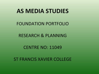
  • 1. AS MEDIA STUDIES FOUNDATION PORTFOLIO RESEARCH & PLANNING CENTRE NO: 11049 ST FRANCIS XAVIER COLLEGE
  • 2. My name is: Anna Fofanah Candidate No:9630
  • 3. Preliminary Project – Research & Planning • Choosing my target audience was very easy because it’s a college magazine, so therefore my target audience would be teenagers aged 16 - 19. On the other hand it could also be for parents • The awareness of my audience had a big impact on my visual design therefore to be able to realte to teenagers; I reseached mutliple magazines targeted to the same age group also doing surveys within the college so I’d know what appealed to them most. • When my final product for my school magazine was finished I was very proud of the outcome because I have never done anything like this before. In Photoshop and InDesign I have learned basic image editing techniques from producing my school magazine for examples by cropping out pictures and using different background colour and playing about with certain images so they appear more suitable for my cover. I have also gained an understanding about the conventions of a school magazine in team’s conventions in layout content and colour schemes
  • 5. Reflections & Feedback • What would you do differently next time? The things that I would do differently is my background colour as the colour of my front cover and contents page are not the same, it makes it look incomplete. My magazine cover is too simple and plain I could have added other pictures or use my colours creatively. • What kind of feedback did you get that might influence you? Some feedback that I received was that the background colour was too bright and the colours used for the font were too similar. Also more images could have been put on the contents page; readers would’ve liked to see more pictures relating to contents within the actual magazine. • What aspects of your understanding of Adobe Photoshop & InDesign do you need to improve? I could use my columns more effectively so that my cover lines are not too close to the edge, or clumped. Also how to use my layers correctly so that I know were all by text and pictures are by naming them.
  • 6. The music genre of my music magazine is: • The genre of my magazine is Jazz music • My chosen title was Riffin, this is because I wanted my magazine to stand out more. So by giving it the name of a musical terminology used within that specific genre gives this affect.
  • 7. So I researched this genre of music publication and studied: • Model 1 • Model 2
  • 8. What I learned from this was….. Cover Design Cover Lines •Use of bright Colours •Formal •Mostly black and white background •Relate to music •Main image Close up or medium •Events coming up or happening •Musicians with an instrument in now saxophone, trumpet or piano •Most of the cover lines involves an •Gender- men or women artist •Plain and simple not too much •CD’s reviews going on it’s not crowded with cover •Tasters lines or pictures •Programs
  • 9. For my music magazine…. • Target Audience: mostly people who enjoy jazz, sophisticate people 18 and over • Frequency: monthly because it allows the reader to have something to look forward to. • Cover price: £3.00 • Publisher : Rhinegold • Unique Selling point: Get the feeling of Jazz in your bones The reader gets to know what the genre of the magazine Jazz
  • 10. This is the face of the magazine • I’ve used a lot of colours because I think that • Front cover jazz magazine is meant to be fun and lively. My main image is a man playing a saxophone, I’ve chosen to use this picture because most of all the magazine that i have researched have used a musician holding a saxophone or trumpet and I didn’t not want to lose that affect so I decided to also have that sort of image. I’ve used six different colours there for breaking the codes and conventions of a jazz magazine. The reason for this is because using a brown background for my cover meant that I couldn’t use colours grey and white as it would not stand out so I used brighter colours. I also used six cover lines which include names of artists, events and cd reviews which normal magazines have. I have used one image because most magazines I’ve researched also have one image.
  • 11. Here are the 4 original photographs I shot for the project……
  • 12. I modified each photograph; here is the original next to the final version: • Here is how I changed the photograph and why The reason why I cropped the background of this picture is because the two men in the background looked like they were not doing anything. This picture was taken at a gig that I attend, so I didn’t not have full control of who should be in the picture as they were a band playing on stage and that’s the reason why I cropped the picture, in order for the main focus to be on the singer who stands out more in than the other people in the picture. In InDesign I used the stroke tool to put a white background around the image. This made the image stand out more and also looked different from the other pictures I have used.
  • 13. And the second one: • Here is how I changed the photograph and why Firstly I used my tools in photo shop to flip my picture vertically, as I wanted the picture to by at the bottom right of my contents page and I wanted her back to be at the edge of the page not in the middle as it didn’t look effective to me. I also cropped out the background of this image because of the door in the background I didn’t think it was appropriate to be part of a magazine picture. I decided to give it a lighter brown background from my contents page because I wanted the picture to stand.
  • 14. And the third one: • Here is how I changed the photograph and why I cropped out the background of this image because I didn’t really like the background as it was not suitable for a magazine and the background colour that I had chosen for my magazine didn’t not go with the colour of this background. I change this picture into black and white because I wanted it to have an old effect and also because most jazz magazines have black and white picture. On my contents page in InDesign I placed a stroke behind the picture and I used swatches to give it the a black background as I didn’t like it on my contents page with just the image alone, it didn’t stand out.
  • 15. And the last one: • Here is how I changed the photograph and why I also cropped out the background of the image because it wouldn’t look professional to have the plug sockets in the picture showing in the magazine and secondly I wanted the main focus to be on the musician
  • 16. Here are a couple of research models for my contents page…
  • 17. This is my contents page Contents Page • In this section I have used clear headings to show the reader the different sections of the magazine and where they need to look to be able to find what they need. • I made my numbers bold and in a different colour so that it stand out and it will catch the readers eye quicker so that the reader will know where the features are in the magazine. • I also placed the same numbers of the features on the pictures it relates to so that the reader will know what picture belongs to which article and who the article is about. • The reason why I have made the fonts of seventeen my contents page larger than the other features is because that’s my main story needs to stand out from all the other • The colour of my heading on my contents page is in white and yellow this is because that's the colour I used for my front cover and this colour scheme has run through out the my contents page.
  • 18. How does the contents page link back to the cover page? My front cover highlight’s the artists and musicians that are also Artists on my contents page for example James Grant and Ashleigh Ndjoli. My main story on my contents page is has a different artist from the main story of my front cover. I wanted my magazine to be different from the other magazines that are already out there. Magazines that use the same artist as their main story on their front cover, contents page and double page spread. After Main story completing both my front cover and contents page I realised that the outcome look of my magazine did not come out as I wanted it to. My idea way not very clear and I feel this might confuse the reader.   My contents page and front cover link because I’ve used Title Colours the same colour yellow and white for my title for both my contents page and front cover. I couldn’t use the same font for my title ‘Riffin’ on my contents page as my cover because it was no longer available.so I tried to get a font that looks just like it and I used ‘MS Mincho’. Also I used the same font ‘Verdana’ for my features and regulars on Same font my contents page and also for my cover lines on my front cover. For my cover lines on my contents page I decided just to use two colours to keep my magazine at a professional standard. I only used more than one colour green, pink, blue etc.. on my front cover to stand and to catch the readers eye.
  • 19. Key points of contents page How have you made the reader want to read on? I have used pictures and words to make my reader want to read on. the pictures are clear and the words tell the read who is the person is and give them incentive to read on. What are the links between images and words? In order for my pictures to link with the words I have placed numbers on them, for example picture 26 and words 26 have the same number. As I have placed all my artist under features that meant that all my pictures would have been placed in one section and I didn’t want that. I decided to spread my pictures around so by giving them number the reader will still know which artist belongs to who. What determines the dominant stories? The size of the image of my dominant story is larger than the other pictures. Also the words are in bigger font an are almost placed around the image. Doing this allows the reader to eyes see the main story before reading other thing that are on the contents page. How have you gone about ordering the information on the page? Firstly, I didn’t want all my pictures in one place, so I had to spread them out on the page. I also did not want my regulars and features to be on one side of the page, as most magazine do. I placed my feature on the bottom right and my regulars on the left because regulars come before features. Then I placed my picture around two on the left and two on the right next to the words. Making everything balanced.
  • 20. How does the contents page flag up your double page spread? My double page spread is based on the  dominant story of my contents page. I have  used the same artist on both contents page  and double page spread. The artist pictures and words are big to  make her stand out and also informs the  reader that she is the cover story and main  feature of the magazine  Even though the background as change on  my double page spread. I used a cream  colour which still matches with the colour  contents page. I also used the same colour  of the background on the bottom right of my  double page spread to keep the colour  brown consistent . The font Times New  Roman is also used through out my double  page spread apart from the title and quotes  which are a different font.
  • 21. Here’s an example of an inspiring double page spread…
  • 22. This is why I think that double spread works The use of only two colours and one picture that takes up half of the page  is amazing. This double page spread works because of it simplicity and  effectiveness. These are the traits that i plan to follow in my double.  The use of the black and white theme with the hint of yellow highlight  significant information. The layout of is not over crowded which makes it  easier for the reader to read. Looking at this double page spread I was  attracted to it so I think this I what I need to for double page spread. The genre of my magazine is jazz. This which it has to have a relaxed  theme about it. This is illustrated in the double page spread that I have  analysed.
  • 23. This is my double-page spread
  • 24. This is how my double page spread works My double page spread has a relaxed and simplicity theme to it. This is also seen in my contents page. The colour scheme show clear link to my contents page and cover page. Although I changed the main model of my magazine. This makes it look like there is no link to my contents page and double page spread. However my re-draft cover page and contents will have the same model which will then link to my double page spread. I started the article with an introduction of who she is and what she is doing. I chose to make the main picture which is on the left page a little bigger than the others. However not that big so that it does not dominant the page and take the attention away from the other pictures.
  • 25. This is how all three components are linked together…. Although my model are different I just my colour scheme is consistent . Same  model on the contents page and double page spread. The theme of jazz is  seen through all the three components  
  • 26. This is my re-drafted cover page • Cover Page • Key modifications from feedback • Colour of my title has changed • Main cover line stands out • Added more tasters • Cover lines on one side • Colour scheme changed to blue, pink, white and black • Background colour changed to grey • Change of instrument Clarinet to a saxophone • Barcode is on the right not on the left • Artist is no longer playing the instrument it’s placed in the background • Change of unique selling line to ‘Get the feeling of Jazz in your bones’ • Artist changed from a man to a female artist • Price no longer placed with barcode, placed next to title • Issue number and date separated • Change of masthead name from ‘Riffin’ to ‘RiffinJazz’ • Colour of the bottom strip changed to pink from white
  • 27. This is my re-drafted contents page • Cover Page • Key modifications from feedback • More tasters • added to extra columns tasters and reviews • Add Subscription • Only three artist picture are featured page • Picture of the front cover is added and a picture of tickets • The main cover story picture changed • Colour scheme changed to white, blue , pink and black • Formation of the layout change • Writings not hidden • Masthead design changed • Colour of masthead changed • Colour of the bottom strip changed to pink from white • Picture position changed
  • 28. This is my re-drafted double spread • Double spread
  • 29. Key modifications to double spread from feedback • Main picture on the left changed to a full picture and in black and white • One column of question and answer is seen on the left page • Issue number, date and website removed • Picture formation change on the right side of the page and 3 new pictures are added • New question is added • Quotes colour changed • Text formation changed • Photographer name added on the side on the left hand side • Same fonts used for question and answer but different font for the quotes • image shot from different angles
  • 30. Evaluation • You can find my blog here: (URL) http://fairofface-fofanaha9630.blogspot.co.uk/ And You can find my evaluation with responses to the 7 questions here: (URL) http://fairofface-fofanaha9630.blogspot.co.uk/