Web Application Visual Design for Non-Designers
•
6 recomendaciones•1,059 vistas

This presentation was part of a seminar for Boston CHI Professional Development Day, March, 2011 The goal of the course was to provide an overview of the "tools" for achieving consistency, hierarchy and personality in web application visual design – placement, color, typography and imagery.

Recomendados
Recomendados
Más contenido relacionado
La actualidad más candente
La actualidad más candente (20)
Similar a Web Application Visual Design for Non-Designers
Similar a Web Application Visual Design for Non-Designers (20)
Último
Último (20)
Web Application Visual Design for Non-Designers
- 1. Web Application Visual and UI Design for Non-Designers BOSTON CHI PROFESSIONAL DEVELOPMENT 2011 Tania Schlatter & Deborah LevinsonNimble Partners
- 2. 4. innovate create new paradigms 3.elevate the ordinary select color, fonts and imagery that communicate personality 2.make informed decisions create visual hierarchy to support use with type, color and placement 1.avoid common mistakes align elements | group like elements | use fonts appropriately | use colors appropriately | be consistent
- 3. We’ll focus on the green areas
- 4. Agenda 1. BASIC PRINCIPLES: CONSISTENCY, HIERARCHY AND PERSONALITY examples and discussion (break) 2. LAYOUT examples, discussion, two activities (BREAK) 3. TYPE examples and discussion 4. COLOR examples and discussion 5. IMAGERY examples and discussion 6. SUMMARY activity and discussion
- 5. Why consistency, hierarchy and personality?
- 6. 1. BASIC PRINCIPLES: CONSISTENCY, HIERARCHY AND PERSONALITY “The goal of communication-oriented design is to develop a message that can be accurately transmitted and correctly interpreted, and which will create the desired behavioral outcome after it has been understood by its recipient.” Mullet & Sano, p. 2
- 7. 1. BASIC PRINCIPLES: CONSISTENCY, HIERARCHY AND PERSONALITY “Differences can cause distraction.” “We need to establish a system of design… that allows people to feel comfortable…” David Hogue http://tv.adobe.com/watch/classroom-five-essential-principles-of- interaction-design/part-1-five-essential-principles-of-interaction-design/
- 9. Conventions are your friends
- 10. Break up pages into clearly defined areas
- 11. Make it obvious what’s clickable
- 13. 1. Are things placed and treated in a way I expect? Like any language, visual language only becomes apparent through consistent use. 2. Does it help me know what to do and what will happen? When the appearance of things – all visual cues – clearly and accurately portrays the relationships between the things it will be easier to grasp. Paraphrase Krug, p. 31 3.Do I get an appropriate sense of the characteristics? “…in design we should always create a persona for the product and ensure that everything in that product is consistent with that persona.”Don Norman, 1.11.2011, Johnny Holland 1. BASIC PRINCIPLES: CONSISTENCY, HIERARCHY AND PERSONALITY
- 14. 1. BASIC PRINCIPLES: CONSISTENCY, HIERARCHY AND PERSONALITY What’s going on here? Stack Overflow PivotalTracker Chase credit card Oracle jobs
- 19. goals tools layout Position and arrangement of elements type Font, size, styles color Hue, shade, value imagery Logo, photos, illustrations, patterns, treatment consistency hierarchy personality
- 20. Why “tools?” Understanding Comics Scott McCloud p. 179
- 21. 2. TOOLS: LAYOUT – EXERCISE How do you decide where things should go?
- 22. 2. TOOLS: LAYOUT Position Proximity Alignment Nesting Grouping Grid Help create relationships and tell a story
- 26. 2. TOOLS: LAYOUT Identify existing templates/paradigms/patterns/conventions at the widget/feature level
- 27. 2. TOOLS: LAYOUT - GRID Grid systems provide a structure and framework for change
- 28. 2. TOOLS: LAYOUT - GRID Grid systems help with consistency and hierarchy http://www.fuelyourcreativity.com/grid-based-design-toolbox/
- 29. 2. TOOLS: LAYOUT – EXERCISE Position Priority Flow
- 31. 3. TOOLS: TYPE Choosing a font How many fonts do you need? What size and weight? http://www.thinkingwithtype.com/contents/letter/
- 32. 3. TOOLS: TYPE Test and compare fonts, sizes, leading, spacing http://www.typetester.org/
- 33. 3. TOOLS: TYPE Font families have variations that help with hierarchy, but may need visual adjustment Tahoma hierarchy Georgia hierarchy
- 34. 3. TOOLS: TYPE Mixing fonts creates greater contrast but requires hand adjusting and careful selection Tahoma and Georgia hierarchy
- 36. 3. TOOLS: TYPE http://www.thinkingwithtype.com/contents/text/#Hierarchy
- 37. 3. TOOLS: TYPE http://www.thinkingwithtype.com/contents/text/#Hierarchy
- 38. 3. TOOLS: TYPE http://www.useit.com
- 39. 4. TOOLS: COLOR Hue Value Shade Complement http://seahawk4.blogspot.com/2010_02_01_archive.html
- 40. 4. TOOLS: COLOR Color can: Create impact Direct the eye Convey personality Complementary colors are especially good at this http://www.slashfilm.com/orangeblue-contrast-in-movie-posters/
- 41. 4. TOOLS: COLOR Orange and blue are everywhere!
- 42. 4. TOOLS: COLOR How to choose? http://kuler.adobe.com/
- 43. 4. TOOLS: COLOR One “lead” color One secondary or accent color Variations in shade/value
- 44. 4. TOOLS: COLOR Which works?
- 45. 4. TOOLS: COLOR Strategic use of accent color
- 46. 4. TOOLS: COLOR Visual spanking
- 47. 4. TOOLS: COLOR Alternatives: Gentle use of red Limited use of red Non-red accent and strategic position Strategic position and catchy copy
- 48. 5. TOOLS: IMAGERY Logo May be text (logotype), symbolic, iconic, pictorial Photos/video Should add information Illustrations Can be literal, data-derived or abstract Patterns/treatment Can help create visual interest without communicating content
- 49. 5. TOOLS: IMAGERY questions to ask tools Who Is the audience? What are they accustomed to? What Is the content? Where Are they when using? Why Are people using the application? How Should the organization be perceived? Logo May be text (logotype), symbolic, iconic, pictorial Photos/video Should add information, not distract Illustrations Can be literal, data-derived or abstract Patterns/treatment Can help create visual interest without communicating content
- 50. 5. TOOLS: IMAGERY Site audience said the organization is: “Service-oriented Caring, expert [and] passionate” “Personal” “Friendly” before
- 51. 5. TOOLS: IMAGERY Strategic use of color and imagery: Colorized logo reflects the diverse community. Abstract nature of the logo is a nice contrast to realist photos. Hot hues (orange,red) help draw attention to important content Photos of the facility provide a sense of place - foreshadow first visit experience Photos of practitioners reduce uncertainty after
- 52. 5. TOOLS: IMAGERY Strategic use of treatment: Rounded corners contrast angular logo and magazine images Gradation provides some depth and unifies elements Dimension effect on buttons emphasizes clickability Animation emphasizes the featured product
- 53. 5. TOOLS: IMAGERY Icons engage the eye and are consistent with the visual system in a related app Are two icon systems too many?
- 54. 5. TOOLS: IMAGERY What can contrast do? What creates contrast? Direct Emphasize Engage Attract (distract) Round/angular Warm/cool Flat/dimensional Big/small Centered/off-center Literal/abstract Text/image Dark/light Uppercase/lowercase On grid/off grid Dense/open
- 55. 5. TOOLS: IMAGERY Contrast is powerful. Use sparingly.
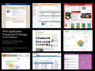
- 56. 5. TOOLS: IMAGERY Whatwould help? What’s working? Mathworks.com Silverback A List Apart Google apps Trefis Mint
- 57. 6. SUMMARY EXERCISE Consistency Hierarchy Personality Layout Type Color Imagery Priority Flow Contrast Abstract Literal Pattern Treatment Position Proximity Alignment Nesting Grouping Grid
- 58. Thank you! Tania Schlatter Deborah Levinson @taniaschlatter @nimblepartners www.nimblepartners.com